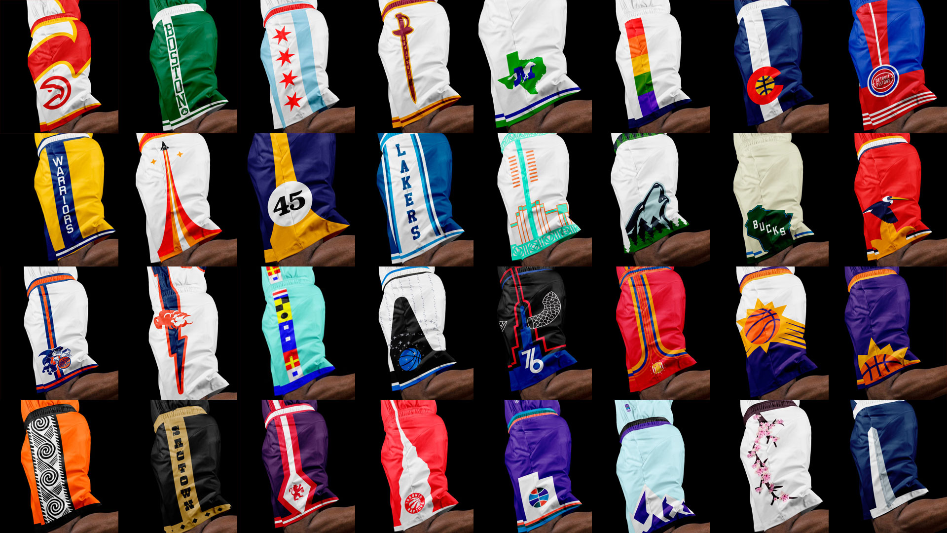
Every team in the NBA reclaimed, reinvigorated, reimagined, or perfectly (we hope!) curated for their fans.
It can be hard for anyone to watch their favorite teams put out names, branding or jerseys that are a little (or a lot) lame. As sports fans we all basically root for laundry; that laundry should be something we're proud to rally around. There's a tangible effect too: projects like the Heat's Vice-themed city jerseys and the Bucks' re-brand prove that if you give your fanbase something that truly resonates, it can spike merch sales.
Our theory is that in addition to presenting an elevated design vision for the Association, these executions would increase revenue across the league. Most importantly and as lifelong hoops fans, we hope anyone who loves the NBA can find at least one element that resonates with them, and that we were able to do right by each team in their own way.
We started with some desktop research, compiling a set of every league-wide logo or uniform ranking we could find, plus commentary from individual team blogs and forums to get a sense for how every team's actual fans felt about their look. This led to some unexpected revelations that really impacted the work. We also dug into each team's city and uniform history to ensure our modern interpretations were rooted in visual cues every team's tribe would recognize.
We tried not to lean on classic logos or uniforms—as that is a separate revenue stream for the NBA—but there were a couple (looking at you, Toronto and Golden State) that could not be denied. Speaking of Barney and The City, that's a pretty good microcosm of the spectrum our work was playing on: combining the experimentation and expressiveness of the 90's (but without veering into caricatures), with the sophistication of today's design language (but with a moratorium on "blanding" and "sports design").
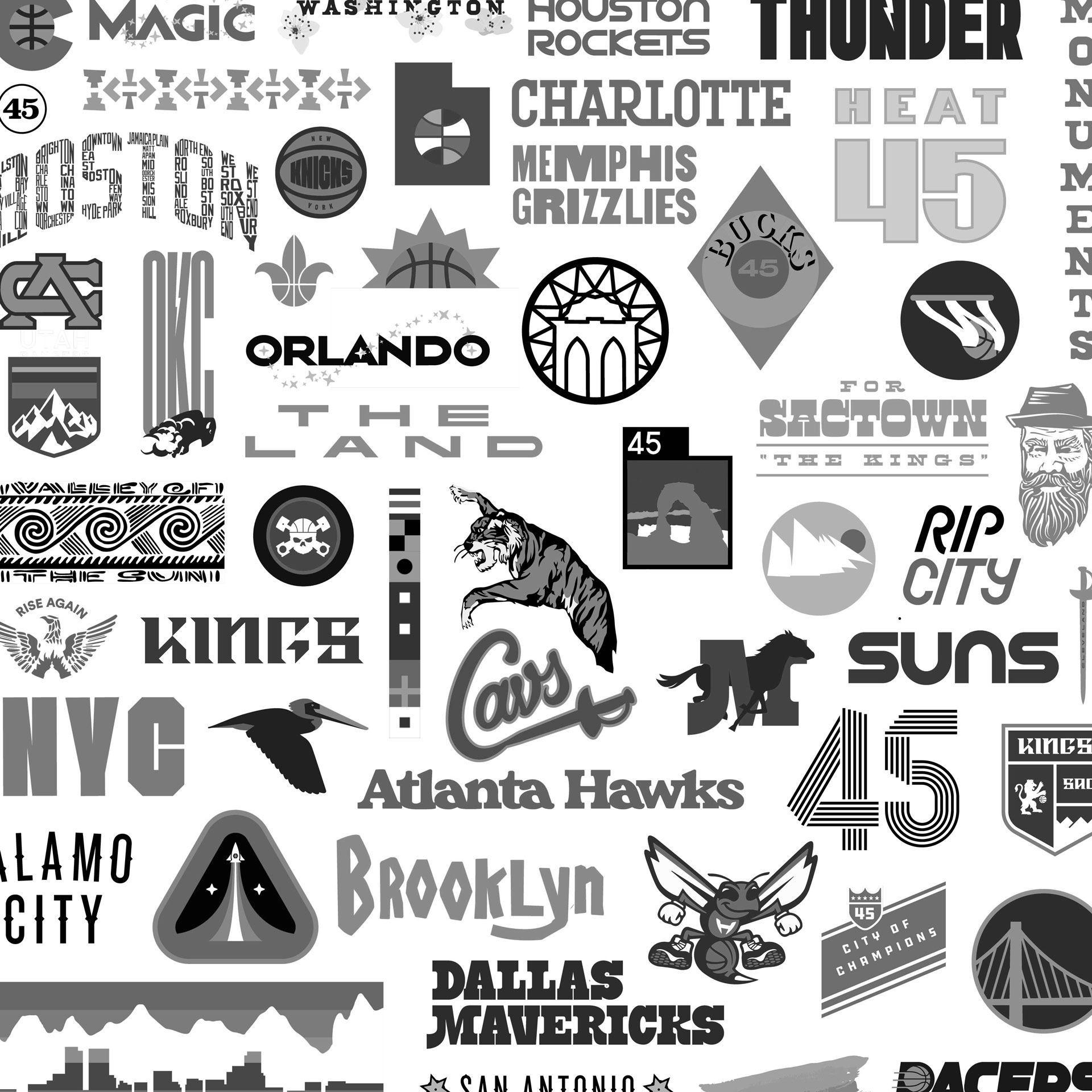
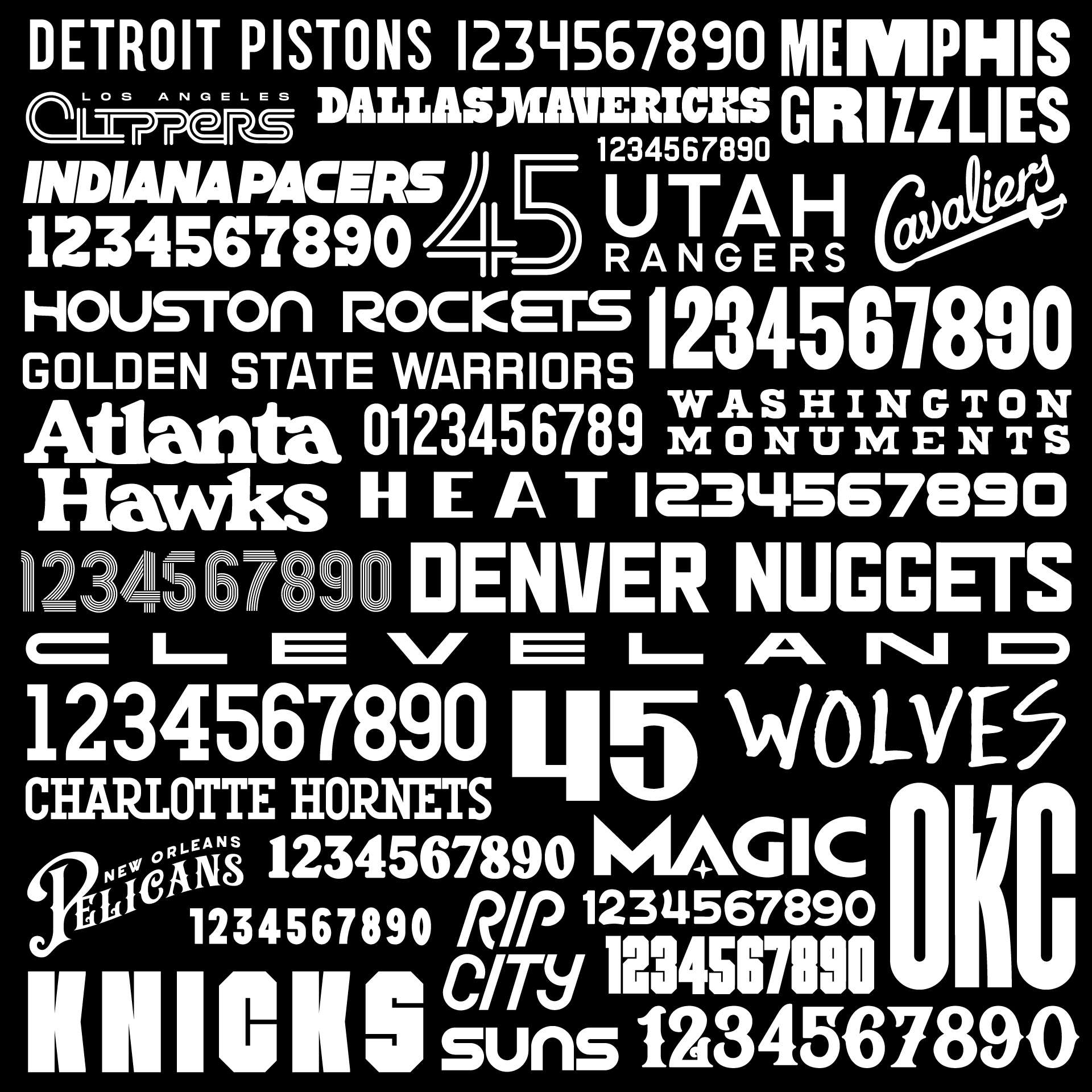
Given that basketball uniforms pretty much come down to lettering and numbers, it's been a little boring to see the league (likely as a backlash to the less successful moments from the aforementioned 90's experimentation) swing the design pendulum to its bland extreme. Many uniforms use similar type and layouts to the point where they aren't own-able— you could swap another teams name and color scheme and not miss a beat. We challenged ourselves to create as much custom lettering as possible (and numbers too!), and to give each team a distinct style while preserving the classics.
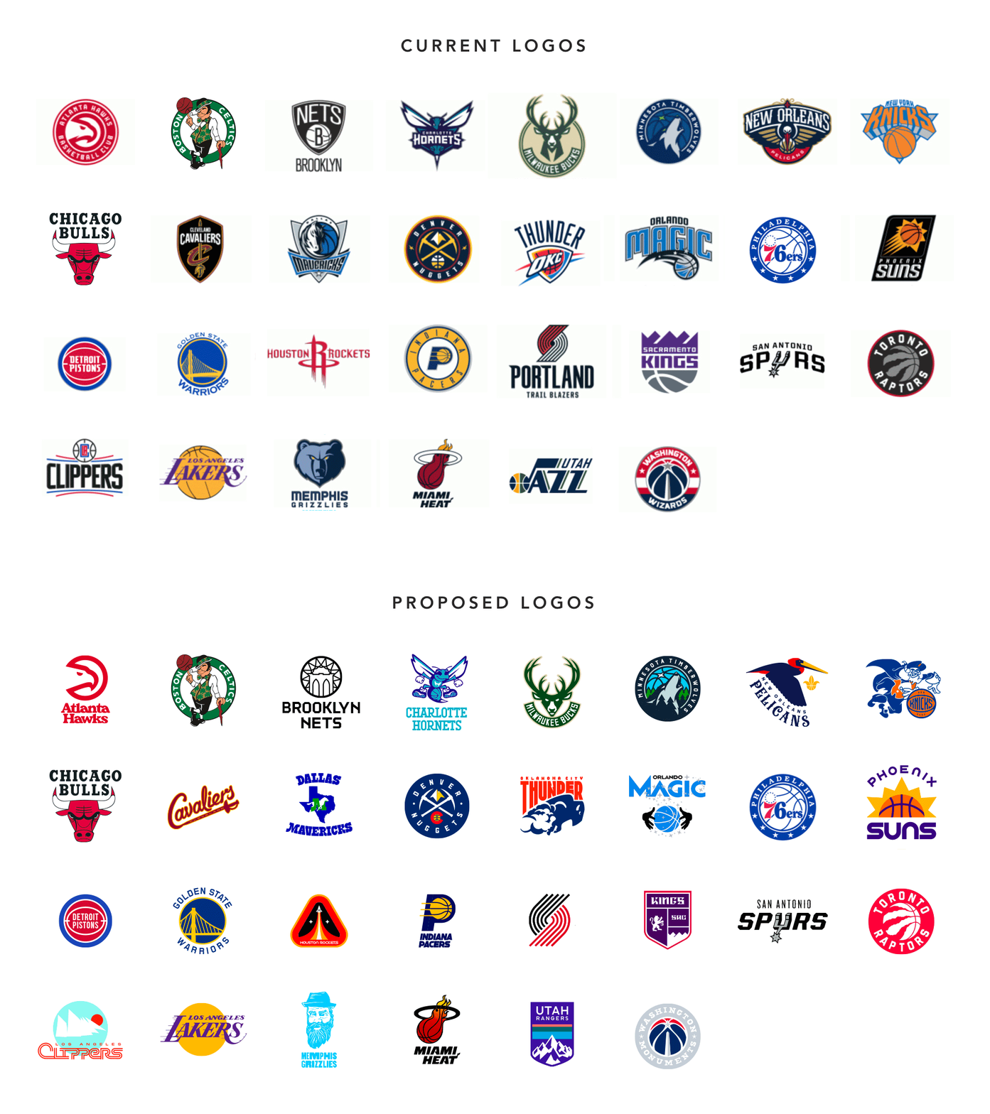
First things first: if you came here to see some designer rename the Lakers or give the Celtics a new logo, you're in the wrong place. While we did rename a couple teams (bracing ourselves for the fallout from Memphis and Utah), we looked at this as an exercise in creating the best or most appropriate expression of each team's story, which meant not reinventing the wheel of teams with storied histories (as always there were some exceptions). The icons of the league typically got no tweaks, or nips and tucks; some teams needed to reclaim their roots; some teams needed better design executions on what were great core concepts; and a few needed a completely fresh start including a new name.
We settled on four uniforms for each team: Association, Icon, City and Statement. We kept it straight for association and Icon treatments, typically amplifying our logo approach for a given team. We got more adventurous with City and Statement designs. Sometimes it meant something simple like promoting an accent color in a team's existing scheme; other times we would get inspired by a cultural moment and go into an out-of-left-field direction (if you love to see uniforms that function as a cohesive set, you should stop reading each team's detail page after the Association and Icon kits). For both City and Statement concepts, we looked to recognize significant and/or significantly under-celebrated moments or people from a particular place.
Couple other design notes: 1) we weren't afraid of things like strokes around letters and numbers—as much as we can be snobbish about those moves as designers, in the context of a jersey, there is nothing cooler that feeling two layers of tackle twill embroidered on top of each other. And 2) we had some fun with neck and armhole trim, even going so far as to bring back some of the old school patterns for teams like Minnesota and Memphis. And as much as possible, we tried to give each team a signature layout that was somehow inspired by their story.
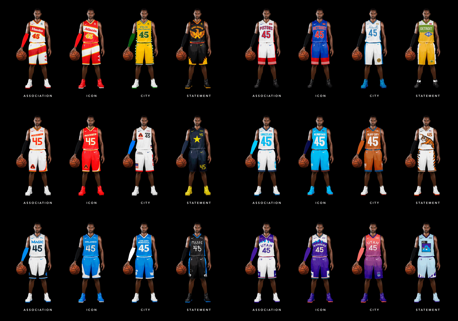
Basketball shorts are in some ways the most interesting part of the uniform: unencumbered by requirements like team and player names and numbers, they are free to inject more storytelling or get wild with their layout. For fans, they're also a lot easier to wear around the house or in pickup games without being made fun of—as much as I'd love to wear my Klay Thompson jersey to the gym, I wouldn't have the guts to do so unless I was also a lockdown defender who shot 40% from 3 (and even then, am I really going to sweat through a jersey I can't easily wash or replace?). And yet: shorts seem to be a relative afterthought in today's NBA. We wanted to pay special attention to each team's shorts and bring back the glory days of instantly recognizable statement pieces that stand alone anywhere from the Association to local rec leagues.
