
Nice foundation and love the symbolism, but too many layers of colors and circles and elements distracts from the narrative with ornament.

We put the logo on a visual diet, filtering the fluff and building in a more direct tie to the CO flag with a color shift and a new secondary logo that incorporates a basketball in to the "C" monogram. The base of this new graphics kit is custom lettering inspired by typography from the plaques of mountain summits.
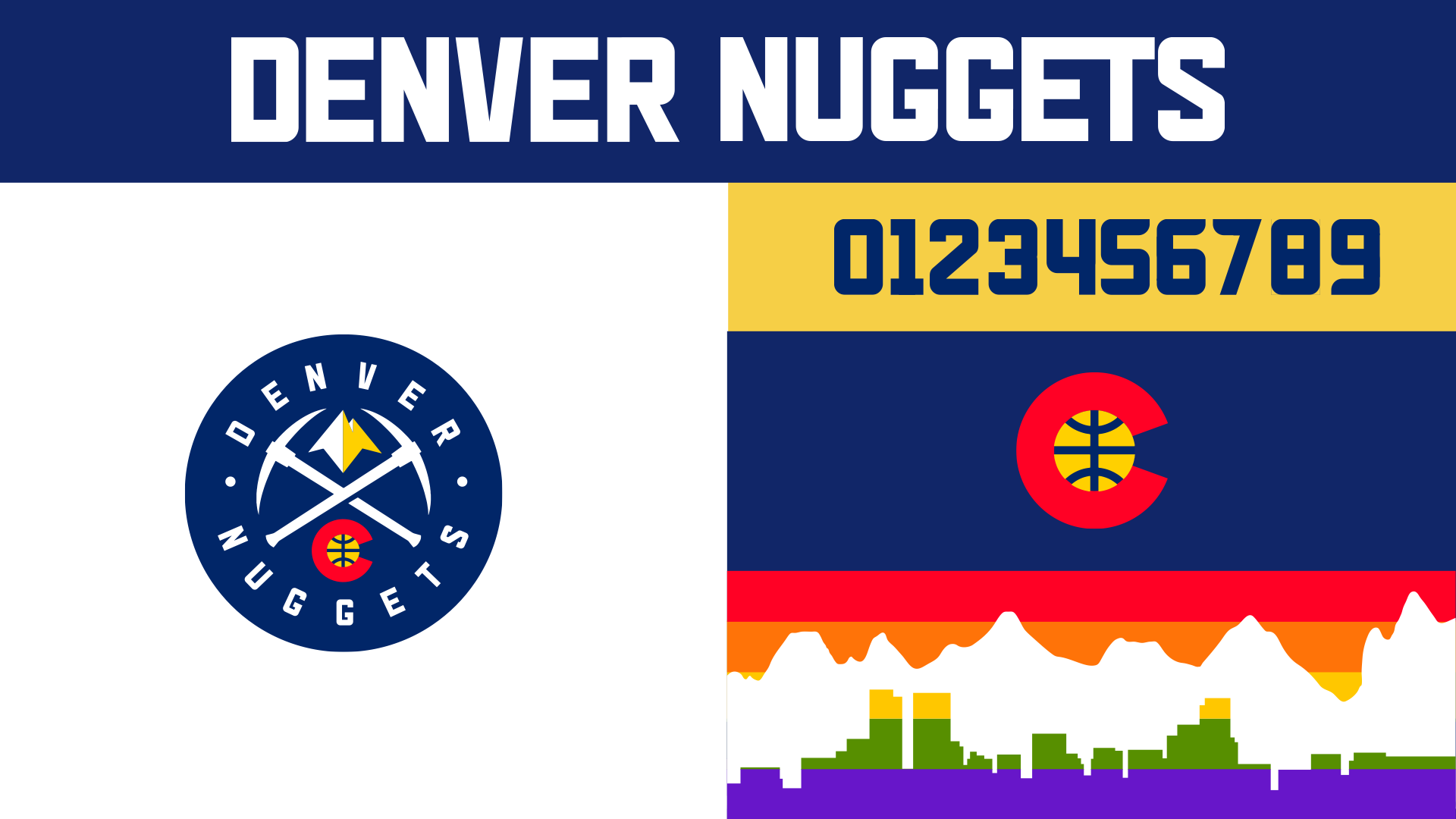
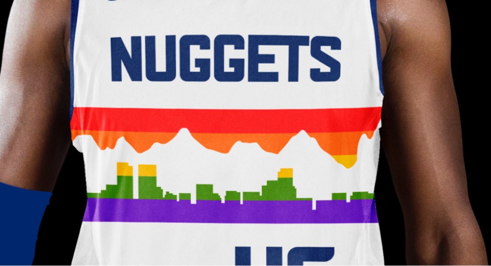
The most significant update other than the state flag references is to the colors and forms of the rainbow skyline —the last couple renditions we've seen stuck with the original geometric forms but made the colors way more muted, which ended up feeling drab and constricted. This update brightens the colors while keeping them in tune with the evolved color base, and adds the actual Denver skyline below a more organic mountain range shape.
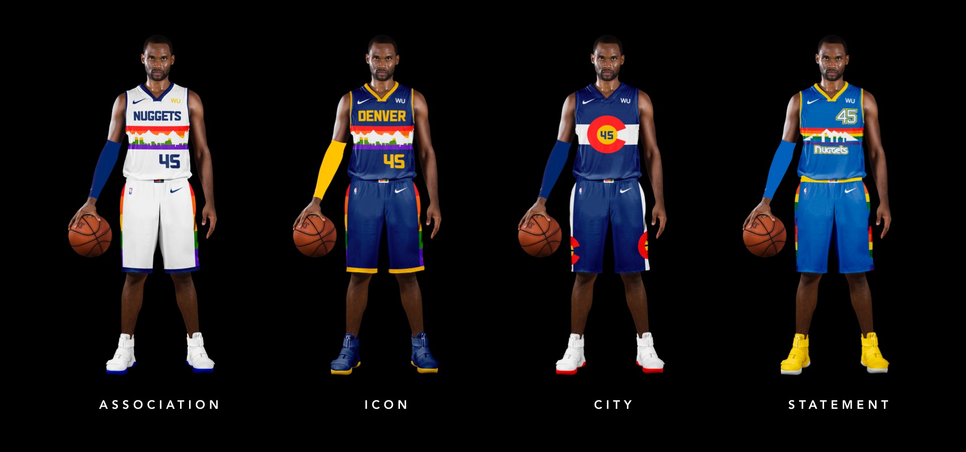
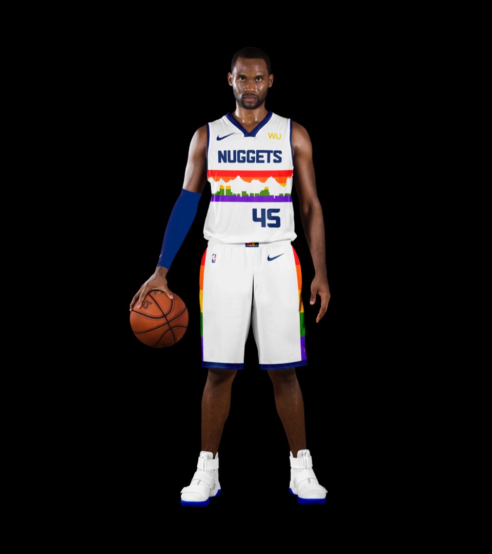
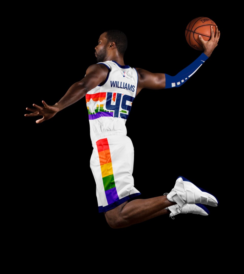
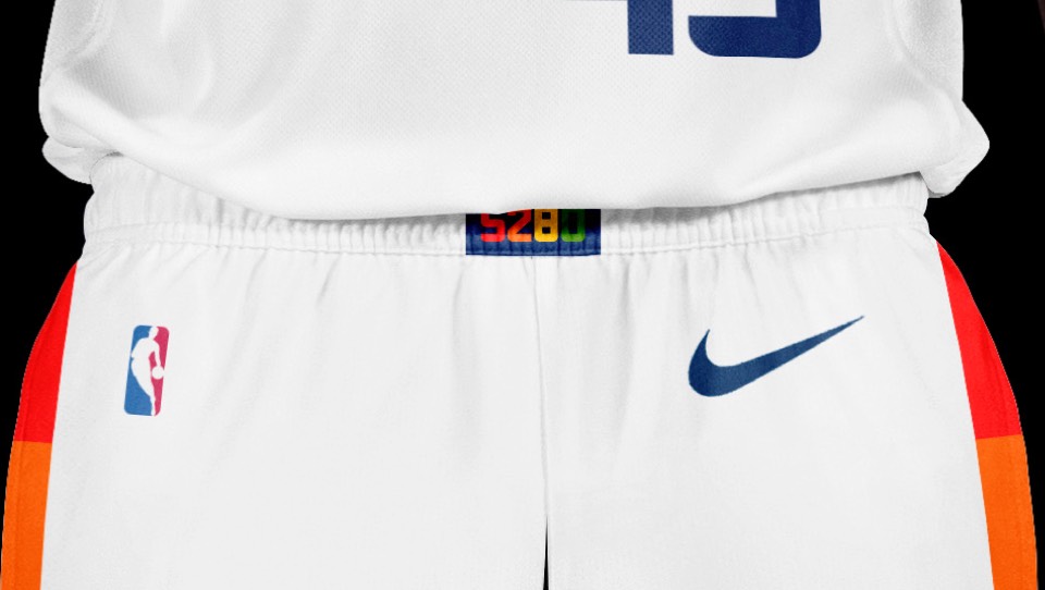
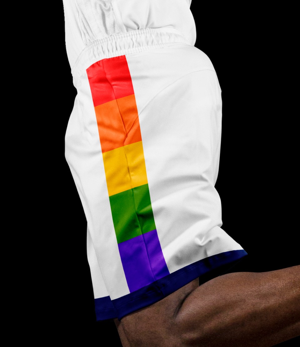
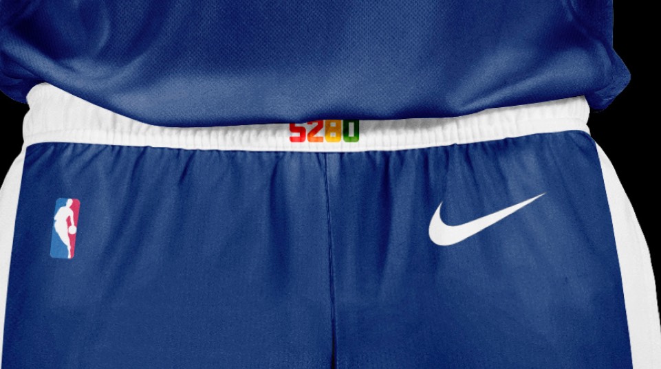
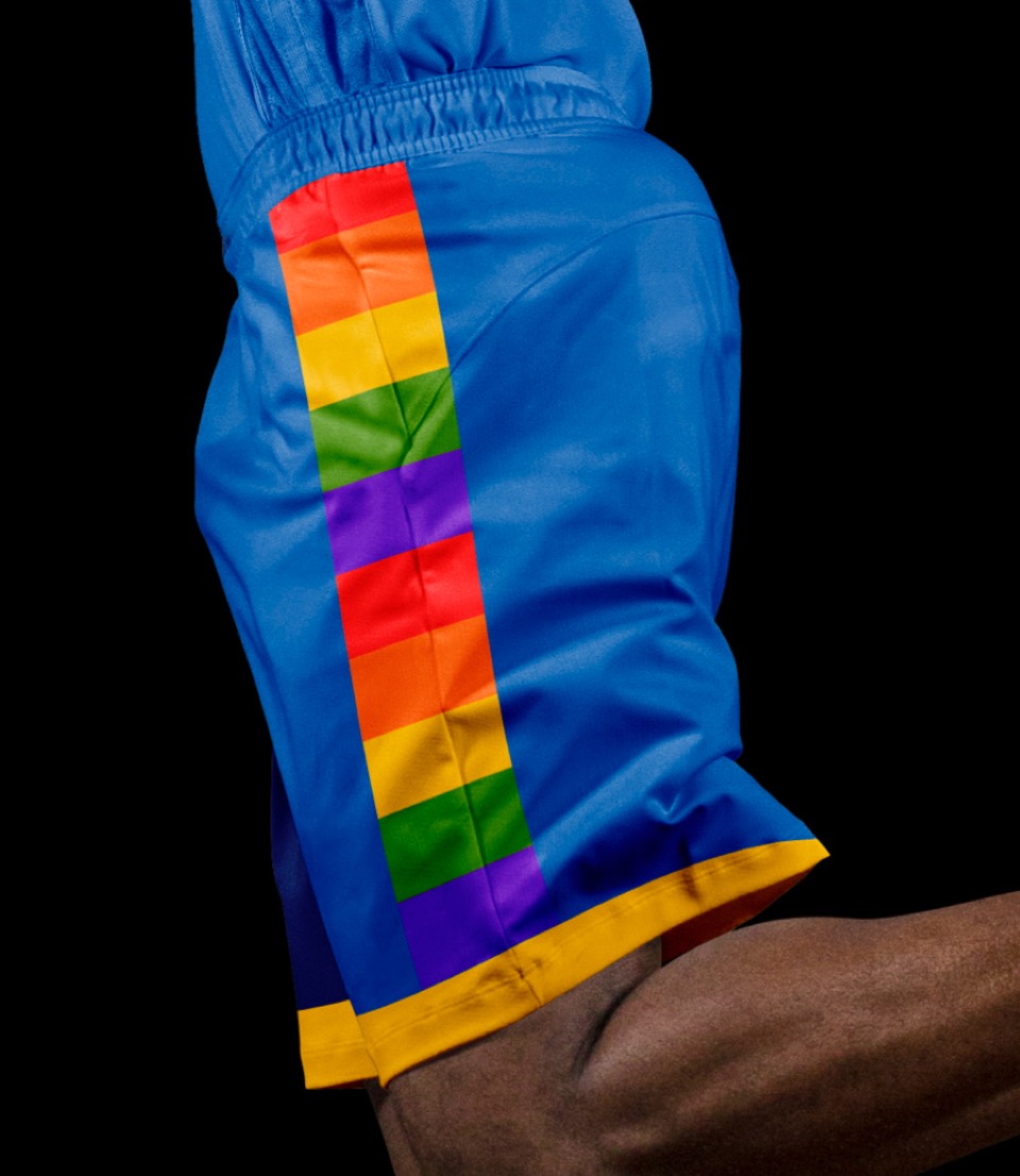
The new rainbow skyline is now the primary jersey design. The big difference other than the shapes of the mountains and buildings is that the team name is now on top and the numbers are on the bottom; flipped from the hardwood classic uniforms. Returning are the rainbow shorts and the mile-high belt buckle detail.
The new rainbow skyline is now the primary jersey design. The big difference other than the shapes of the mountains and buildings is that the team name is now on top and the numbers are on the bottom; flipped from the hardwood classic uniforms. Returning are the rainbow shorts and the mile-high belt buckle detail.
Another significant update is the word DENVER for their Icon jersey instead of using NUGGETS for both. The rainbow really pops against the navy and isn't competing for our attention with what used to be a more royal blue.
Another significant update is the word DENVER for their Icon jersey instead of using NUGGETS for both. The rainbow really pops against the navy and isn't competing for our attention with what used to be a more royal blue.
Another wrap-around design that translates the Colorado flag to a uniform. This gives the rainbow skyline more intentionality as it ties it to the flag proportions. The secondary Logo is also prominent on the shorts which is a nice standalone piece for rec league games, etc.
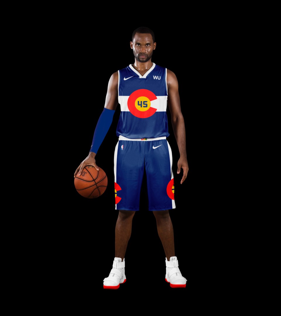
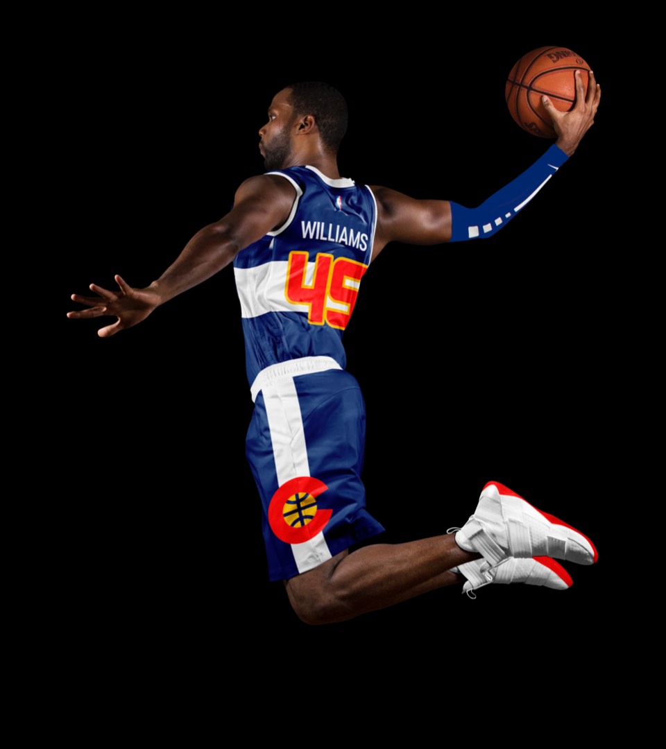
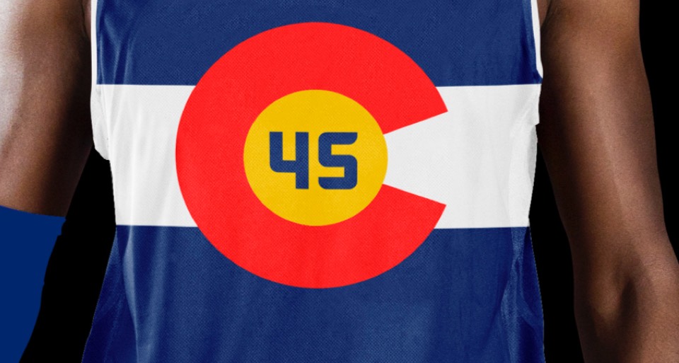
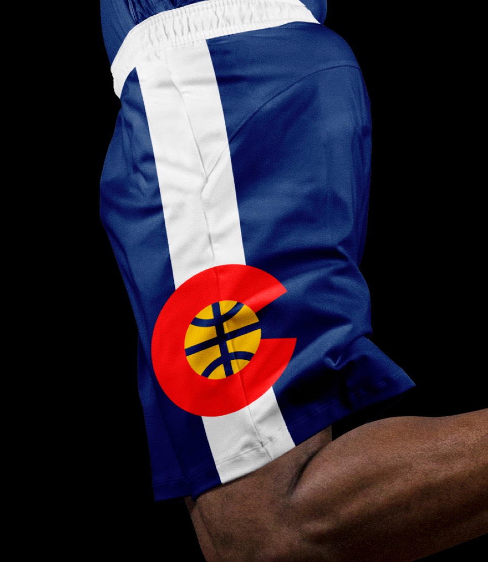
Another wrap-around design that translates the Colorado flag to a uniform. This gives the rainbow skyline more intentionality as it ties it to the flag proportions. The secondary Logo is also prominent on the shorts which is a nice standalone piece for rec league games, etc.
The OG uniforms were too unique not to include here, with the royal blue and yellow, the crazy letters and the abstracted skyline. Wouldn't be the Nuggets without it.
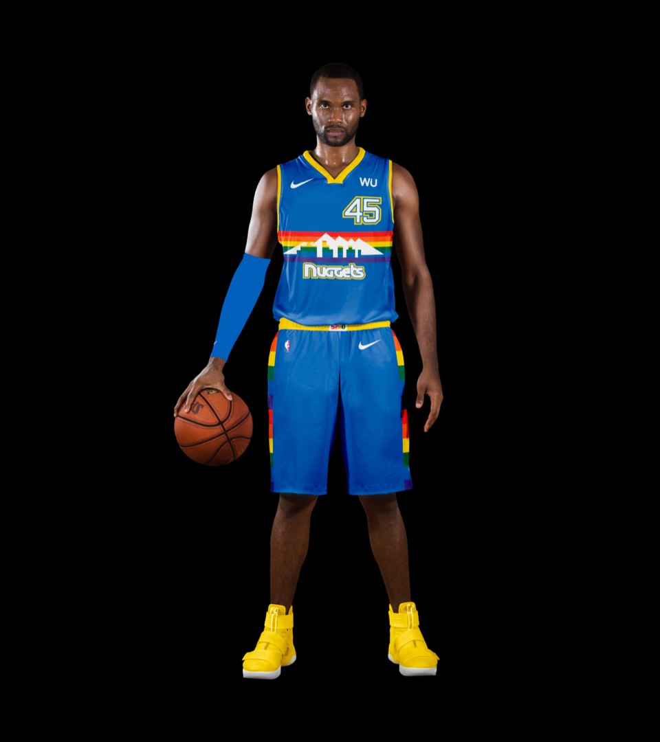
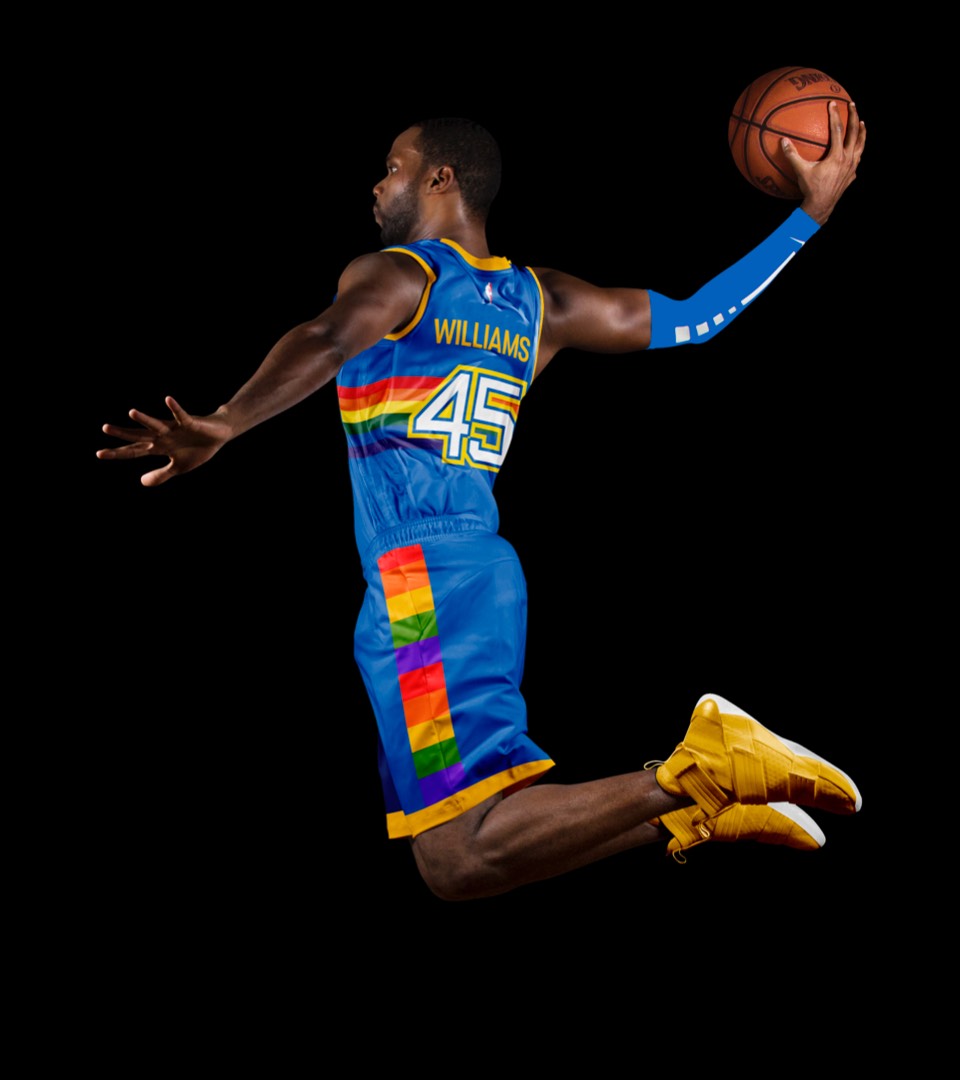
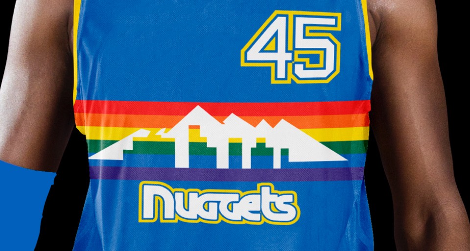
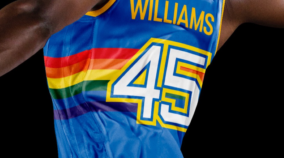
The OG uniforms were too unique not to include here, with the royal blue and yellow, the crazy letters and the abstracted skyline. Wouldn't be the Nuggets without it.