
One of the cleanest but most bland logos in the NBA. Thanks mostly to the gray, it doesn't have a lot of personality and doesn't scream "royalty" like the Kings should.

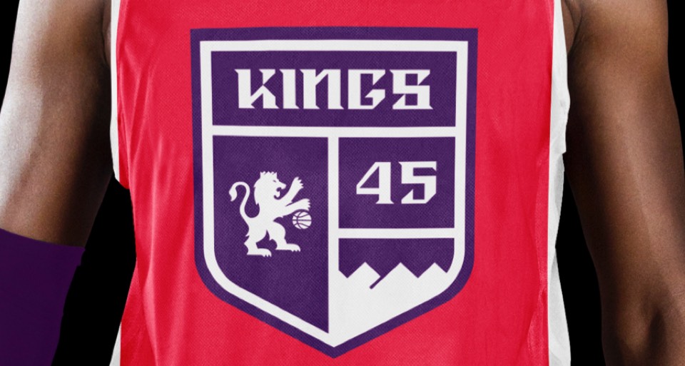
We pushed the type to a more expressive place, building a set of blackletter(ish) forms. And it wouldn't be "royalty" without a proper crest, so we created a shield featuring their secondary logo, the "SAC" moniker and the existing graphic of the mountains surrounding Sacramento.
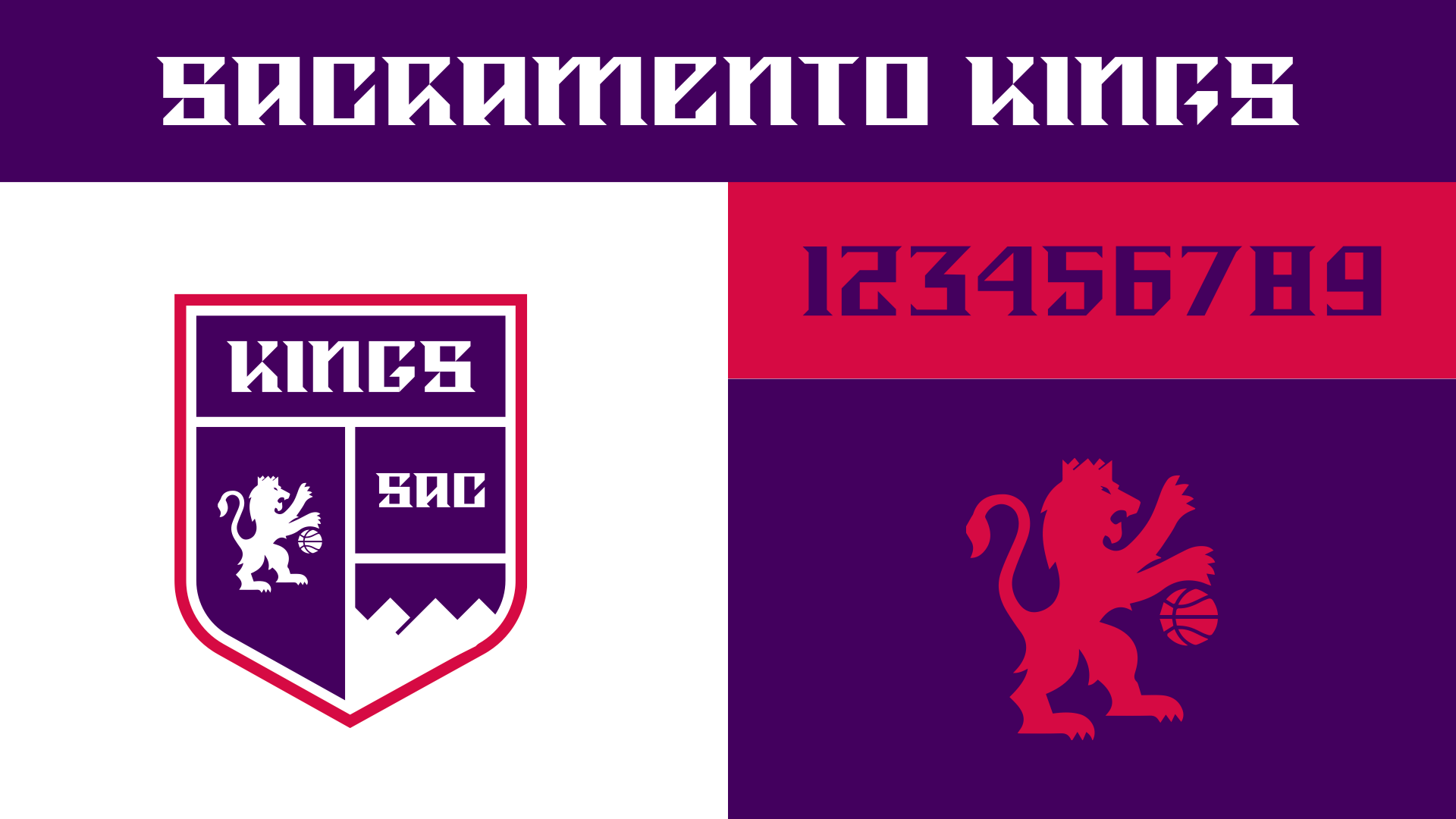
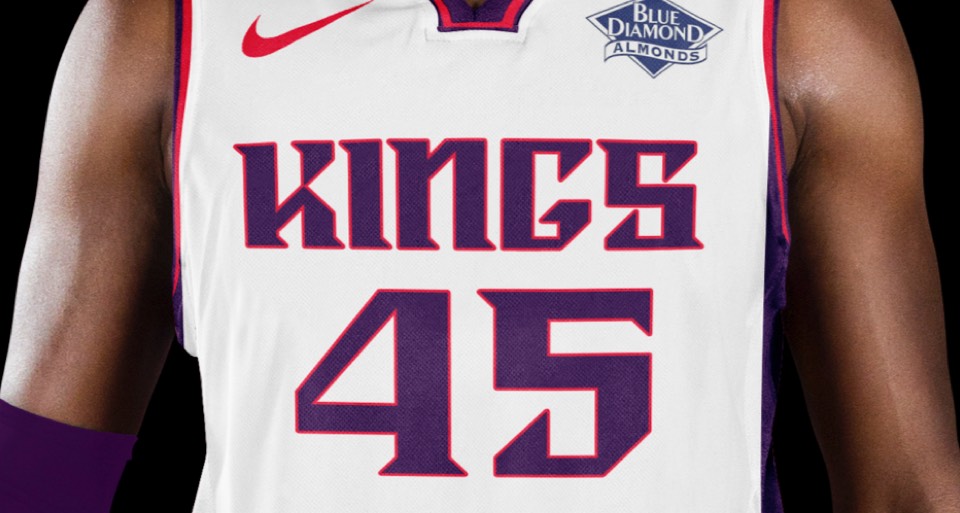
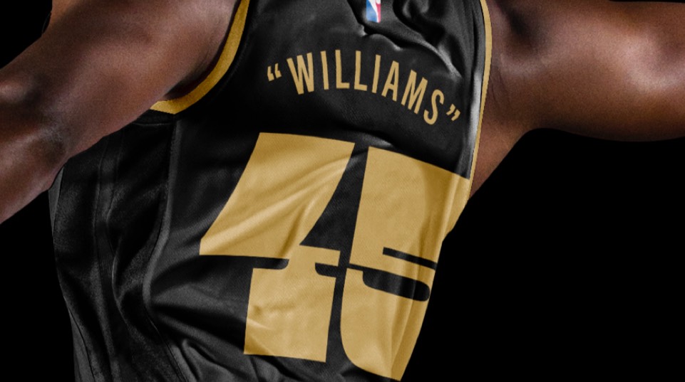
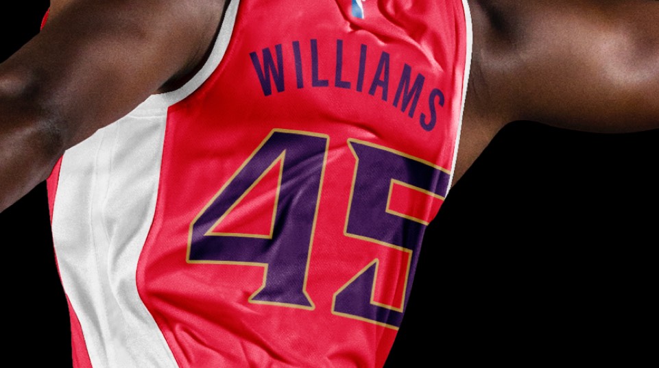
We extended the custom lettering to a number set and added a red for better energy and a more "royal" palette. We (and the Sacramento fans) love their secondary logo so much that we kept it as well as added it to the primary logo.
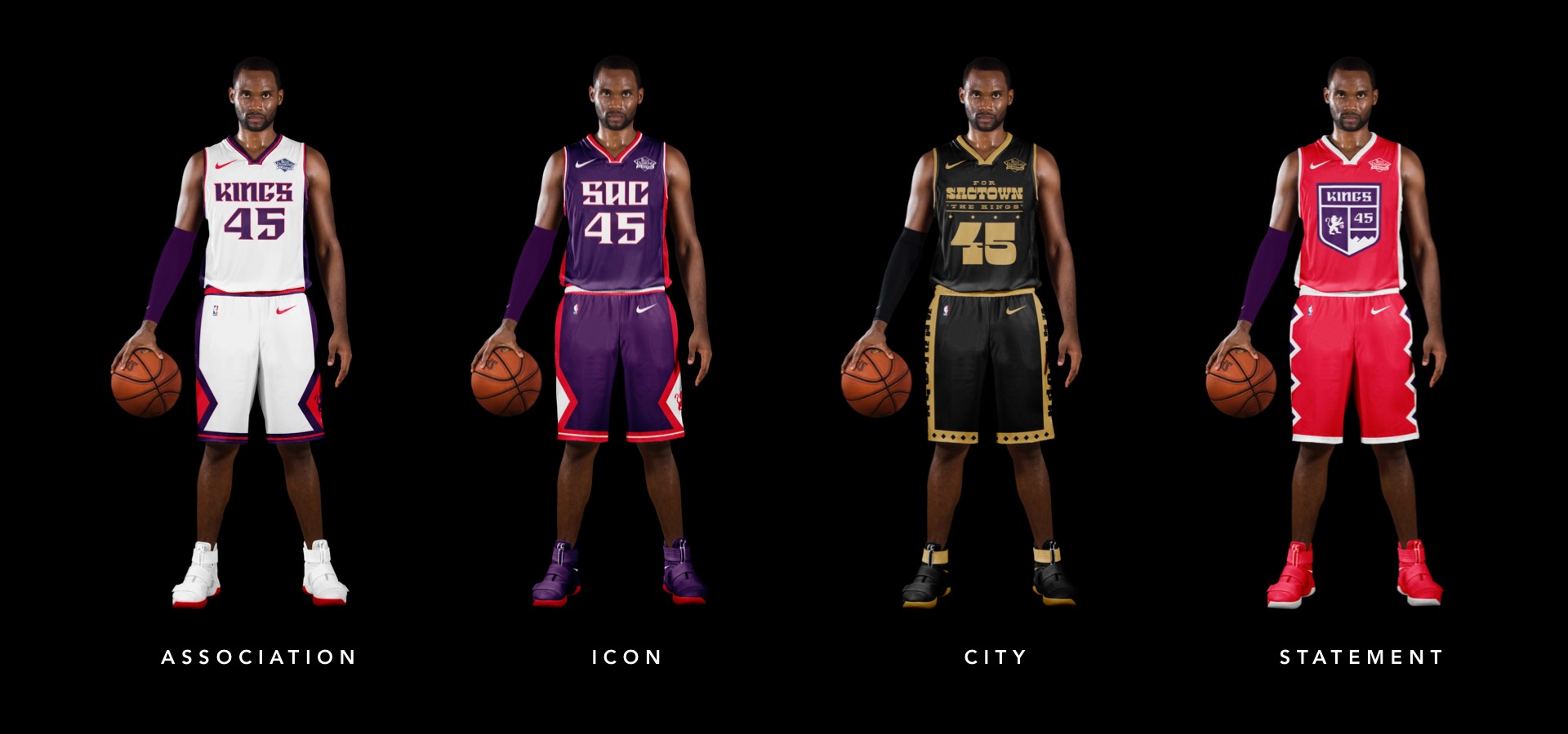
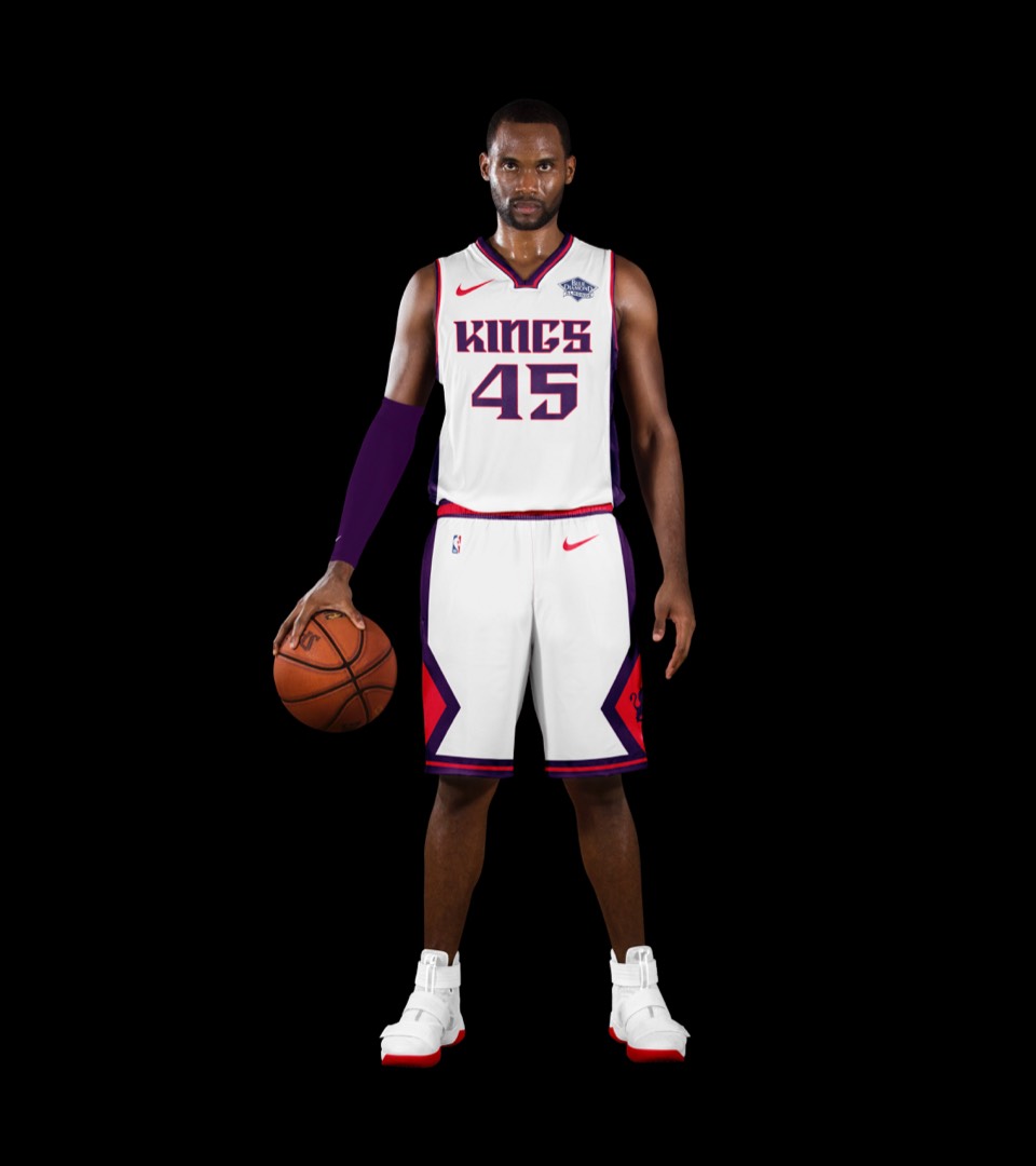
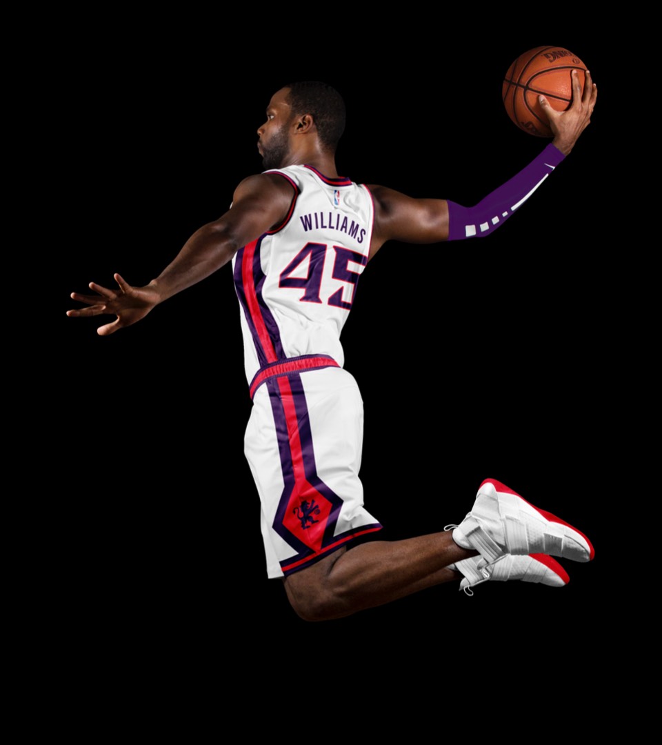
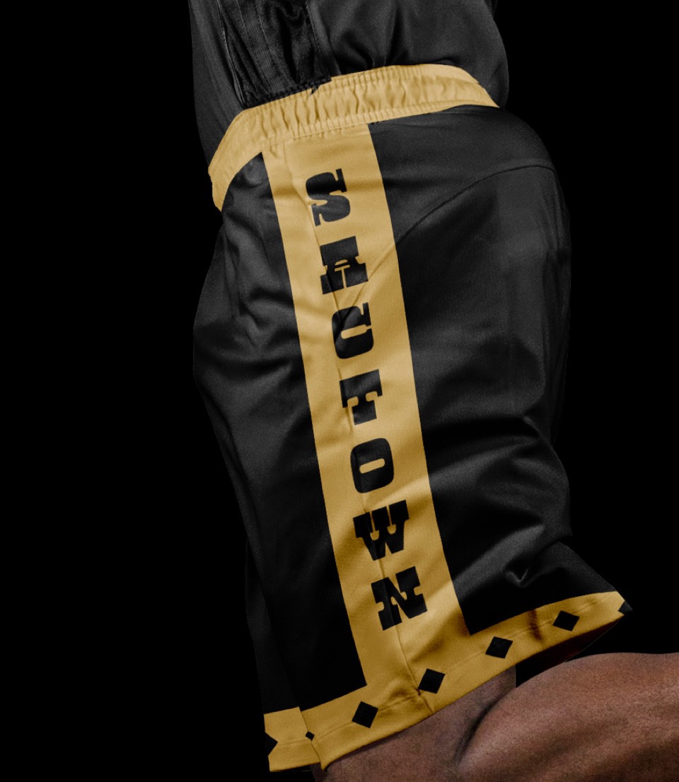
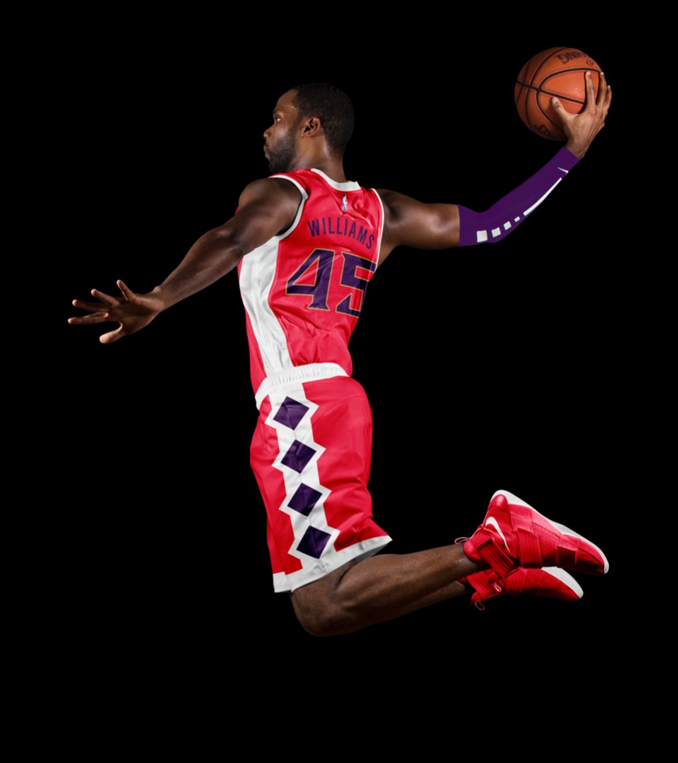
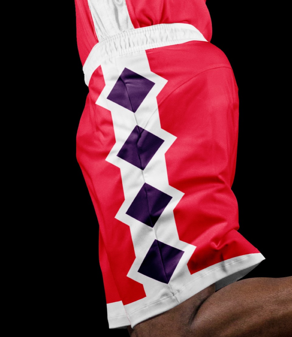
The association jerseys are similar in style, although the new lettering represents a significant visual shift. We've also swapped out the bland gray for royal red and added diamonds to the shorts.
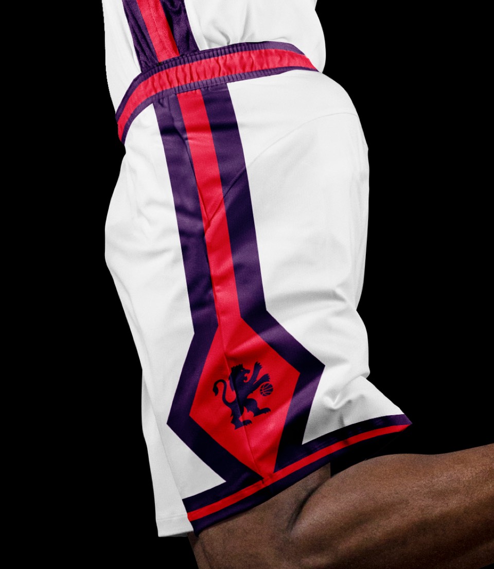
The association jerseys are similar in style, although the new lettering represents a significant visual shift. We've also swapped out the bland gray for royal red and added diamonds to the shorts.
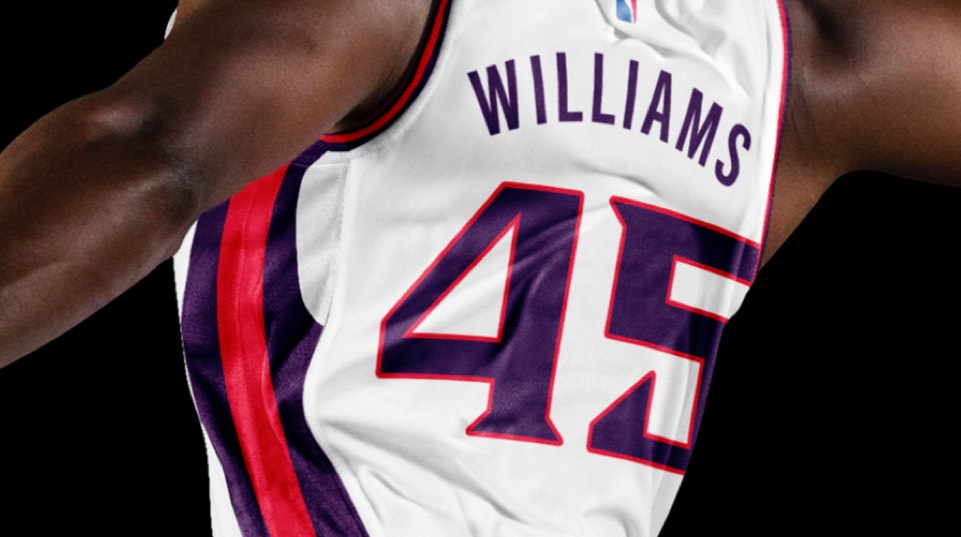
Kept the "SAC" moniker here but it gets a major boost with the updated color palette and the lettering.
Kept the "SAC" moniker here but it gets a major boost with the updated color palette and the lettering.
An homage to the California Gold Rush, which began with the discovery of gold in Sacramento. We brought it to life with a layout and a voice inspired by the old western gold rush flyers.
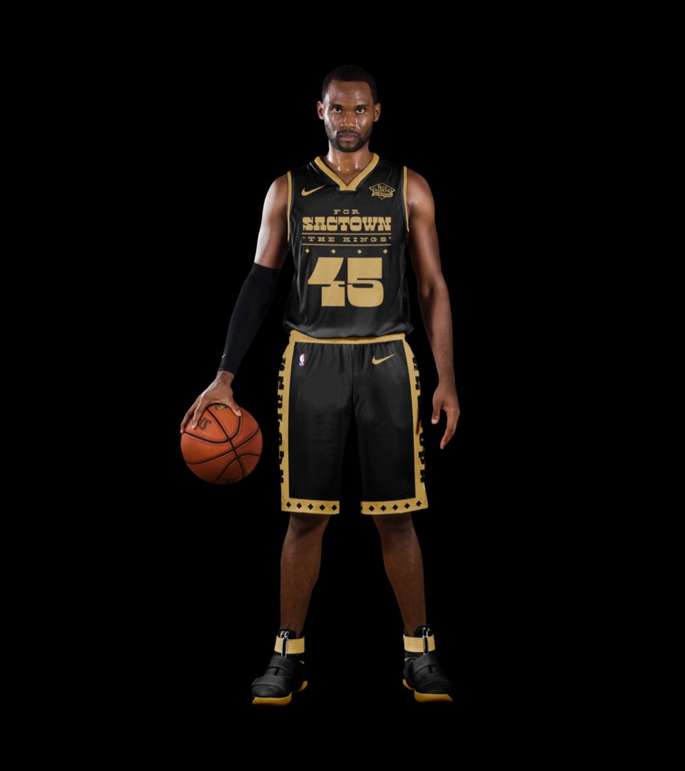
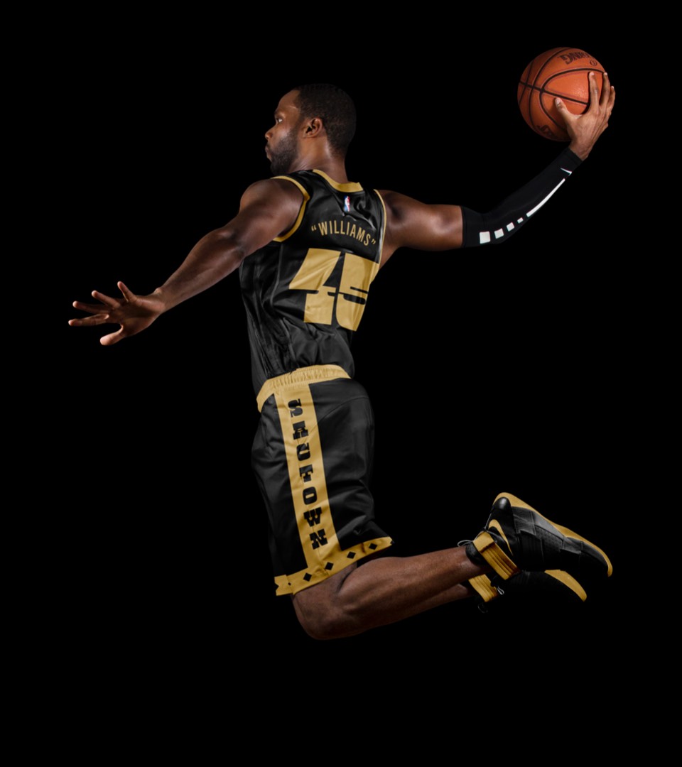
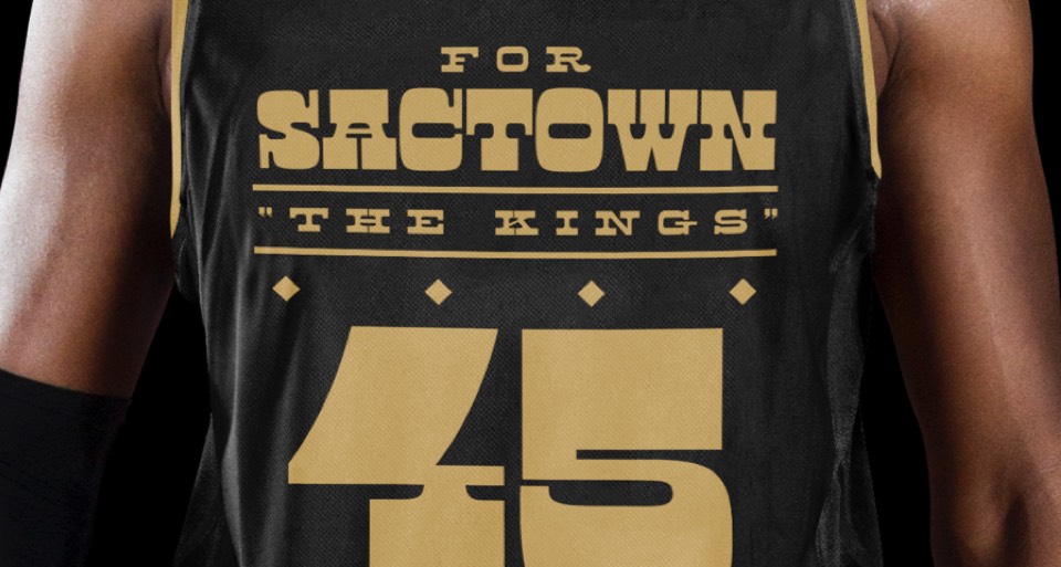
An homage to the California Gold Rush, which began with the discovery of gold in Sacramento. We brought it to life with a layout and a voice inspired by the old western gold rush flyers.
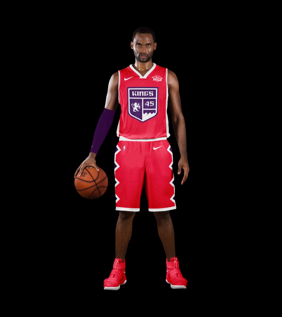
Inspired by medieval knights' tunics, we promoted the crest front and center, turning all the "royal" elements up to eleven.
Inspired by medieval knights' tunics, we promoted the crest front and center, turning all the "royal" elements up to eleven.