
The logo is a really clever way to say "raptor" without saying "Jurassic Park." Our only nitpick would be, for something so brilliantly simple, can it be simpler? Does it have to lean on the design crutch that is black? And why push the coolest element (the clawed basketball) in the the background by making it gray? (Or "grey" if we're speaking Canadian)

The answer is, ditch the red outer stroke and go all red and white, which really helps the ball pop and instantly reads "Canada".
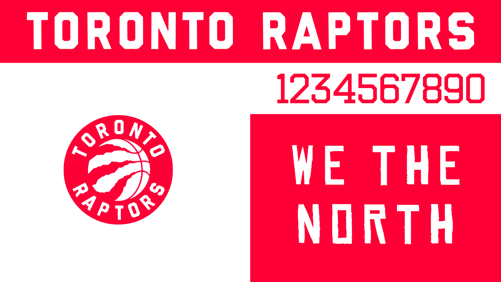
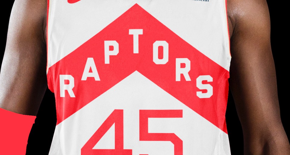
We continue the red and white palette throughout, with a thin version of the logotype for the numbers that feels more cold and technical, more "north". Also including the WE THE NORTH rally cry as a secondary element, which we absolutely love.
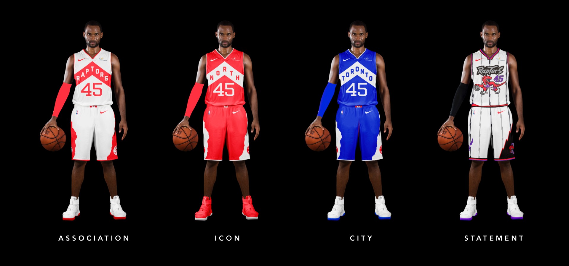
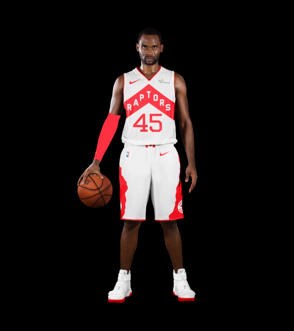
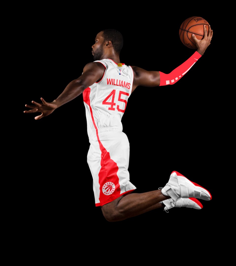
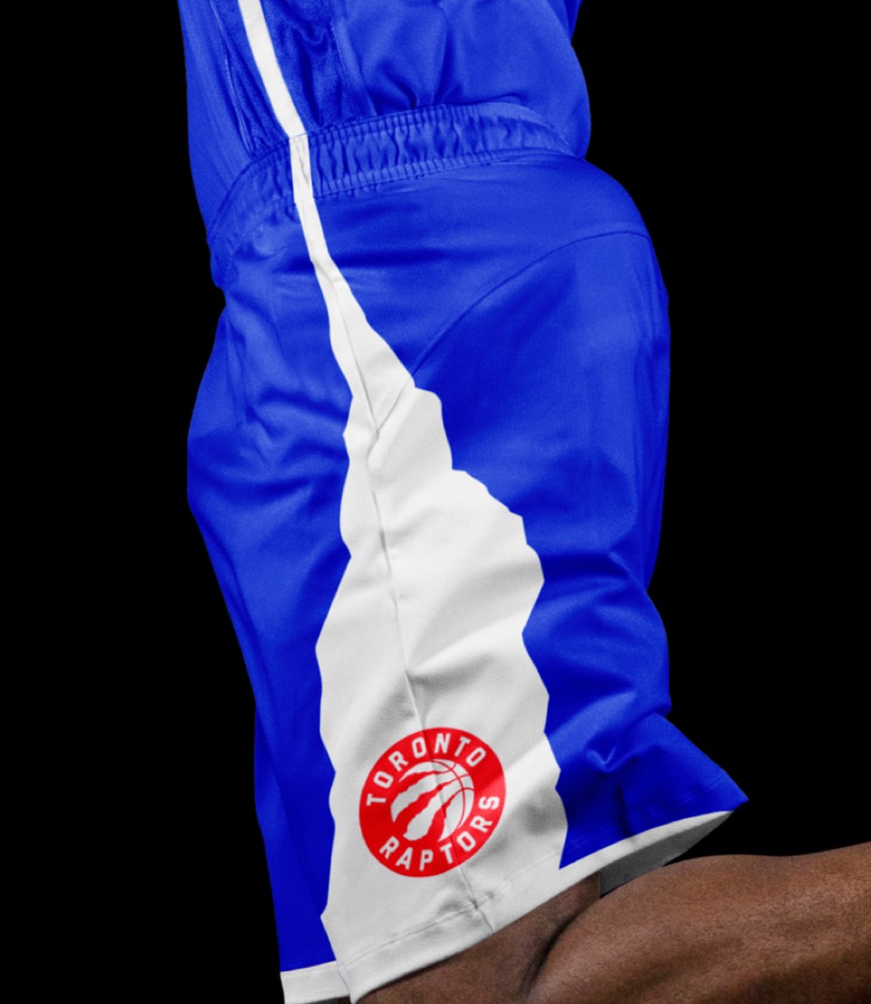
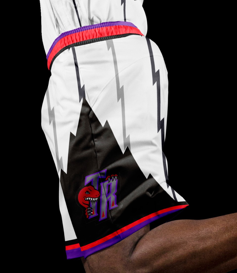
OK, so. Chevron is great. New numbers are one improvement. The shorts are where we really go for it. Instead of cutting the chevron off abruptly, we have it turn into a small side stripe that gets clawed open as it runs down the side of the shorts! This helps it connect the top and bottom of the uniform, and the Chevron to the logo.
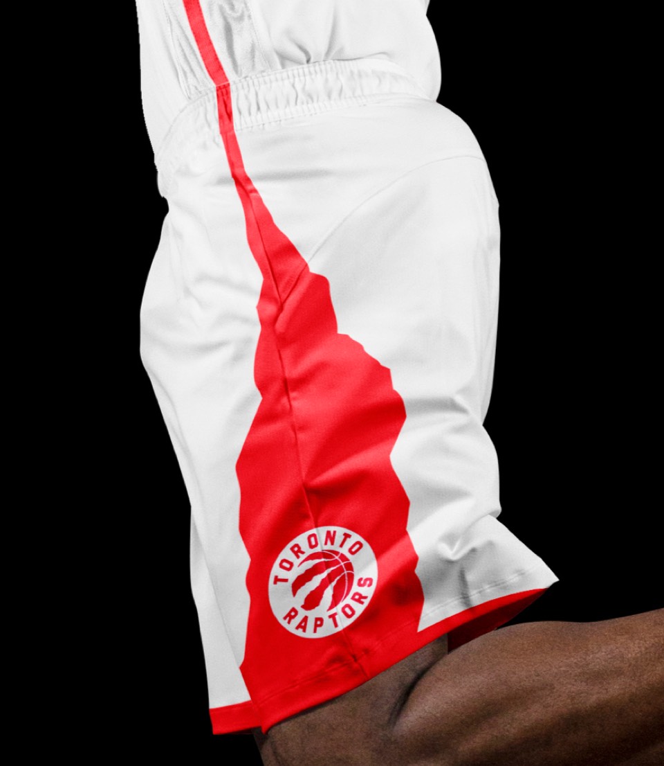
OK, so. Chevron is great. New numbers are one improvement. The shorts are where we really go for it. Instead of cutting the chevron off abruptly, we have it turn into a small side stripe that gets clawed open as it runs down the side of the shorts! This helps it connects the top and bottom of the uniform, and the Chevron to the logo.
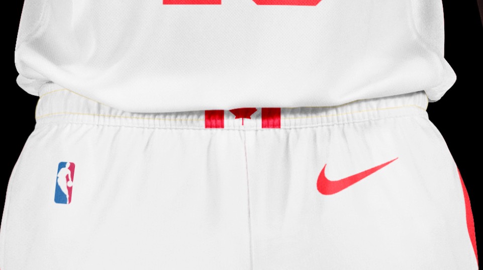
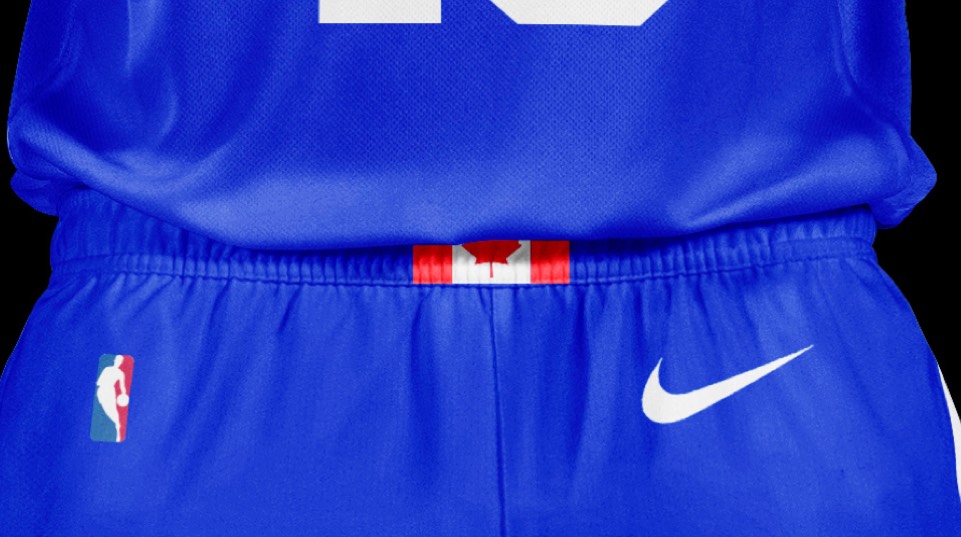
Same moves but inverting our colors and with THE NORTH in the chevron shape. Oh, and who can forget the Canadian flag on the belt buckle.
Same moves but inverting our colors and with THE NORTH in the chevron shape. Oh, and who can forget the Canadian flag on the belt buckle.
Somehow the Raptors do not have a uniform that says TORONTO—until now. We also thought it would be appropriate to imagine a world where they DID go with blue and white as their team colors to match the other Toronto franchises... and boy does it look good.
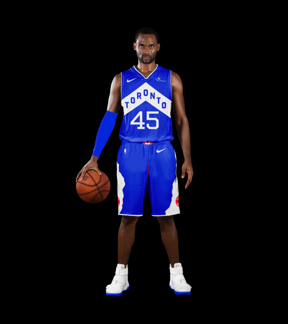
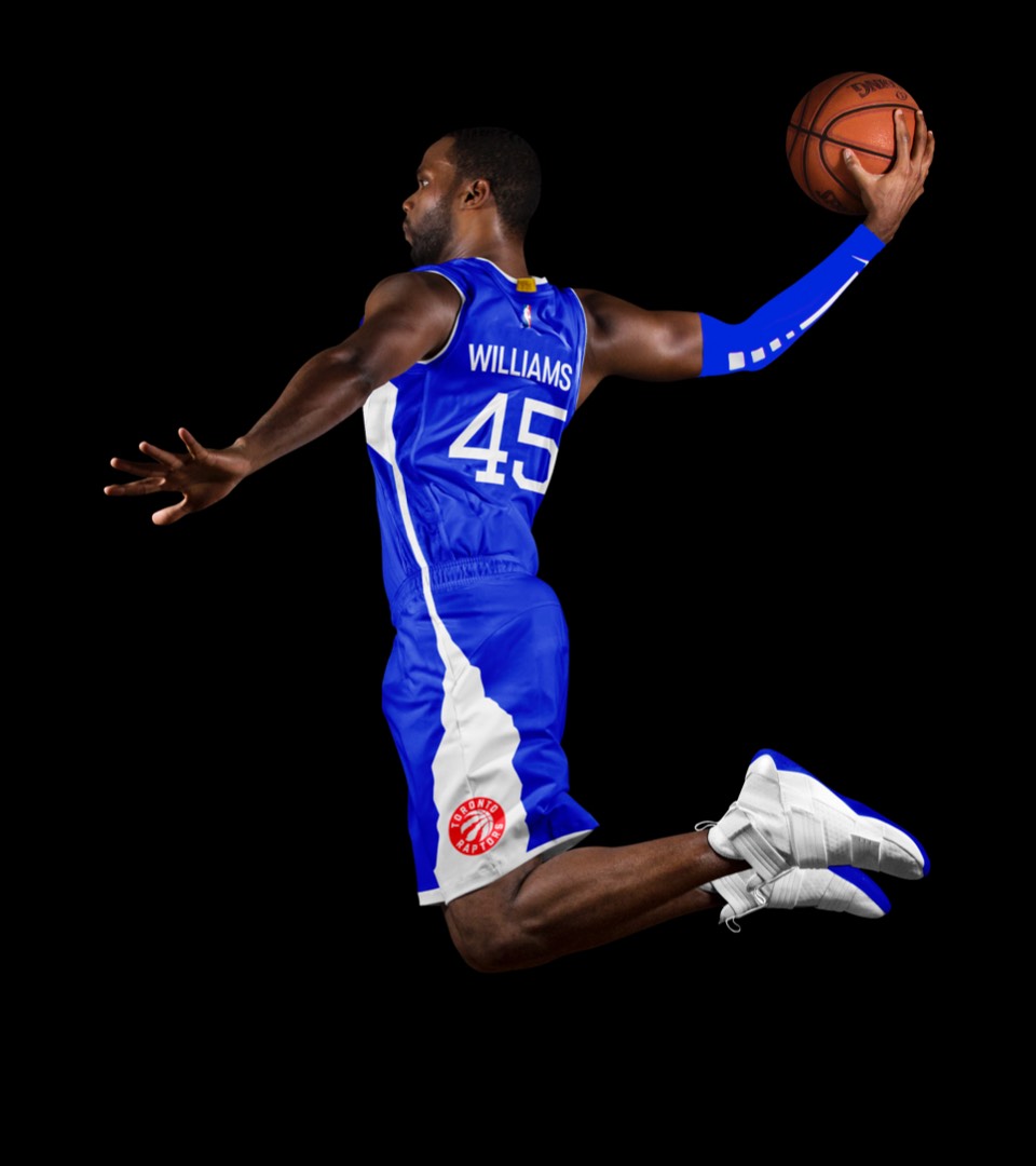
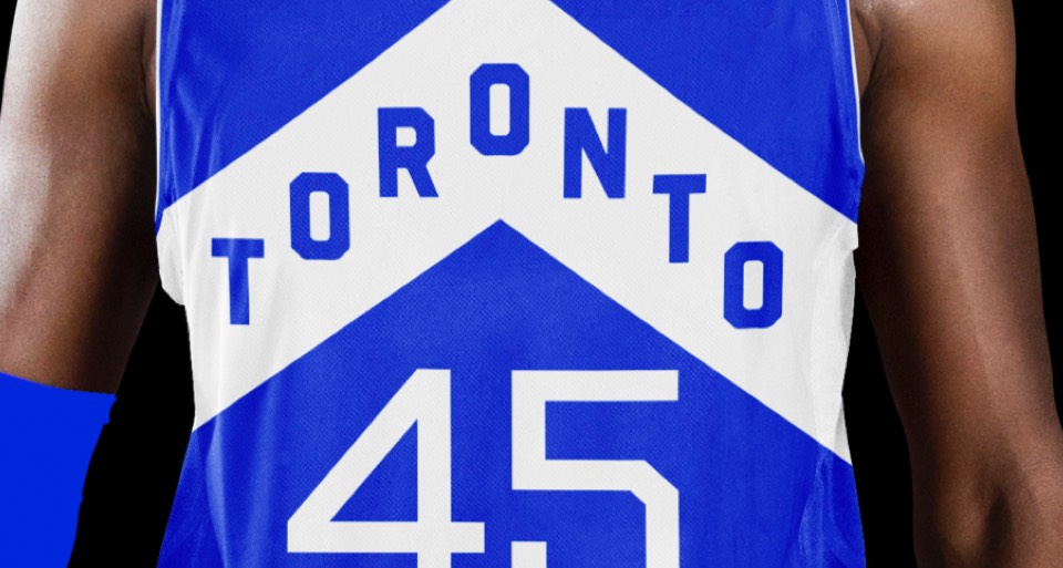
Somehow the Raptors do not have a uniform that says TORONTO—until now. We also thought it would be appropriate to imagine a world where they DID go with blue and white as their team colors to match the other Toronto franchises... and boy does it look good.
The only question here is, do you go purple dino jersey, or white dino jersey? From what we can see, the Raptor fans love them both but give a slight edge to the white jersey. It's the barney you wear to a formal occasion.
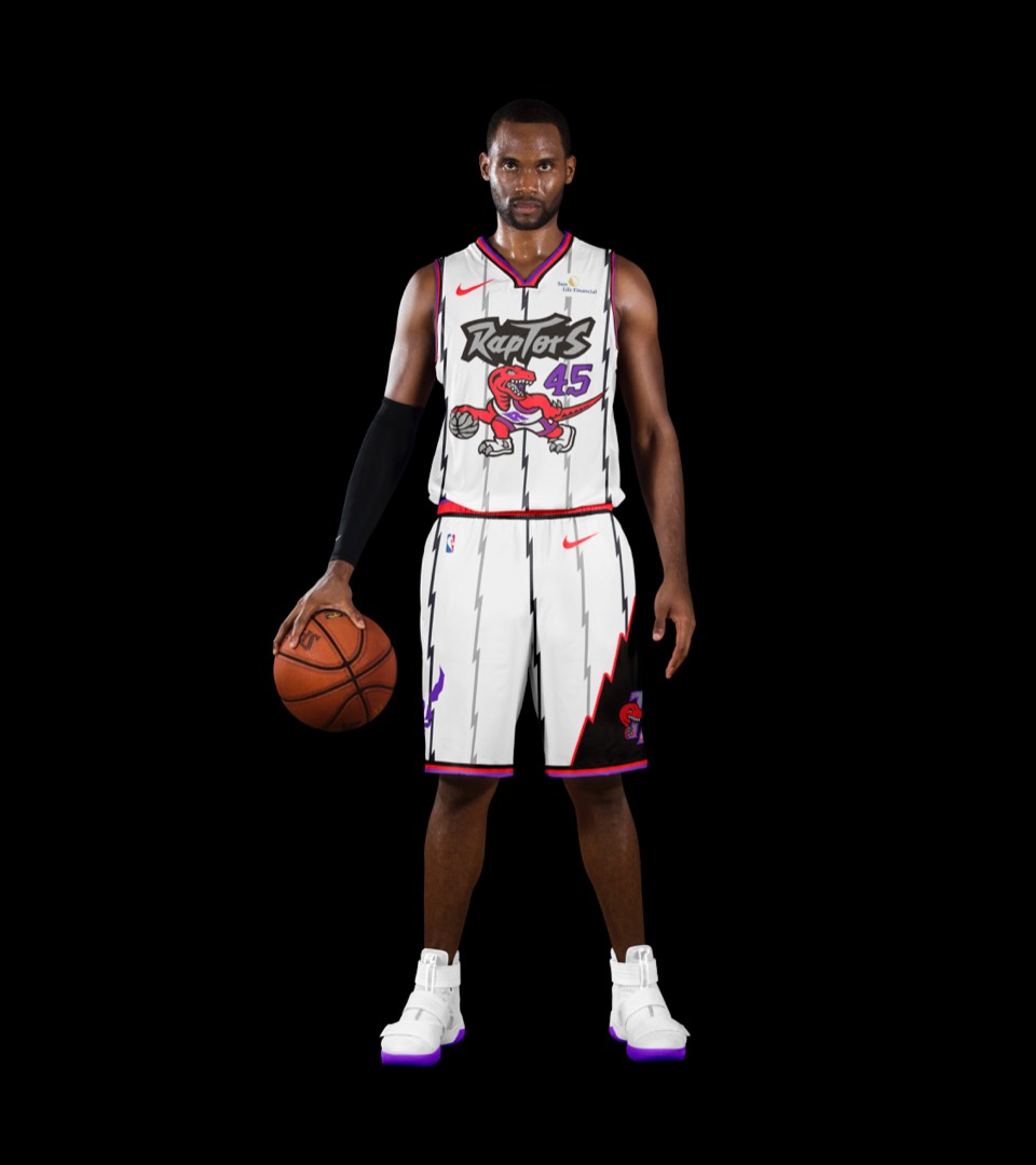
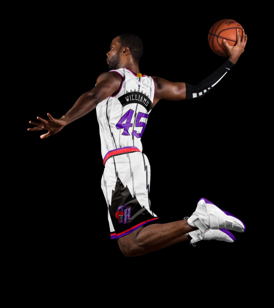
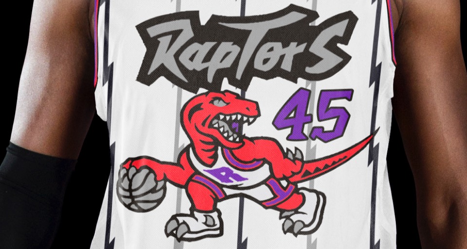
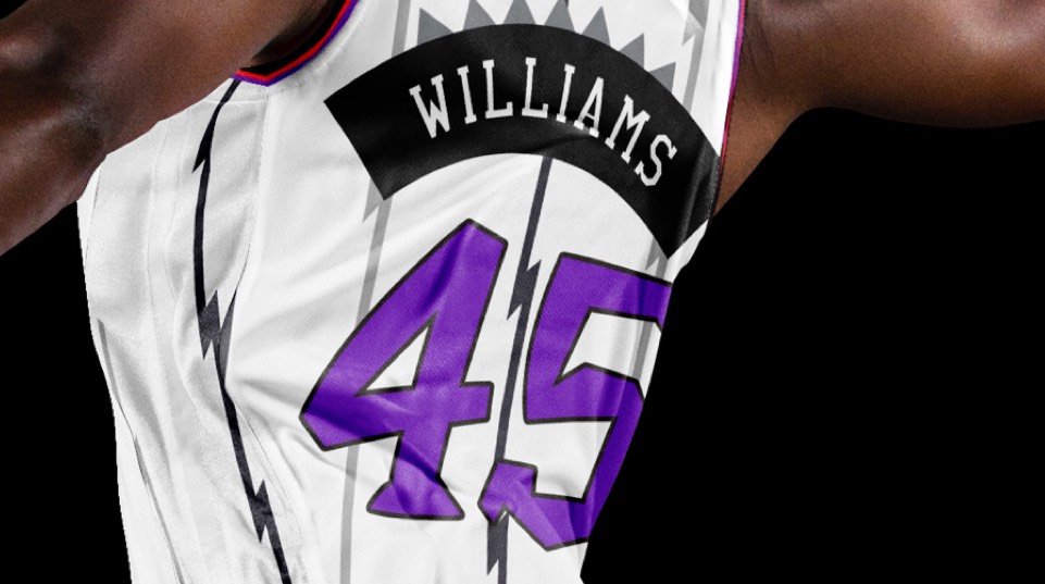
The only question here is, do you go purple dino jersey, or white dino jersey? From what we can see, the Raptor fans love them both but give a slight edge to the white jersey. It's the barney you wear to a formal occasion.