

Other than the name, the rest of the logo is pretty great. A few too many stripes here and there and the type clashes a little bit with the rest of the aesthetic but that's nothing compared to how much the name clashes with everything. At this point it seems like they're just ignoring the name altogether; might as well change it up!


You could make arguments for a ton of names that would fit here: Senators, Diplomats (the Dips!), Generals, etc. The Washington Generals are already that-team-that-plays-against-the-Globetrotters, so that's out. We like the Monuments as the most direct tie to the logo, but really anything would be an improvement. We kept the foundational elements, streamlined the outer circle, skinny-d up the stars to get closer to the original Washington family crest, and drew some new letters inspired by some of the plaques on the Washington Monument.
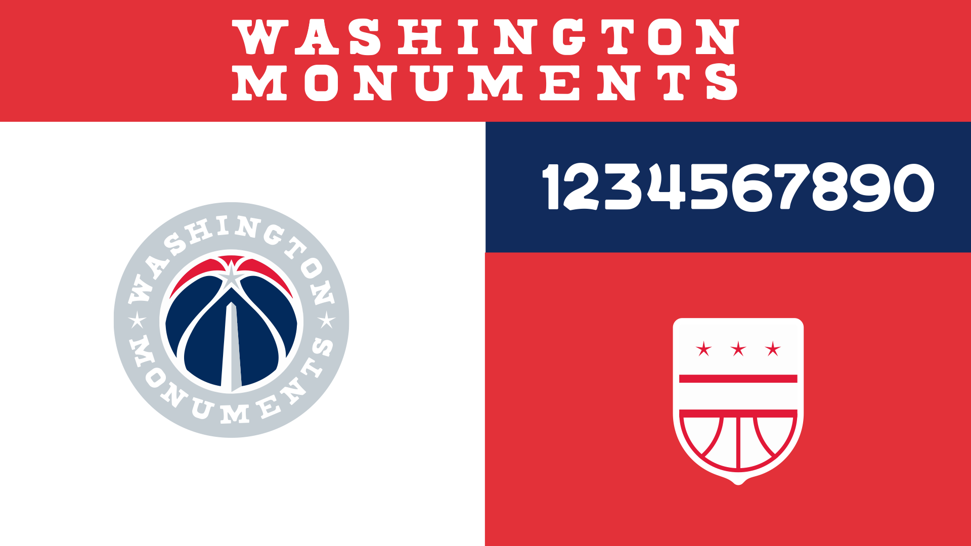
We downgraded the silver in the color palette, extended the stone cut lettering to the numbers, and added a secondary logo that combines a basketball with the Washington family crest.
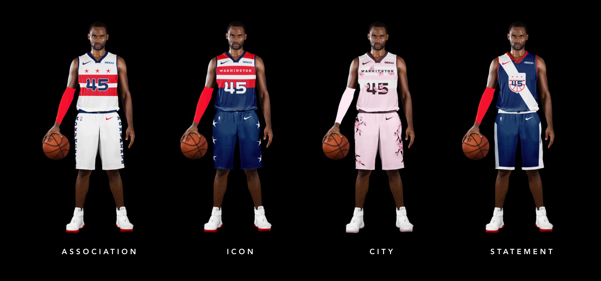
We featured the very cool DC flag as the centerpiece of the jersey and ran the MONUMENTS name up each leg to match the movement of the Washington Monument itself.
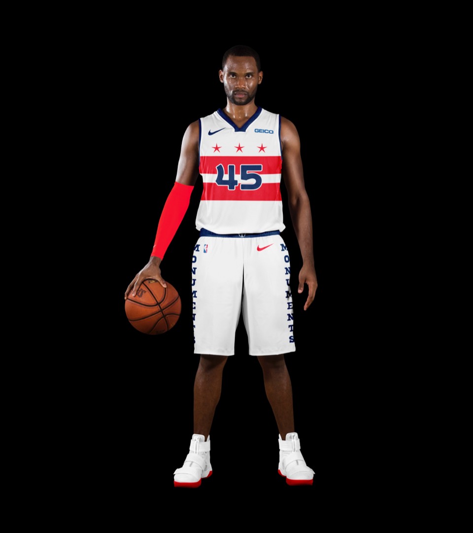
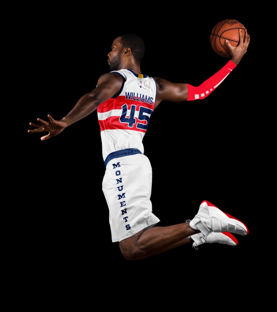
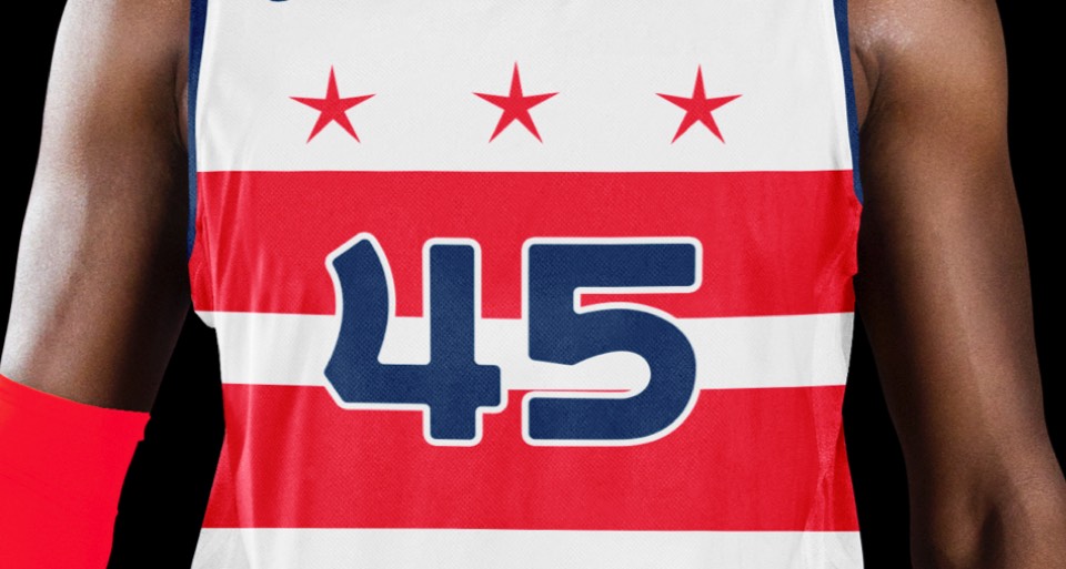
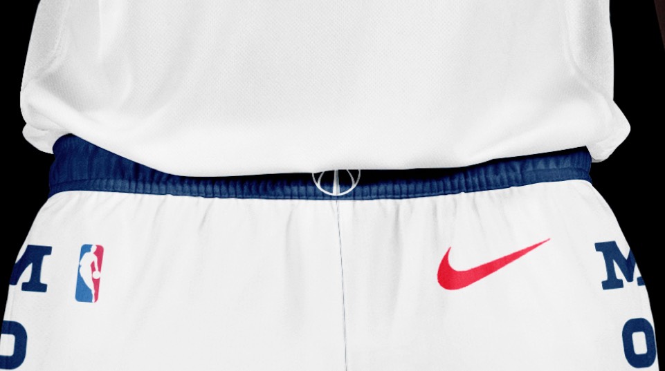
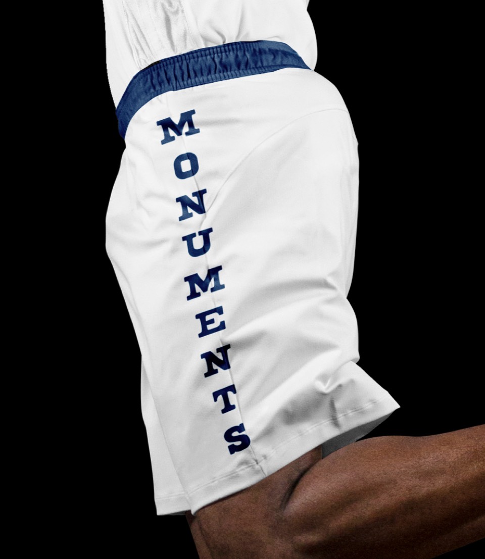
We featured the very cool DC flag as the centerpiece of the jersey and ran the MONUMENTS name up each leg to match the movement of the Washington Monument itself.


A return to the iconic stars and stripes uniform here, moving the three stars down to the shorts.
A return to the iconic stars and stripes uniform here, moving the three stars down to the shorts.
How cool would it be to do a cherry blossom uniform for DC! We've kept the stripes on top but shifted the color palette to whites and pinks and overlaid cherry blossoms and branches on the jersey and shorts.
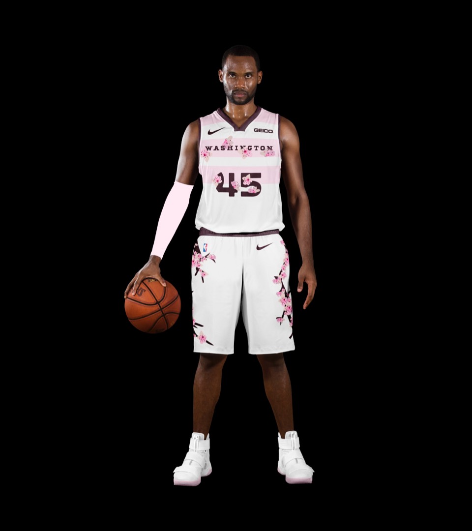
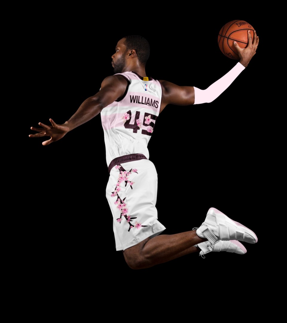
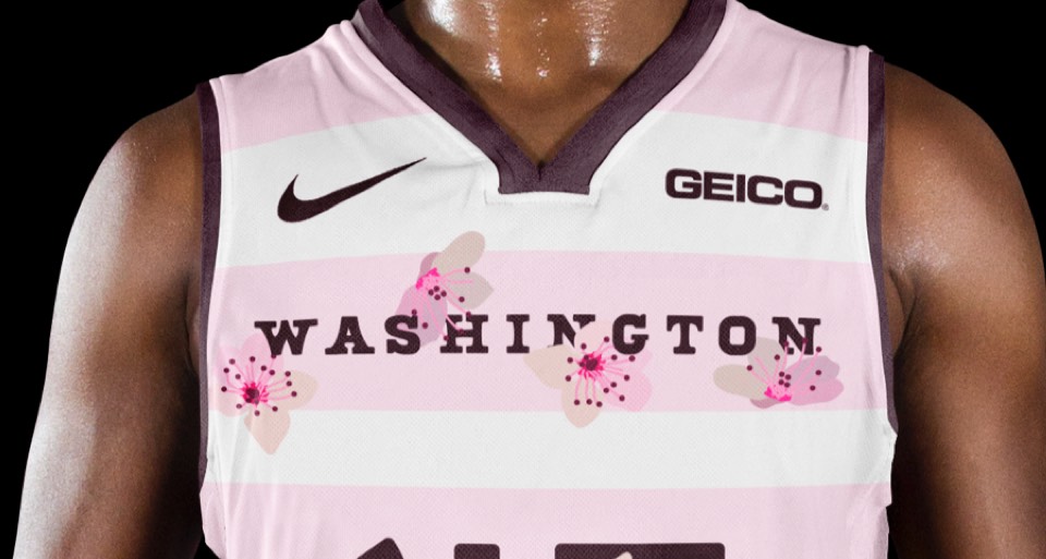
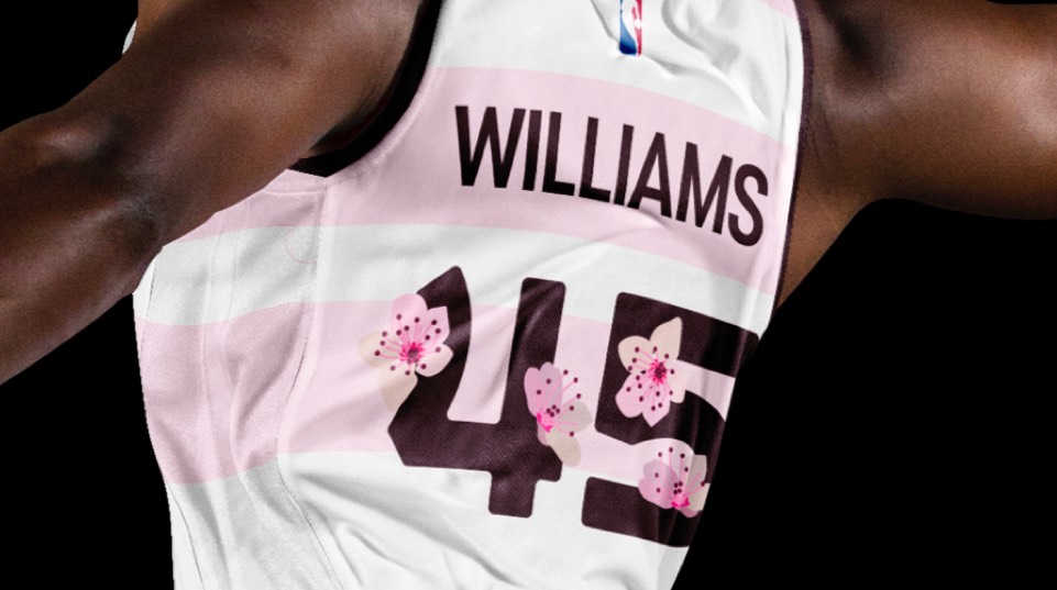
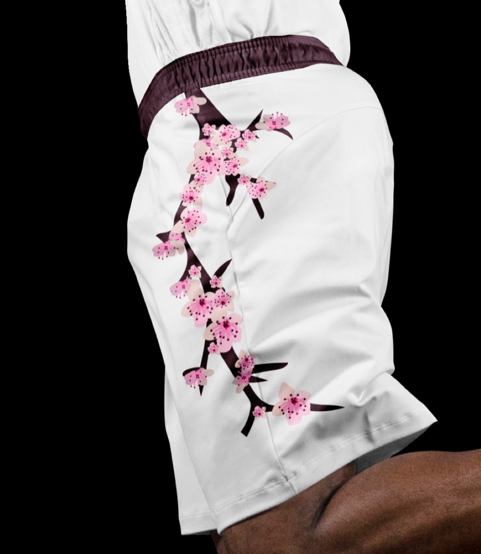
How cool would it be to do a cherry blossom uniform for DC! We've kept the stripes on top but shifted the color palette to whites and pinks and overlaid cherry blossoms and branches on the jersey and shorts.


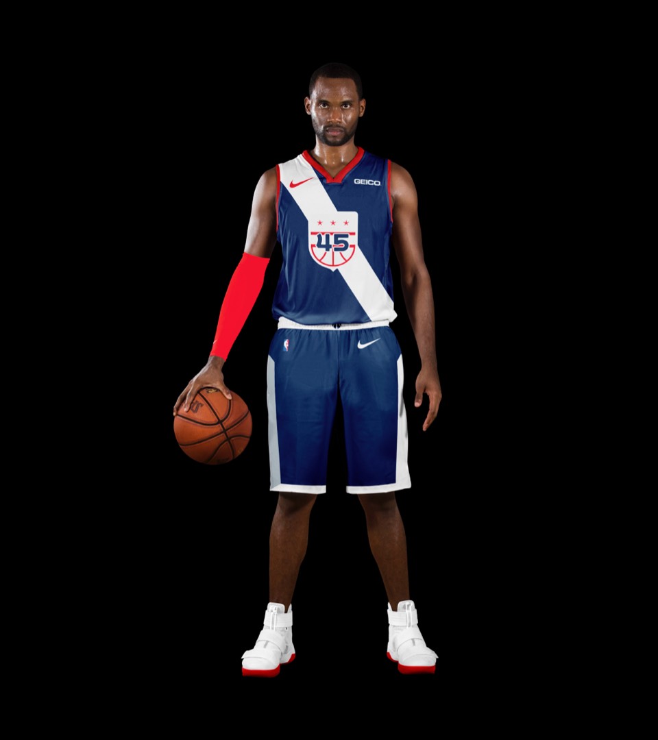
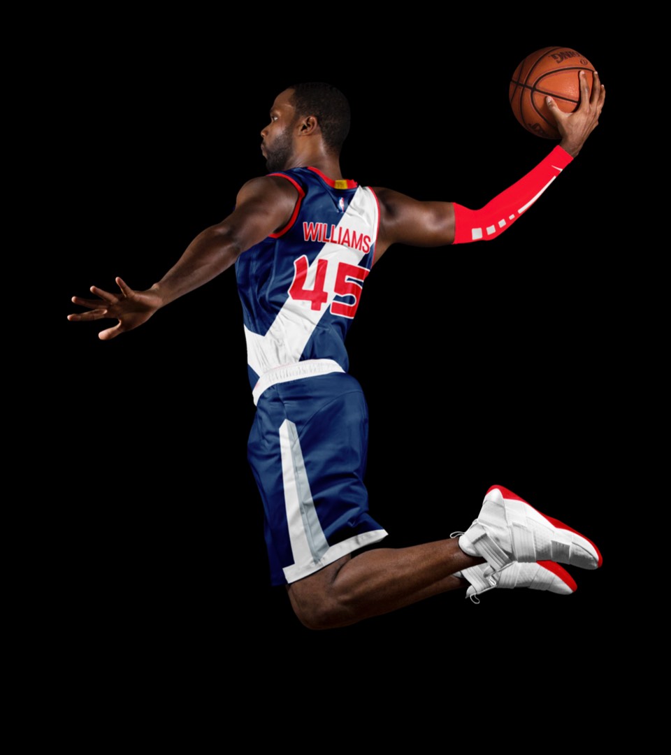
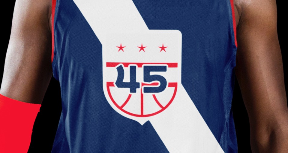
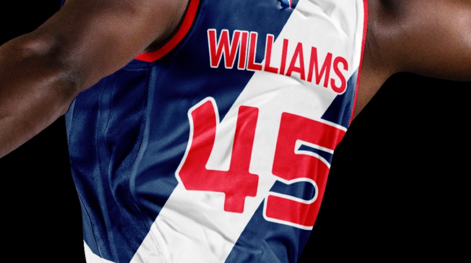
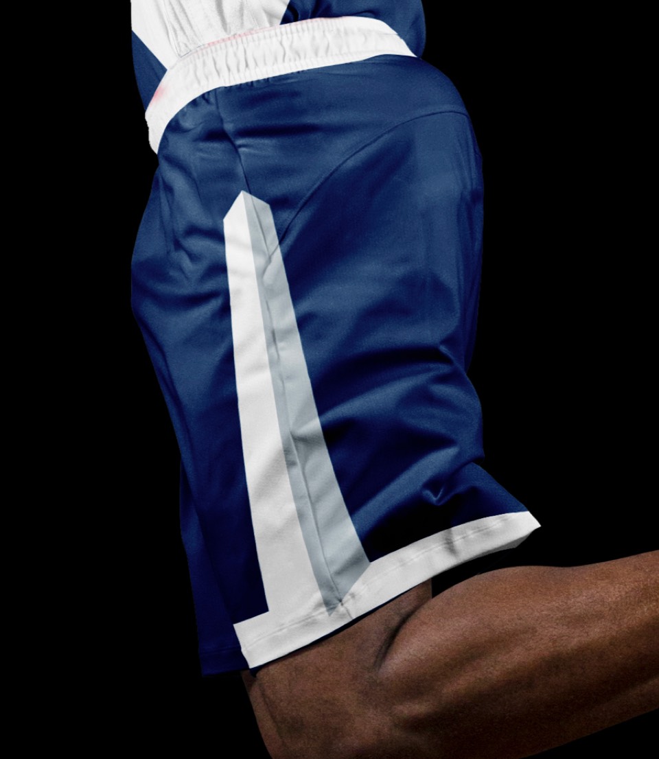
The "Blue Coats" uniform, inspired by what the Americans wore in the revolutionary war. We've embedded the secondary Washington crest in a "sash" across the jersey, and added the Washington Monument to each leg.


The "Blue Coats" uniform, inspired by the what the Americans wore in the revolutionary war. We've embedded the secondary Washington crest in a "sash" across the jersey, and added the Washington Monument to each leg.
