Whirlpool’s brand had gotten stale. It was especially apparent on social channels, where they had never measured anything other than negative brand sentiment on a post. By extending their color palette, refining their typography, and introducing new approaches for voice, graphics, photography, illustration & content strategy, we delivered measurably positive brand sentiment on social for the first time in company history.
Whirlpool was showing up on social using a templated approach to layout combined with an inconsistent execution of type, imagery and messaging details. We turned that philosophy inside out, focusing on consistency and sophistication in their brand elements, a more liberal use of their gold (as well as a fresh new “marigold” color) and photography that reinforces their color palette and brand persona. Not to mention a new illustration approach and more relatable subject matter.
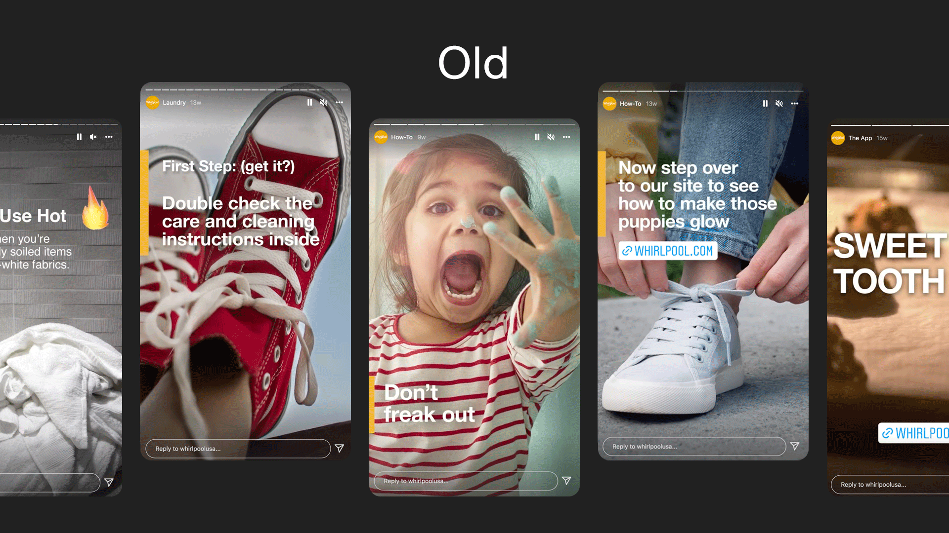
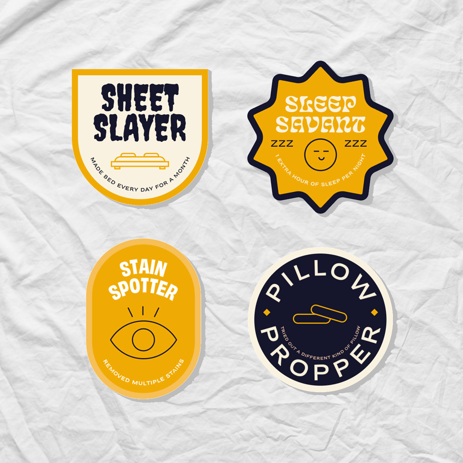
The new look has been rolled out across social channels, starting with last quarter’s “Clean Sheets, Better Sleep” content (shown below) and will continue to be built on in the coming months and years.
PROJECT LINKS
CAPABILITIES
Branding
Creative Direction