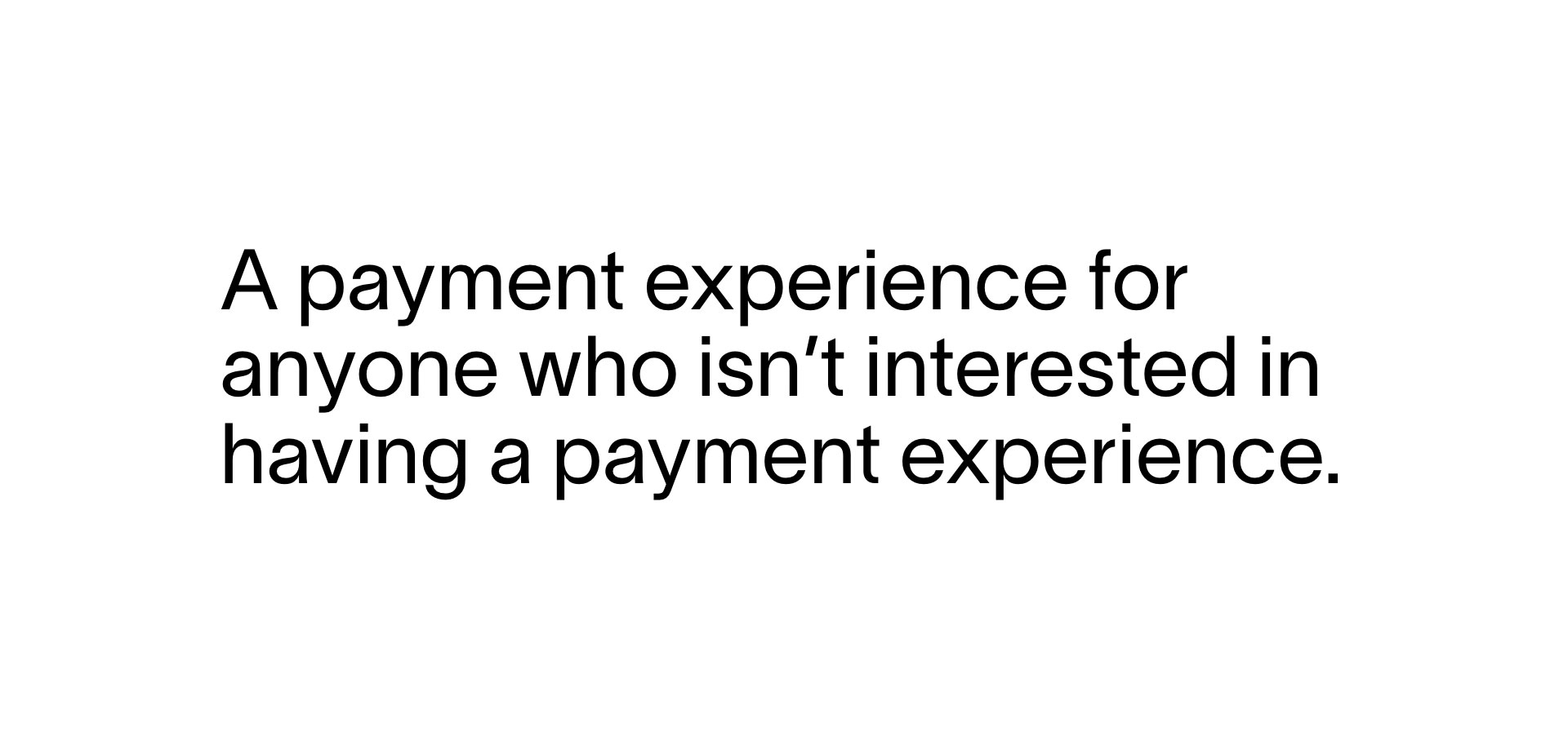
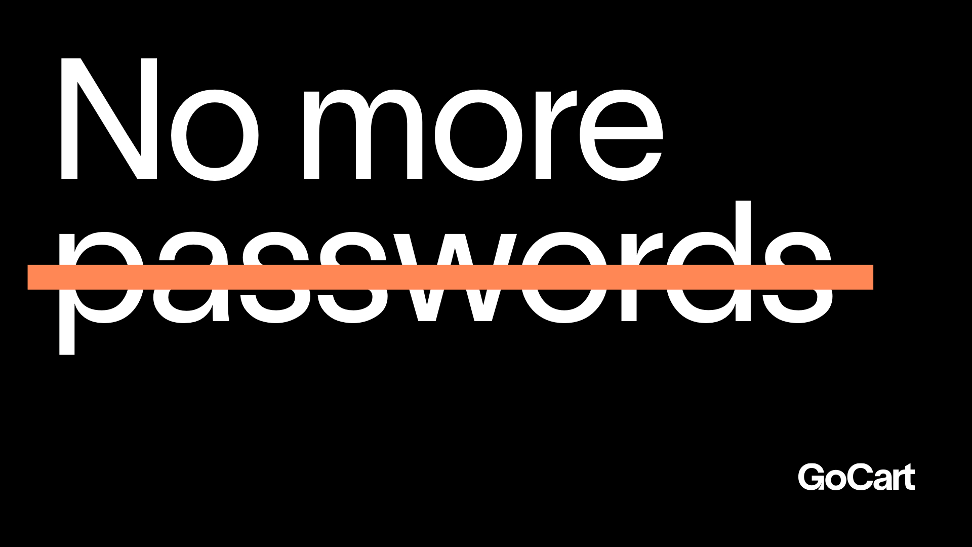
GoCart is a new payment platform (backed by FIS) with a fresh voice for a crowded category: it automatically recognizes you at checkout, so you can seamlessly pay for anything (even healthcare & professional services), using any payment method you want. Rather than focusing on the same old (and somewhat misleading) “fast checkout” talk, we positioned them as a brand on a mission to destroy payment friction for everyone.
The effect of GoCart is a payment process that feels invisible; seemed like a good starting point for the backbone of the identity. The logo is a modified version of Nizar Kazan’s Lausanne, and we extend that deadpan approach to the type and color, which starts with a black and white base.

It gets fun when we introduce ultra-bright pops of color in graphics and photography, as we transition to showing the possibilities GoCart unlocks: being able to seamlessly pay for anything, anywhere, any way you want. Another goal of our palette is to stand out from the sea of blues and mostly conservative color approaches taken by most of their competitors.
With this being a brand new platform, a huge priority was educating people on exactly how it works. We blended actual product UI, custom photography (with hand-painted elements emphasizing things GoCart helps you pay for more easily), and “transparent” graphics in a series of fluidly animated layouts expressing various product features.


PROJECT LINKS
CAPABILITIES
Branding
Creative Direction
Animation
Illustration
Photography
Website Design
HTML/CSS/JS