

Not saying if it came out today that it wouldn't receive criticism, but 17 titles later and with the amount of charm and nostalgia any logo that hasn't been changed in decades has, it would be insane to change it.


No changes!
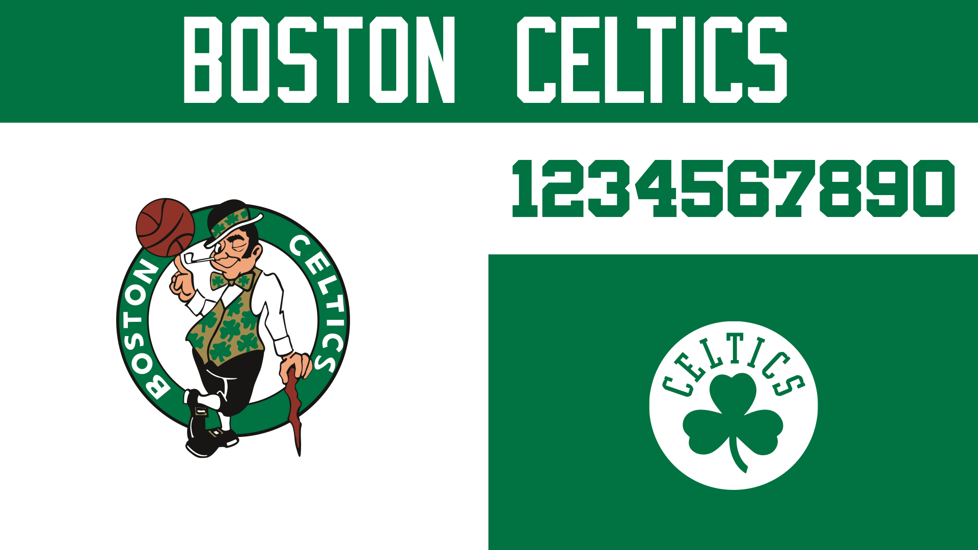
This comes down to being good stewards of the heritage that's already there. We stuck to the green and white, ditched any other colors like the blacks and golds that had shown up on the fringes, and included the secondary Celtics logo, which we didn't realize before this exercise was a really tasteful update to their original mark!
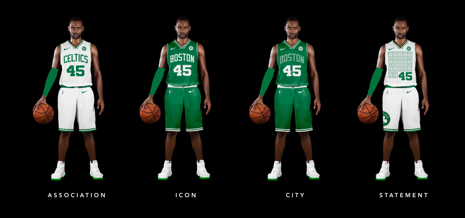
Sticking to what works here, no real updates other than simplifying their shorts a tiny bit to reference the Bird era.
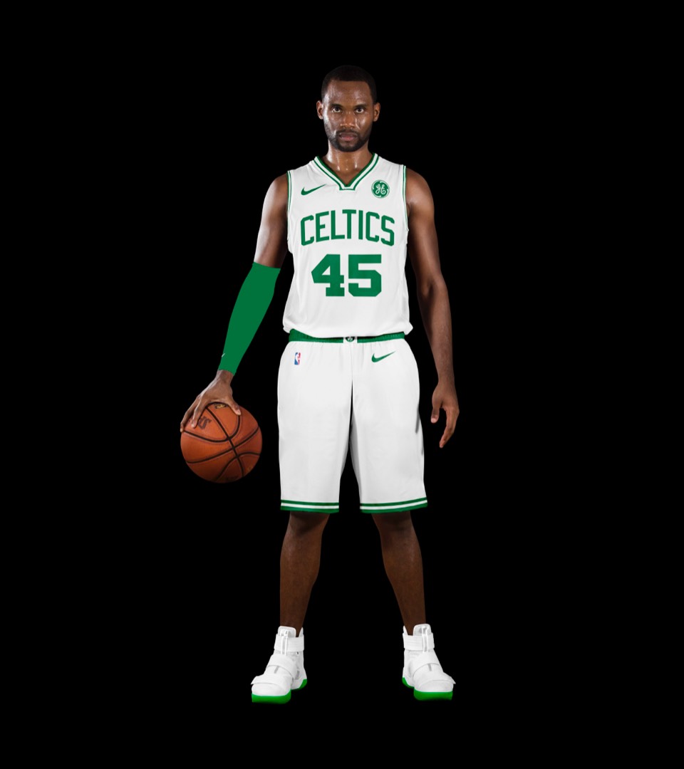

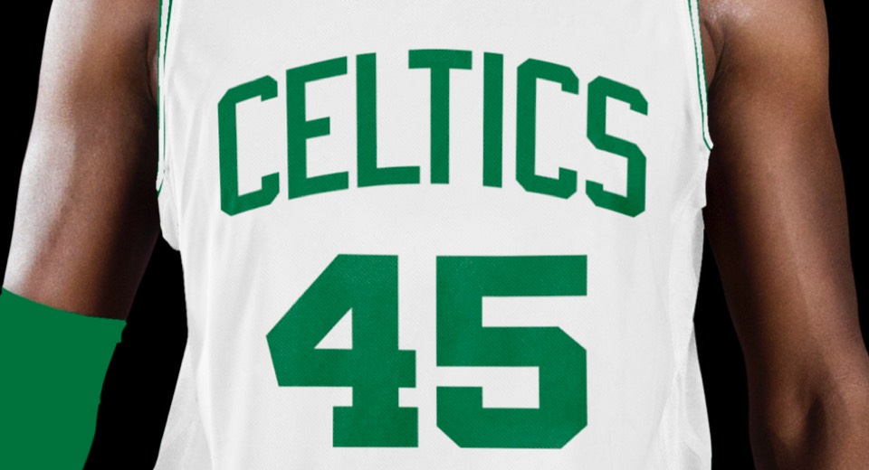
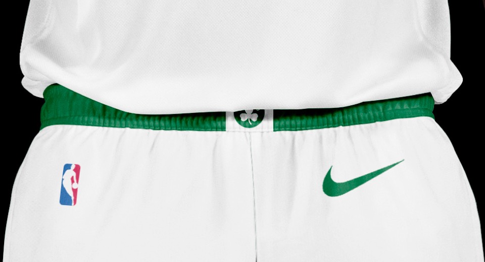
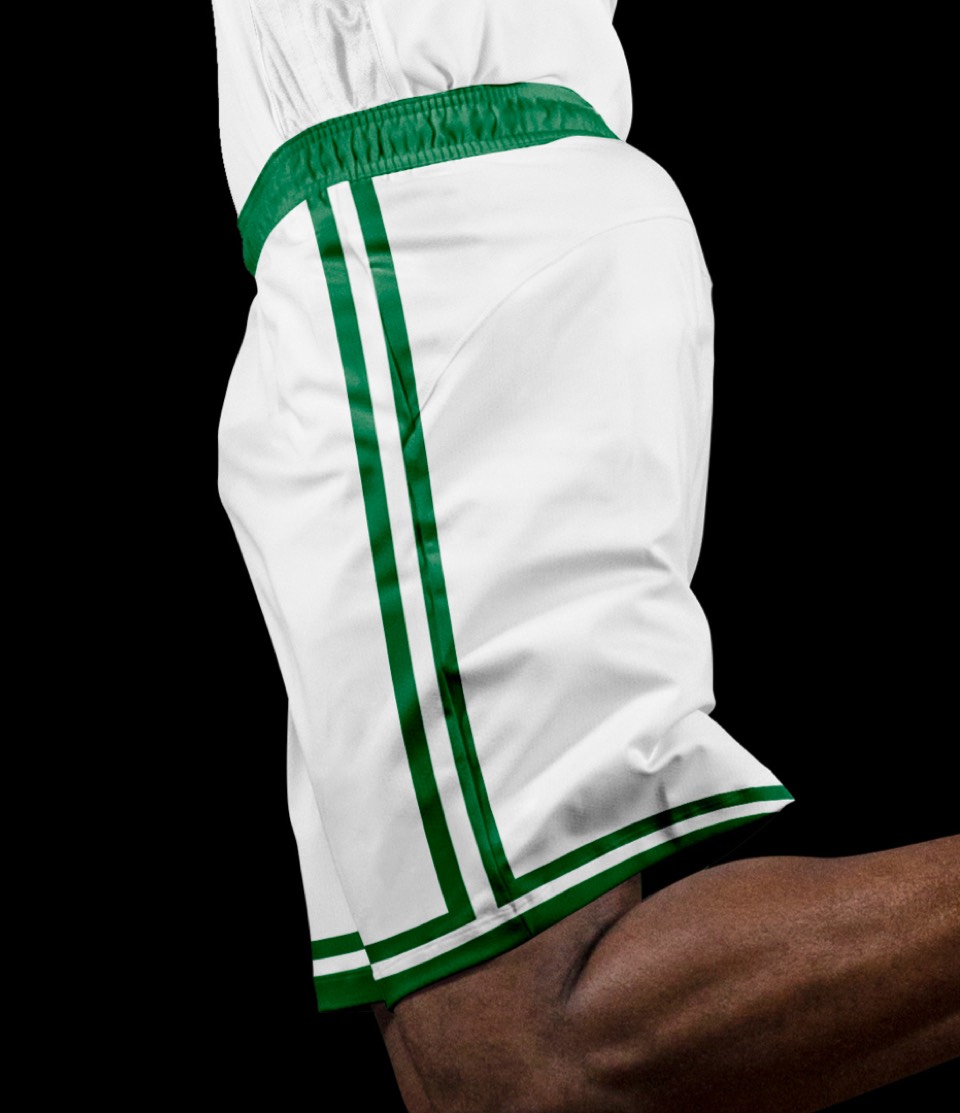
Sticking to what works here, no real updates other than simplifying their shorts a tiny bit to reference the Bird era.


Can't mess with a classic.
Can't mess with a classic.
Boston is known as a "city of neighborhoods," so we created a city uniform that is the classic wordmark at first glance, but when you get close you can see BOSTON is actually comprised of the names of every neighborhood in the city. We've also given them some shorts that say BOSTON on each leg with the secondary logo below.
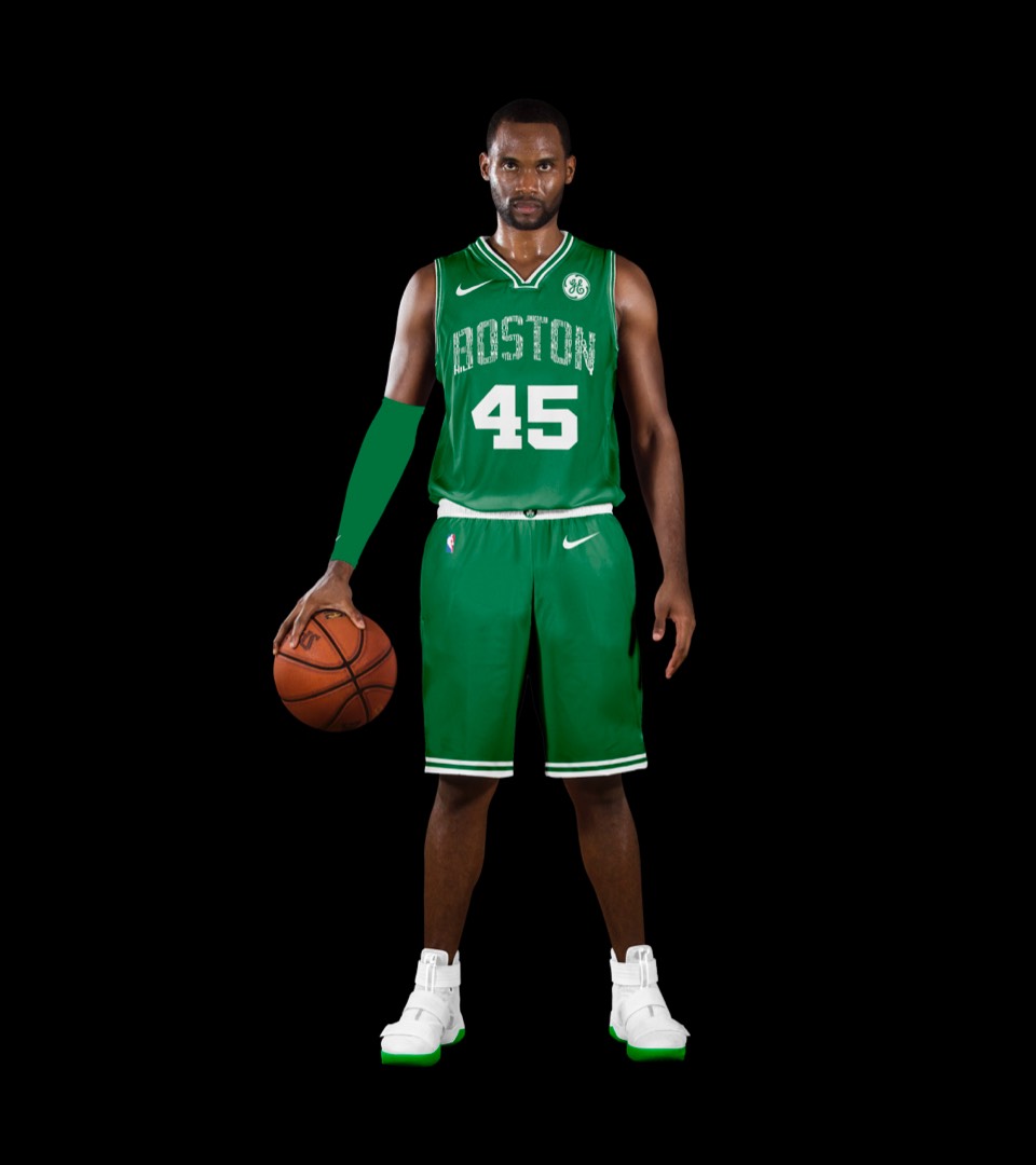
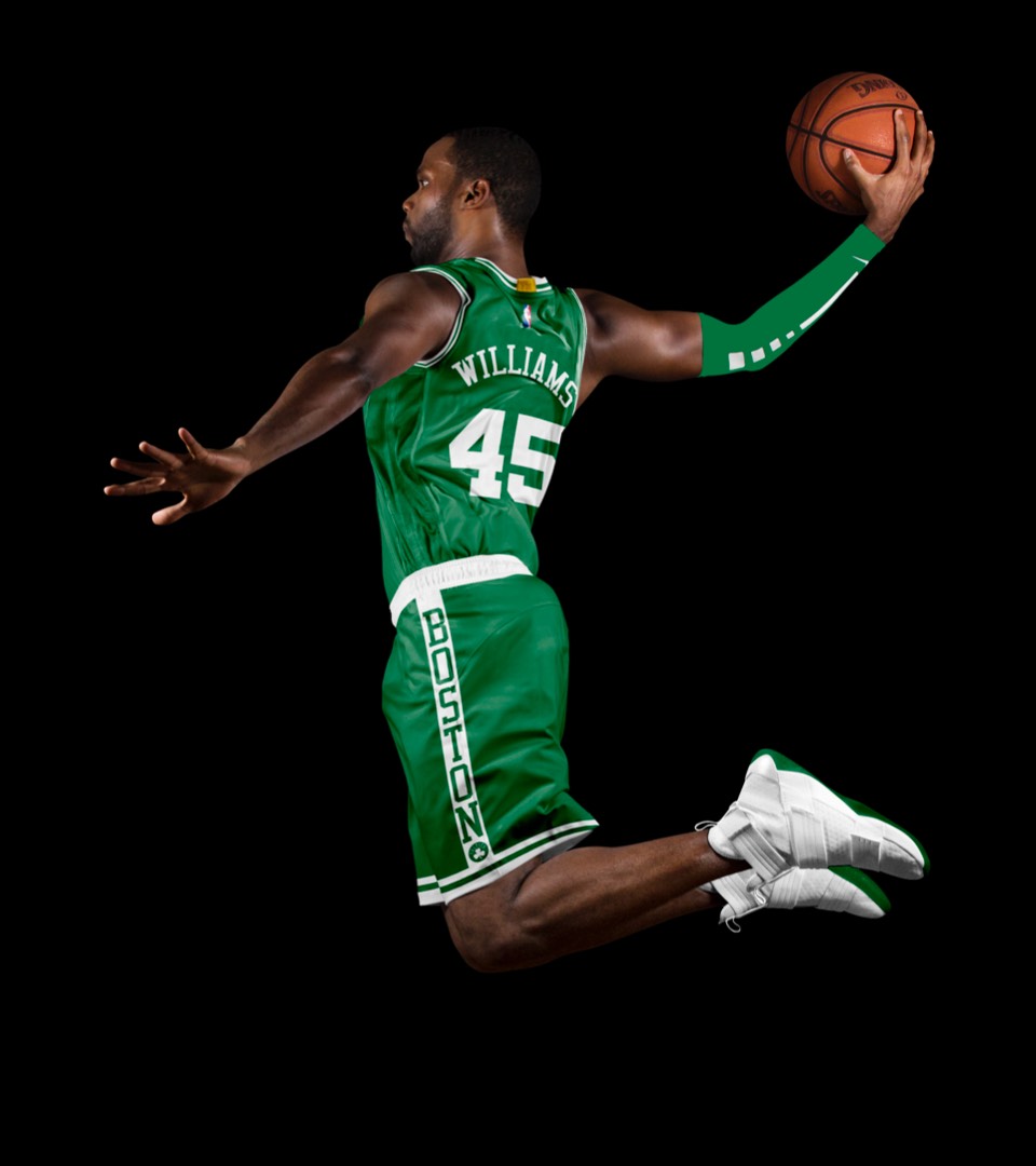
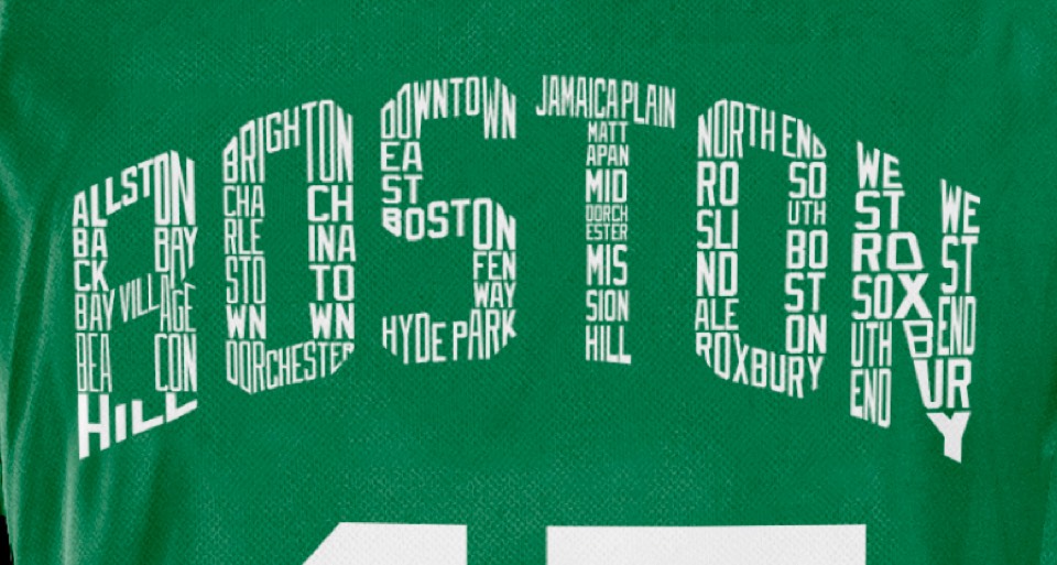
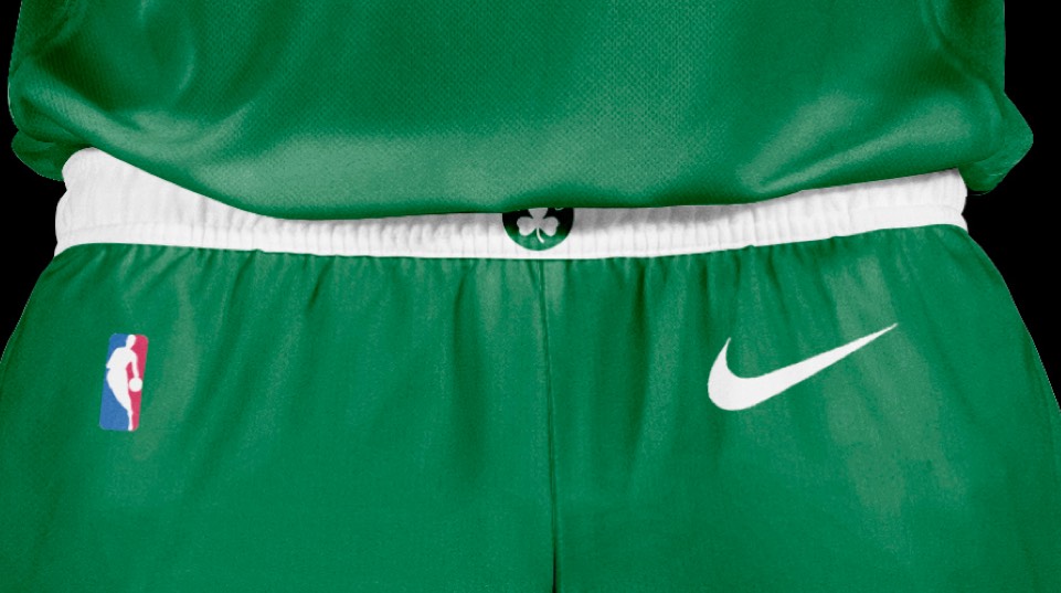
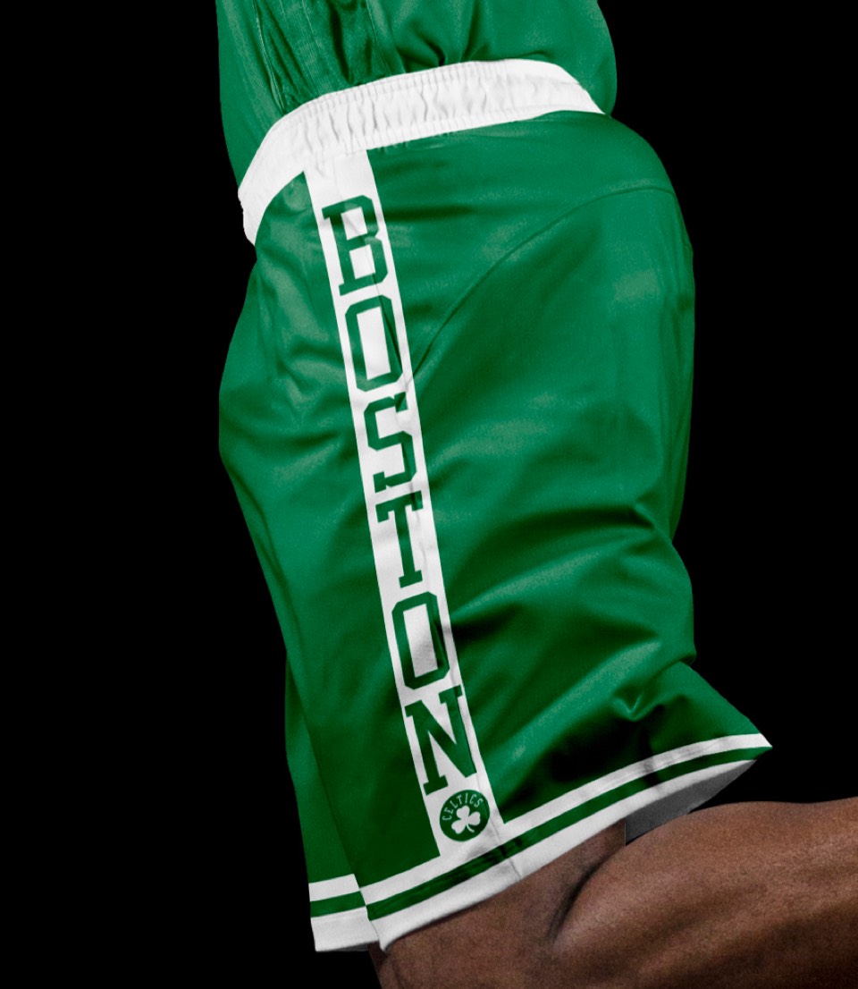
Boston is known as a "city of neighborhoods," so we created a city uniform that is the classic wordmark at first glance, but when you get close you can see BOSTON is actually comprised of the names of every neighborhood in the city. We've also given them some shorts that say BOSTON on each leg with the secondary logo below.


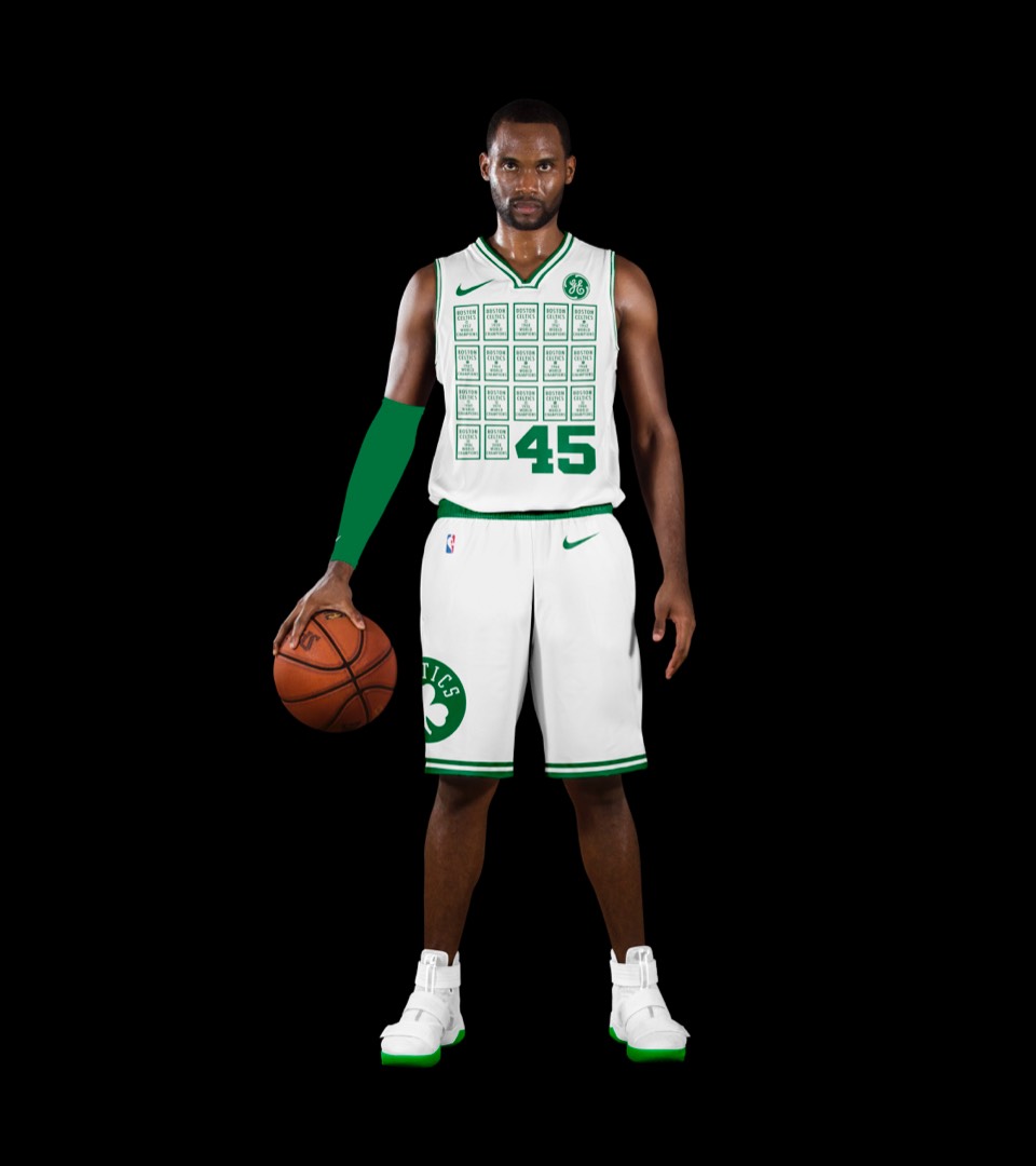
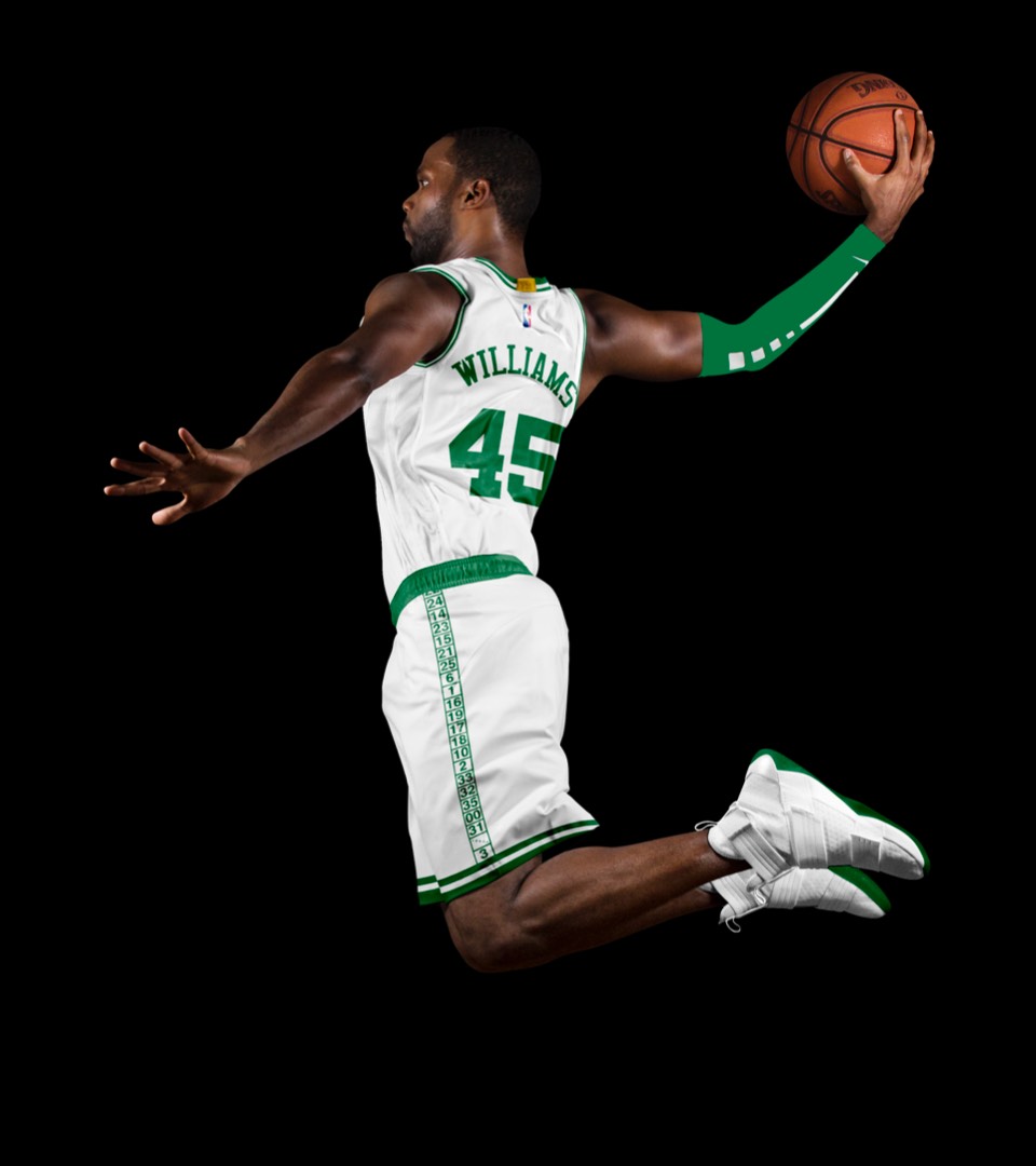
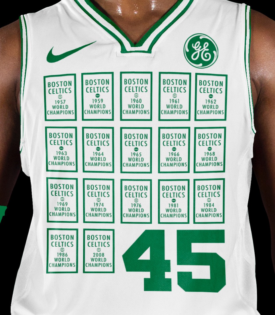
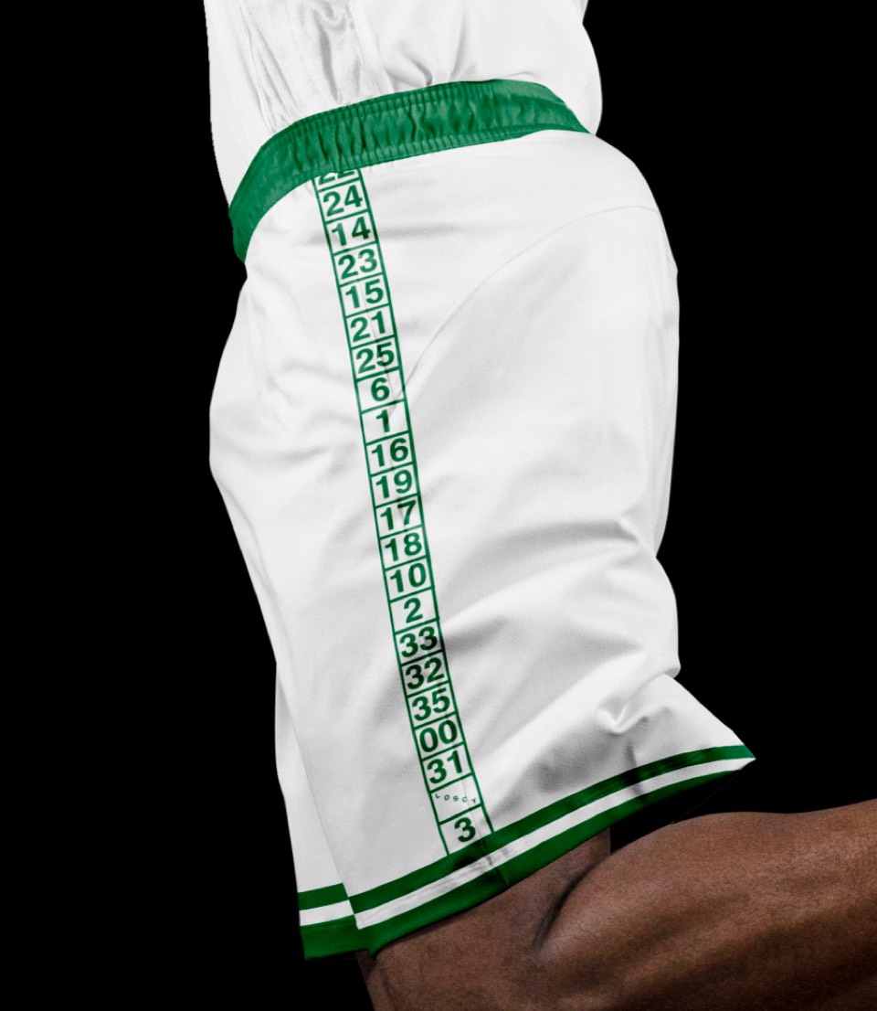
Would you believe we designed this before the Celtics released their "Banner" jerseys for this season? Great minds. Our take on the banner concept is to show the rest of the league (except the Lakers, who just caught up!) what 17 titles looks like. The shorts also feature the secondary/original logo, plus the retired numbers of all the Celtics legends.


Would you believe we designed this before the Celtics released their "Banner" jerseys for this season? Great minds. Our take on the banner concept is to show the rest of the league (except the Lakers, who just caught up!) what 17 titles looks like. The shorts also feature the secondary/original logo, plus the retired numbers of all the Celtics legends.
