

The Nets logo, with its shield, basketball and B is about as inoffensive as it gets. They're clearly sticking to their design choices, but the design lacks any reference or meaning, the craft is poor and the result isn't somethign that feels as distinct as they clearly would like and doesn't give fnas anything to rally around.


Our new design extends and modifies a typeface that was literally made for the Barclays Center (aptly named Brooklyn), to a new logo that incorporates the Brooklyn Bridge and an aerial view of a basketball net. We tried to stay true to the clean aesthetics that the Nets set out for in their initial branding, but with more intentionality and a sense of place that their fanbase can rally around.
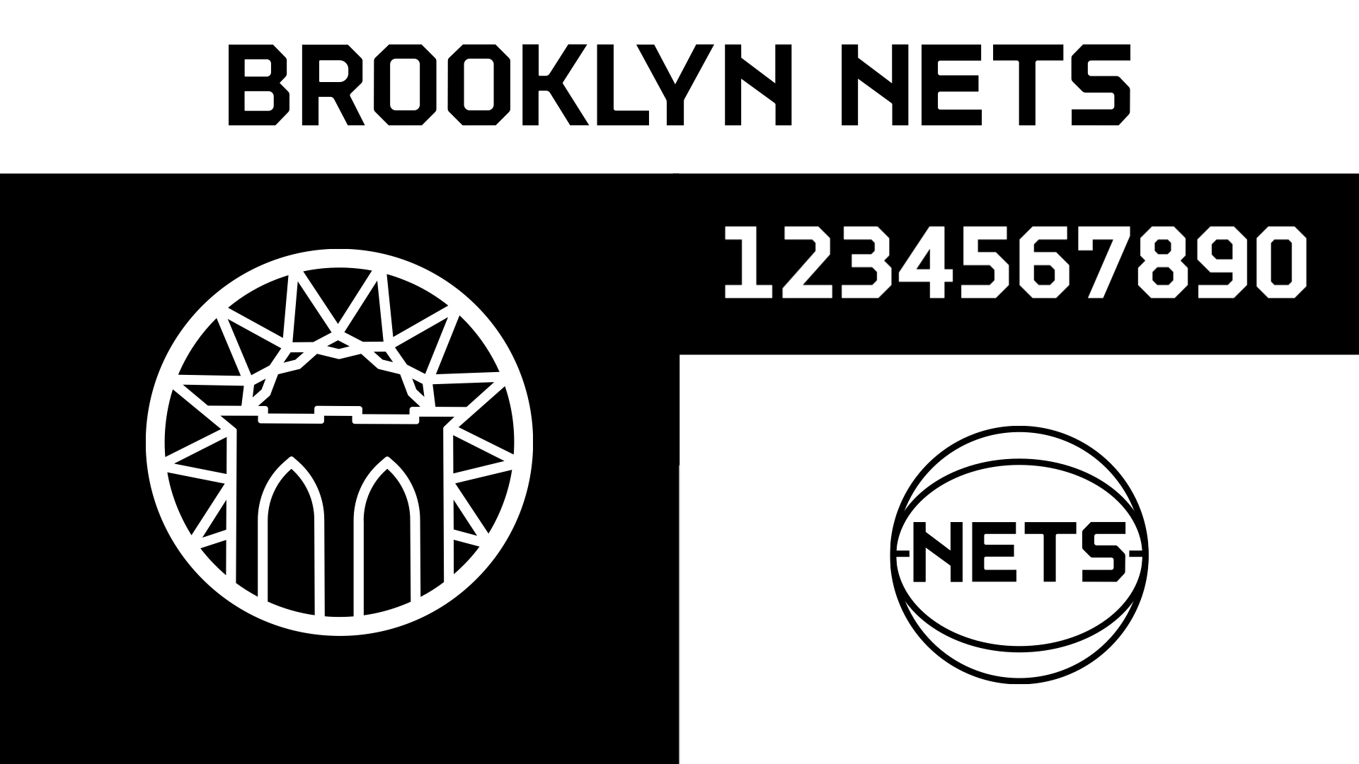
We added a secondary NETS-on-a-basketball mark inspired by some of their historic logos.
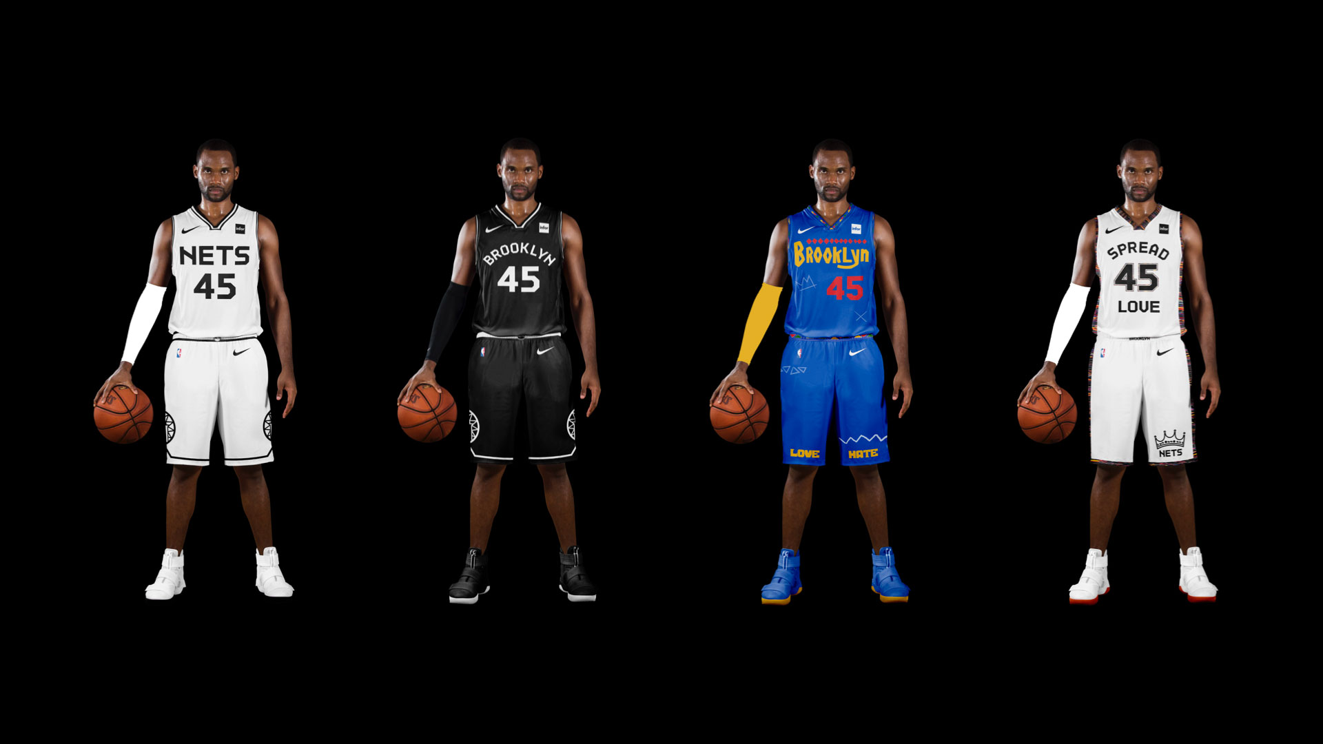
The Nets didn't have a jersey that just says Nets. Now they do. A no-nonsense Association uniform with the new logo on the shorts.
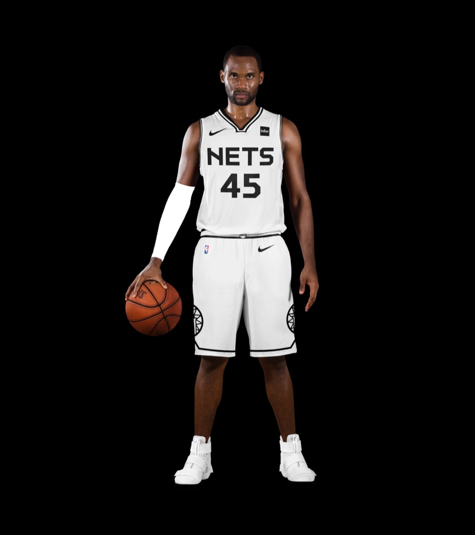
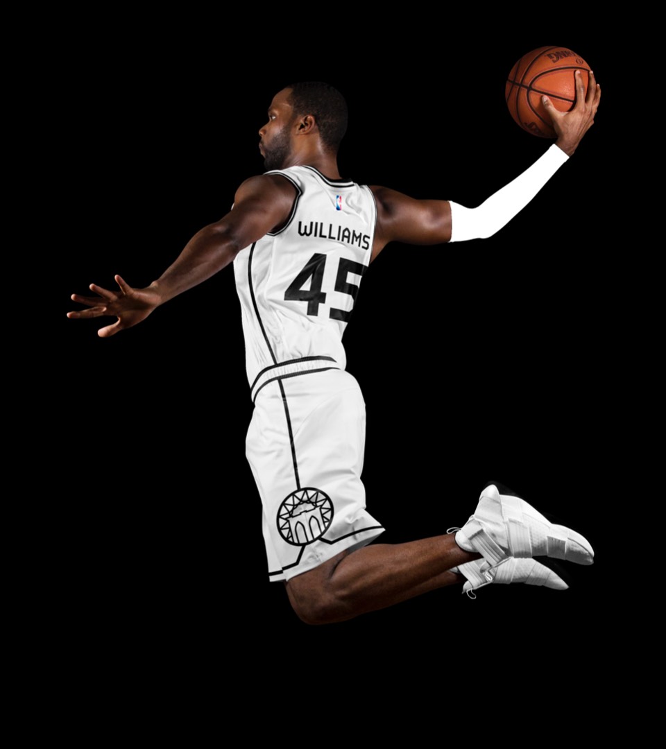
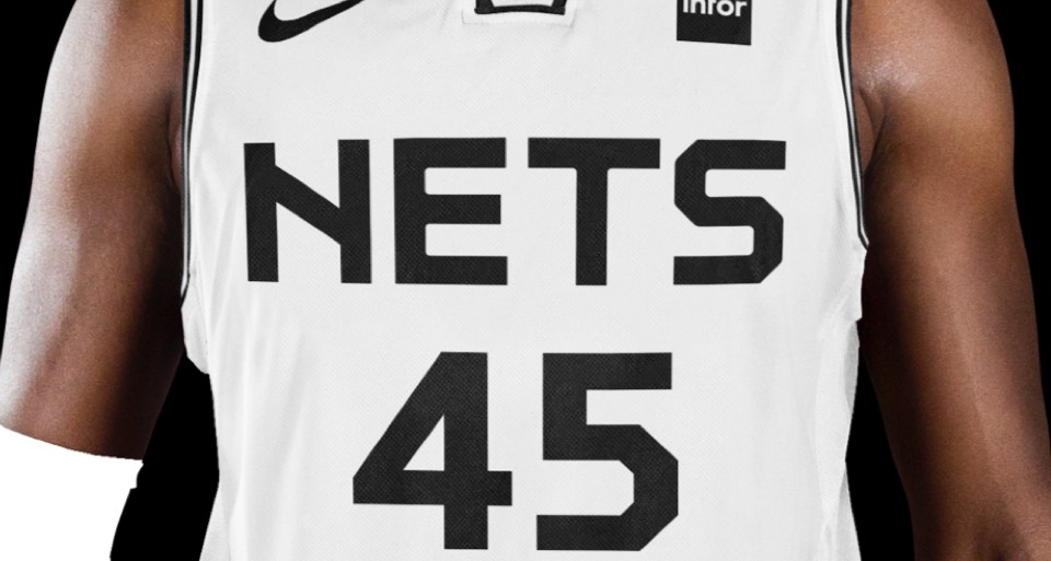
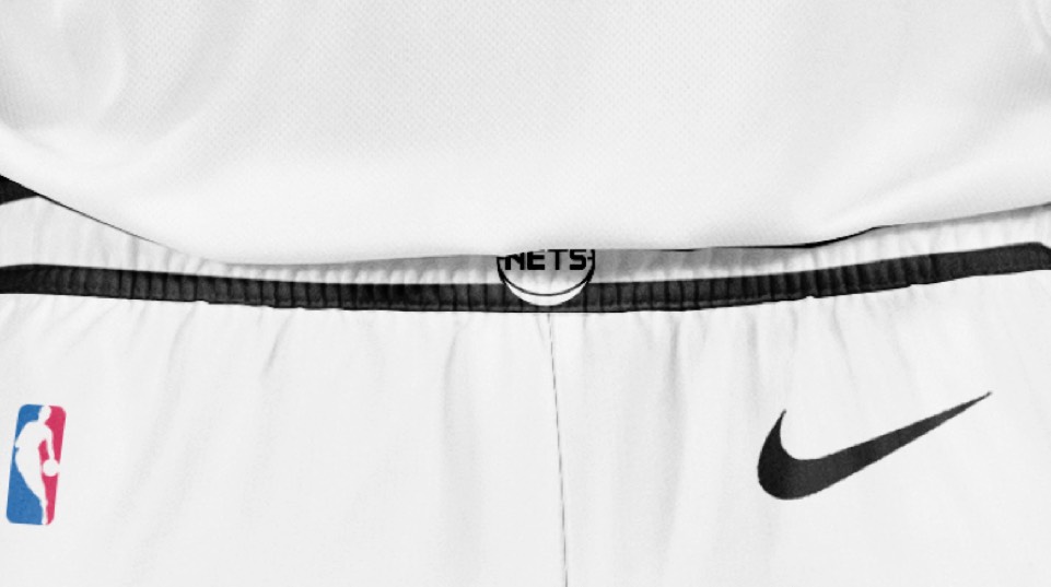
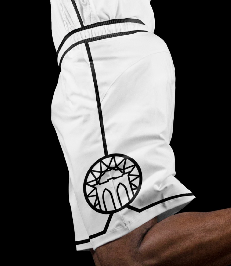
The Nets didn't have a jersey that just says Nets. Now they do. A no-nonsense Association uniform with the new logo on the shorts.


Updated the type treatment and incorporated the new logo on the shorts.
Updated the type treatment and incorporated the new logo on the shorts.
Is "Do the Right Thing" the most iconic Brooklyn movie? We've incorporated the type featured in the movie, the patterns featured in the title sequence and sidewalk chalk art. The jersey numbers are in the same typeface as the Jackie Robinson Dodgers jersey worn by Mookie throughout the film. This uniform also acts as an official olive branch to longtime Knicks fan and Brooklyn native Spike Lee.
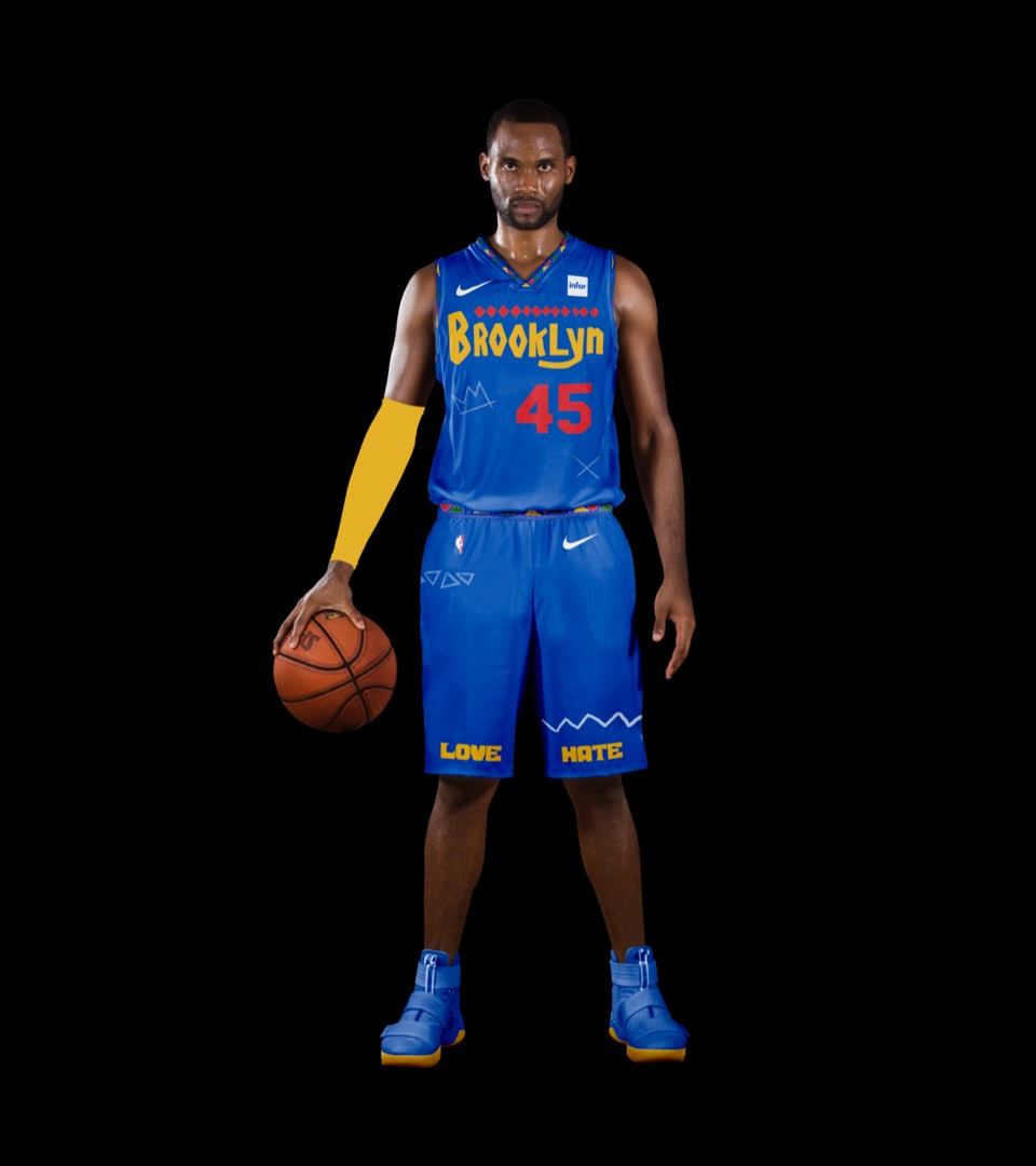
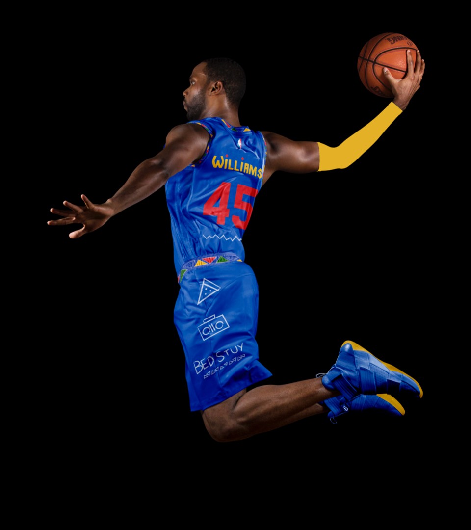
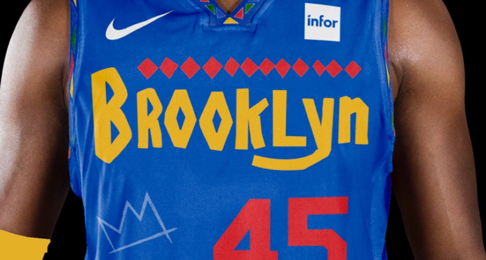
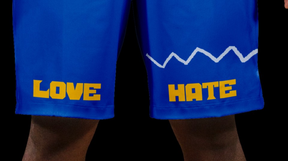
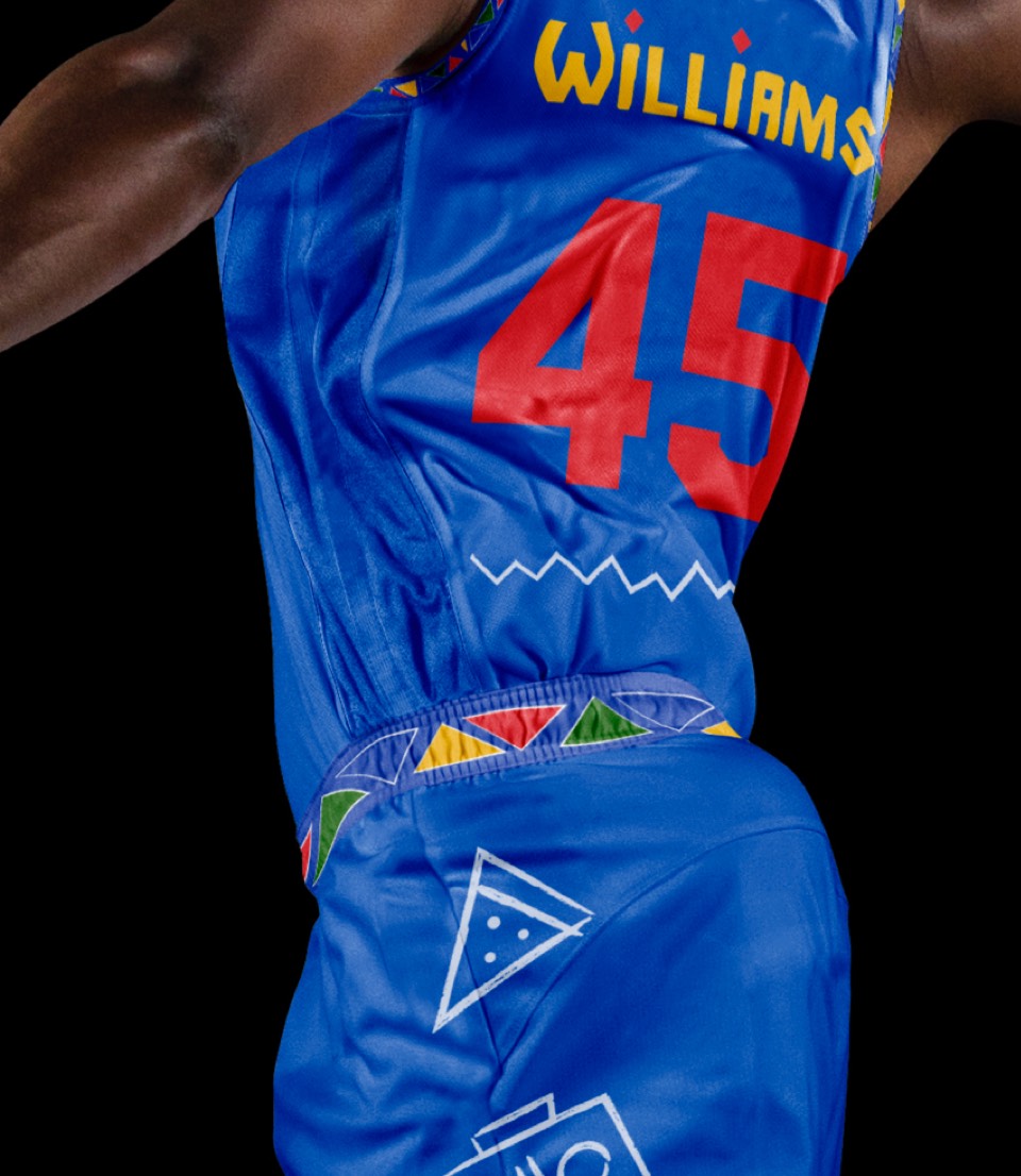
Is "Do the Right Thing" the most iconic Brooklyn movie? We've incorporated the type featured in the movie, the patterns featured in the title sequence and sidewalk chalk art. The jersey numbers are in the same typeface as the Jackie Robinson Dodgers jersey worn by Mookie throughout the film. This uniform also acts as an official olive branch to longtime Knicks fan and Brooklyn native Spike Lee.


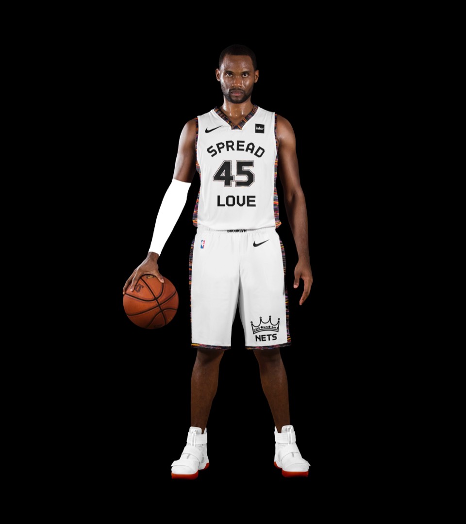
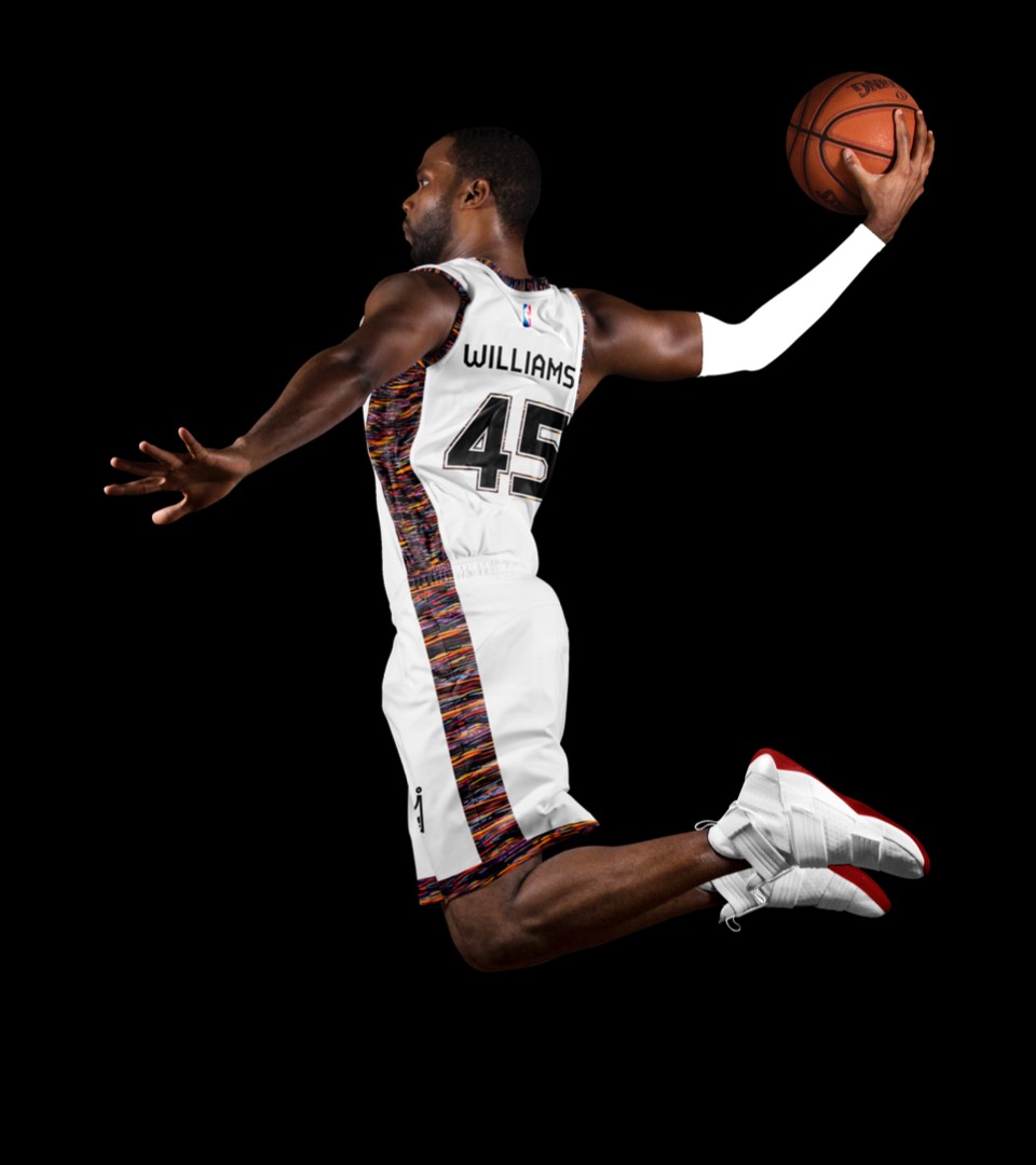
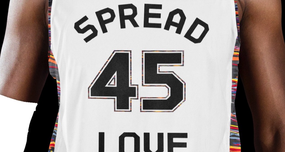
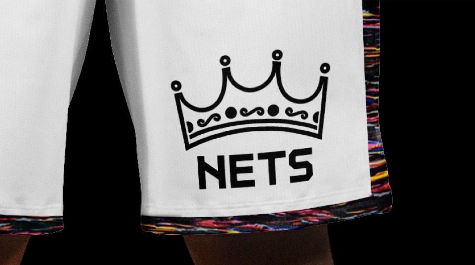
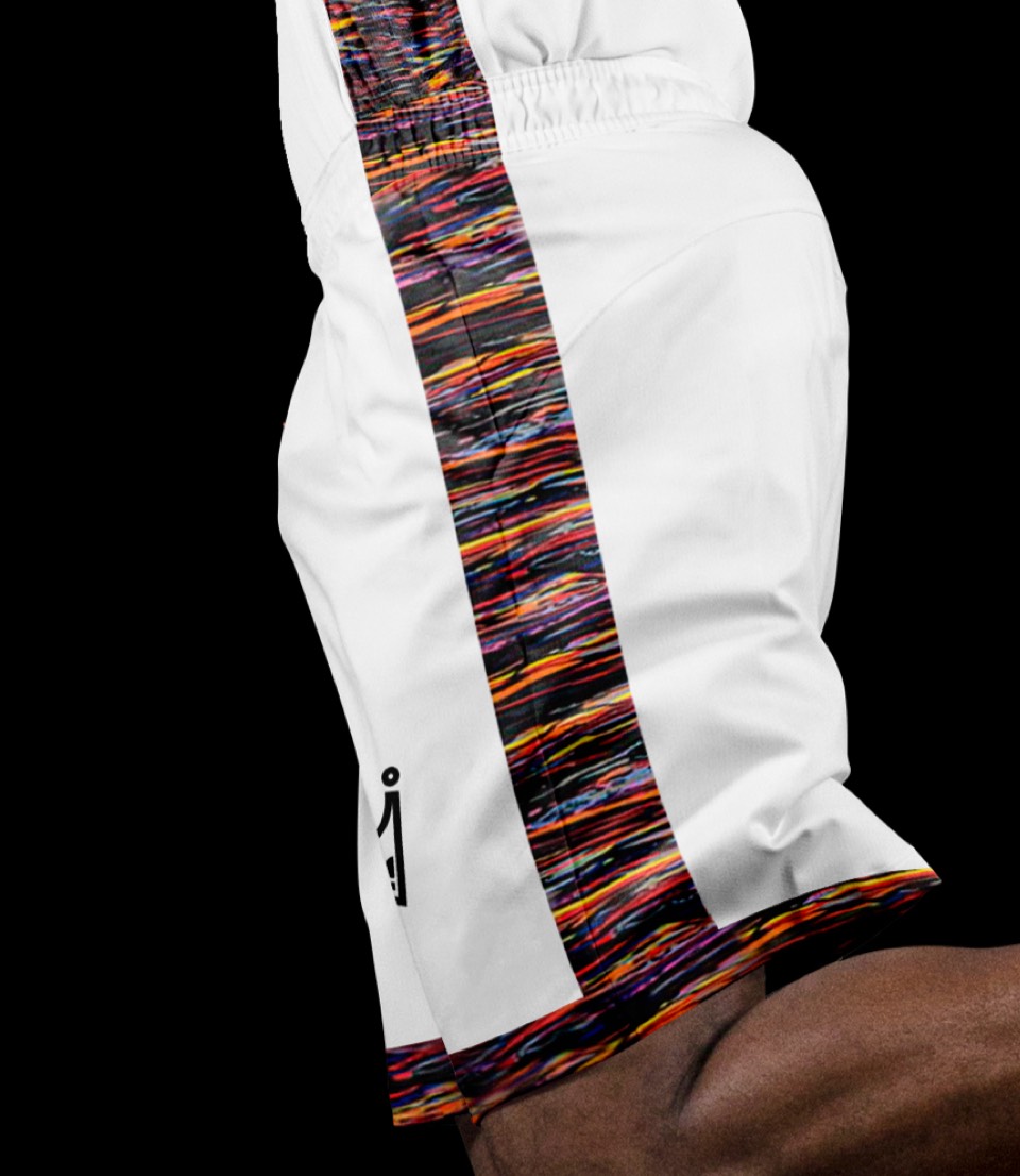
We've steered the statement jersey to even more fully embrace Biggie. Along with the Coog—ahem— "Brooklyn Camo," we've incorporated his iconic crown and lyrics from "Juicy."


We've steered the statement jersey to even more fully embrace Biggie. Along with the Coog—ahem— "Brooklyn Camo," we've incorporated his iconic crown and lyrics from "Juicy."
