
Today's hornet is not relatable, caught between a character and an icon, and stylistically, a caricature of sports logo design. I get that hornets have stingers but does everything have to be so sharp and pointy and aggressive?

We found out as we got into our Hornets research that they actually have a next-gen logo for Hugo the Hornet! Turns out it's incredible, a great balance of old and new, exactly what the primary logo should be (right down to the fact that he's wearing Jordan 11's as a shout out to their owner, MJ). All we had to do was give the color scheme a facelift and bring back a custom slab serif for their wordmark.
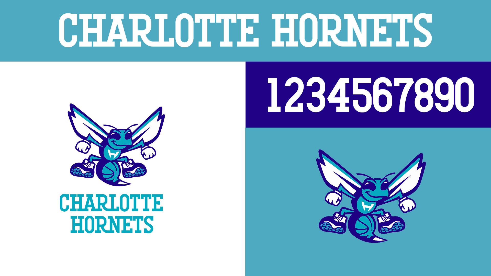
No need to overthink this, just get back to a more vibrant teal and purple combination with better contrast, and extend our custom slab (something about a soft slab serif always said North Carolina to me) to numbers. It was unclear whether "buzz city" had been wholeheartedly adopted by their fanbase as it feels more like a marketing moment than a rallying cry, so we ditched that too. We have Hugo, what more do we need?
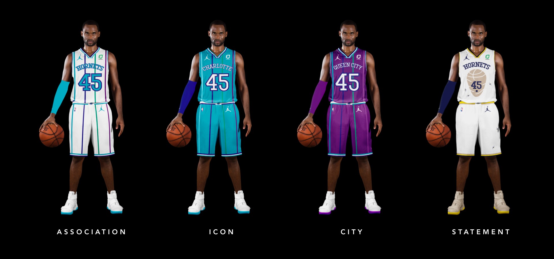
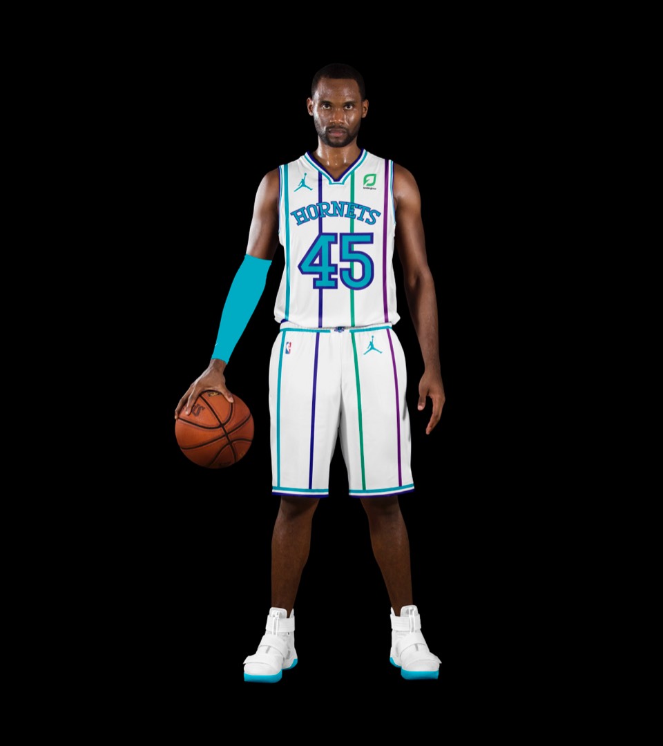
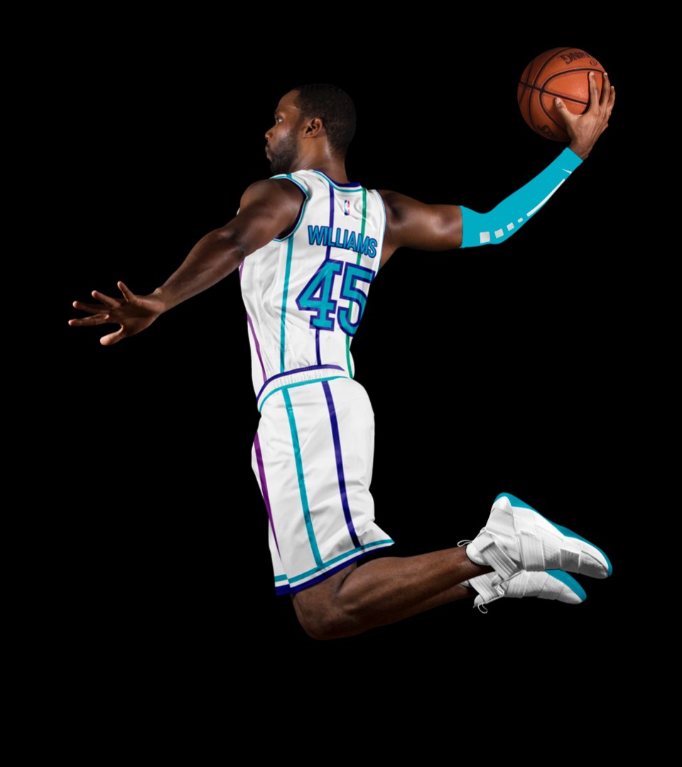
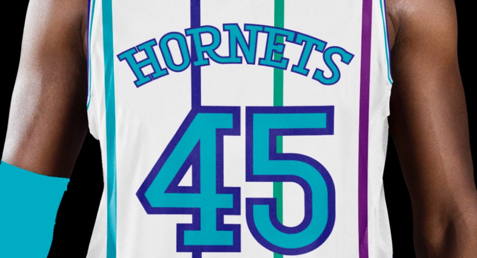
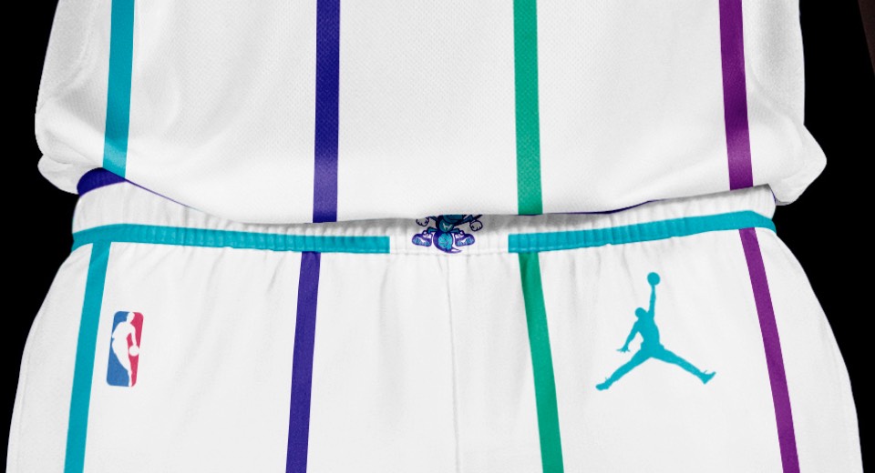
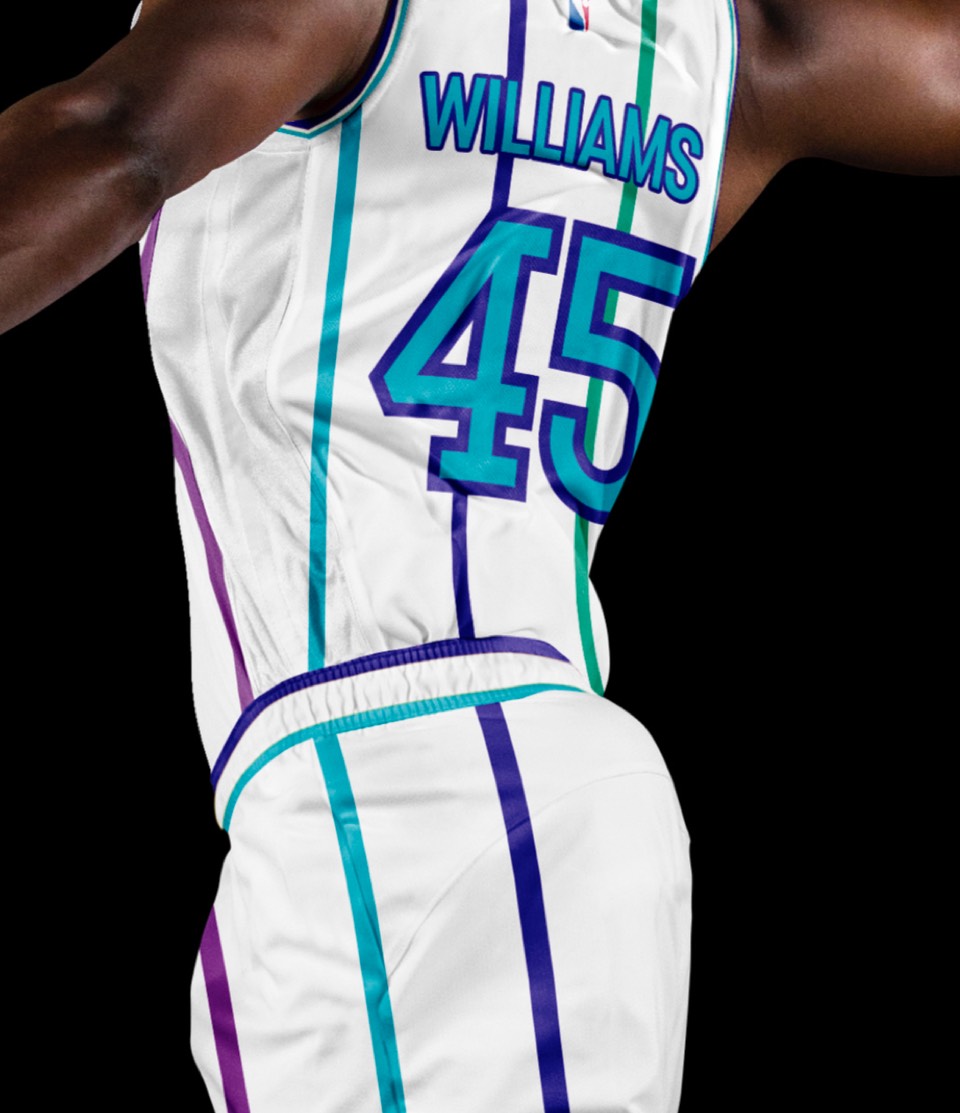
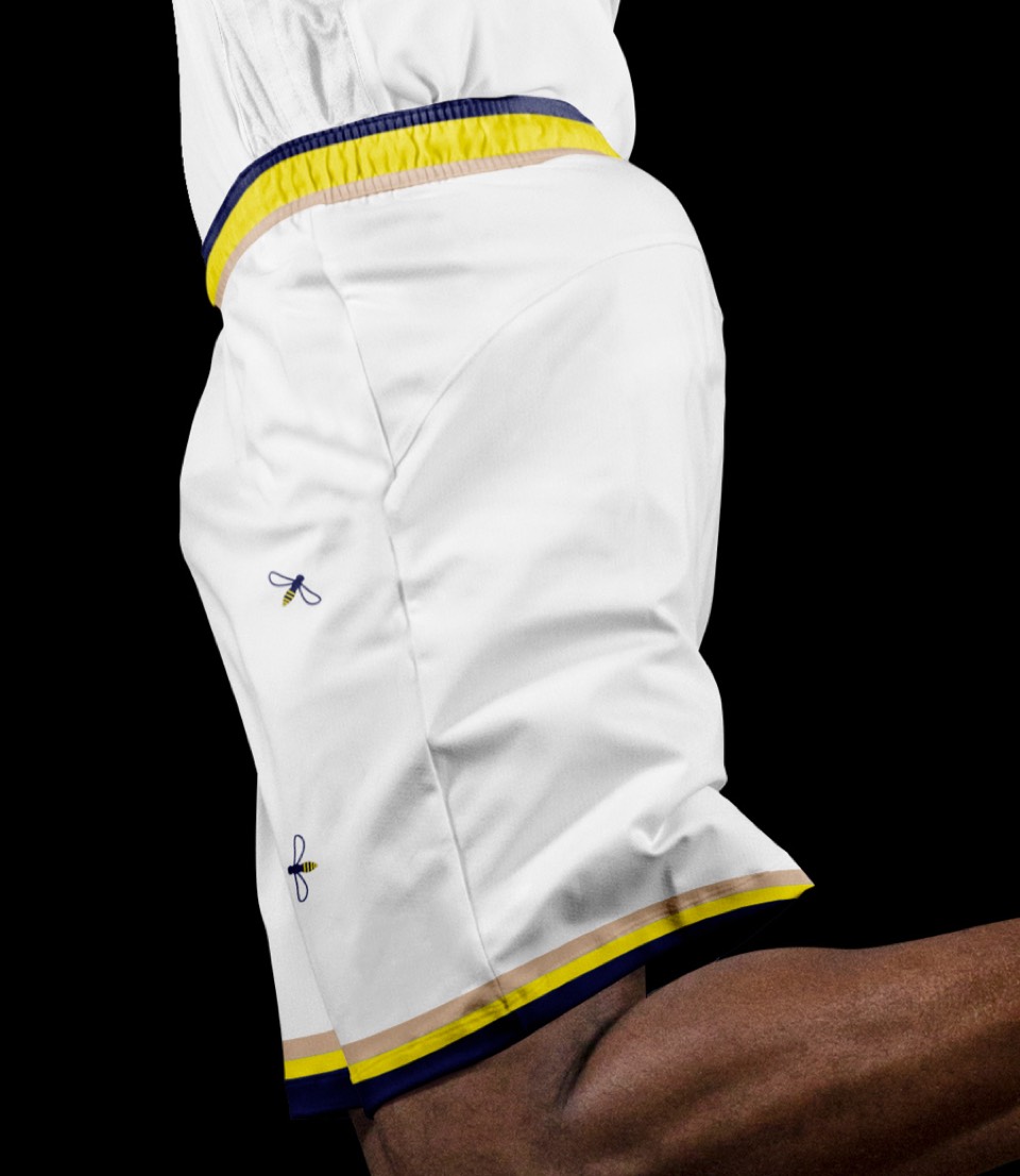
Back to the multi-colored pinstripes on white, with the Hornet belt buckle. Nice and fresh. We also got crazy and extended their pinstripes to the shorts— never understood why they didn't have them on their shorts all along.
Back to the multi-colored pinstripes on white, with the Hornet belt buckle. Nice and fresh. We also got crazy and extended their pinstripes to the shorts— never understood why they didn't have them on their shorts all along.
It could only be teal. Love that it makes the pin stripes a little more subtle too.
It could only be teal. Love that it makes the pin stripes a little more subtle too.
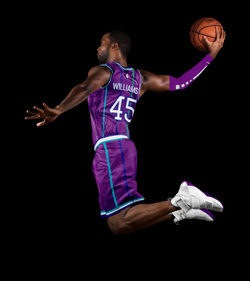
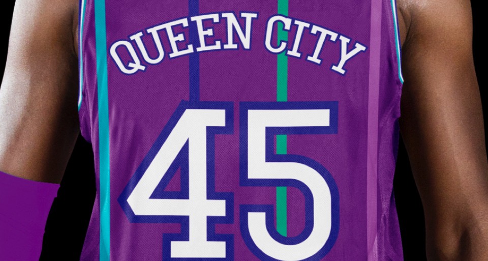
The purple uniform as an alt feels like a must-have for the Hornets, and while Buzz City always felt a bit contrived, Queen City is an actual nickname for Charlotte (after Queen Charlotte, wife of King George III at the time the city was founded) that hasn't been used enough.
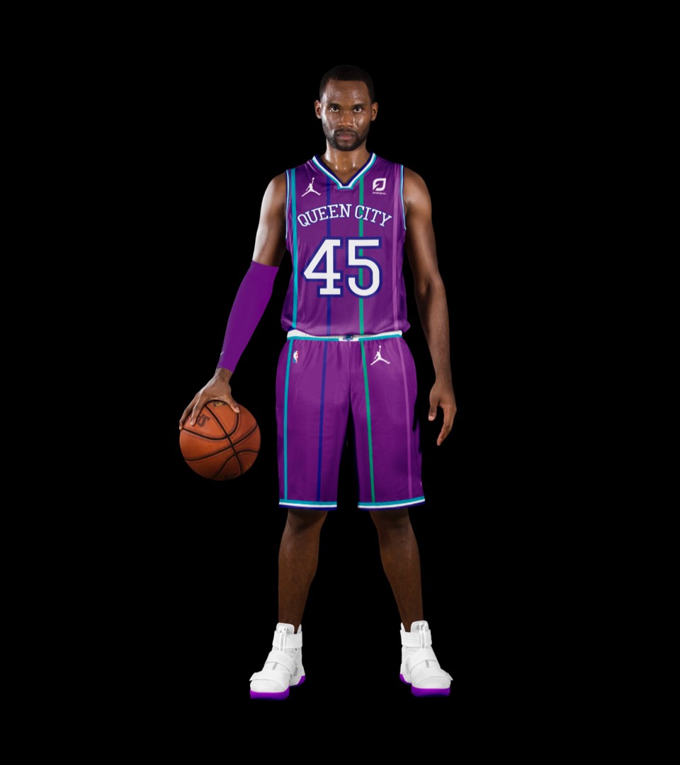
The purple uniform as an alt feels like a must-have for the Hornets, and while Buzz City always felt a bit contrived, Queen City is an actual nickname for Charlotte (after Queen Charlotte, wife of King George III at the time the city was founded) that hasn't been used enough.
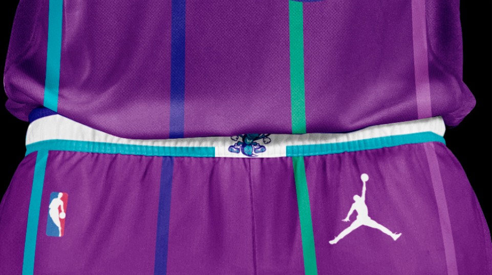
The Hornets nickname isn't about an insect, it's in reference to Lord Cornwallis describing the city as "a veritable hornets nest of rebellion" during the Revolutionary War. We didn't want to go as far as representing that in the primary logo, but the statement uniform was a chance to pay tribute, with a design inspired by the first flag of North Carolina.
The Hornets nickname isn't about an insect, it's in reference to Lord Cornwallis describing the city as "a veritable hornets nest of rebellion" during the Revolutionary War. We didn't want to go as far as representing that in the primary logo, but the statement uniform was a chance to pay tribute, with a design inspired by the first flag of North Carolina.