
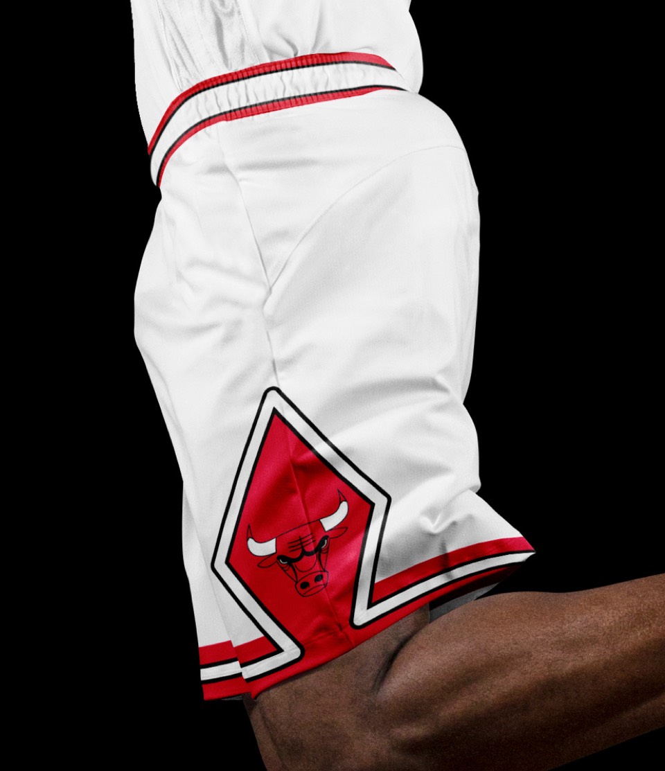
Designed in 1966, still just as intimidating today.

No changes!
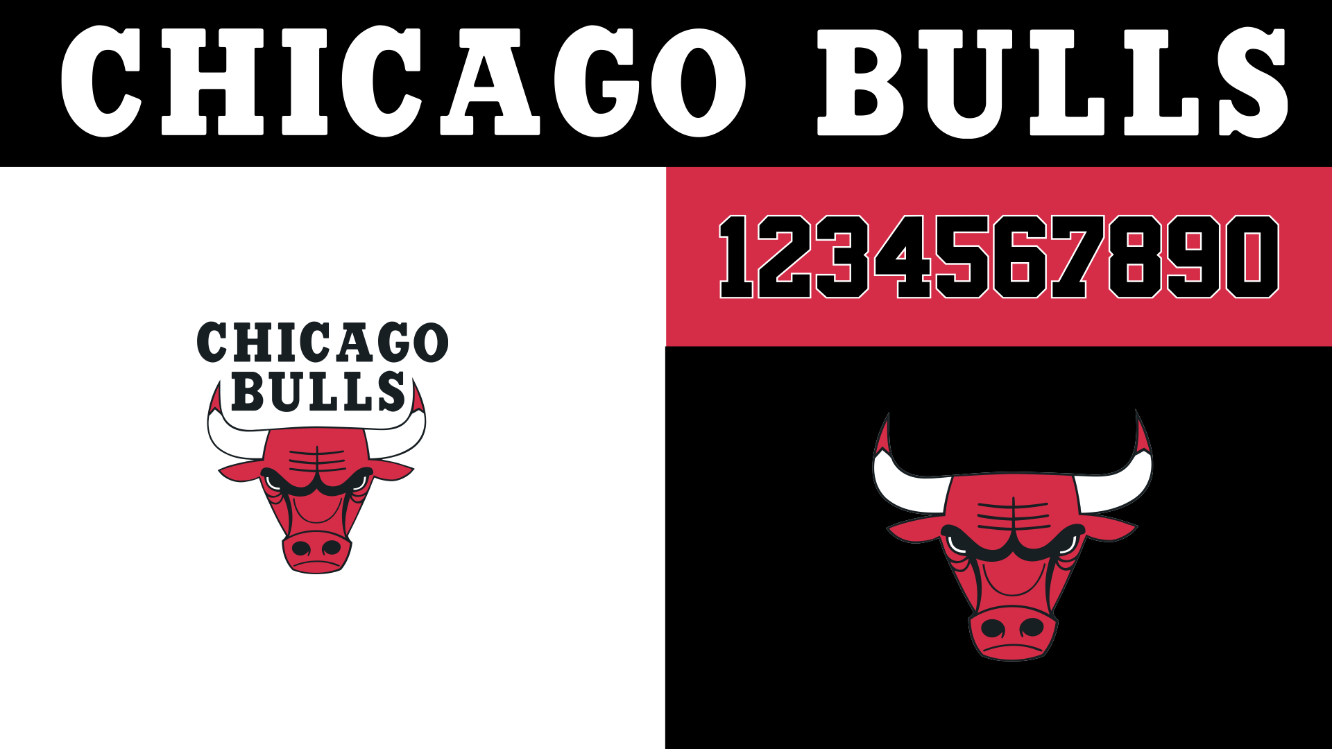
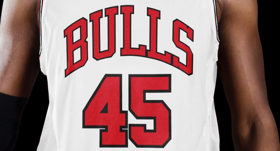
The Chicago Bulls lettering holds up today. Numbers are classic, and despite being such a ubiquitous color palette, you can't think red and black without thinking of the bulls.
Nothing to add here.
Nothing to add here.
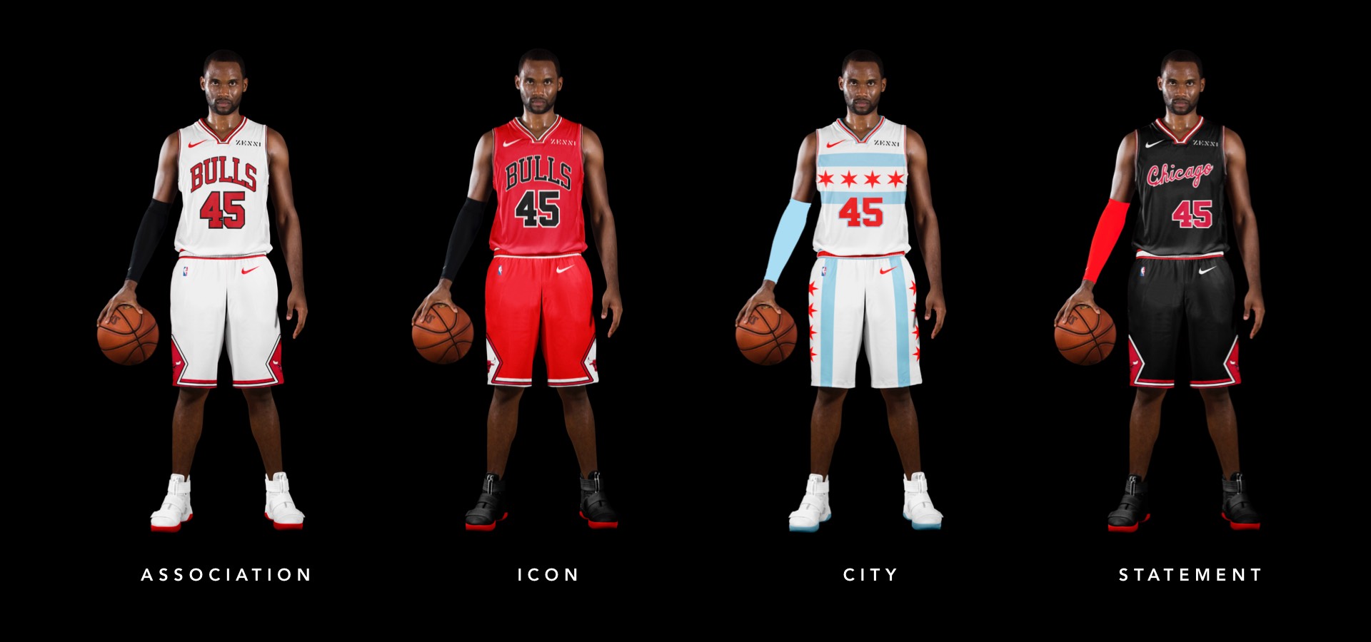
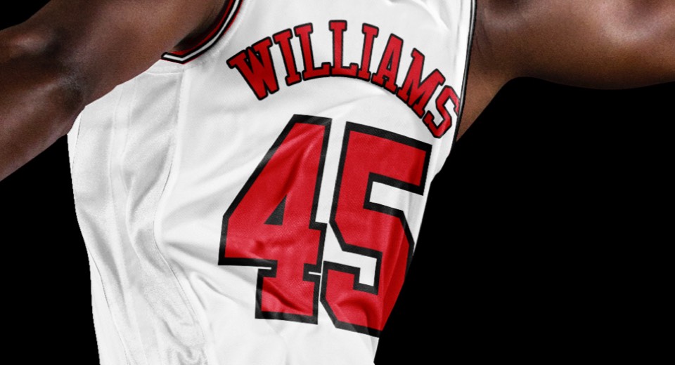
One of the teams that doesn't say the city name on their "away" (now icon) uniforms.
One of the teams that doesn't say the city name on their "away" (now icon) uniforms.
They've done the Chicago flag before, but it felt small and inexplicably brought black into the palette. This one sticks with red white and blue, featuring the stars and stripes pretty much everywhere - which looks cool and graphic while allowing the shorts to stand alone.
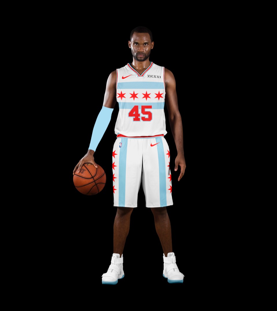
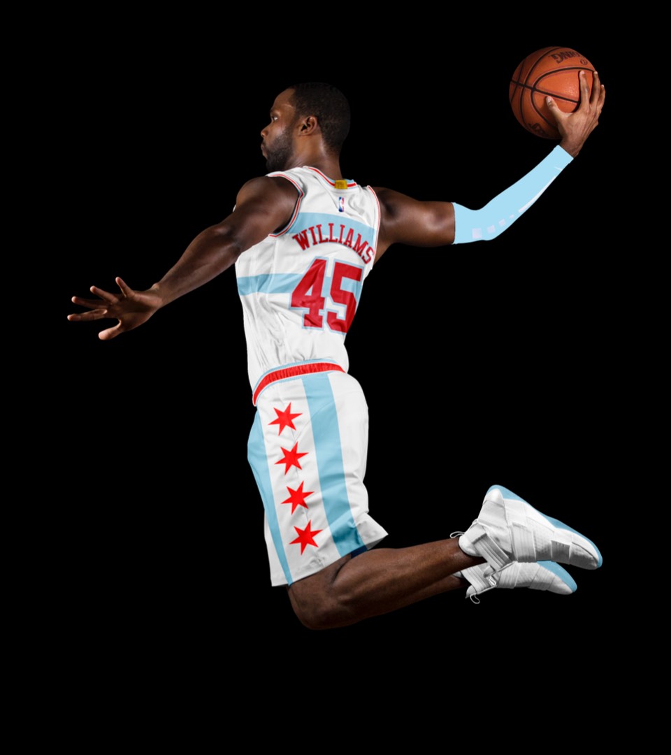
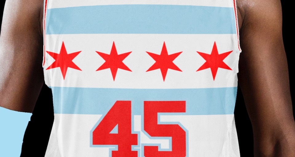
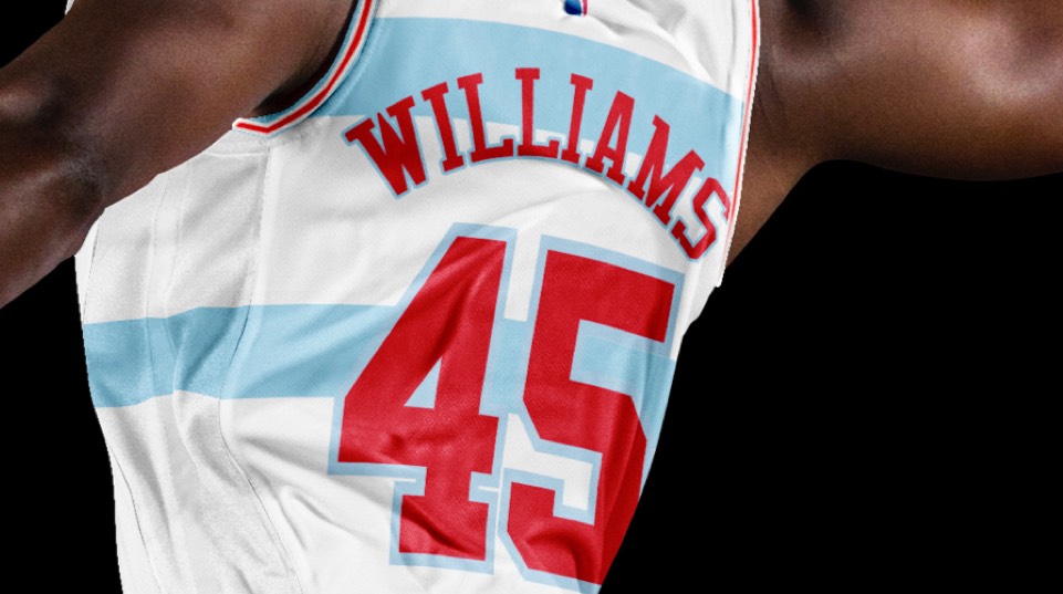
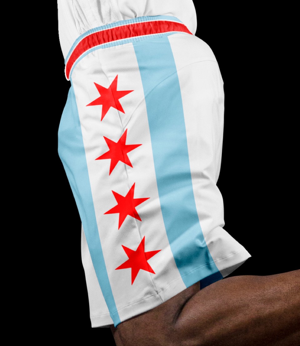
They've done the Chicago flag before, but it felt small and inexplicably brought black into the palette. This one sticks with red white and blue, featuring the stars and stripes pretty much everywhere - which looks cool and graphic while allowing the shorts to stand alone.
An MJ double-tribute, combining his rookie-year script layout with the black colorway they debuted during their 72-win season.
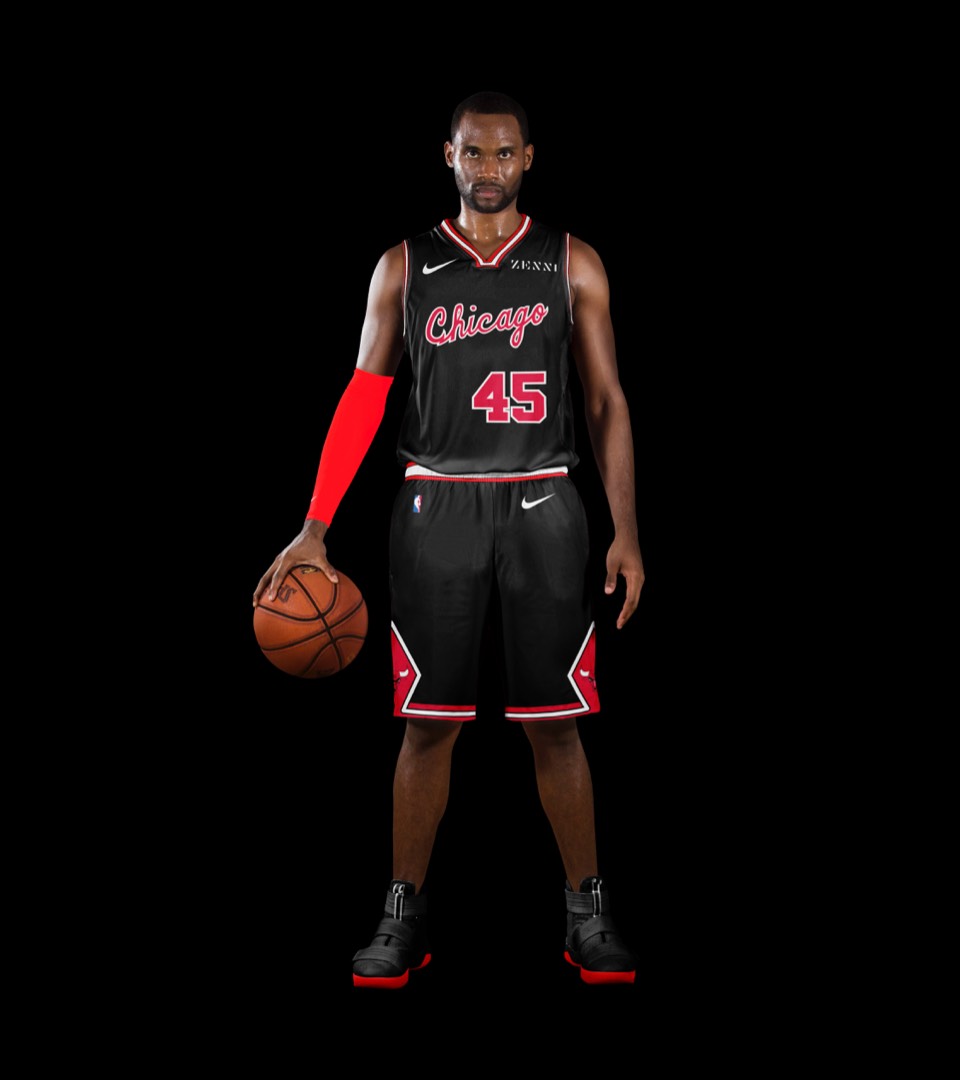
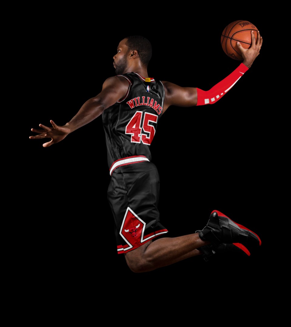
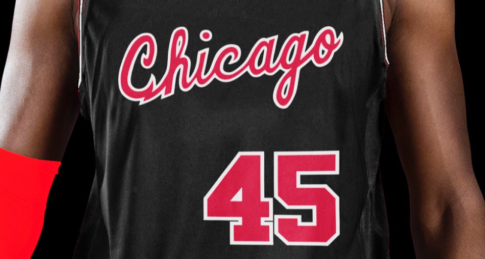
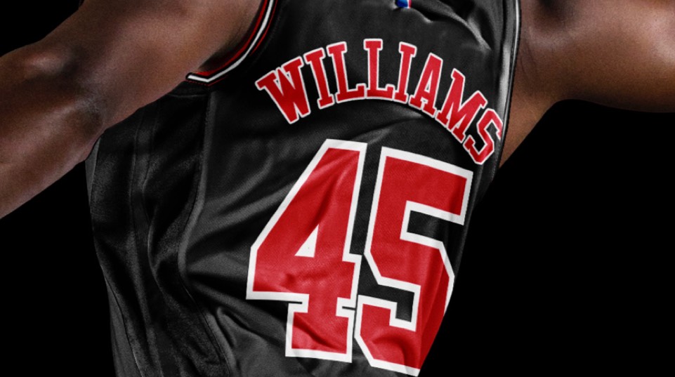
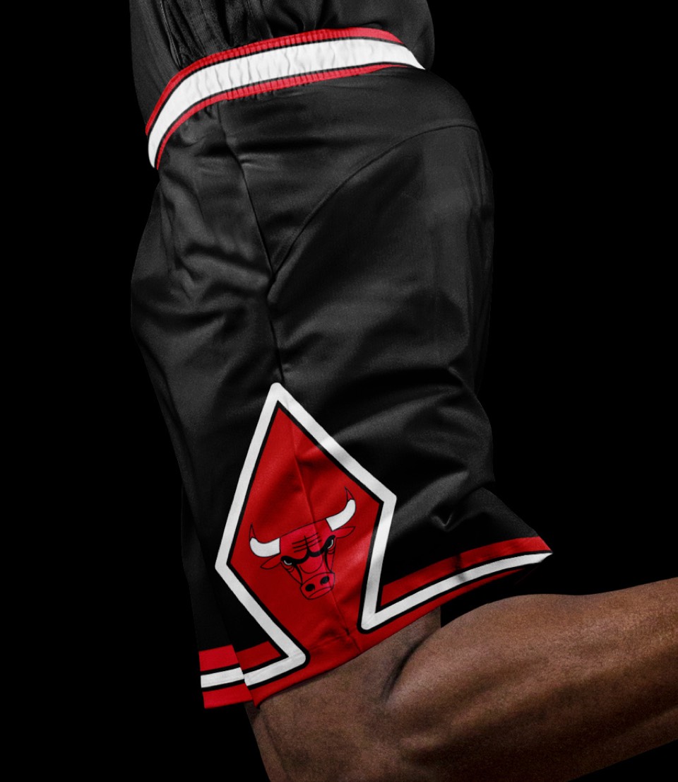
An MJ double-tribute, combining his rookie-year script layout with the black colorway they debuted during their 72-win season.