
It's sports-design satire, with all the beveling and angled type and muddying combinations of colors and shapes. One bright spot: the sword slicing through a "C" that looks like it was made with a sword. Something to build on.

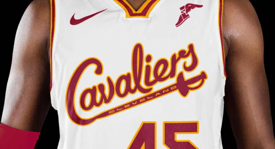
We brought the type back to the midwest, with a script that says "Cavaliers" being cut out by a sword with CLEVELAND engraved on it. And it wouldn't be the Cavs without the combination of wine and gold, so we took a cue from their original look and filtered out the blues and blacks to get back to their essence.
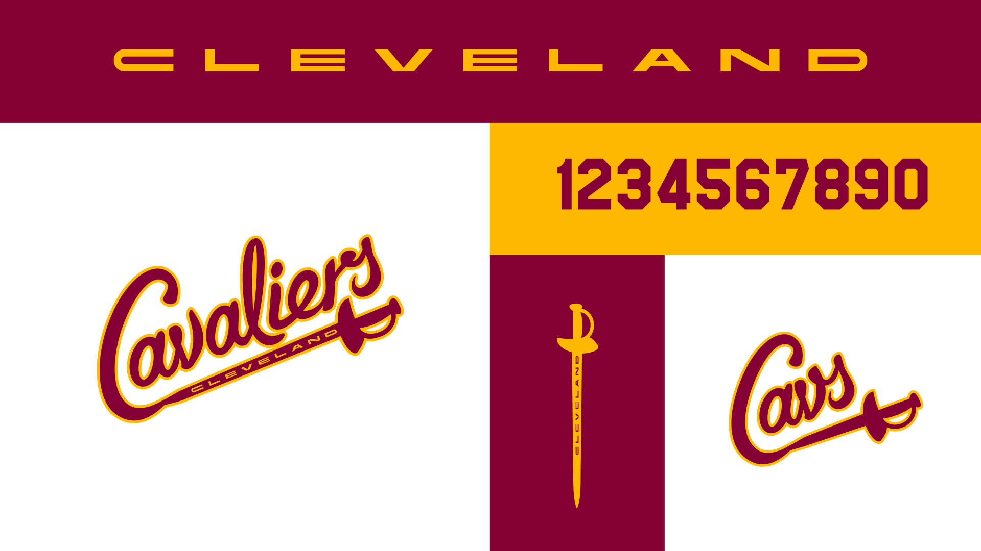
We love the combination of the super extended, cut-from-steel letters for CLEVELAND and the script that feels blue collar and small town at the same time. Added to that are some classic numbers and a a secondary "dagger" logo that says Cavs.
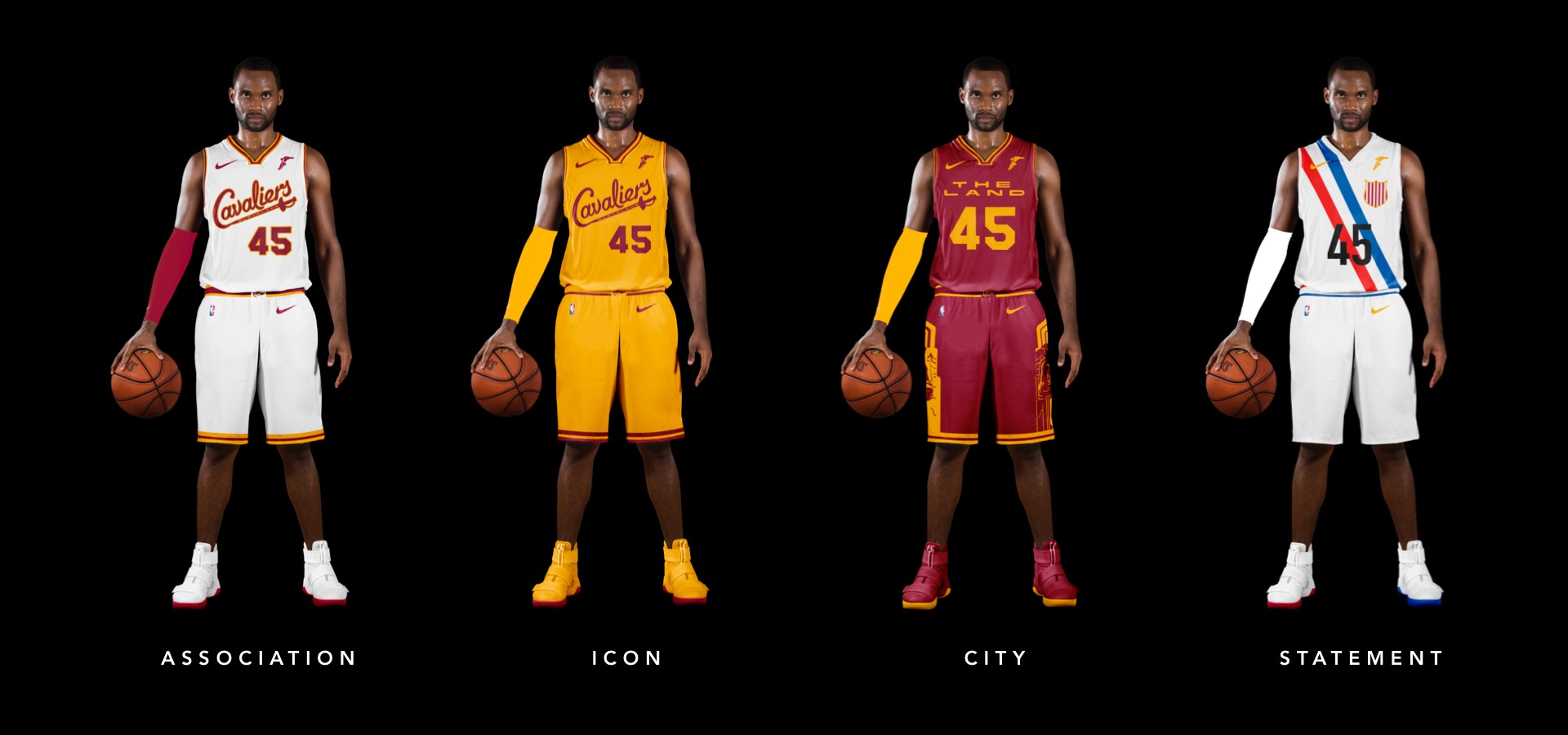
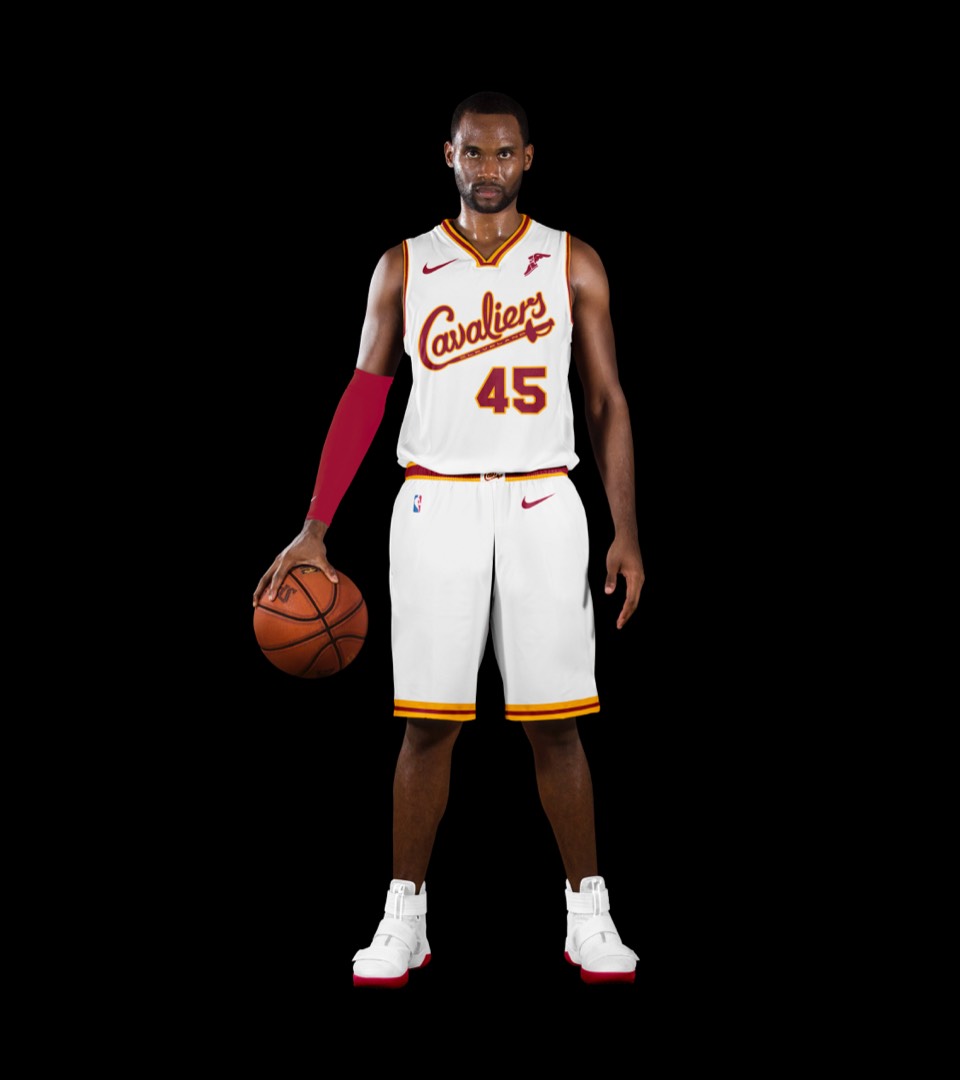
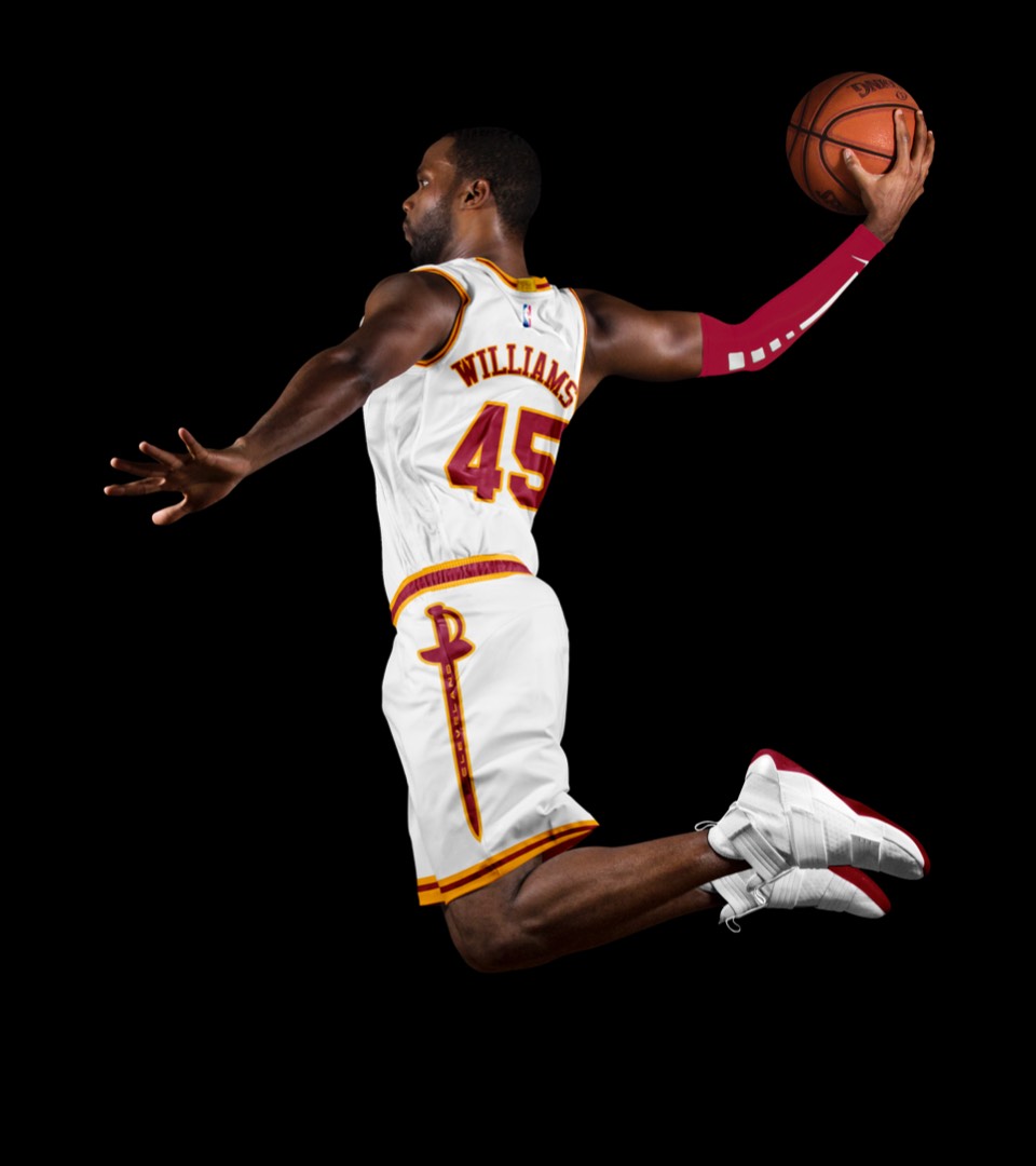
White with wine and gold numbers has always been the best part of their kit, even more so now with the updated typography. The shorts feature the dagger logo on the belt buckle and the full sword on each leg.
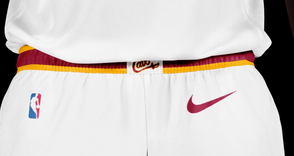
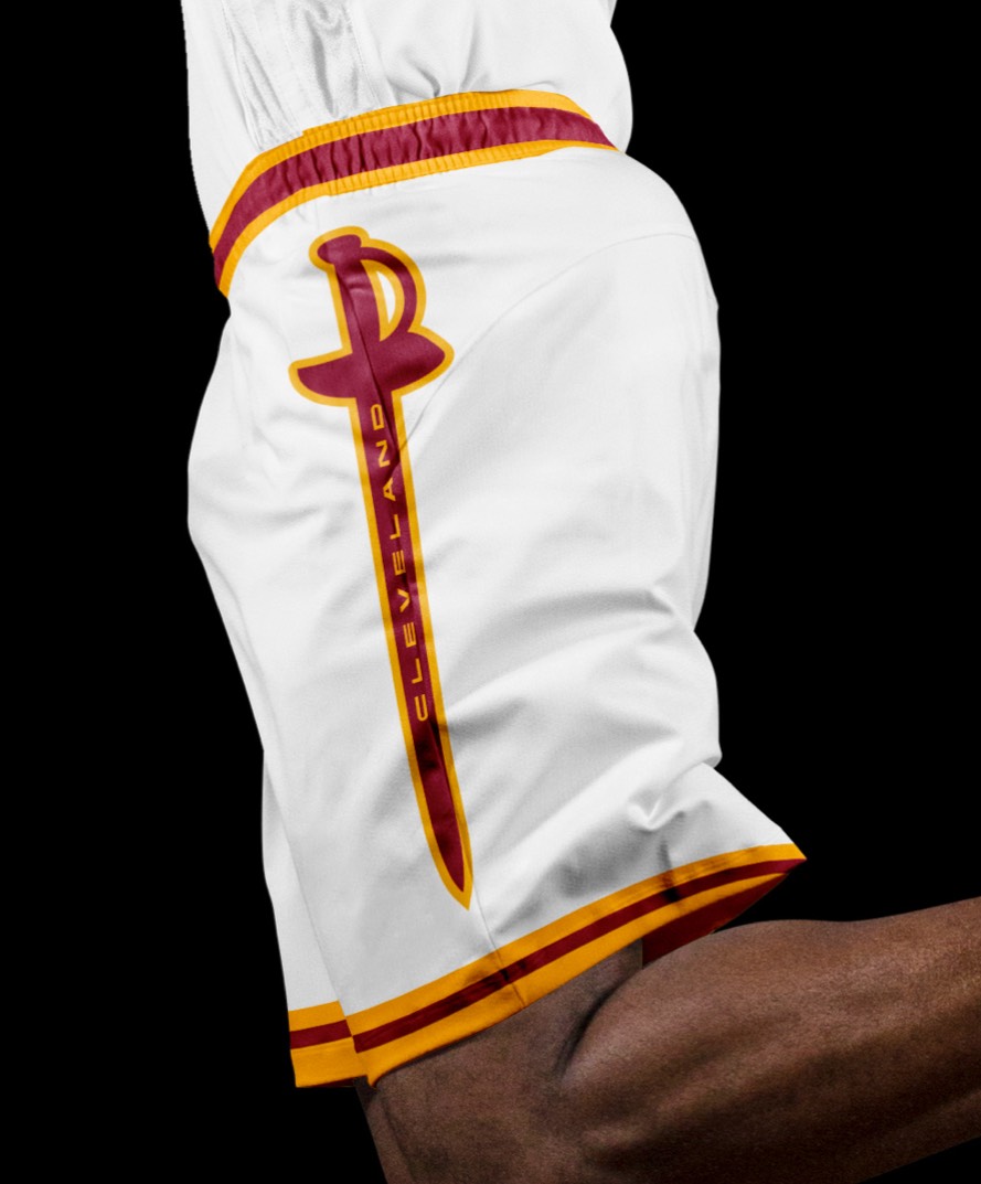
White with wine and gold numbers has always been the best part of their kit, even more so now with the updated typography. The shorts feature the dagger logo on the belt buckle and the full sword on each leg.
As a nod to the Cavs' original uniforms, we went gold with red lettering, no stroke. Both association and icon uniforms say "Cleveland Cavaliers" so no need to change layout or hierarchy.
As a nod to the Cavs' original uniforms, we went gold with red lettering, no stroke. Both association and icon uniforms say "Cleveland Cavaliers" so no need to change layout or hierarchy.
The wine background with a gold THE LAND label in the same extended lettering as CLEVELAND. The shorts feature two of the Guardians of Traffic from the Hope Memorial Bridge—one of the coolest gateways to a city we've ever seen.
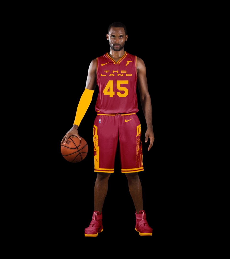
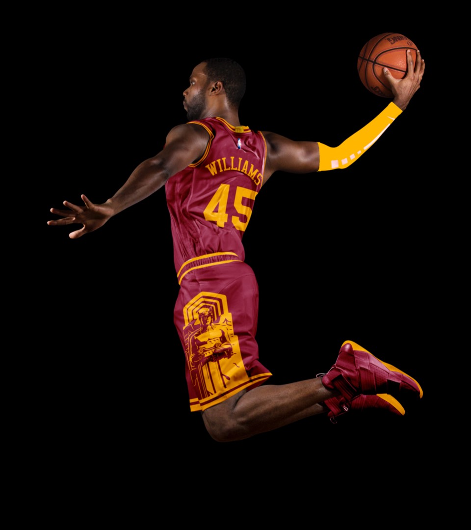
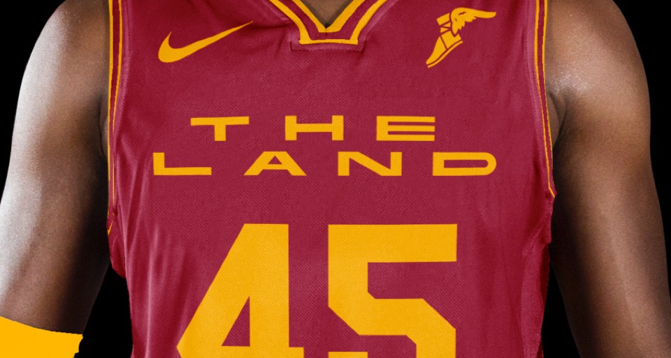
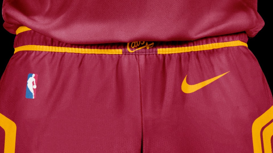
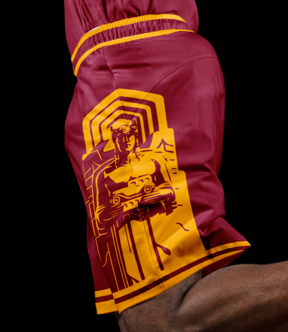
The wine background with a gold THE LAND label in the same extended lettering as CLEVELAND. The shorts feature two of the Guardians of Traffic from the Hope Memorial Bridge—one of the coolest gateways to a city we've ever seen.
Jesse Owens grew up and rose to fame in Ohio. This tribute to his performance and symbolism at the Munich Games features the same markings he wore for the Olympics, and race-inspired numbers in DIN, the former national typeface of Germany.
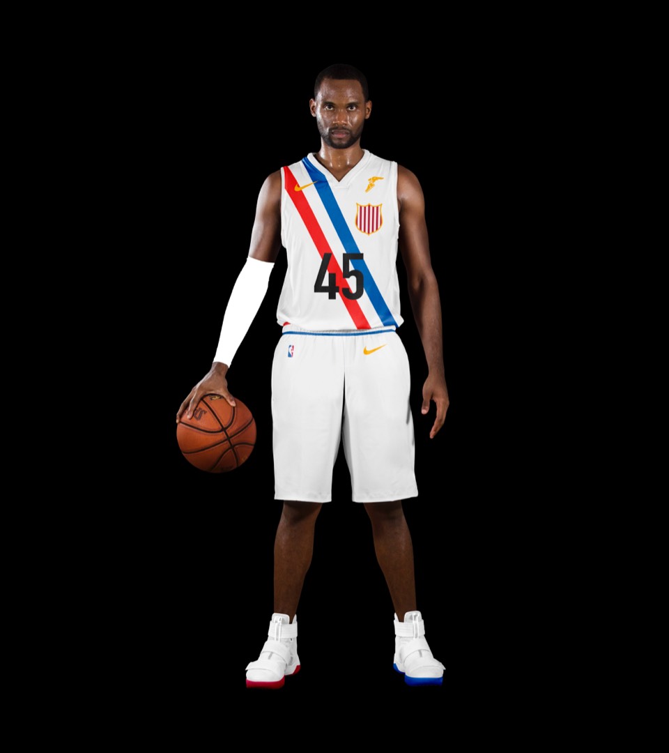
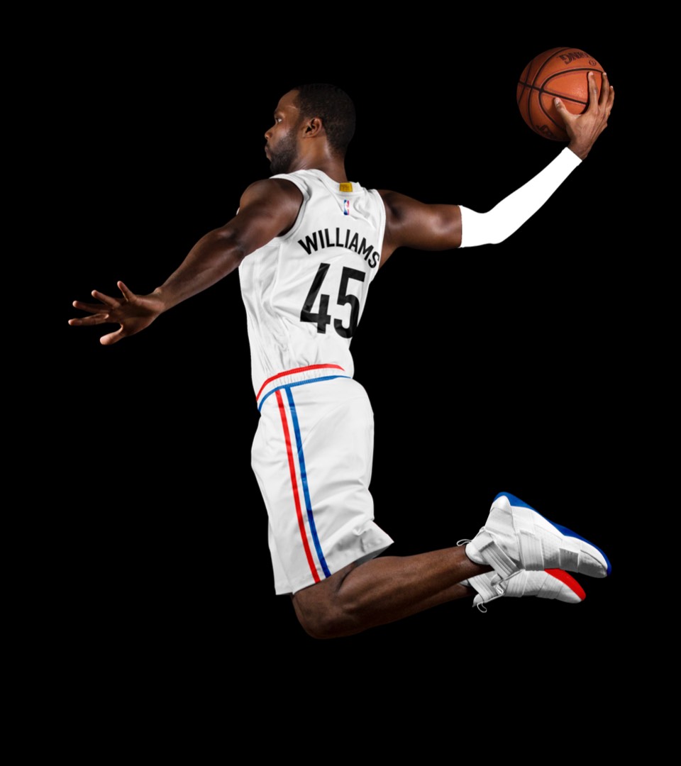
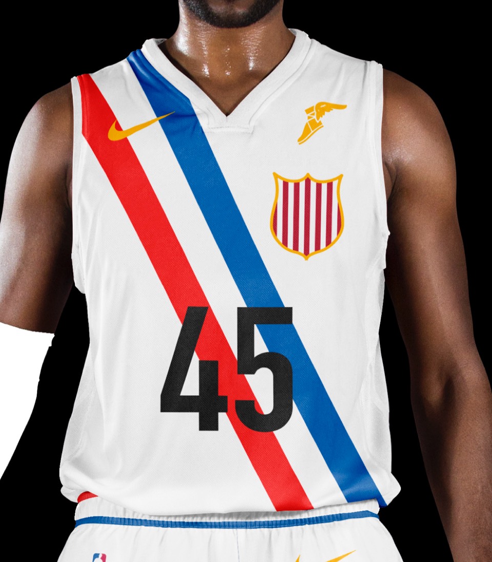
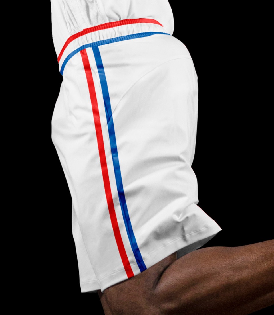
Jesse Owens grew up and rose to fame in Ohio. This tribute to his performance and symbolism at the Munich Games features the same markings he wore for the Olympics, and race-inspired numbers in DIN, the former national typeface of Germany.