
Definitely want to keep the horse but beyond that, it's an overload of shading and shapes and spikes and very dated/sports-y lettering.

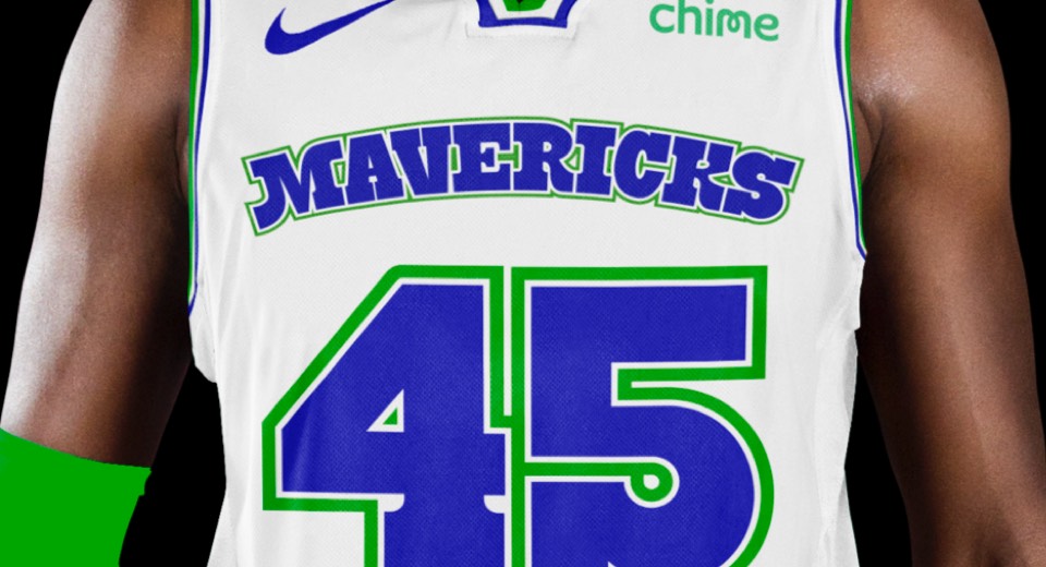
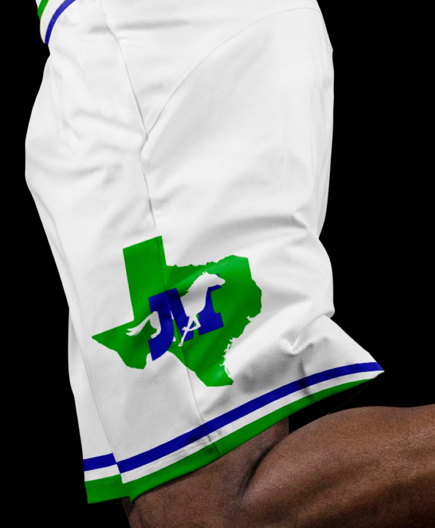
The combo of royal blue and green is surprisingly unique to the NBA, so we brought it back. The horse is now a silhouette running through the letter M, paying homage to the original logo which was an M with a cowboy hat hanging off it. Instead of a basketball as a containing shape, we used the state of Texas.
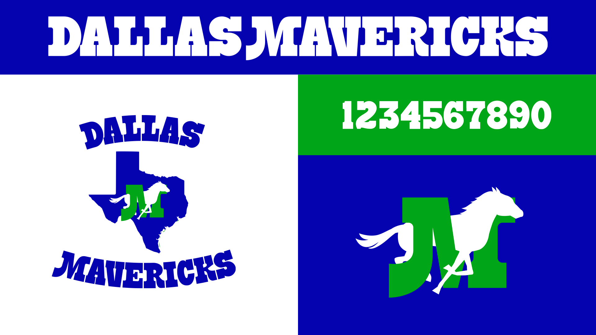
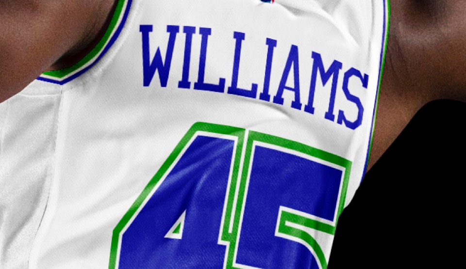
We drew some more playful letters in the reverse-stress style of the original logo and extended those to some numbers that will be very fun in tackle-twill. Also provided a secondary logo that loses the texas shape and allows for just the horse + M mark.
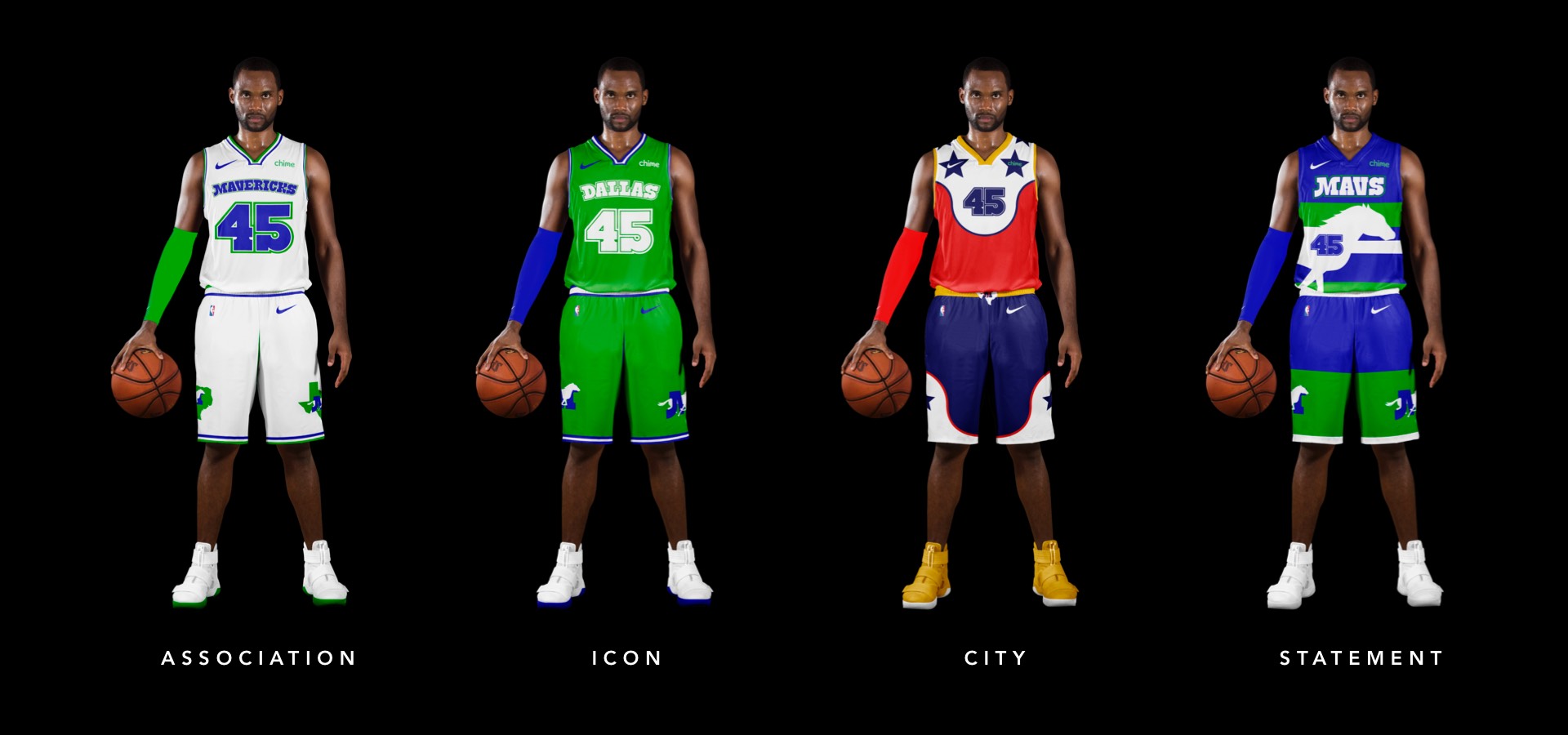
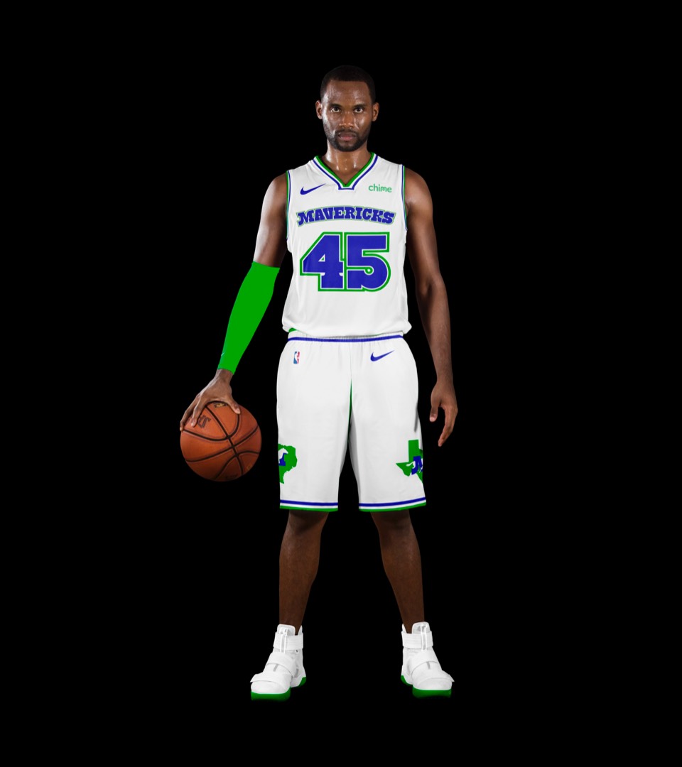
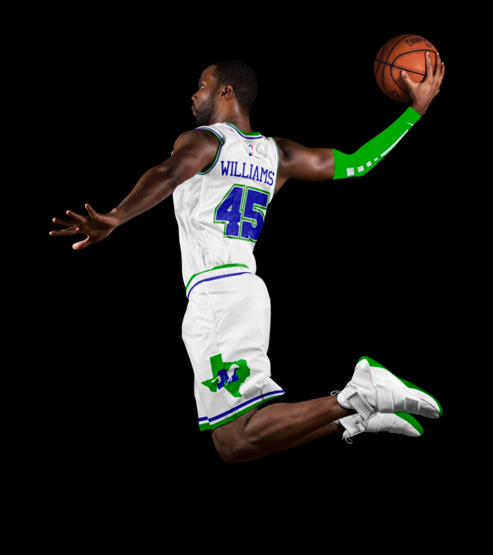
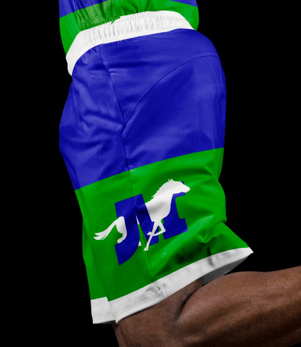
As much as it might be scoffed at from a purely design POV, there's something awesome about the old double strokes on the numbers—especially when you consider how cool it would be to layer those on top of each other for the physical jerseys. The shorts are simple but still iconic, with the logo on each side and the classic blue/white/green trim.
As much as it might be scoffed at from a purely design POV, there's something awesome about the old double strokes on the numbers—especially when you consider how cool it would be to layer those on top of each other for the physical jerseys. The shorts are simple but still iconic, with the logo on each side and the classic blue/white/green trim.
The rare Icon jersey that complements the Association kit without directly duplicating it. Here we have a green background with white on white letters and blue on blue trim. It's less expected but also aligns with the color way for their original uni's. The shorts keep the horse+M icon but lose the state of Texas since the jerseys already say DALLAS on them.
The rare Icon jersey that complements the Association kit without directly duplicating it. Here we have a green background with white on white letters and blue on blue trim. It's less expected but also aligns with the color way for their original uni's. The shorts keep the horse+M icon but lose the state of Texas since the jerseys already say DALLAS on them.
A nod to the Texas State fair with the "Big Tex" colorway, inspired by some of the 60-ft-tall statue's wardrobe over the years.
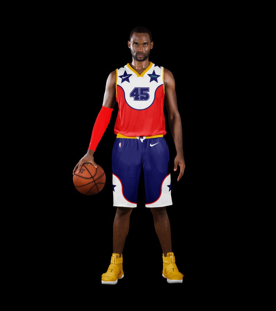
A nod to the Texas State fair with the "Big Tex" colorway, inspired by some of the 60-ft-tall statue's wardrobe over the years.
Motion lines inspired by a herd of horses running, plus the "Mavs" shorthand wordmark.
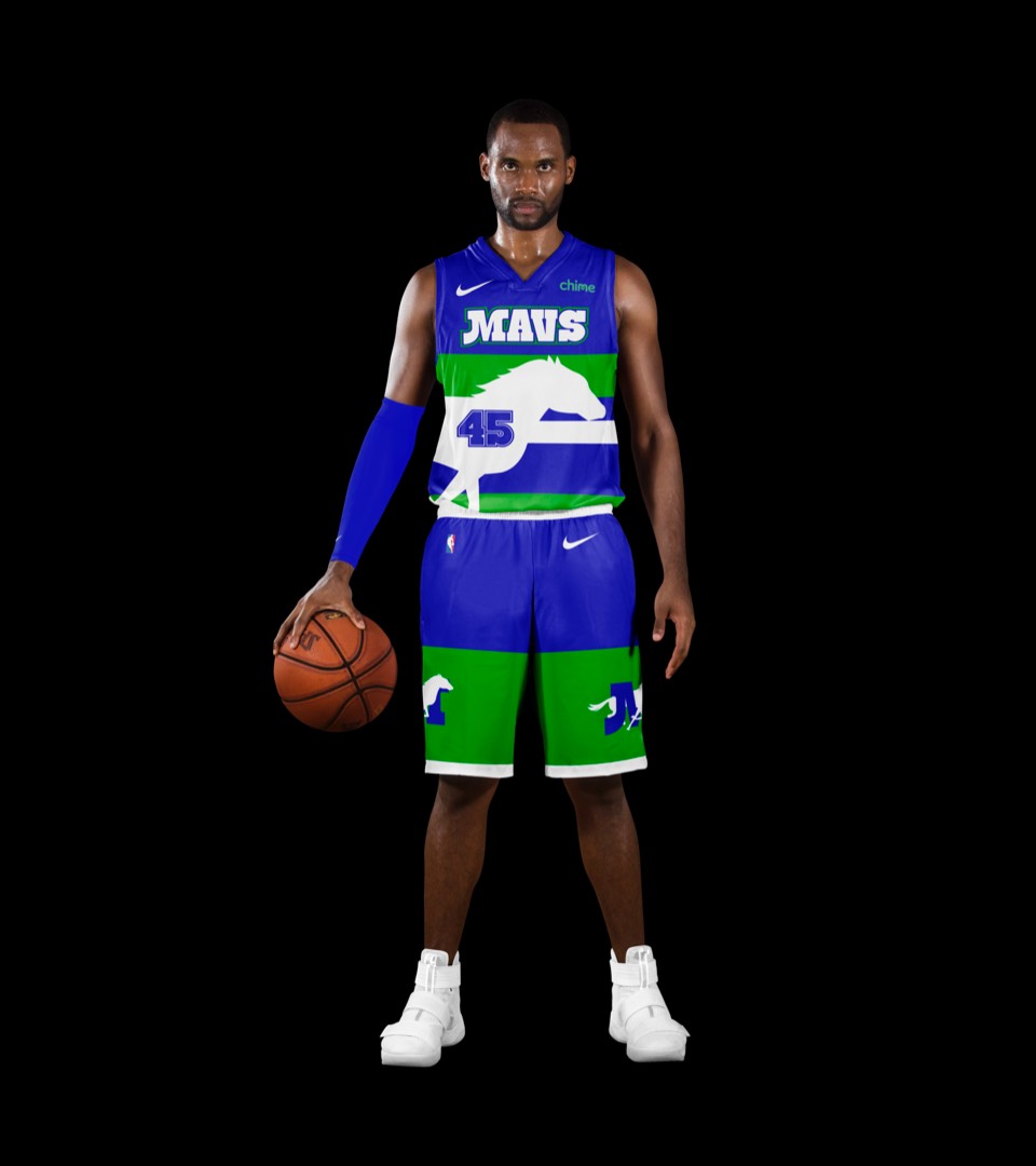
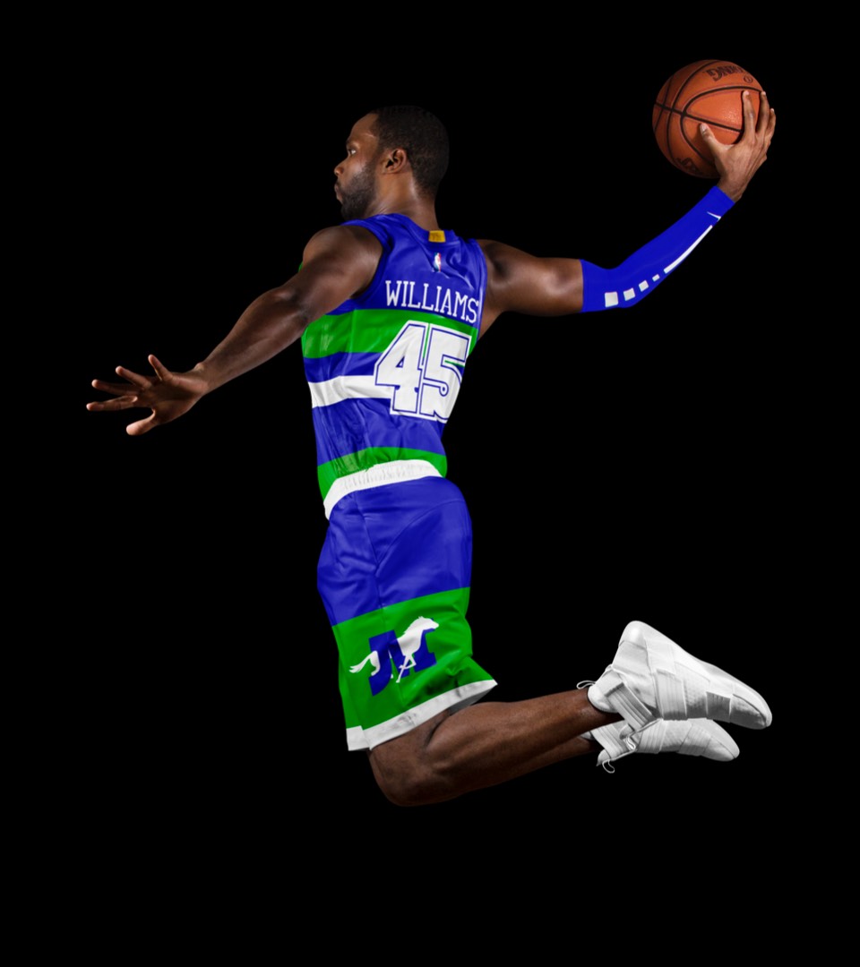
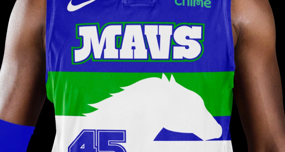
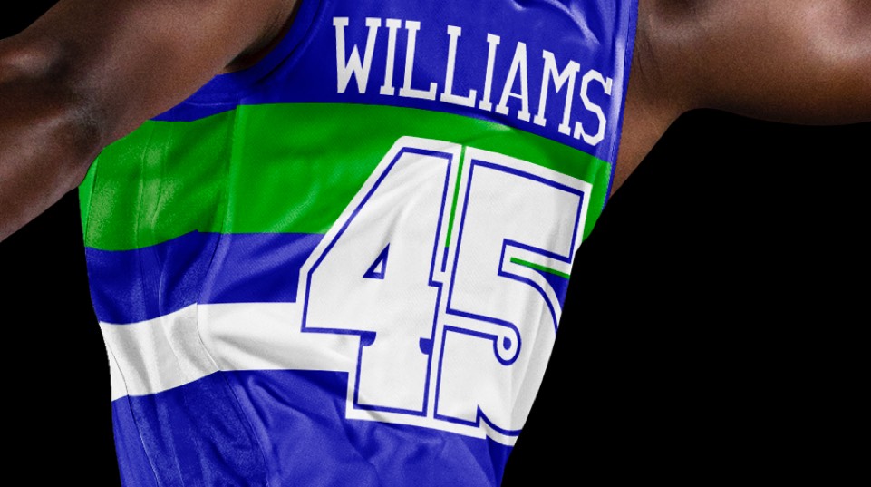
Motion lines inspired by a herd of horses running, plus the "Mavs" shorthand wordmark.