
A lot of designers are offended by the off-center (they would say off-kilter) logo; we don't mind it! Leaves room for the numbers on the jersey and with a slightly more iconic rendition of the bay bridge, it can work. Probably one too many strokes on the circle when you compare it to the 60's era stuff, and by far the most offensive element is the lettering, which between the uneven structure, the arbitrary spurs and the fact that WARRIORS is slightly bigger than GOLDEN STATE... probably best to start fresh.

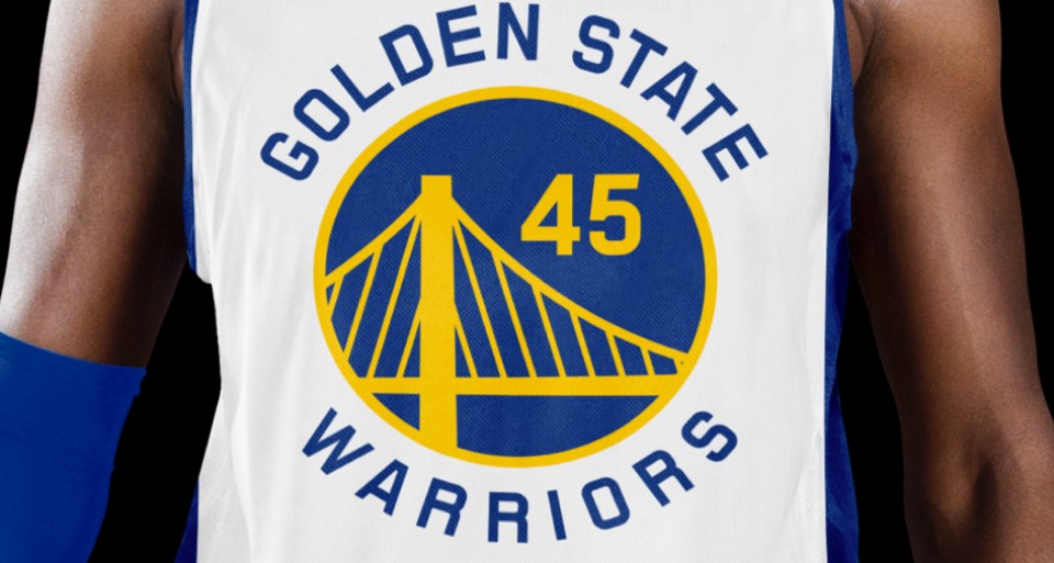
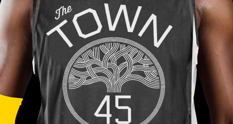
And start fresh we did! Love that they go with "Golden State" as opposed to "San Francisco" or "Oakland" and to reinforce that, we drew some lettering that was inspired by the California state flag. We livened up the blue and yellow a touch, simplified the bay bridge, removed the outer blue ring and kept all the type sizing unified.
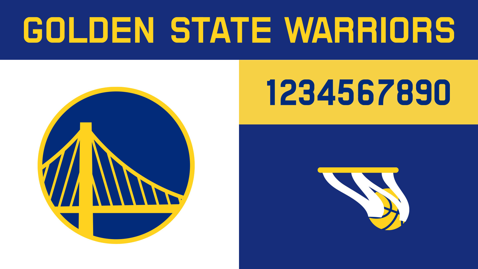
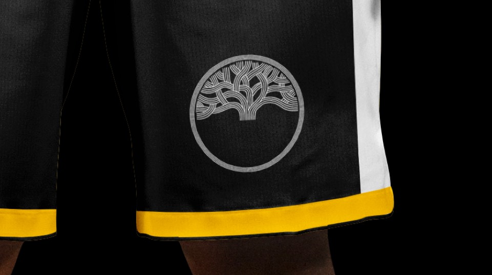
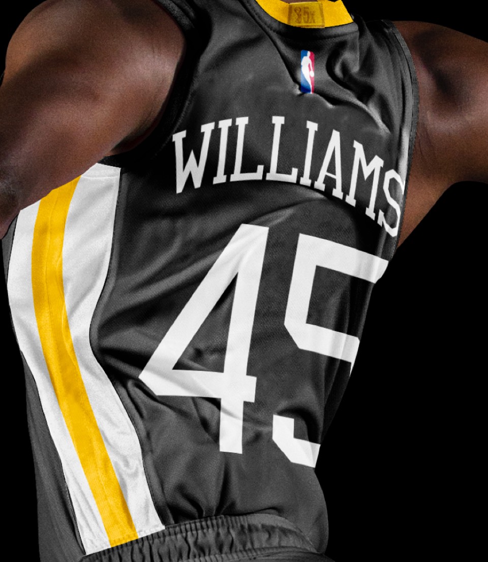
Extending the new type to numbers was an easy choice and much better than whatever default-NBA look they have going with their numbers right now. We also added a secondary logo honoring the splash brothers legacy: a ball swishing through the letter W.
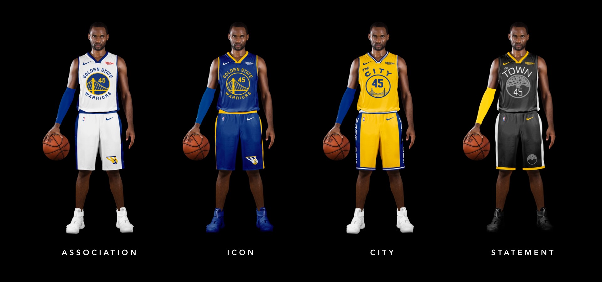
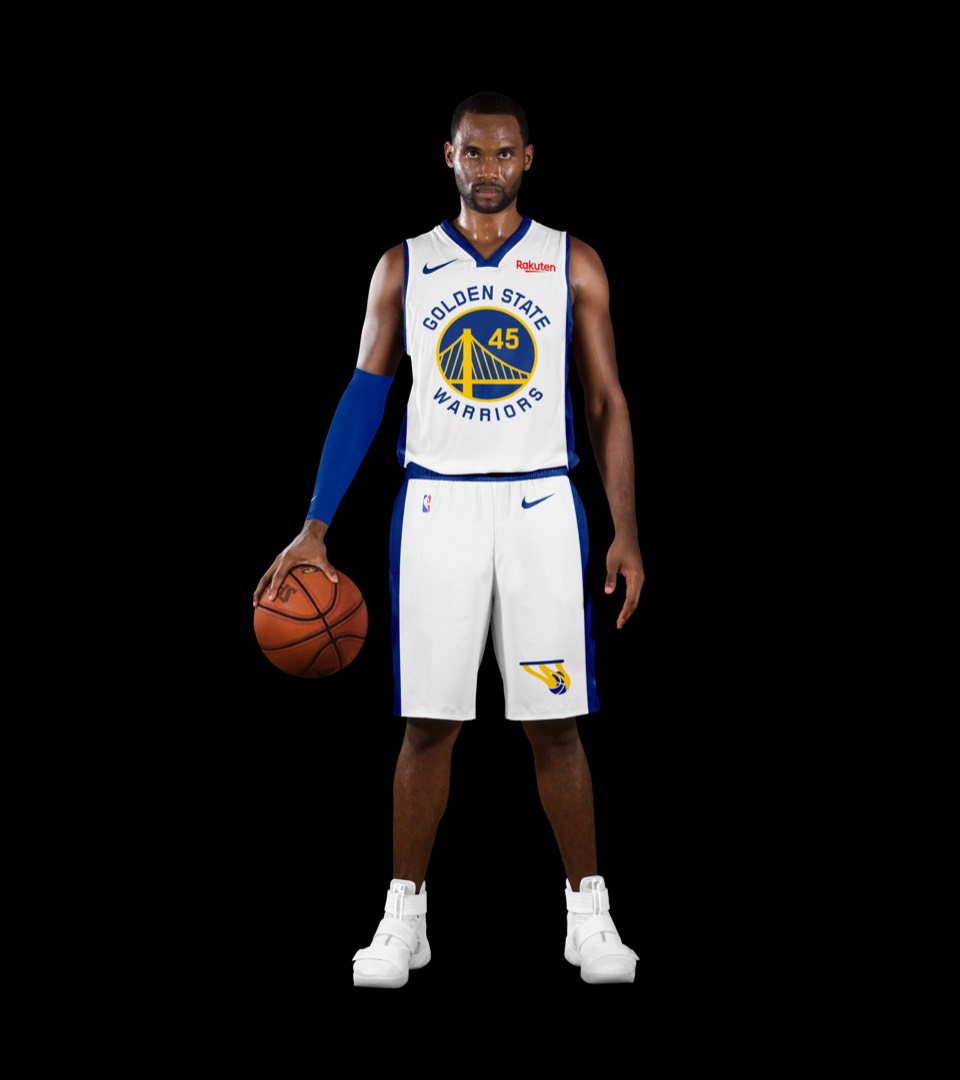
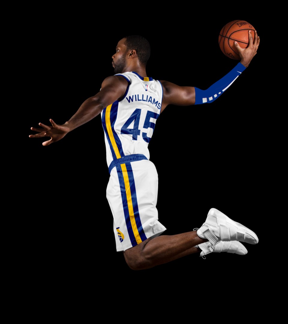
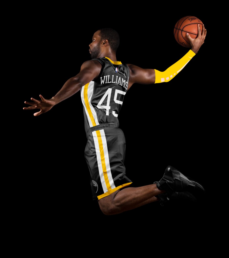
The jersey stays pretty much as-is but is elevated through our nips and tucks. "Shorts inspired by the Bay Bridge" is a fun idea but felt like one move too many and competed with the wonderful approach to the front of the jerseys. So we went with a more classic side stripe and the new secondary logo on the left knee.
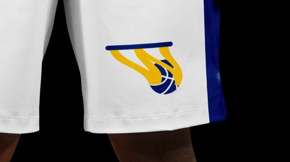
The jersey stays pretty much as is but is elevated through our nips and tucks. Shorts inspired by the bridge is a fun idea but felt like one move too many and competed with the wonderful approach to the front of the jerseys. So we went with a more classic side stripe and the new secondary logo on the left knee.
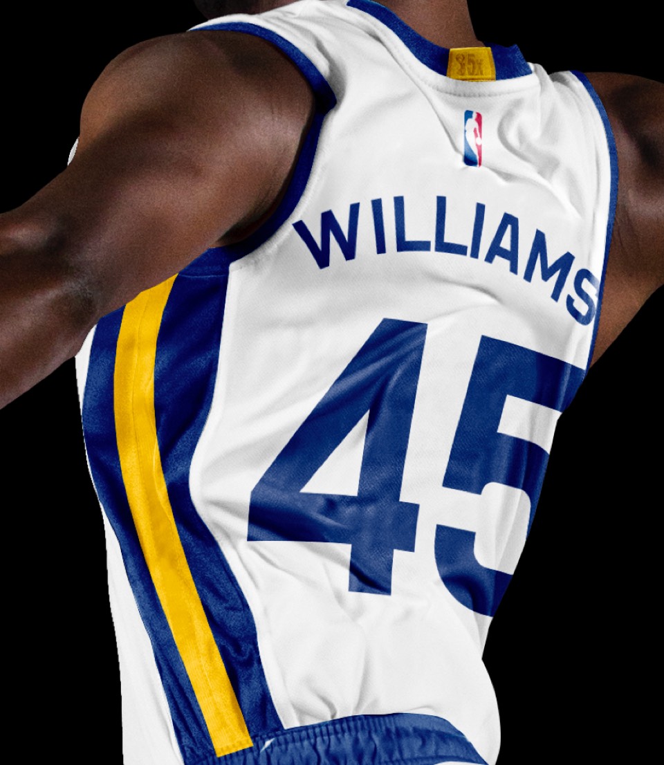
Love the decision to go from a yellow fill to a blue fill last year; we followed suit on the sides of the jersey with a single yellow stripe; simplifying all around.
Love the decision to go from a yellow fill to a blue fill last year; we followed suit on the sides of the jersey with a single yellow stripe; simplifying all around.
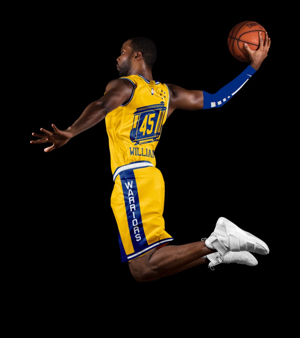
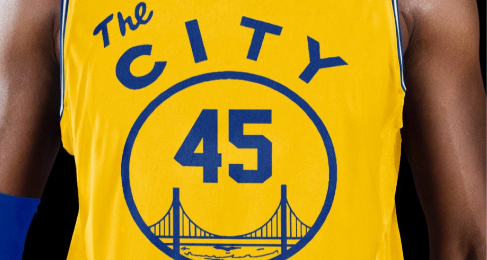
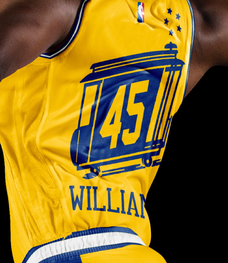
This was a no-brainer: the yellow colorway of THE CITY uniform is probably the greatest uniform of all time when you factor in the trolley numbers on the back; a must have for the set.
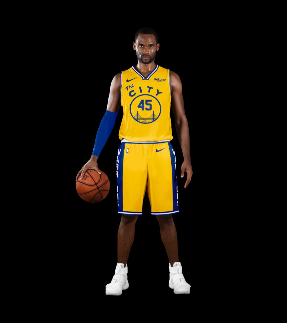
This was a no-brainer: the yellow colorway of THE CITY uniform is probably the greatest uniform of all time when you factor in the trolley numbers on the back; a must have for the set.
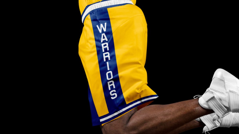
The recent THE TOWN city jersey was a perfect complement to the hardwood classic and it feels right to rep both Oakland and San Francisco here. We went with the yellow trim (superior to the blue version) and simplified the side stripes to match the other uniforms.
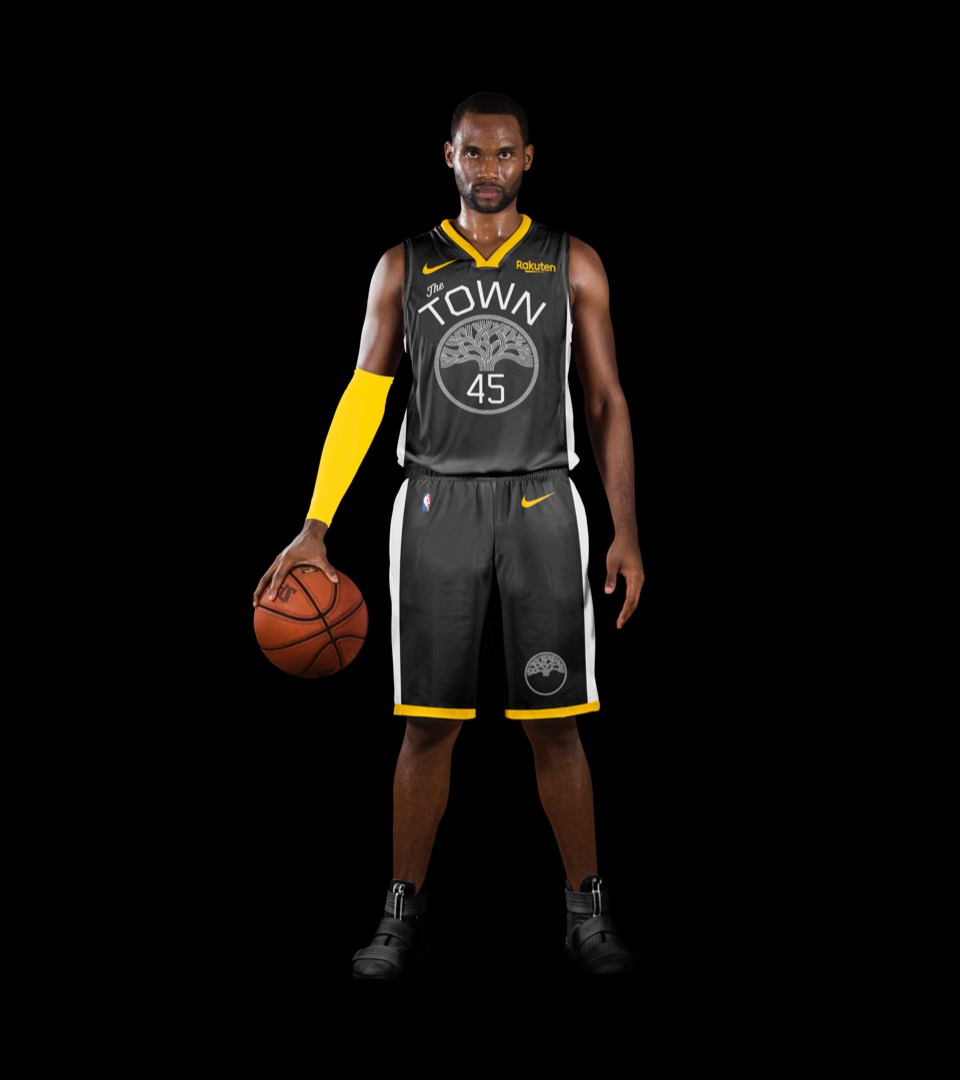
The recent THE TOWN city jersey was a perfect complement to the hardwood classic and it feels right to rep both Oakland and San Francisco here. We went with the yellow trim (superior to the blue version) and simplified the side stripes to match the other uniforms.