
An awkward arrangement that doesn't seem to fit anywhere, the red is muddy, it seems like it's inspired by the polarizing 90's era cartoon rocket but it wants to be more sophisticated and just doesn't know how. The lettering is a bit of a mess and, with the rocket booster inspiration and the Jetson-style swoops, comes off as more clip-art-retro than it probably wants to be.

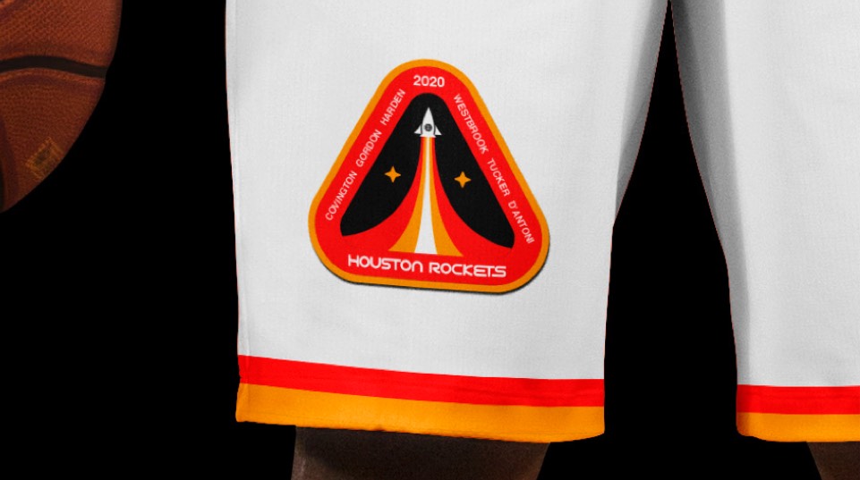
This might be my favorite of our new logos; we completely reimagined the layout as a mission patch. Starting with a return to the red and orange colors, we feature a rocket blasting into space carrying a basketball and zooming beyond two stars (one for each title) to chase after the next one.
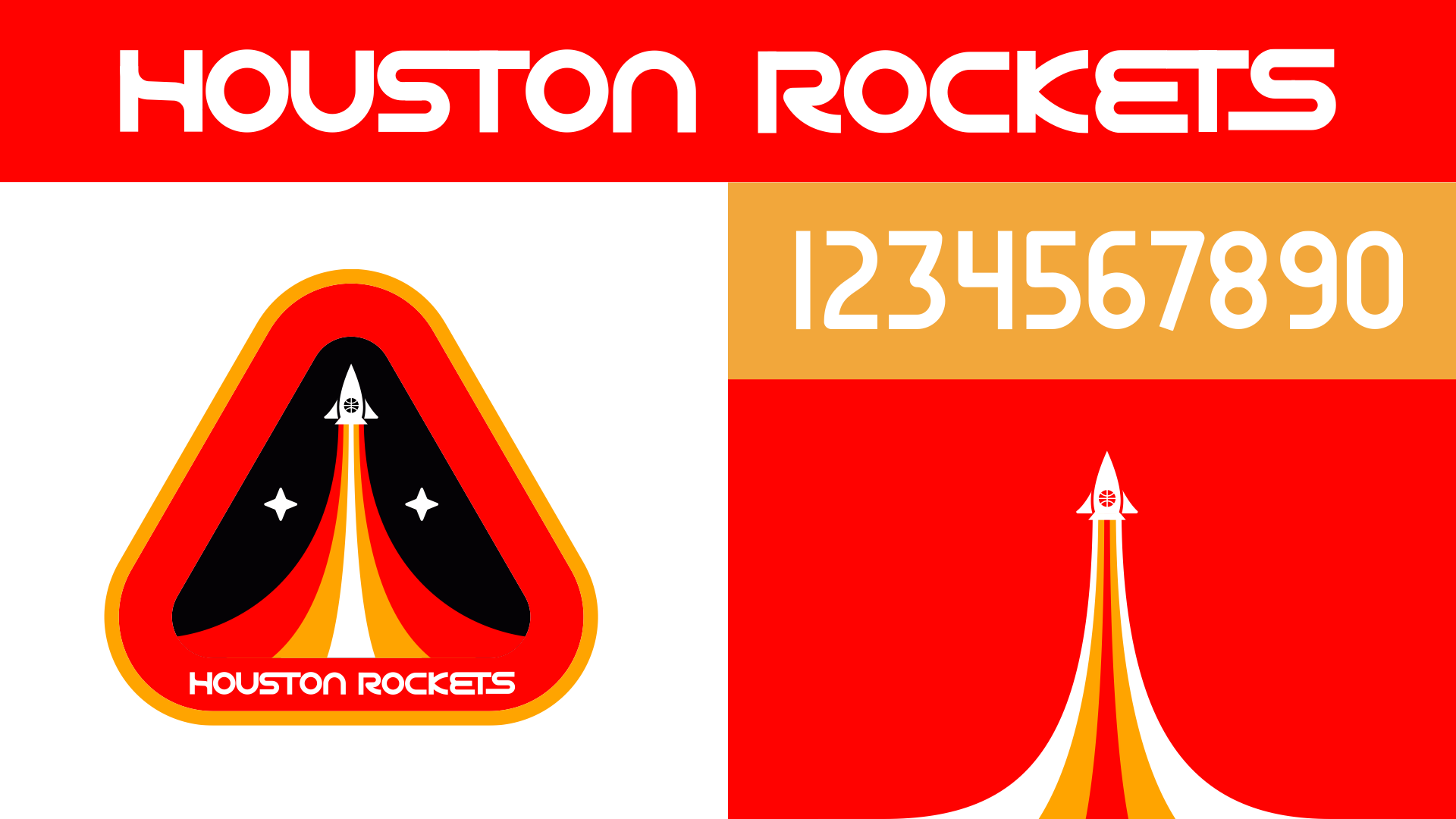
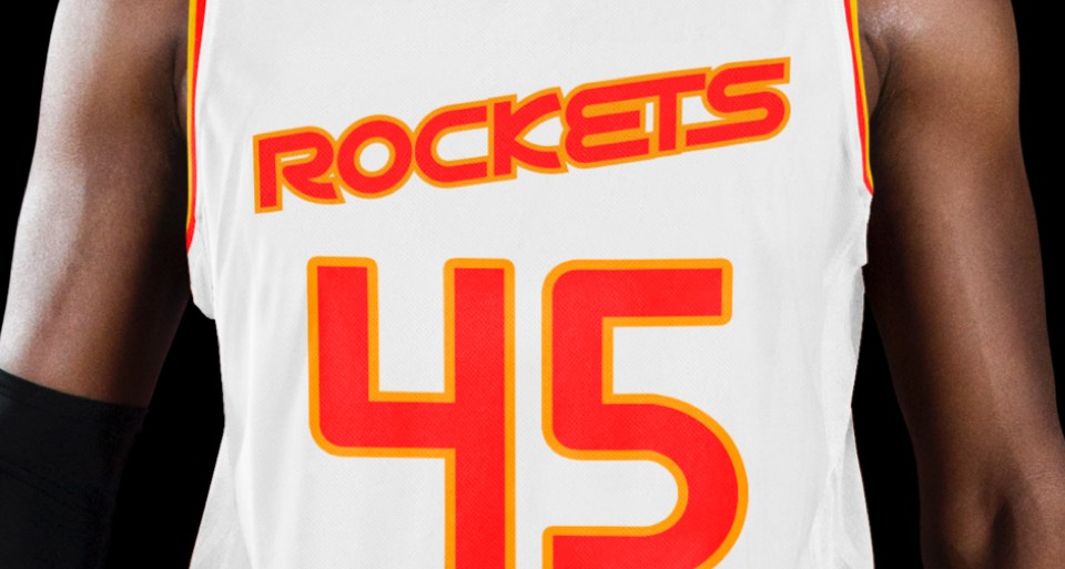
The new custom letters and numbers are inspired by principles found in the NASA "worm" logo without being a direct lift—we preserved the lowercase "n" from the Hakeem days for example, and the counter form of the K is inspired by the nose of a rocket.
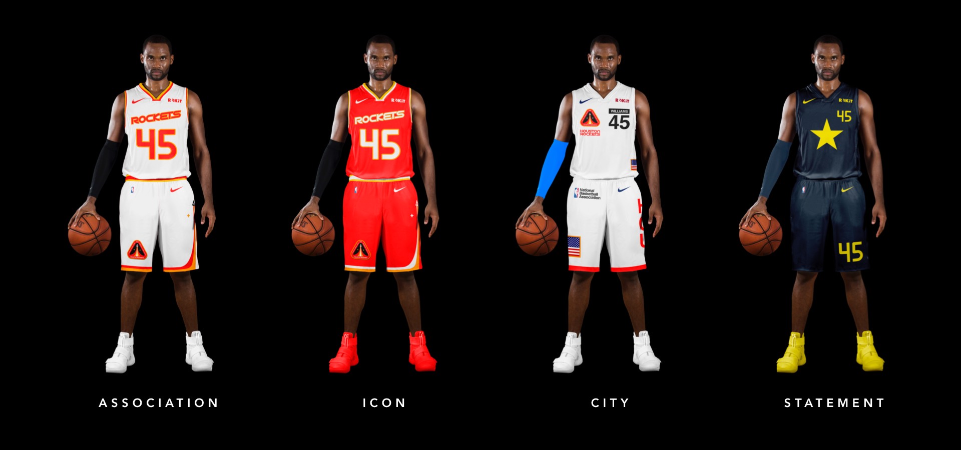
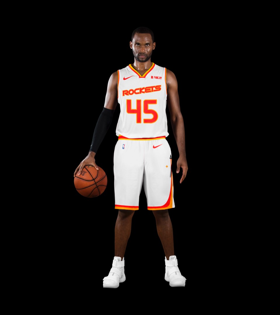
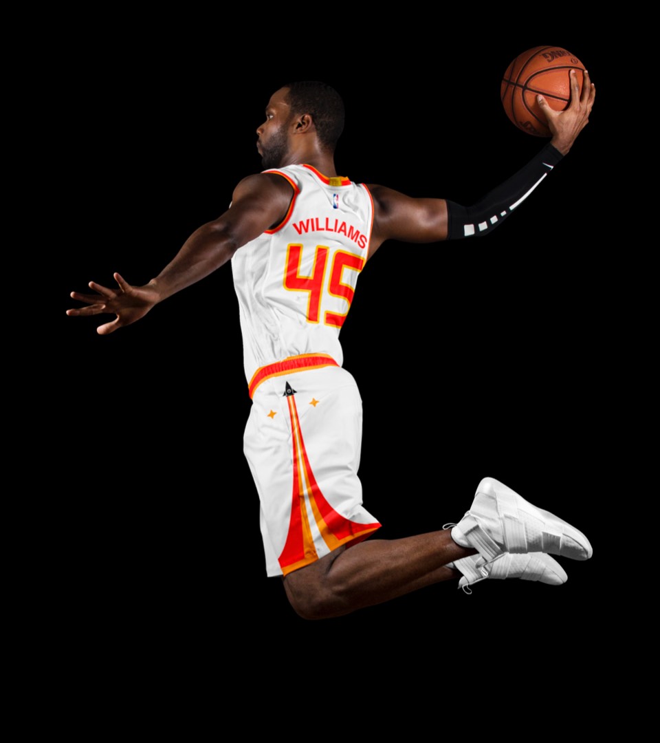
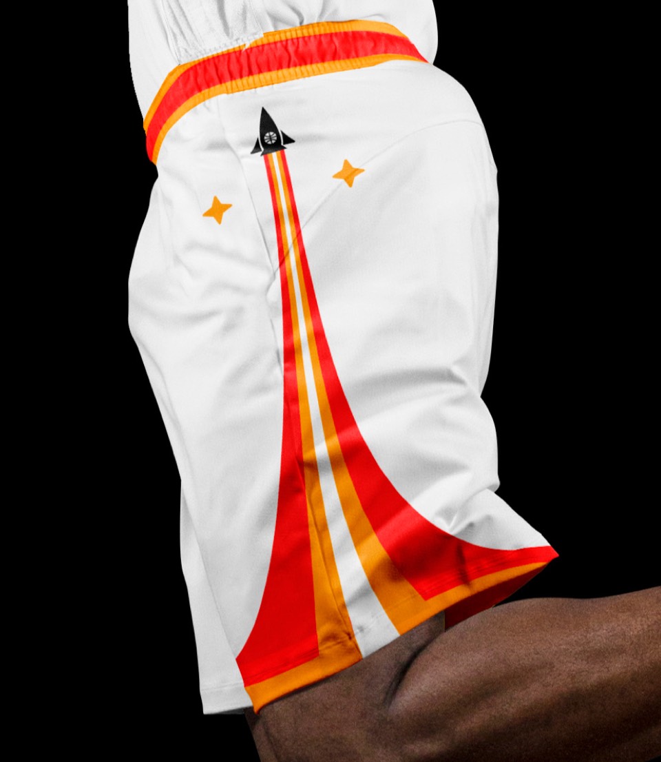
We brought back the ascendant type in addition to the red and yellow color treatment, but with a bespoke font and numbers. We included the two-stripe trim around the neck and arms but modernized it with an asymmetrical treatment for the shorts, with our rocket blasting off up the left leg.
We brought back the ascendant type in addition to the red and yellow color treatment, but with a bespoke font and numbers. We included the two-stripe trim around the neck and arms but modernized it with an asymmetrical treatment for the shorts, with our rocket blasting off up the left leg.
Same moves as the association in red. One additional note: the mission patch logo can double as an ACTUAL mission patch every year Houston makes the playoffs! We left room on the sides for the names of the starting five and either the sixth man or the head coach every year, it would be a great collector's item.
Same moves as the association in red. One additional note: the mission patch logo can double as an ACTUAL mission patch every year Houston makes the playoffs! We left room on the sides for the names of the starting five and either the sixth man or the head coach every year, it would be a great collector's item.
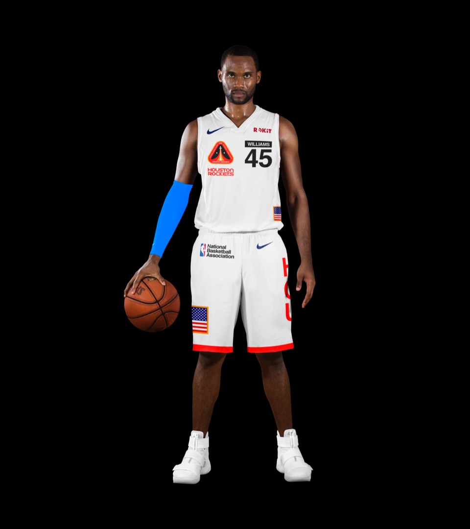
Houston has done the NASA-inspired uniform before but not like this. All the colors, sizing and positioning of the elements are inspired by a combination of jumpsuits, EMUs and rocket markings: there's a mission patch on the front right breast with the last name and number on the left breast; Helvetica labels abound as a shout out to NASA's graphic standard; oversized NBA logos, American flags throughout. And a couple finishing touches: the Saturn-rocket-style HOU up the side of the shorts and the EMU-style single red trim stripe at the knee.
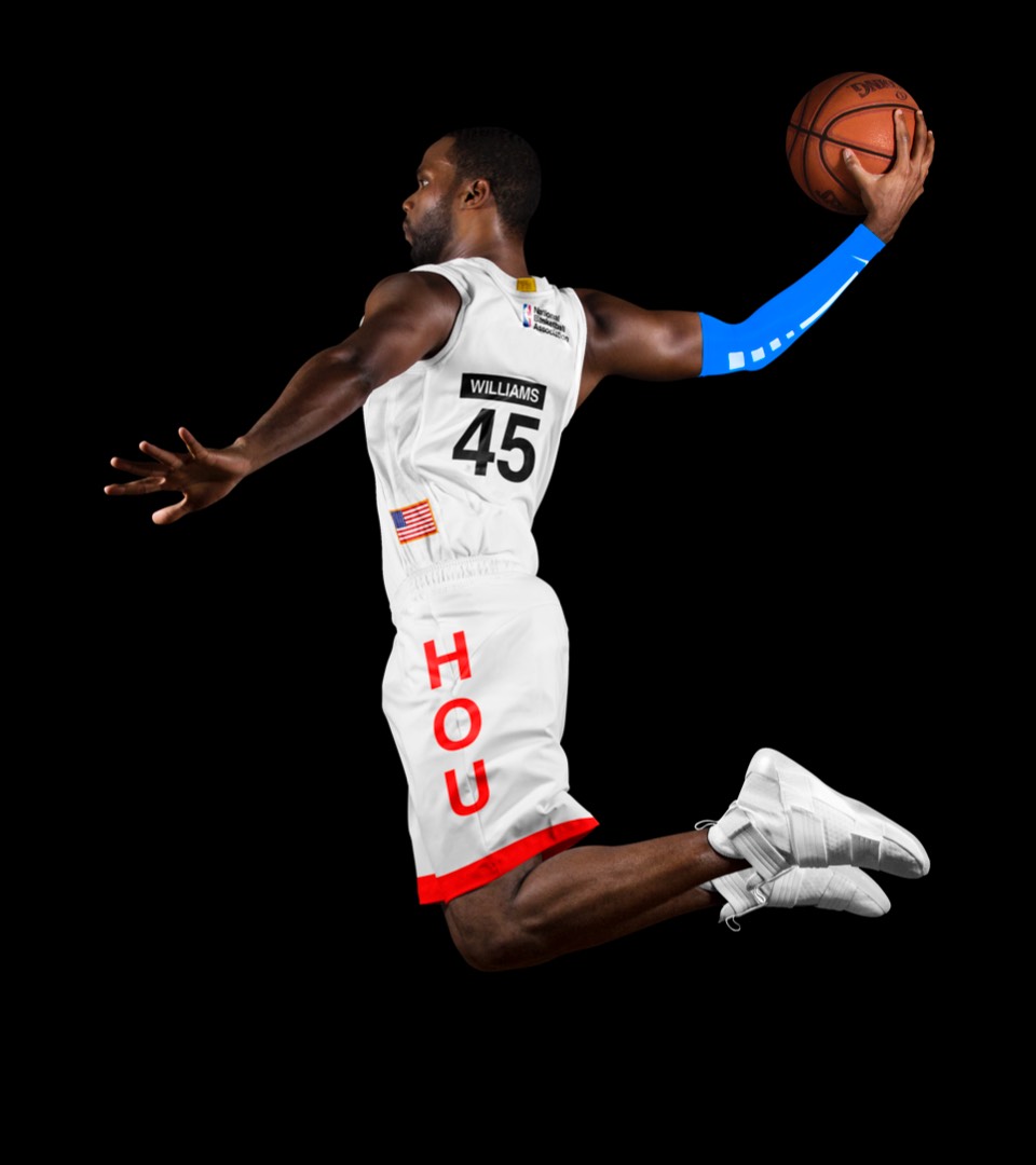
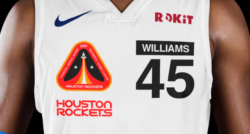
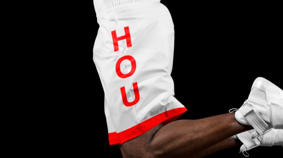
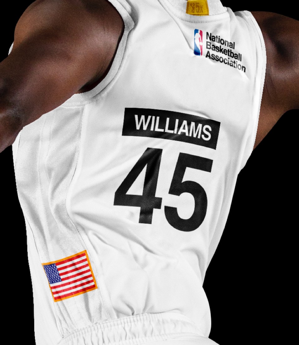
Houston has done the NASA-inspired uniform before but not like this. All the colors, sizing and positioning of the elements are inspired by a combination of jumpsuits, EMUs and rocket markings: there's a mission patch on the front right breast with the last name and number on the left breast; Helvetica labels abound as a shout out to NASA's graphic standard; oversized NBA logos, American flags throughout. And a couple finishing touches: the Saturn-rocket-style HOU up the side of the shorts and the EMU-style single red trim stripe at the knee.
A uniform capturing the first national flag of the Republic of Texas, approved by none other than Sam Houston. The epitome of the Lone Star ideal, it features a single yellow star on a navy kit with only the requisite player number and name as complementary elements.
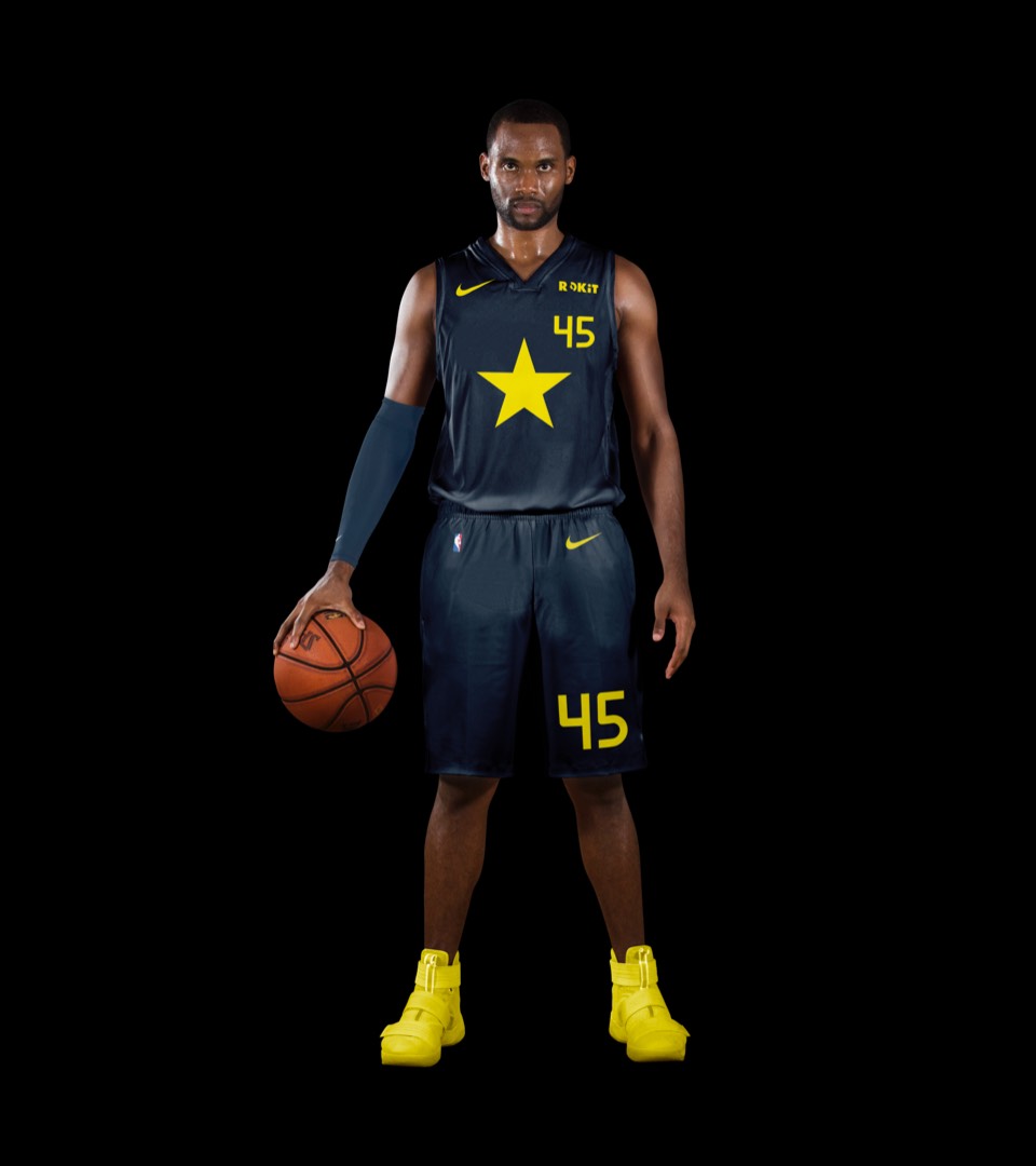
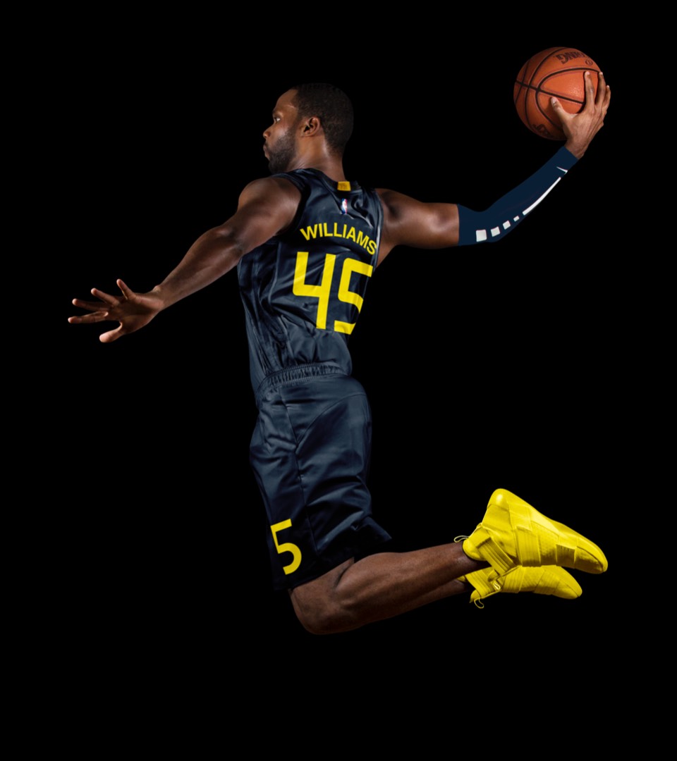
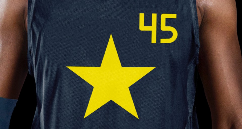
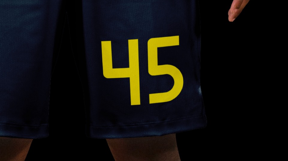
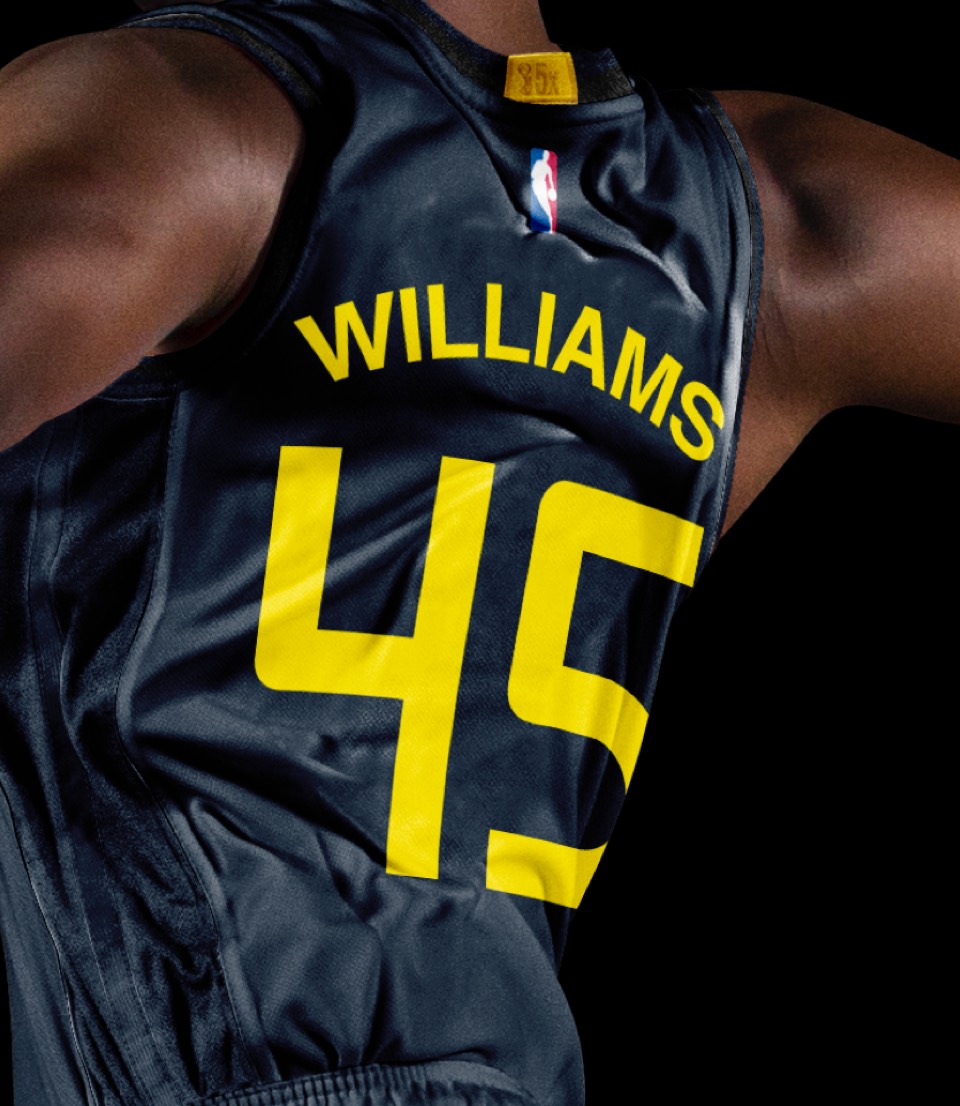
A uniform capturing the first national flag of the Republic of Texas, approved by none other than Sam Houston. The epitome of the Lone Star ideal, it features a single yellow star on a navy kit with only the requisite player number and name as complementary elements.