

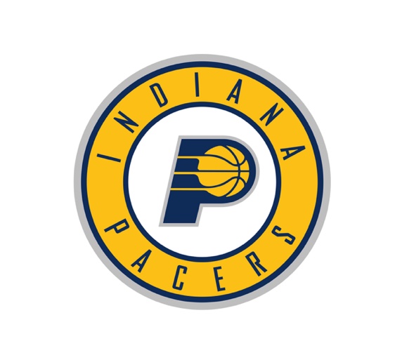
The basketball + P is a nice signature but they've gone and wrapped it in the trendy/played-out circle "seal". Also strange that for a team with a logo that is the first letter of their name, the wordmark doesn't match the style of the P in the logo.


Easy remedy for all that - do the things we weren't seeing! Ditched the ornamental type around the P to bring their signature element front and center, and created a custom logotype from the P
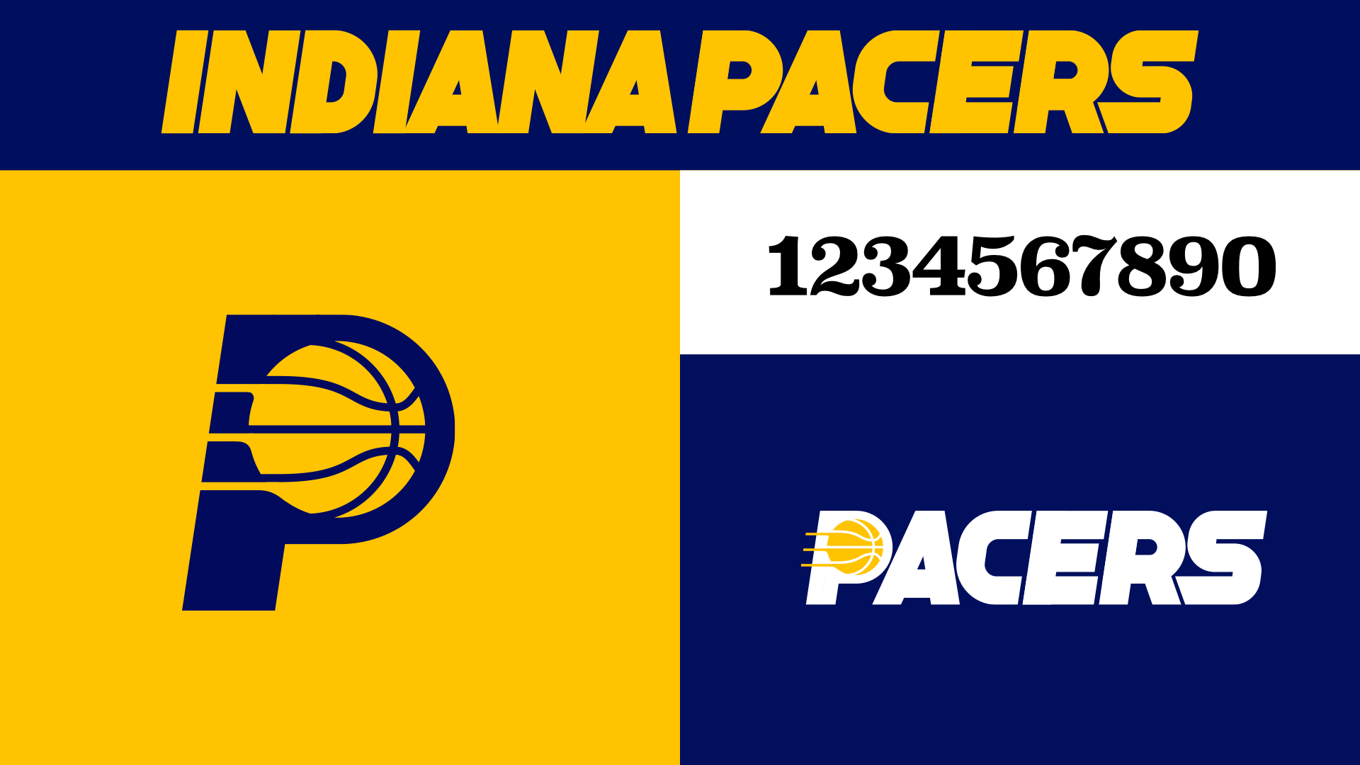
The custom lettering allows for a nice little secondary PACERS logo; also including black-on-white vintage indy-style race numbers.
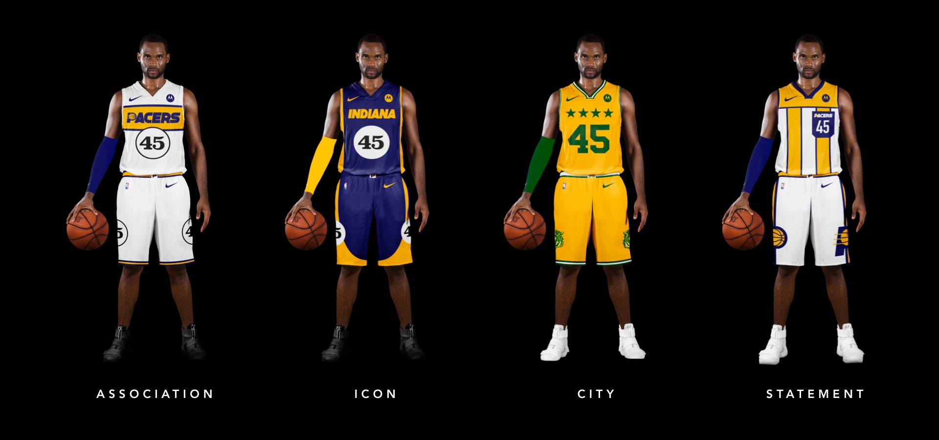
We've promoted the pace car theme last seen on the city jerseys to the primary expression for Indy. The white uniforms draw on a previous Pacers kit with a horizontal racing stripe across the chest that wraps around to house the player name on back. Rounded out with the iconic circular racing numbers on the front and sides and black shoes for the "tires".
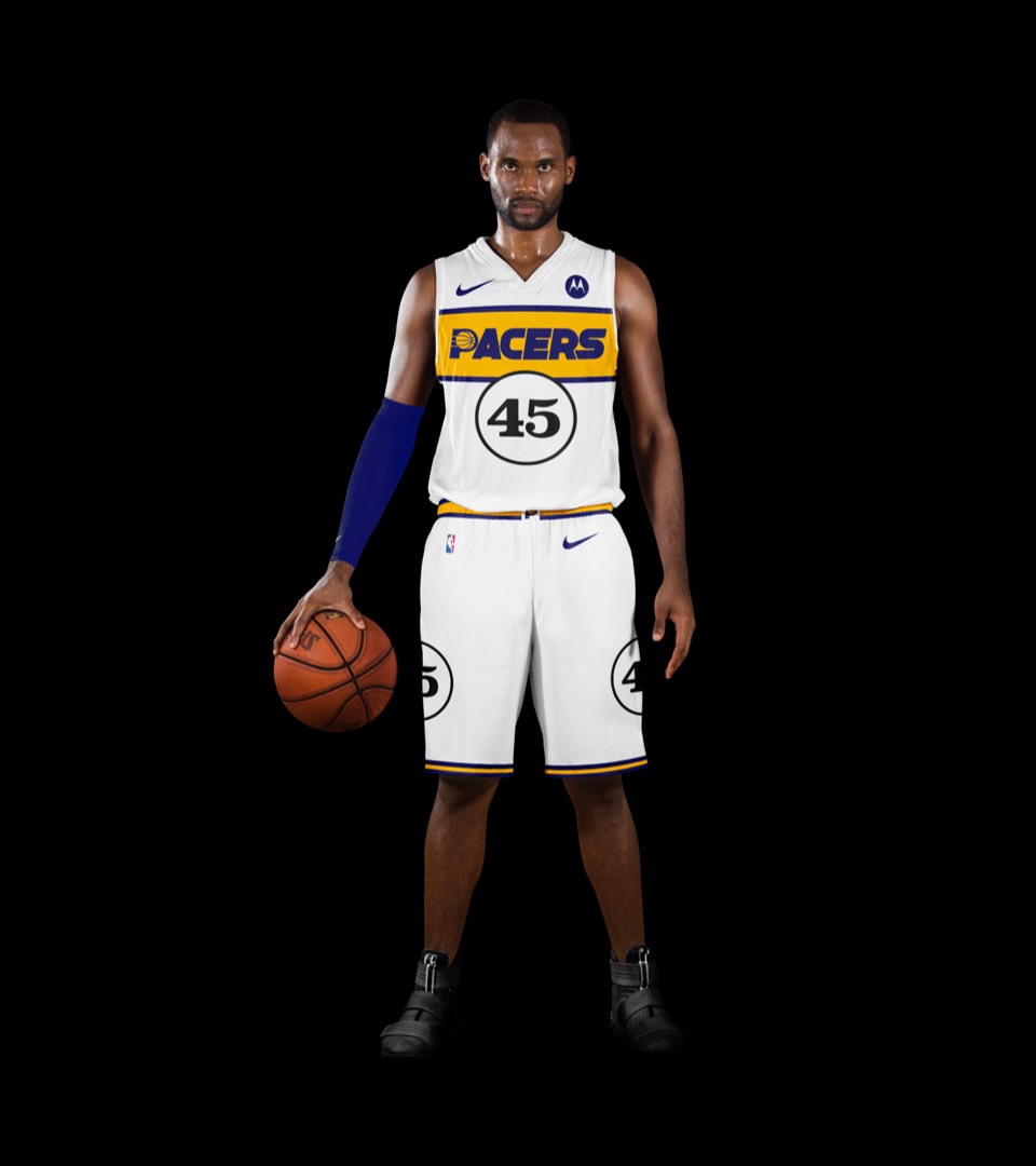
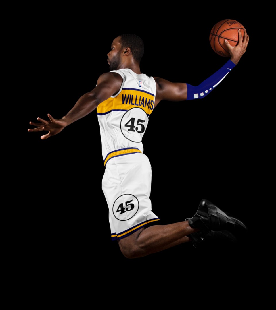
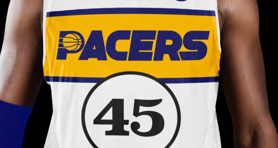
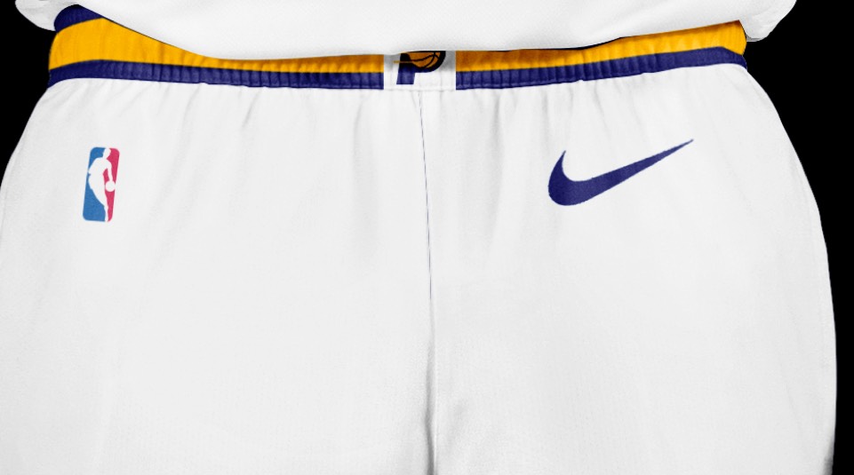
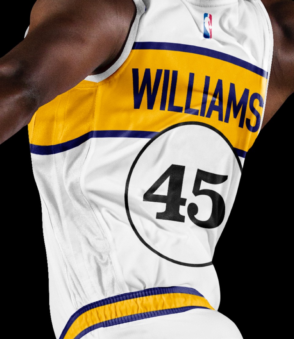
We've promoted the pace car theme last seen on the city jerseys to the primary expression for Indy. The white uniforms draw on a previous Pacers kit with a horizontal racing stripe across the chest that wraps around to house the player name on back. Rounded out with the iconic circular racing numbers on the front and sides and black shoes for the "tires".


A rare case of the icon and association jerseys getting not only inverse colorways, but new "paint jobs" (feels appropriate for the Indy car theme). The Icon uniform gets a vertical racing stripe down the sides, and a player name that wraps around the number decal.
A rare case of the icon and association jerseys getting not only inverse colorways, but new "paint jobs" (feels appropriate for the Indy car theme). The Icon uniform gets a vertical racing stripe down the sides, and a player name that wraps around the number decal.
Crispus Attucks. The forgotten Hoosiers. It would be amazing to see Indy make up for selling out and featuring the fake Hoosier uniforms by creating a replica of Oscar Robertson's championship High School team, the first all-black school to win the Indiana State Title.
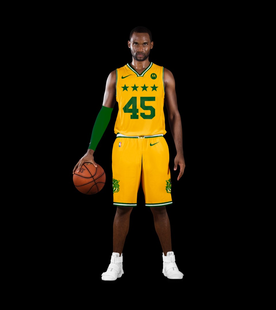
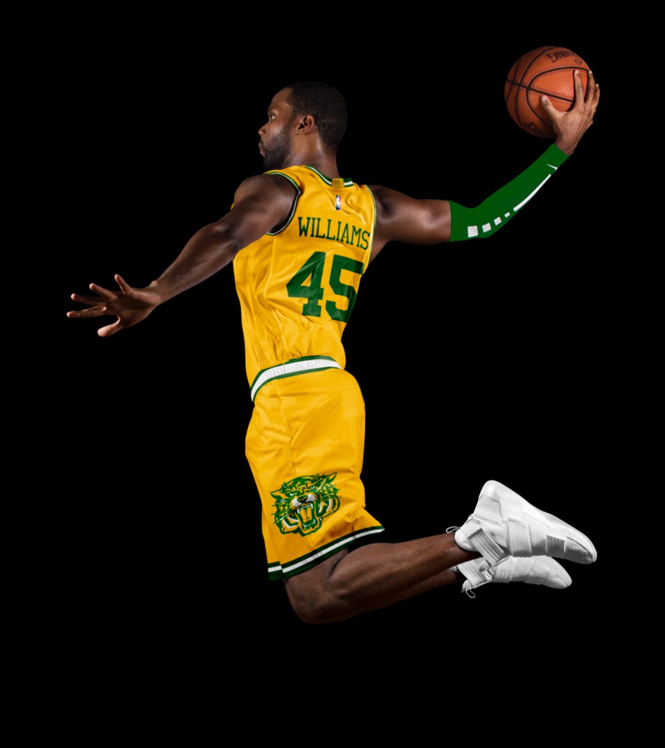
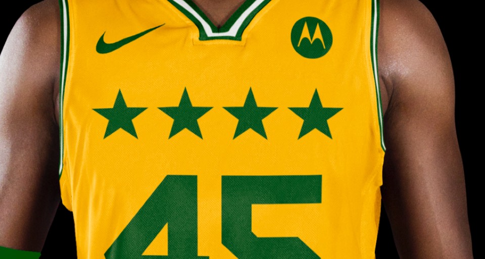
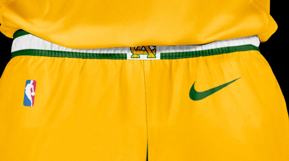
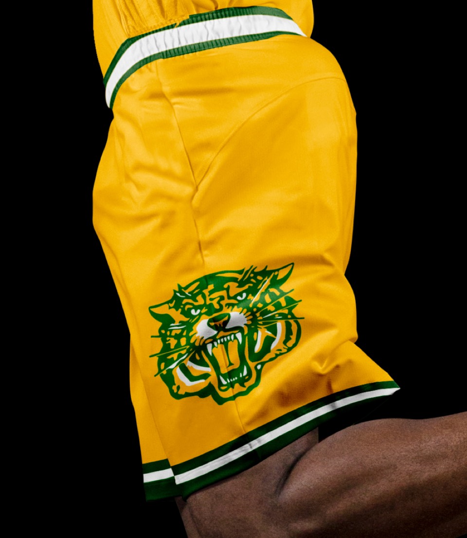
Crispus Attucks. The forgotten Hoosiers. It would be amazing to see Indy make up for selling out and featuring the fake Hoosier uniforms by creating a replica of Oscar Robertson's championship High School team, the first all-black school to win the Indiana State Title.


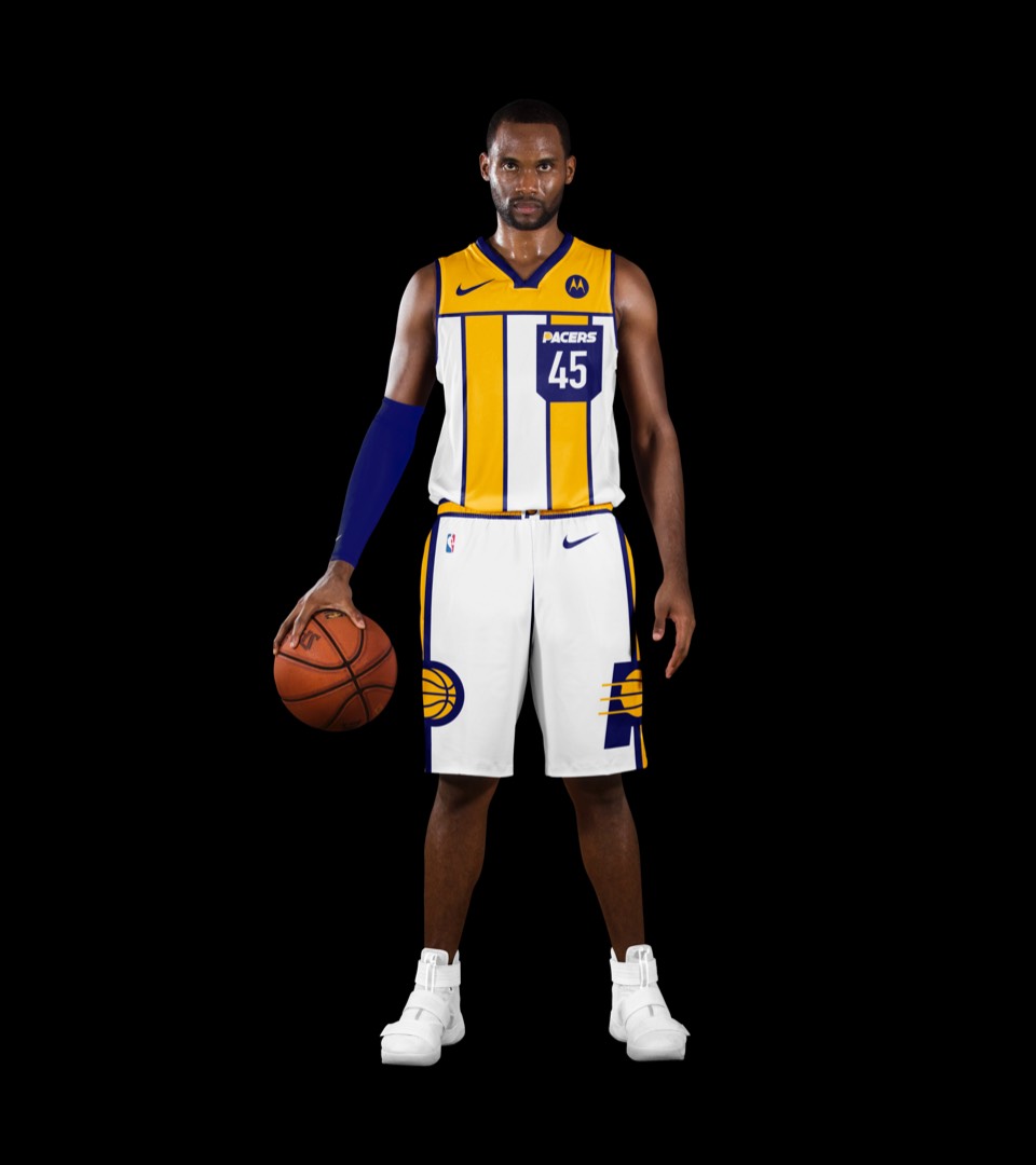
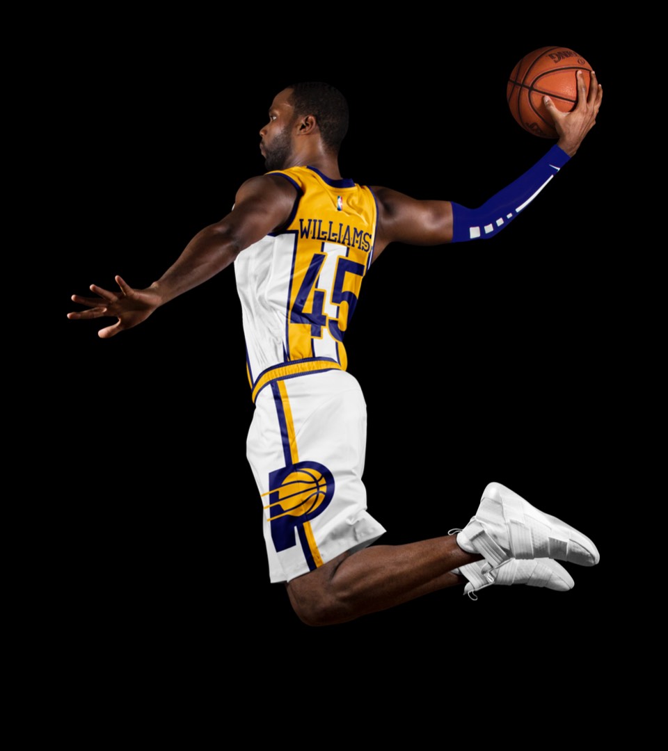
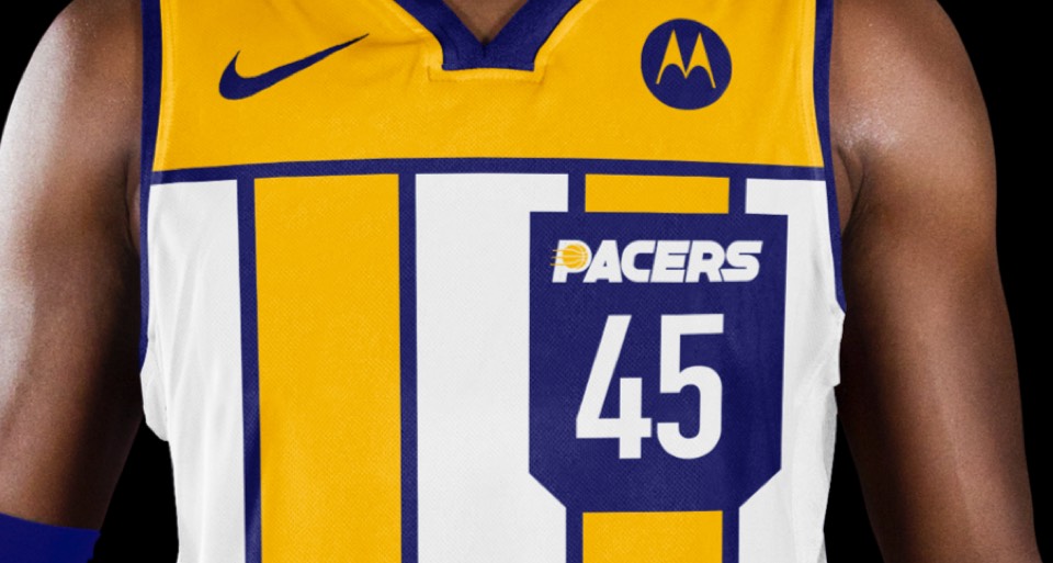
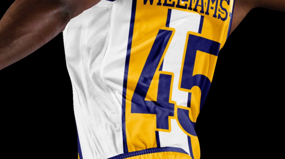
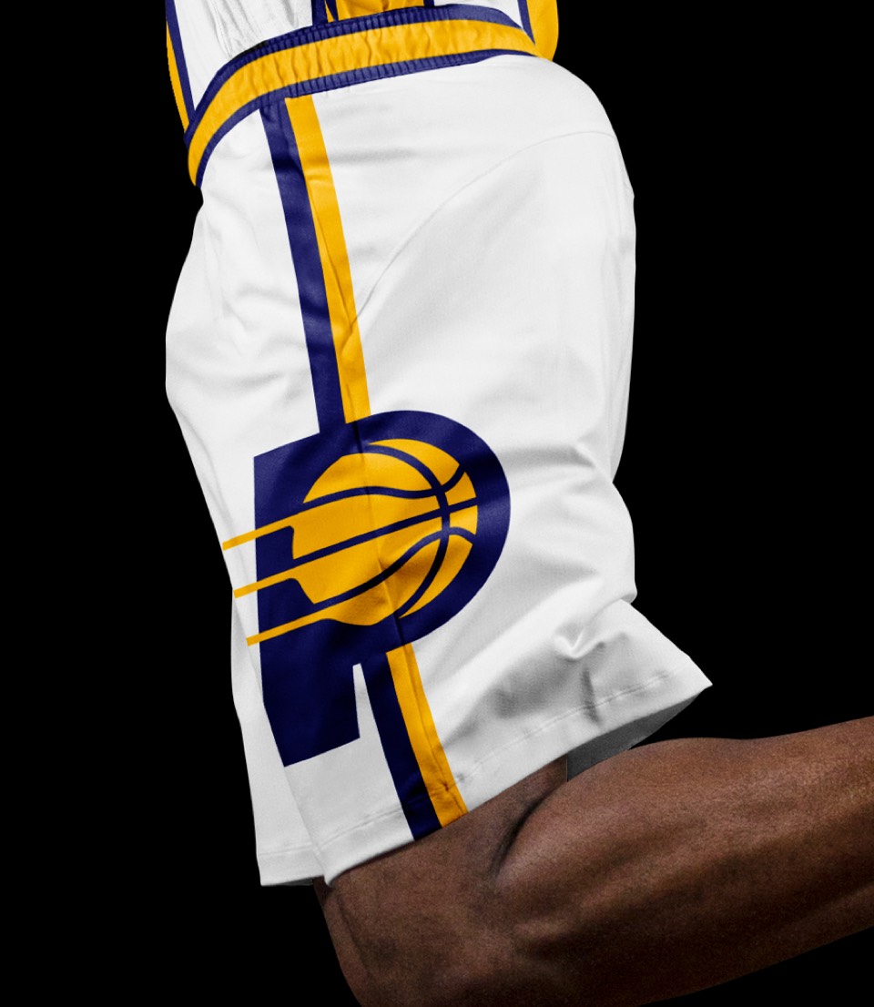
We can't forget that the Pacer name comes from horse racing. Before pace cars, it was pacer horses that made Indiana famous. This jockey-inspired design features two vertical stripes, a breast "pocket" with the PACERS secondary logo and number, and a huge P monogram on the shorts.


We can't forget that the Pacer name comes from horse racing. Before pace cars, it was pacer horses that made Indiana famous. This jockey-inspired design features two vertical stripes, a breast "pocket" with the PACERS secondary logo and number, and a huge P monogram on the shorts.
