

There is so much to talk about that is wrong, it's overwhelming. The beveled type (a poorly-done version of what would have been a bad move anyway), the lines, the sort-of-basketball with a "basketball court" LAC monogram in the center (reading "LA CLIPPERS CLIPPERS"?). Best to just move on.


If the Lakers = Hollywood, the Clippers = Santa Monica. We brought back the old San Diego Clippers logo and added a couple sails to give it a bottom arc that would be specific to a clipper ship. There are now five sails (one for each player on the court) in front of a sun on a blue circle (representing the ocean/sky). The lighter blue circle and the text layout is a nice counterpoint to the Lakers' yellow circle—it's nice when local teams can have a subtle visual connection (like how all Pittsburgh teams are black and yellow).
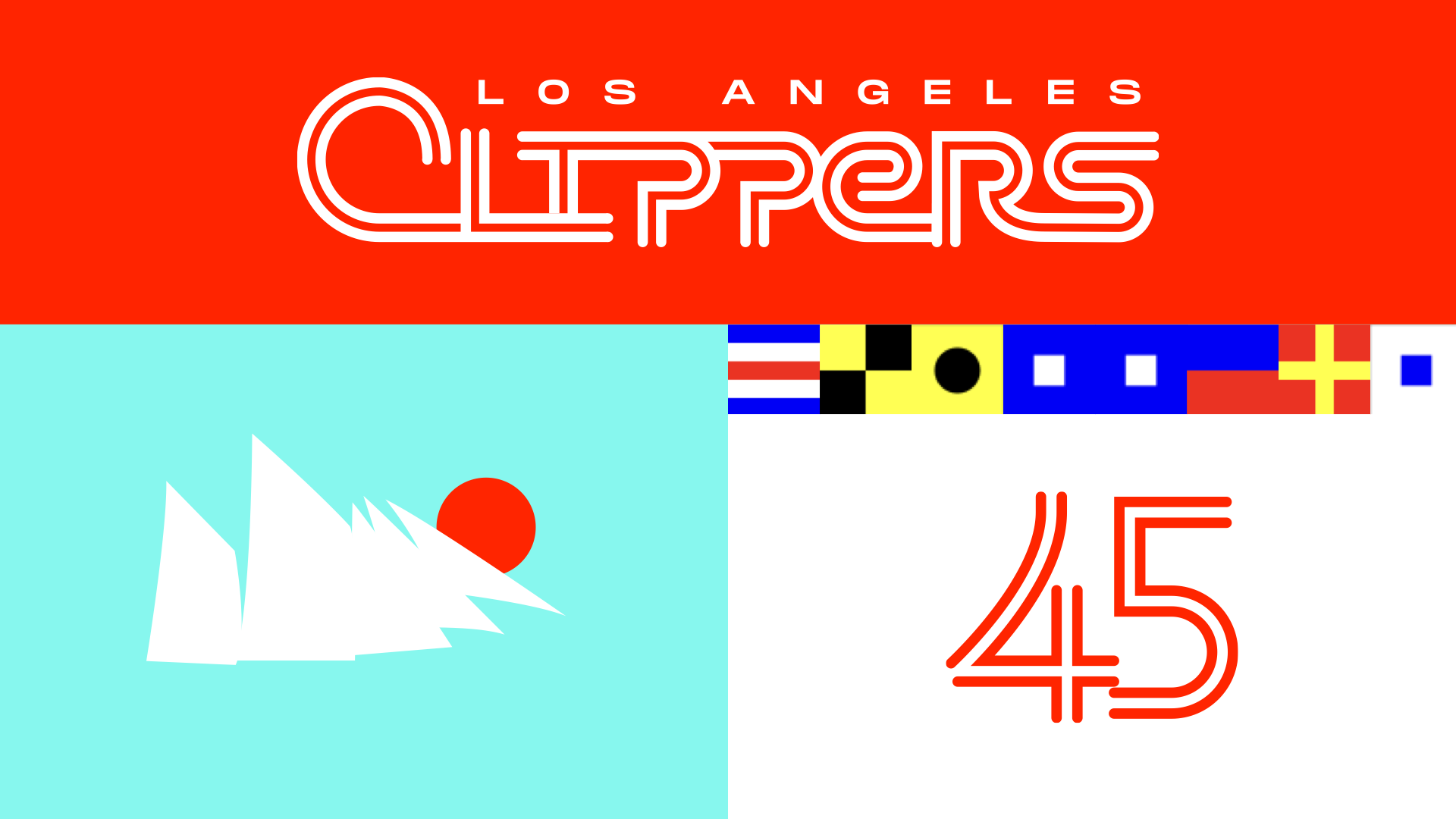
We created an inline lettering/numbering approach inspired by west coast surf culture, and brightened up the red a bit. The most fun we had was spelling out CLIPPERS in nautical flag symbols as a graphic element—been done before by fans and we really think this should be a thing!
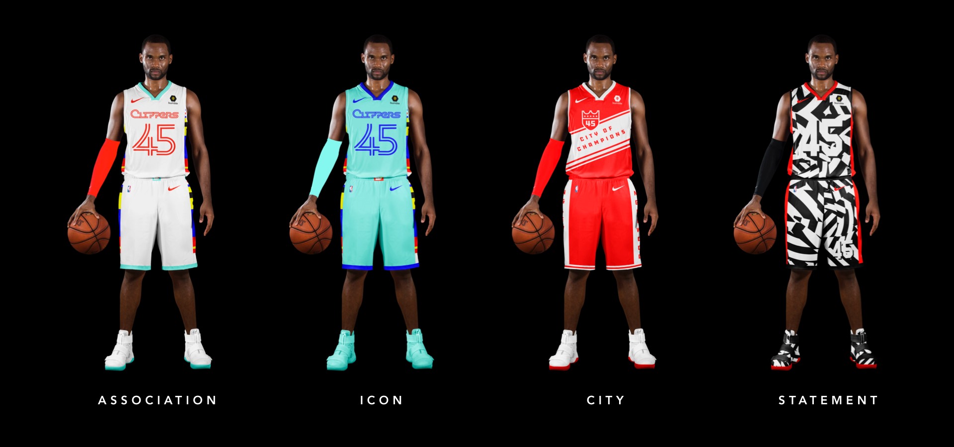
Red on white here, with a clipper ship belt buckle and the CLIPPERS flags running down each side of the uniform (makes the shorts especially awesome).
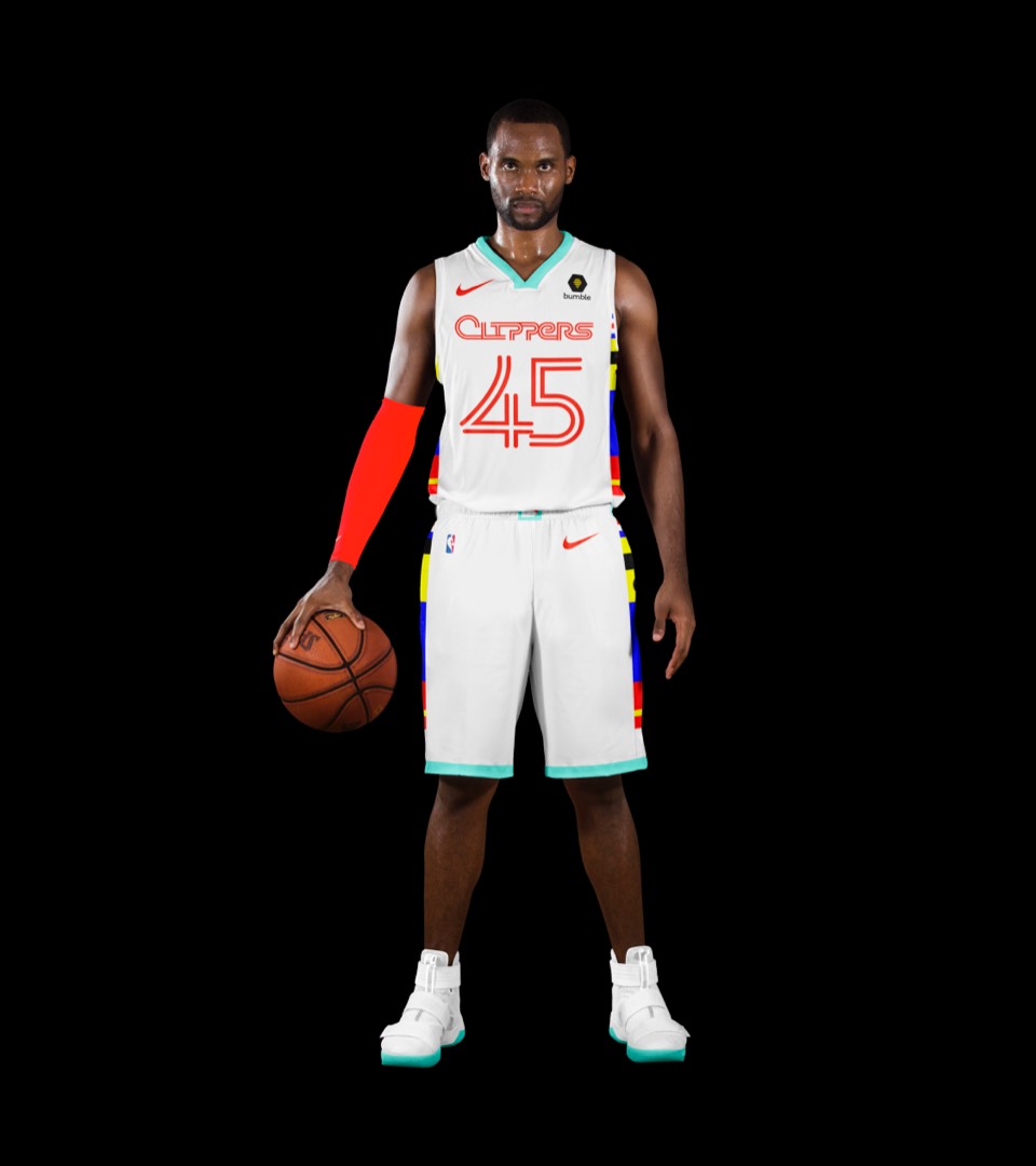
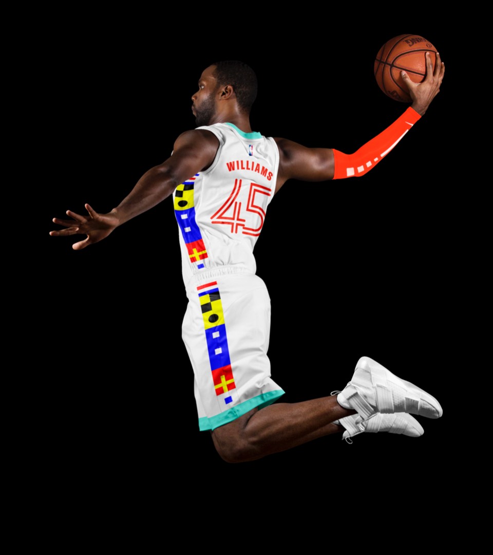
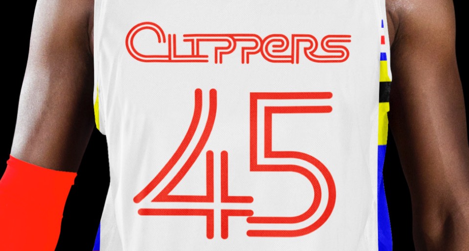
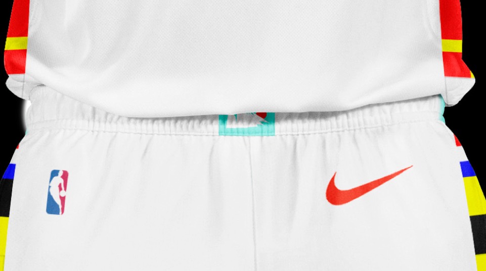
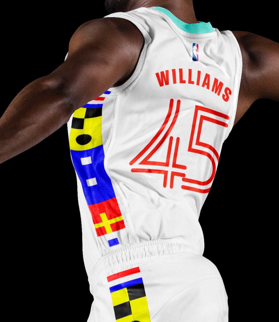
Red on white here, with a clipper ship belt buckle and the CLIPPERS flags running down each side of the uniform (makes the shorts especially awesome).


Blue on blue feels right here, and like the lakers, we're saying CLIPPERS on both Association and Icon jerseys; they don't own Los Angeles, it might actually be confused with the Lakers if we did put LA on a jersey!
Blue on blue feels right here, and like the lakers, we're saying CLIPPERS on both Association and Icon jerseys; they don't own Los Angeles, it might actually be confused with the Lakers if we did put LA on a jersey!
The Clippers are planning to move to Inglewood in 2024-ish; consider this a housewarming gift. Inglewood happens to have the coolest city motto there is: City of Champions (and yes we realize that's a bit of an oxymoron for the Clips; consider it a speaking-your-dreams-into-existence thing). The flood of their accent red color and a layout—inspired by one of Inglewood's old city signs— is striking and who wouldn't want shorts that say INGLEWOOD down the sides?
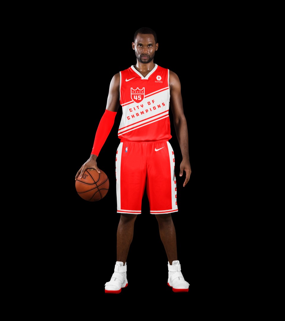
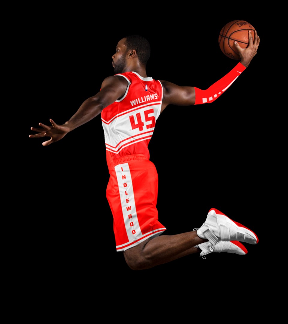
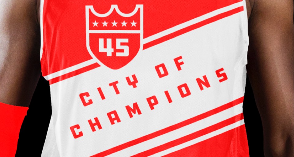
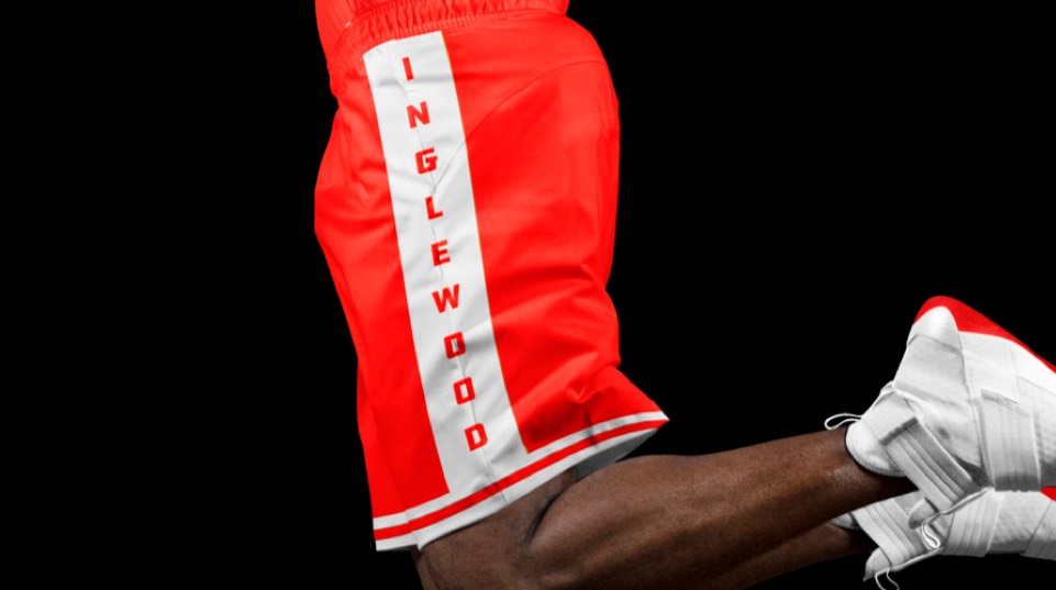
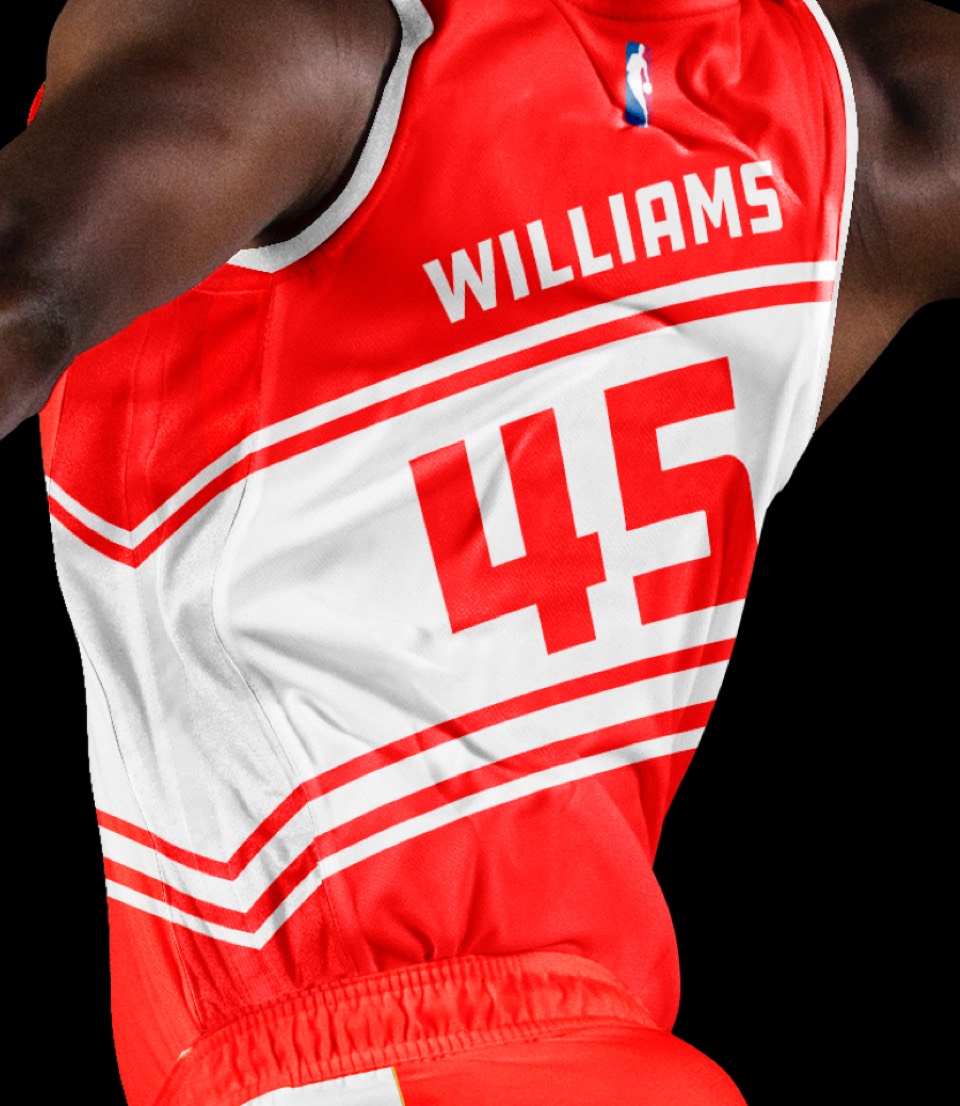
The Clippers are planning to move to Inglewood in 2024-ish; consider this a housewarming gift. Inglewood happens to have the coolest city motto there is: City of Champions (and yes we realize that's a bit of an oxymoron for the Clips; consider it a speaking-your-dreams-into-existence thing). The flood of their accent red color and a layout—inspired by one of Inglewood's old city signs— is striking and who wouldn't want shorts that say INGLEWOOD down the sides?


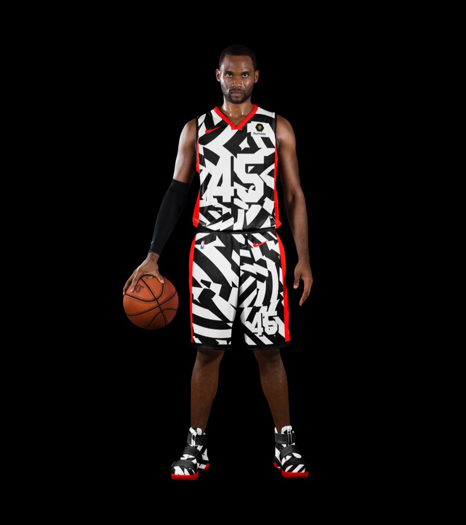
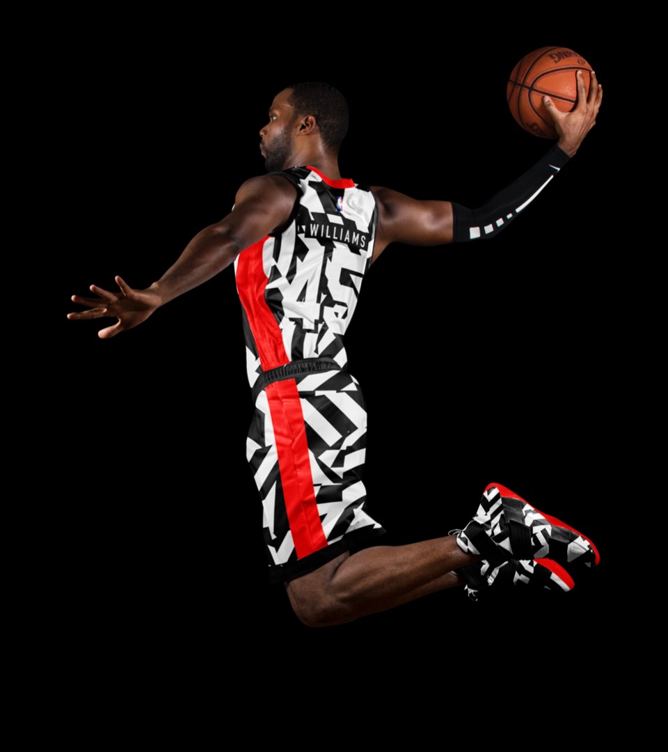
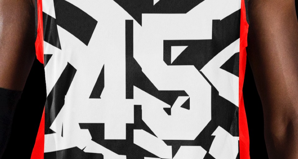
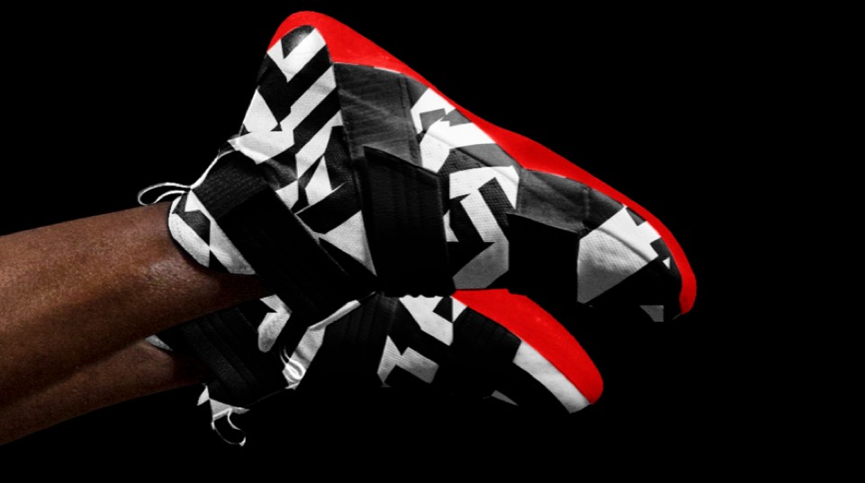
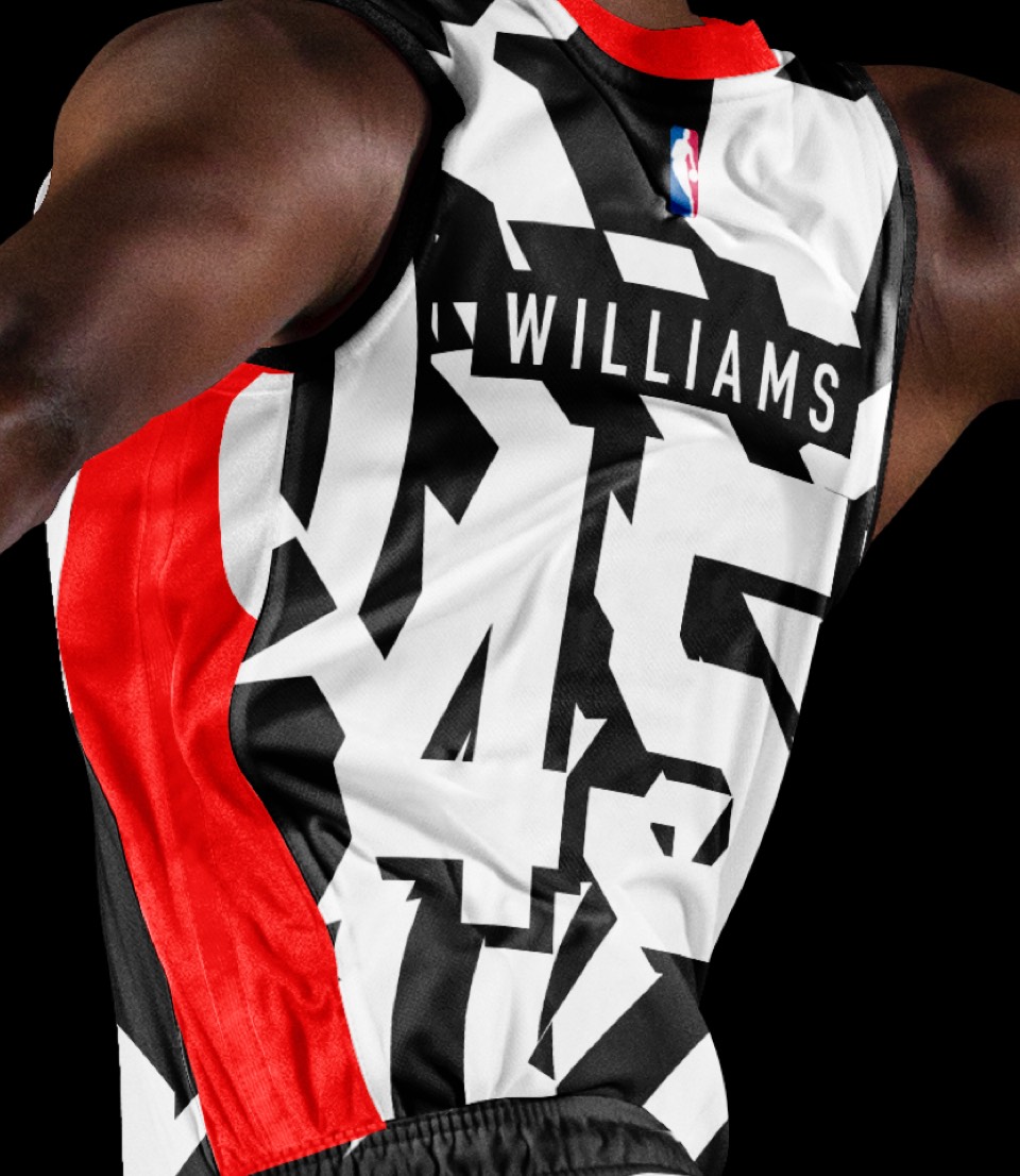
Two words: DAZZLE. CAMO. First used on WWI clipper ships, we brought it to the court, right down to slightly camouflaged battleship numbers! I have to imagine this is breaking a half dozen uniform standards for the NBA but it would be so worth it to bend some rules and make this (or at least the shoes) a reality.


Two words: DAZZLE. CAMO. First used on WWI clipper ships, we brought it to the court, right down to slightly camouflaged battleship numbers! I have to imagine this is breaking a half dozen uniform standards for the NBA but it would be so worth it to bend some rules and make this (or at least the shoes) a reality.
