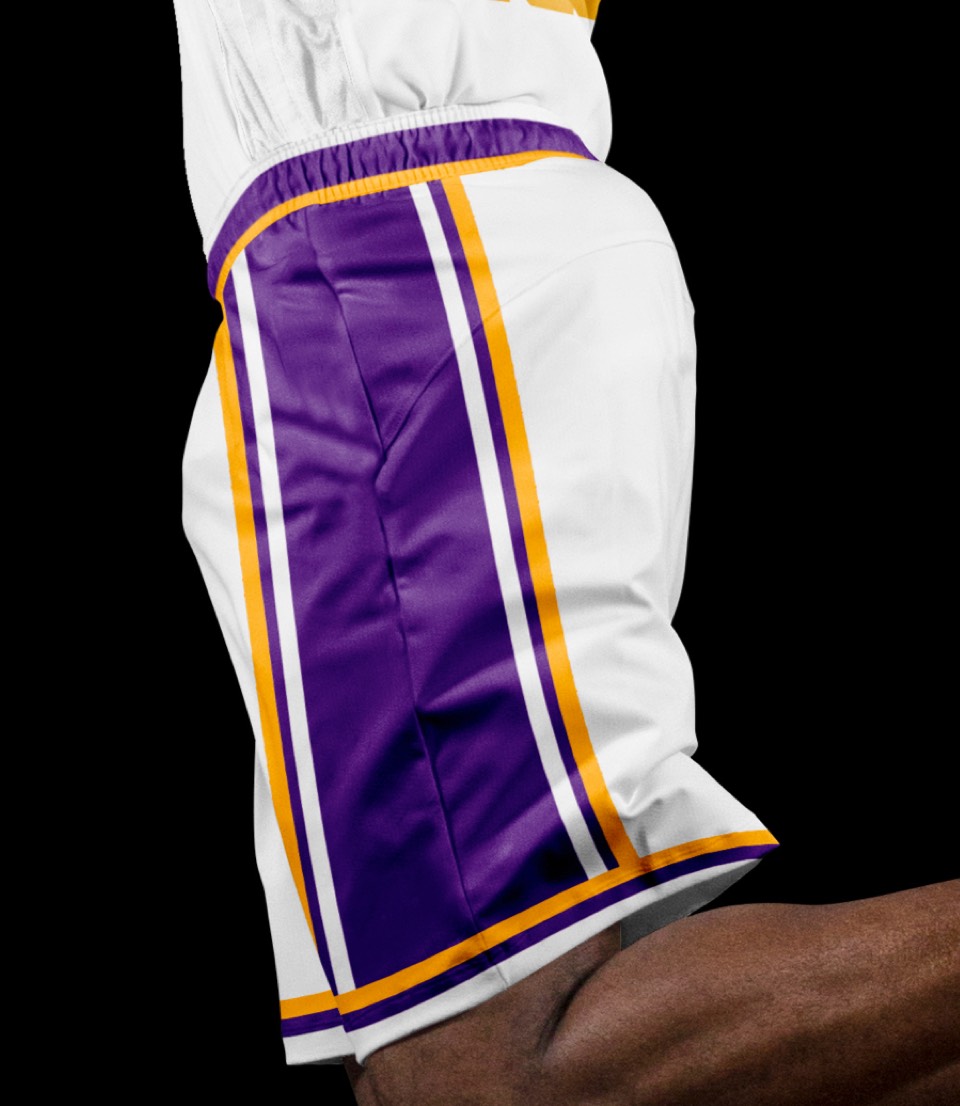


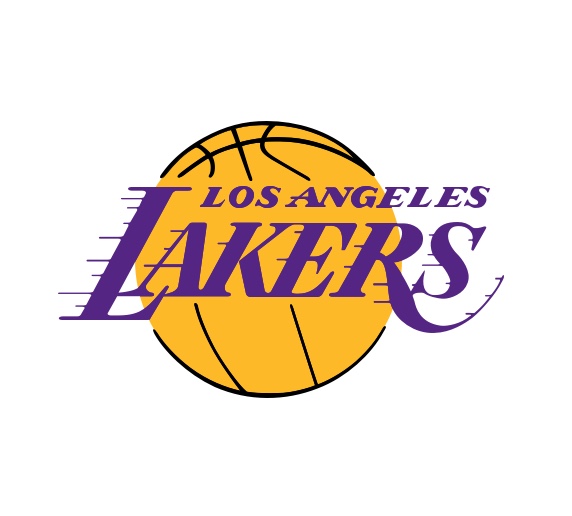
As iconic as the logo is, there is one subtle tweak to look at. For one, they have an inexplicably-black outline of a basketball behind their logo. At this point, nobody in the entire world needs to have it explained to them that the lakers play basketball, the black clashes with the purple and the line art competes with the Lakers lettering.


So we removed it! The streamlined logo feels like something built for the modern world without losing the iconic charm of the real hero, the (unchanged) LAKERS lettering. The circle even feels better and more appropriate as the Los Angeles sun than a basketball and widens the Lakers reach as a cultural icon, not just a basketball team.
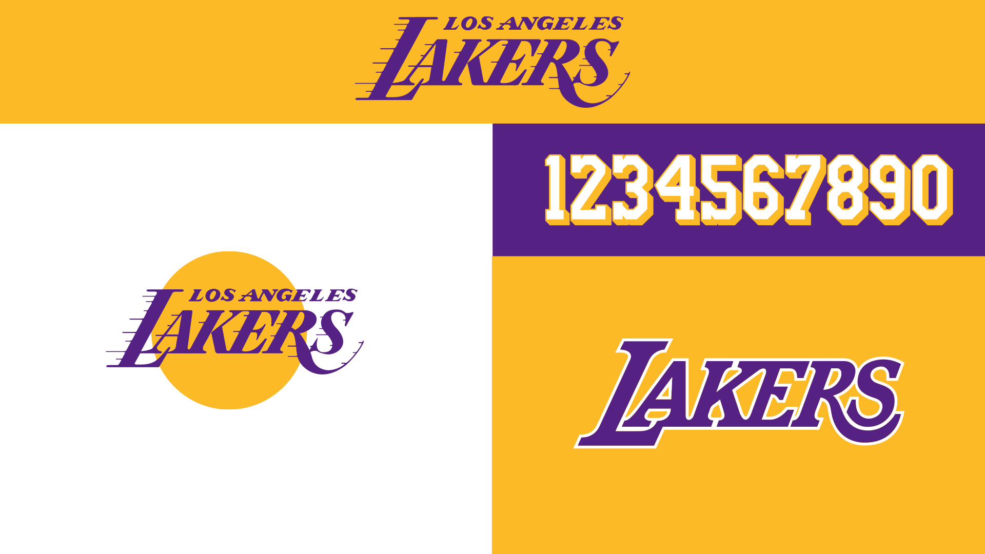
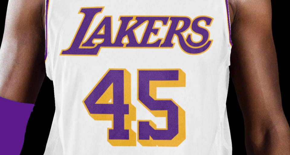
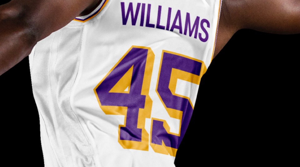
This was all about curation, not creation— we determined the Showtime-era numbers were the best option, and the only tweak we made was a very minor kerning fix between the E and the R on the secondary LAKERS lettering.
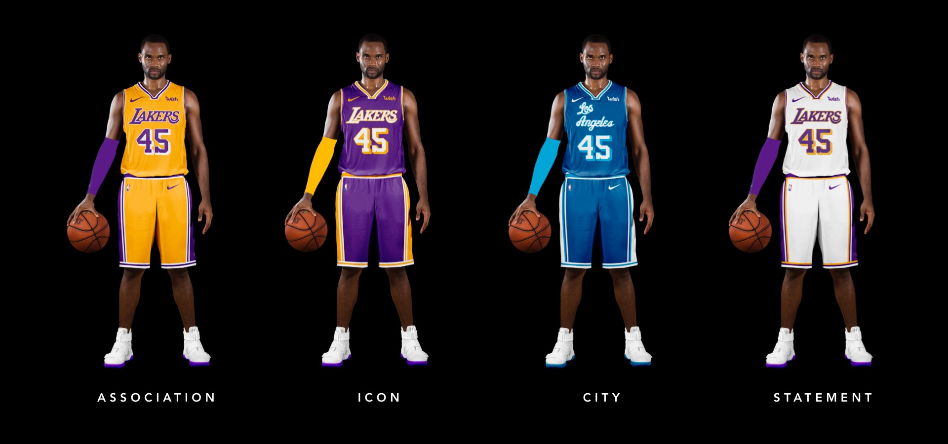
Showtime. Enough said.
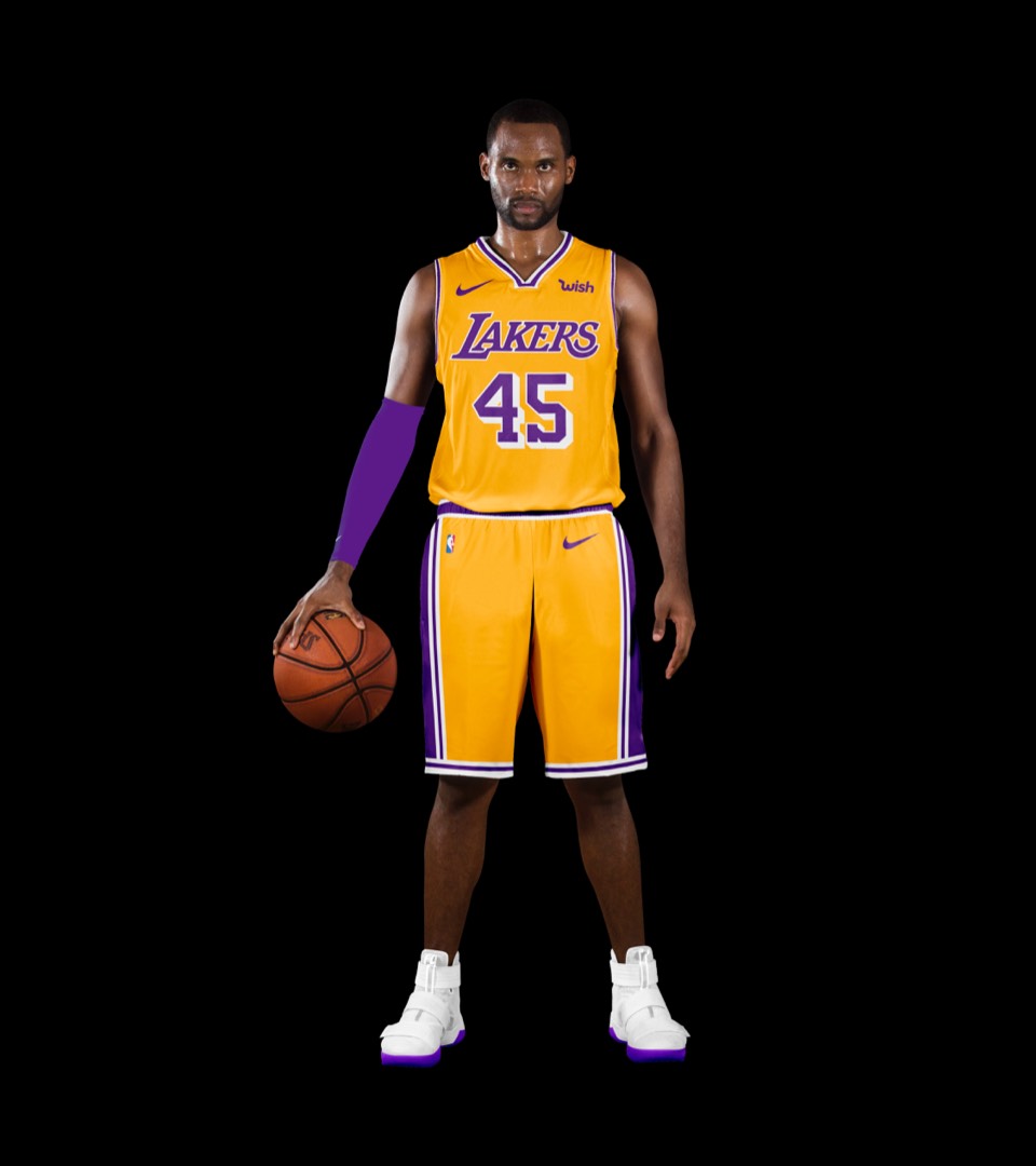
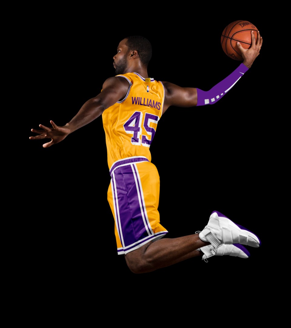
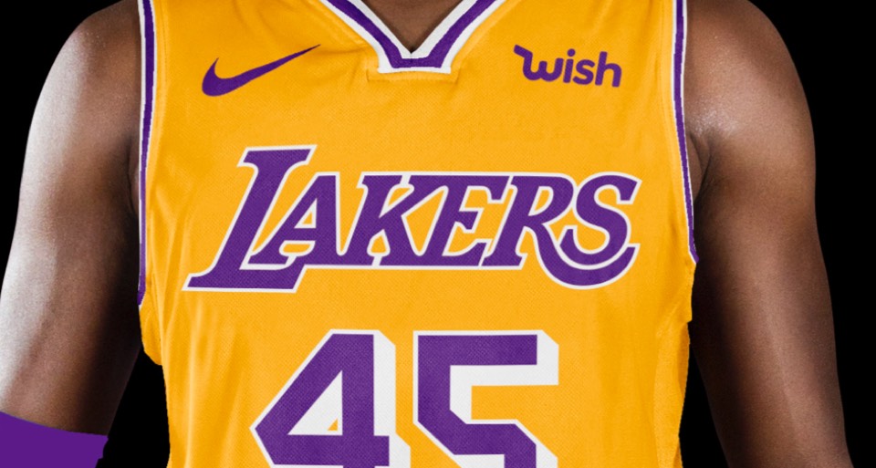
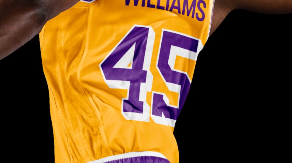
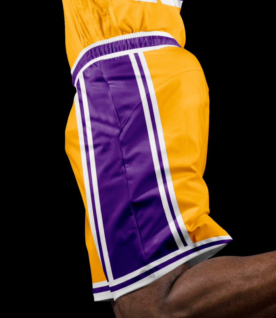
Showtime. Enough said.


SHOW. TIME.
SHOW. TIME.
The Lakers will always be synonymous with LA, so we wanted to make sure they had a uniform that said Los Angeles... this throwback from shortly after they moved to LA from Minneapolis does the trick.
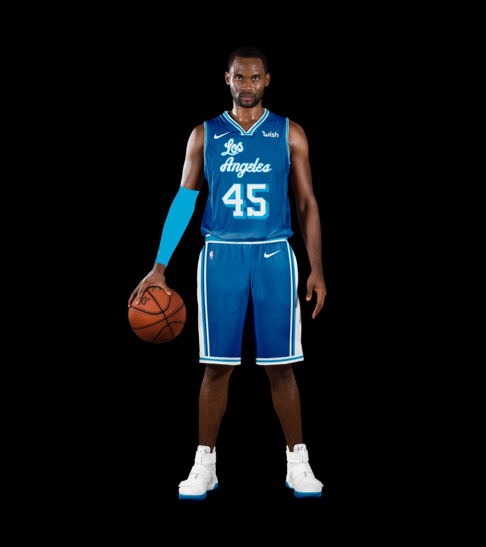
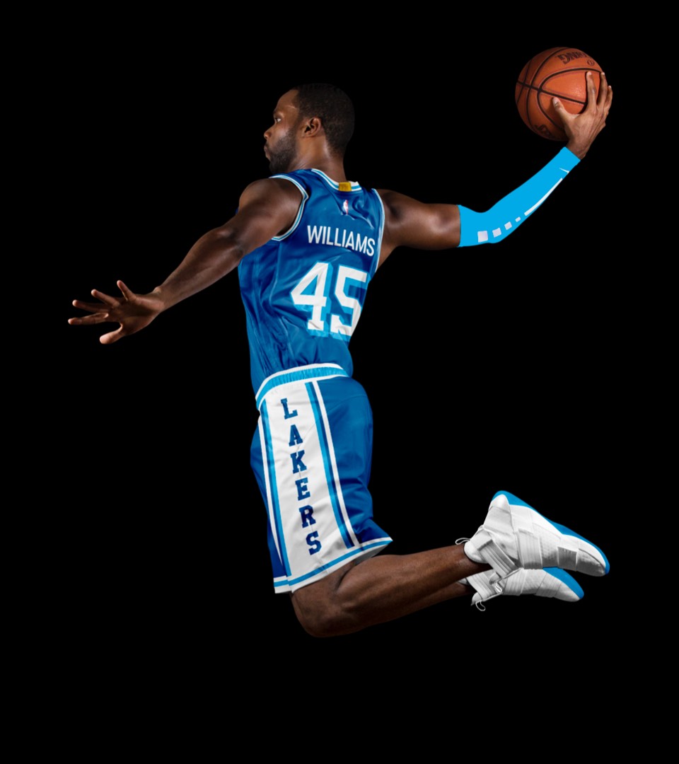
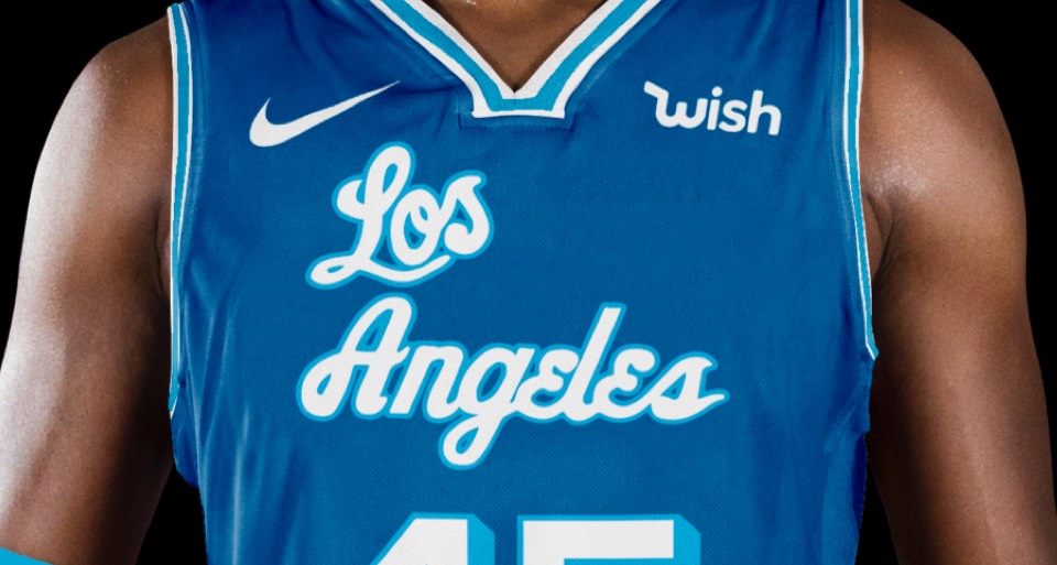
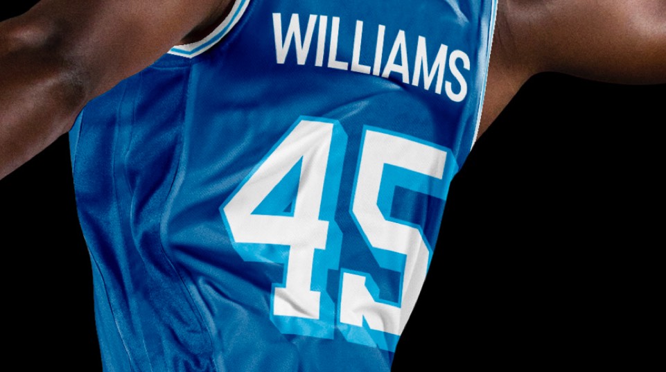
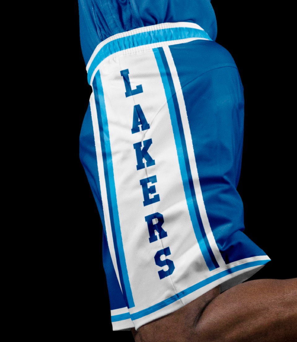
The Lakers will always be synonymous with LA, so we wanted to make sure they had a uniform that said Los Angeles... this throwback from shortly after they moved to LA from Minneapolis does the trick.


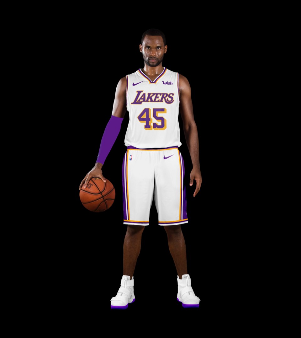
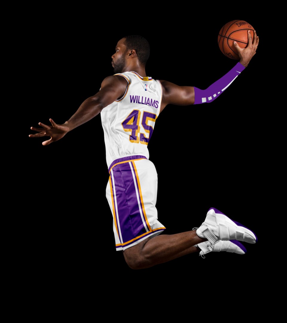
Wouldn't be a Lakers kit without the Sunday Whites.


Wouldn't be a Lakers kit without the Sunday Whites.
