

The current Grizzly bear is a decent-if-slightly-dated "sports logo" and the type is inoffensive enough. But when you think about all the movement (that CLAW) and the neat colors and trim (which they're getting back to!) from the Vancouver team, it feels a bit muzzled.


We didn't initially think a re-name was necessary, opting to try to shift the meaning of "Grizzlies" to a woodcut drawing of a mountaineer. The response from the Grindhouse was swift and harsh, but in a very helpful way—we got some very thoughtful comments from fans saying they would be more receptive to a re-name than we thought. The obvious choice from what we were reading was the Memphis Blues, especially given that we were changing the name of the Utah Jazz; the "team named after a musical genre" was wide open! We created a swooping wordmark starting with a treble clef "B", accenting with a more vibrant "Beal Street Blue". The lettering is drawn from a collection of old woodcut show print letterforms as a nod to the music scene.
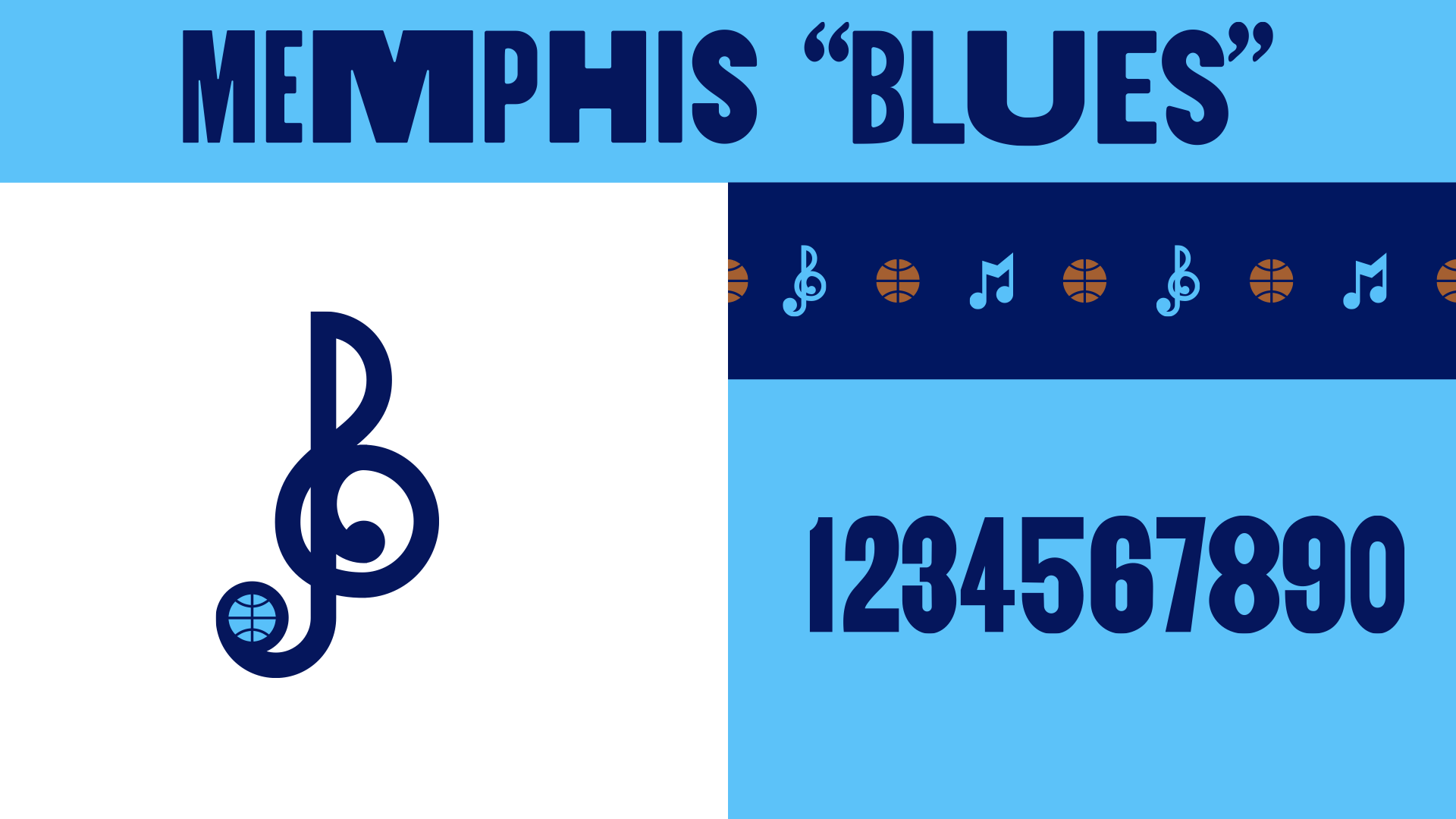
Colors stick with blue on blue as our primary palette but with a brighter light blue for a more vibrant energy. We replaced the yellow with the brown from the Vancouver palette to signify the Chickasaw Bluff. And we built a music-note-plus-basketball pattern inspired by some of the typographic ornaments that would appear on old blues posters
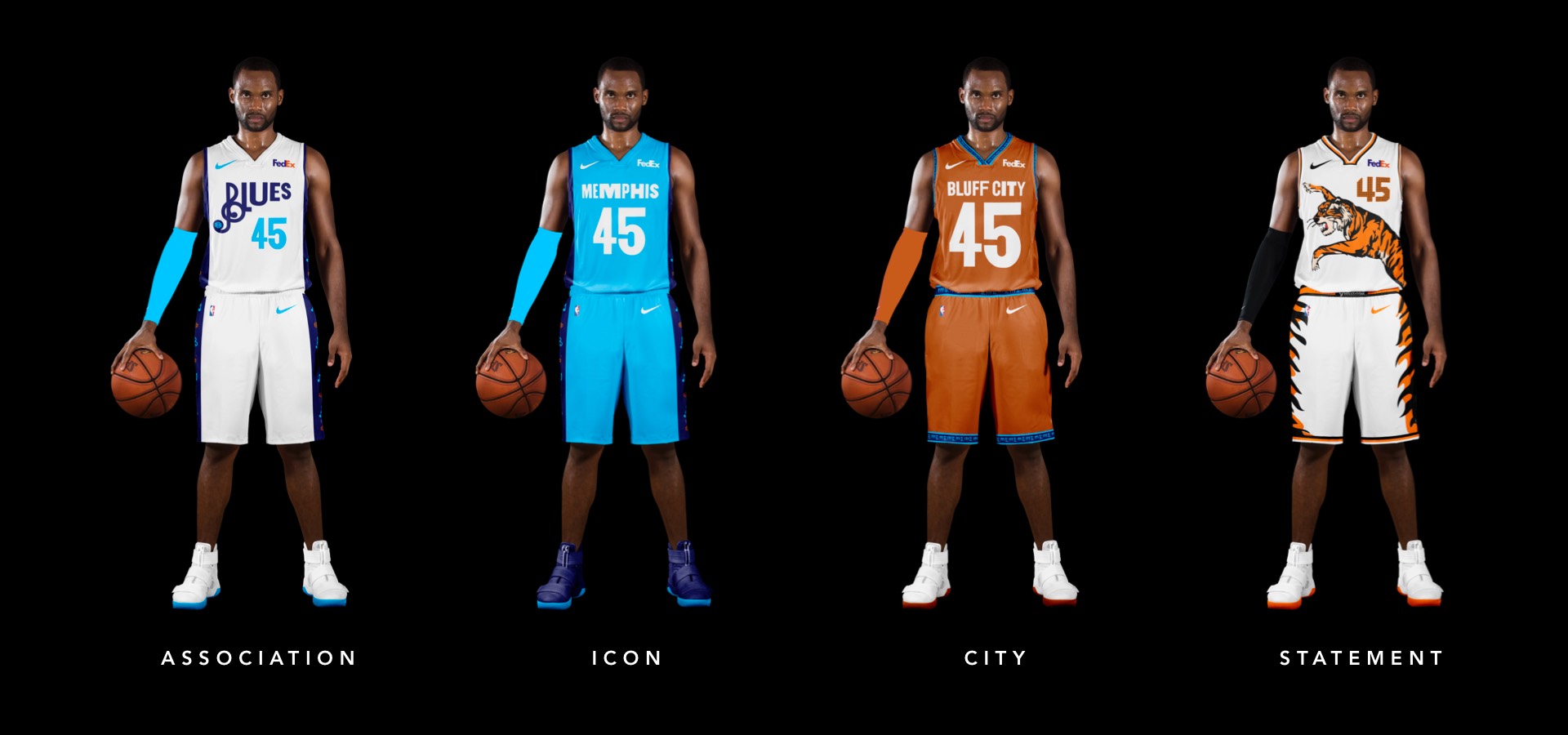
The blue on white pops, and we extended the woodcut type to the numbers for a distinct look that's still worthy of Grit and Grind. Our new blues pattern appears within the side stripes on navy.
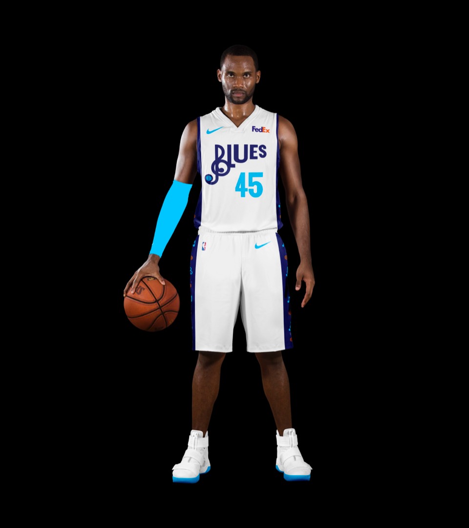
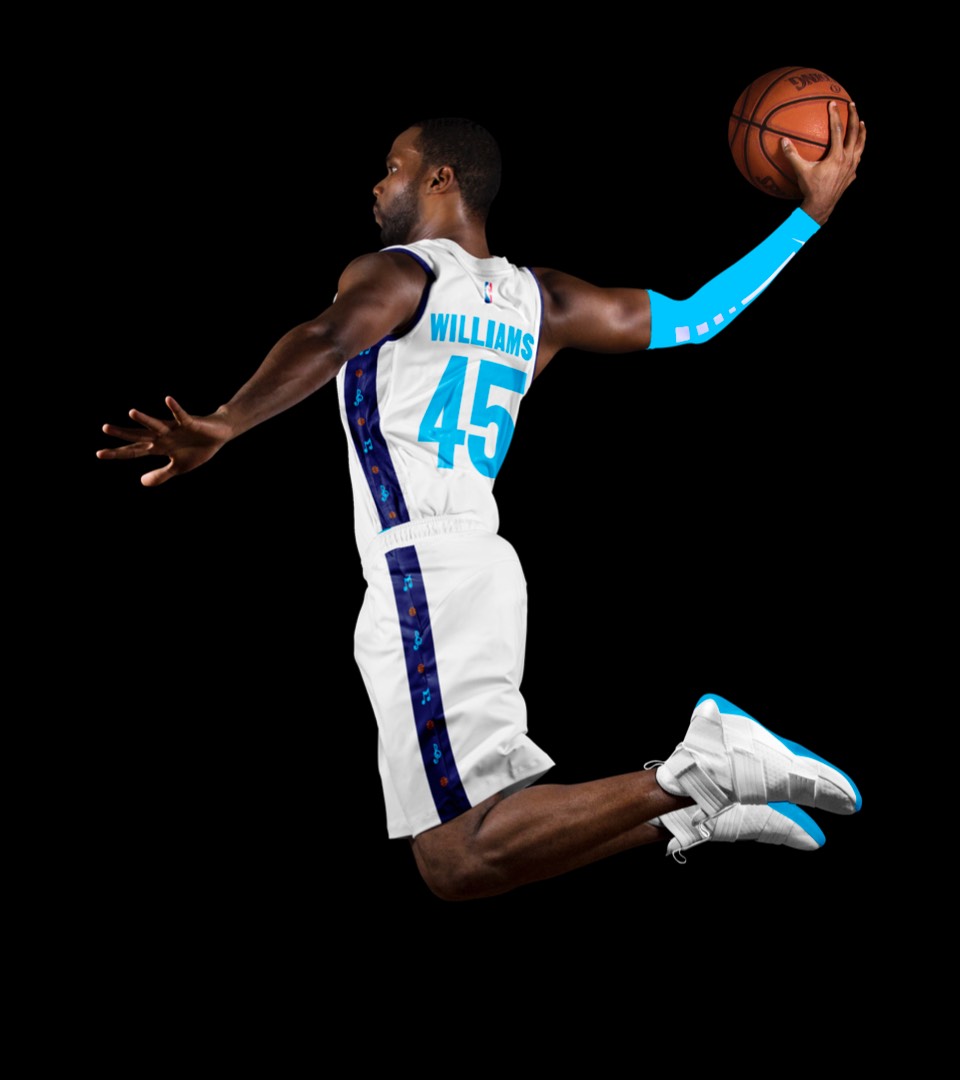
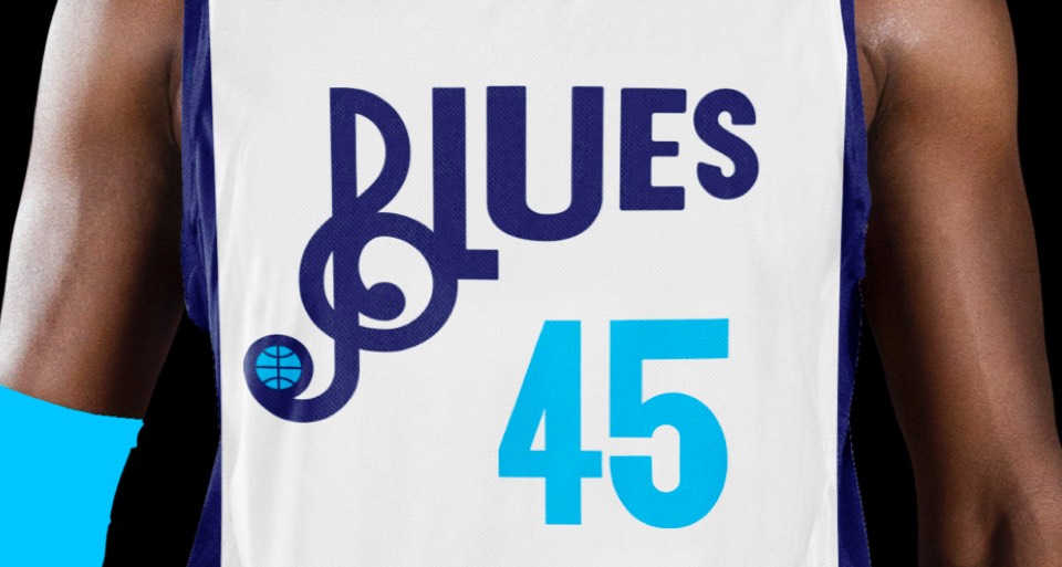
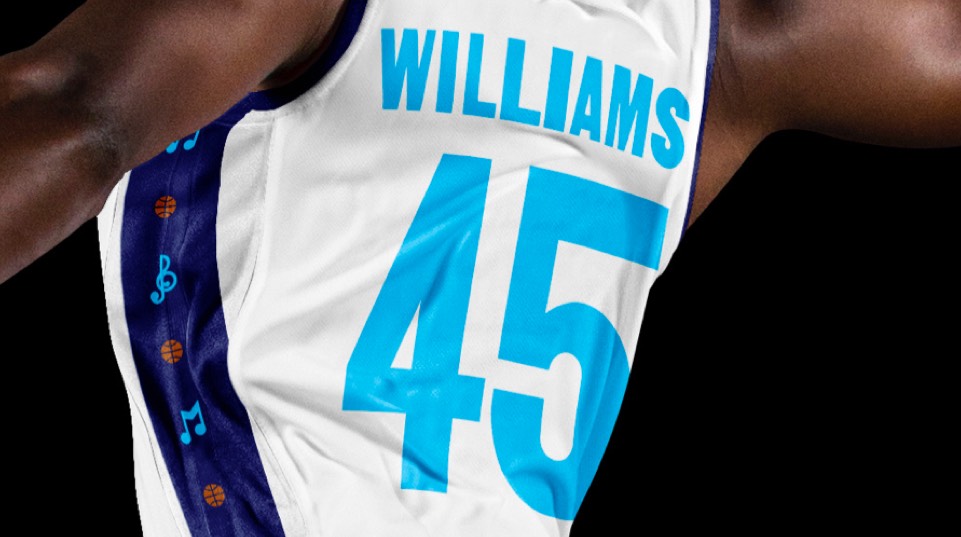
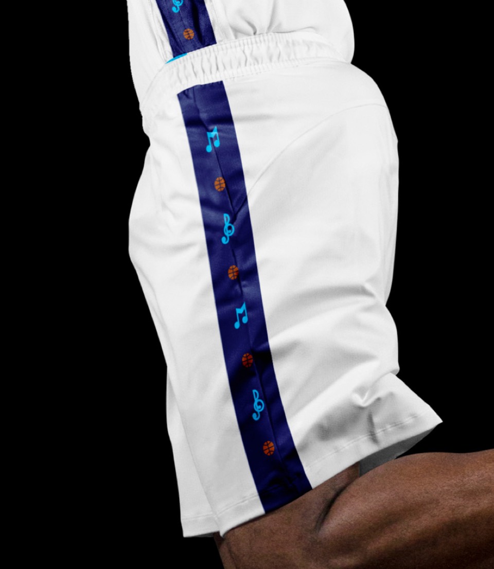
The blue on white pops, and we extended the woodcut type to the numbers for a distinct look that's still worthy of Grit and Grind. Our new blues pattern appears within the side stripes on navy.


The lighter blue is refreshing here, and another detail is, on both icon and association kits, the side stripes stay the same color.
The lighter blue is refreshing here, and another detail is, on both icon and association kits, the side stripes stay the same color.
Leaning in to the Chickasaw Bluff burnt orange here, and paying tribute to the soon-to-be-famous Bluff City name.
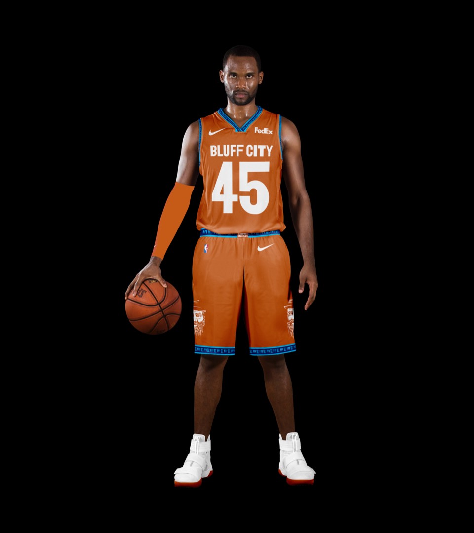
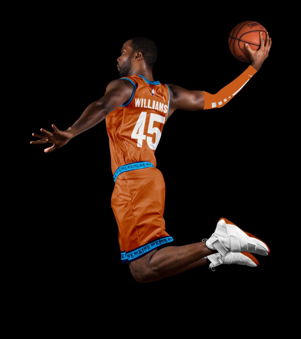
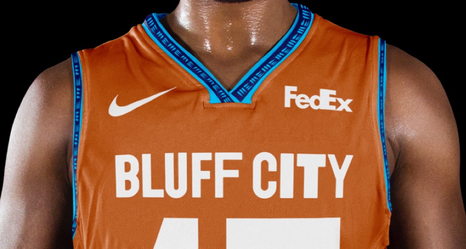
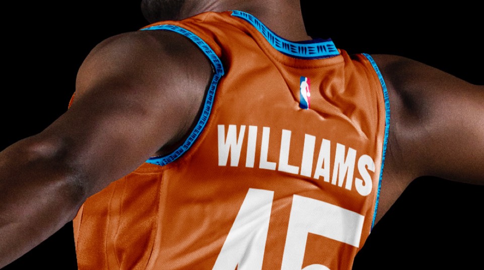
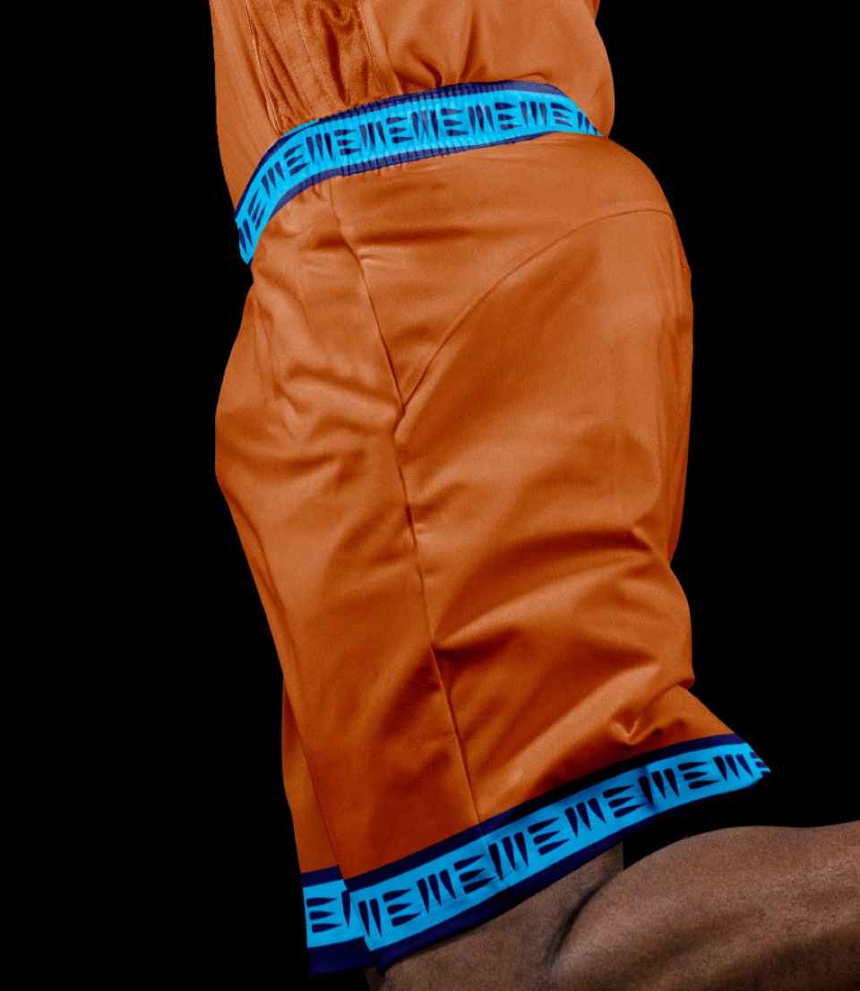
Leaning in to the Chickasaw Bluff burnt orange here, and paying tribute to the soon-to-be-famous Bluff City name.


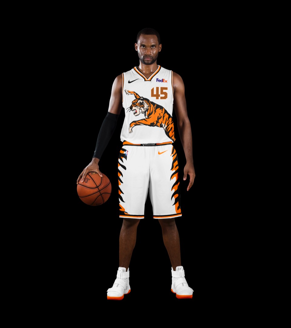
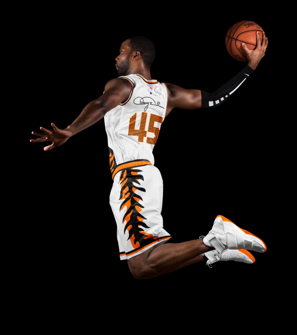
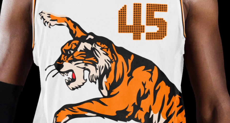
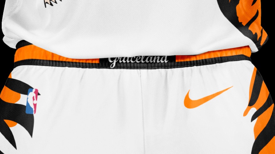
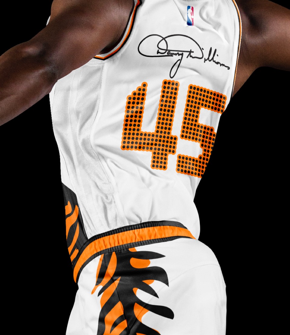
As if all the above moves weren't bold enough, we're dialing it way up with a freaking "Graceland" uniform. Inspired by Elvis' famous tiger jumpsuit, it features the lunging tiger on the front, tiger stripe shorts with a GRACELAND belt buckle, Vegas lights numbering (where he debuted this jumpsuit) and each player's last name as their signature.


As if all the above moves weren't bold enough, we're dialing it way up with a freaking "Graceland" uniform. Inspired by Elvis' famous tiger jumpsuit, it features the lunging tiger on the front, tiger stripe shorts with a GRACELAND belt buckle, Vegas lights numbering (where he debuted this jumpsuit) and each player's last name as their signature.
