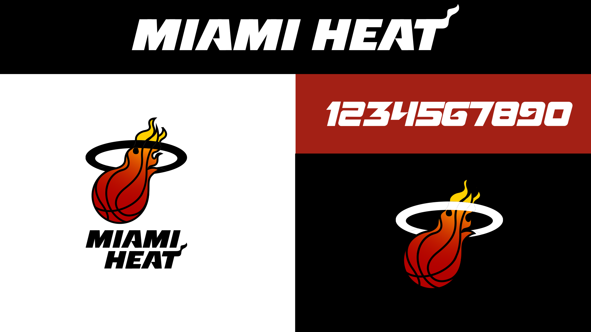


The (pre-NBA Jam!) "HE'S ON FIRE" moment is genius and the type walks right up to the line of too cheesy without going over it, keeping in perfect tune with the heat's look and the feel of the city (that T!).


Two things: 1) why the awkward 90/10 ratio of slightly-too-dark red / yellow for the flame? We updated it to a more consistent gradation from a brighter red to orange to yellow. And 2) Why the outlined rim? Fixed that as well: black fill on white, white fill on black.

Biggest evolution here was replacing the italic varsity-style numbers with an extension of the logotype style. While we were at it, we secretly re-drew the wordmark to finesse a few details, and adjust how the angled lines match up with each other when the MIAMI and HEAT are stacked. Only other tweak was making the red a liiiiitle brighter.

No need to reinvent the wheel here, other than the numbers which do help everything feel more cohesive.


No need to reinvent the wheel here, other than the numbers which do help everything feel more cohesive.


Same here, number style is an impactful tweak but not messing with anything else.
Same here, number style is an impactful tweak but not messing with anything else.
At this point there are several VICE colorways to choose from, we picked our all-time fave, the "Vice Nights" uniform, and gave it a number style update.


At this point there are several VICE colorways to choose from, we picked our all-time fave, the "Vice Nights" uniform, and gave it a number style update.


"Deco Days" is a complement to "Vice Nights", an ode to the wealth of Art Deco architecture (more than any other city!) in Miami. Featuring Super symmetrical numbers and lettering; stripes, shapes and trim all inspired by the most iconic buildings in the city; and a new colorway that feels like an instant classic for Miami and a nice counter to the now-iconic Vice colors.


"Deco Days" is a complement to "Vice Nights", an ode to the wealth of Art Deco architecture (more than any other city!) in Miami. Featuring Super symmetrical numbers and lettering; stripes, shapes and trim all inspired by the most iconic buildings in the city; and a new colorway that feels like an instant classic for Miami and a nice counter to the now-iconic Vice colors.


