
The coolest buck ever, great balance of menacing, nostalgic undertones, all without without veering into lame sports design territory. Love the hidden basketball in the antlers. Only thing that distracts and doesn't feel connected is the too-sharp M / Neck.

Simple solution is to remove the M/neck and the ornamental circle, getting us down to only the best bits and balancing out what felt like a too-tall logo.
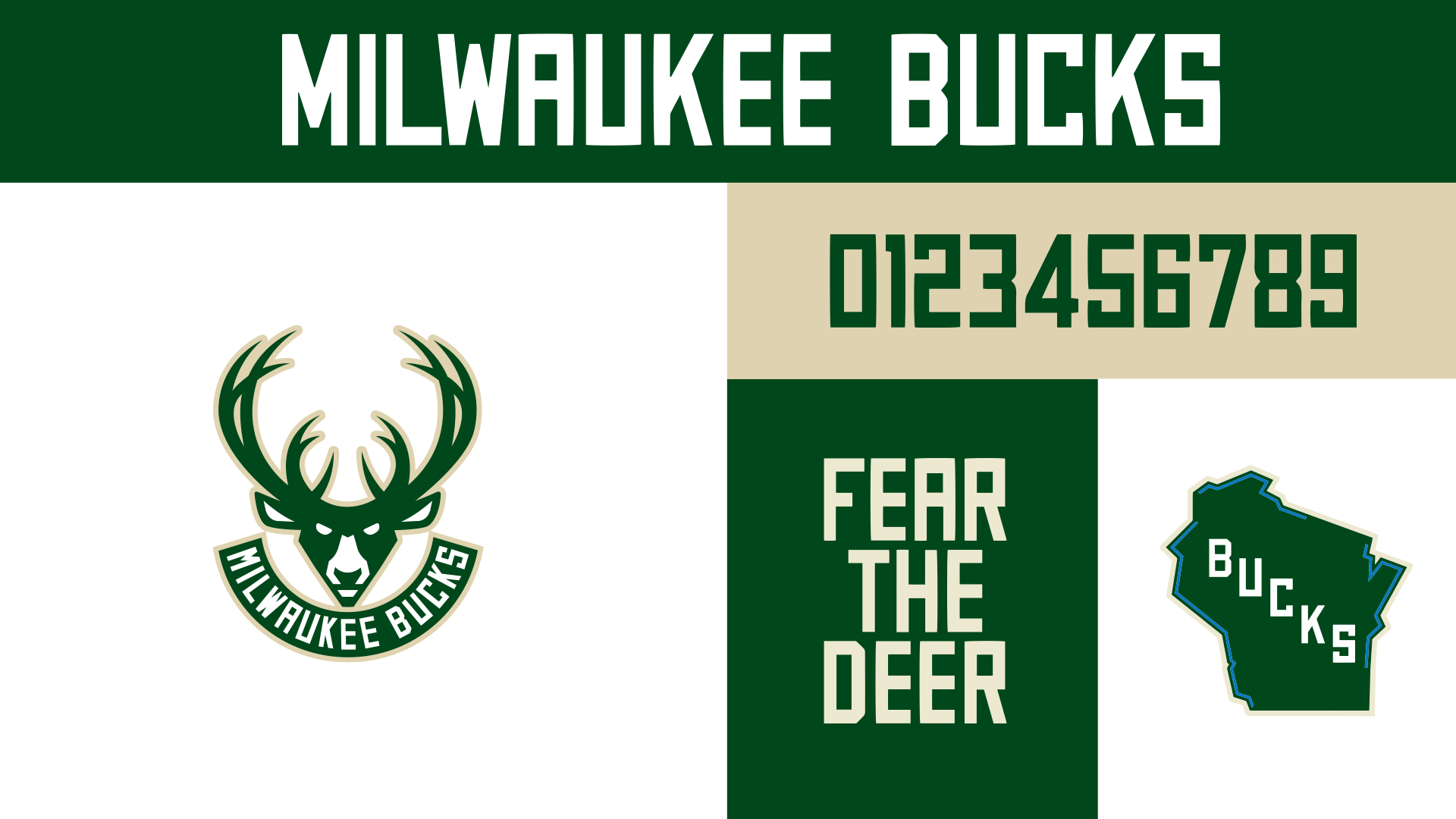
Nothing further here; FEAR THE DEER is great, lettering and colors are perfect, love the secondary Wisconsind logo.
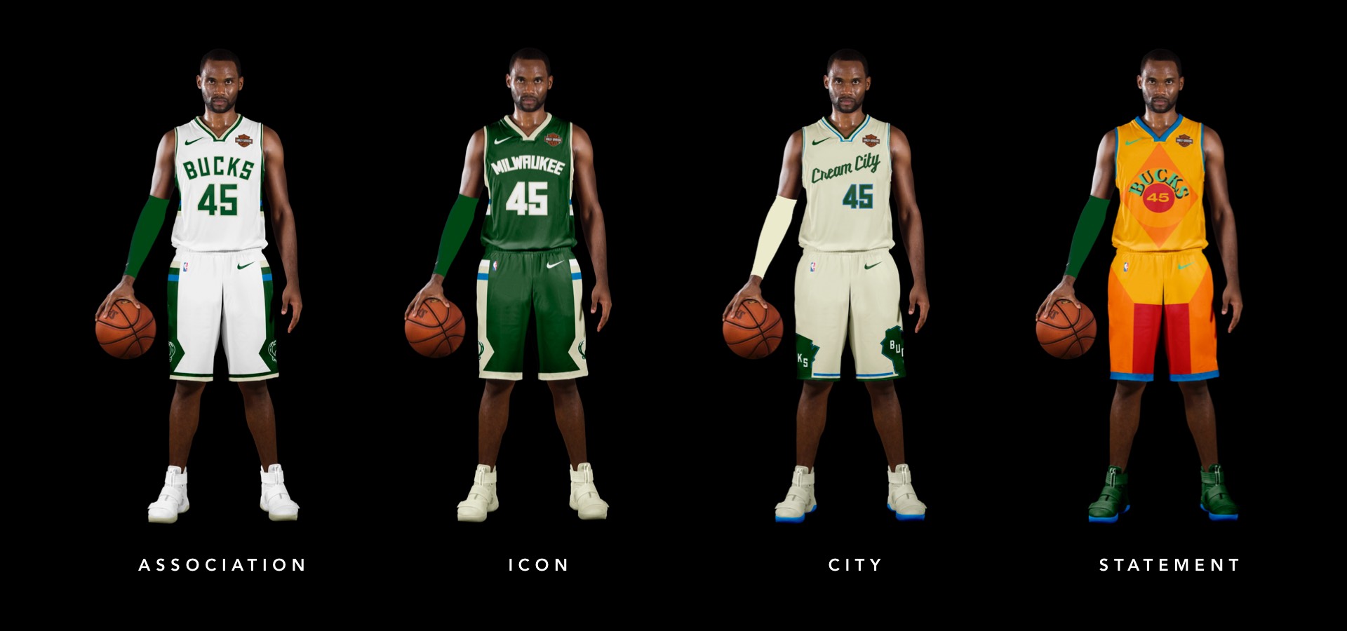
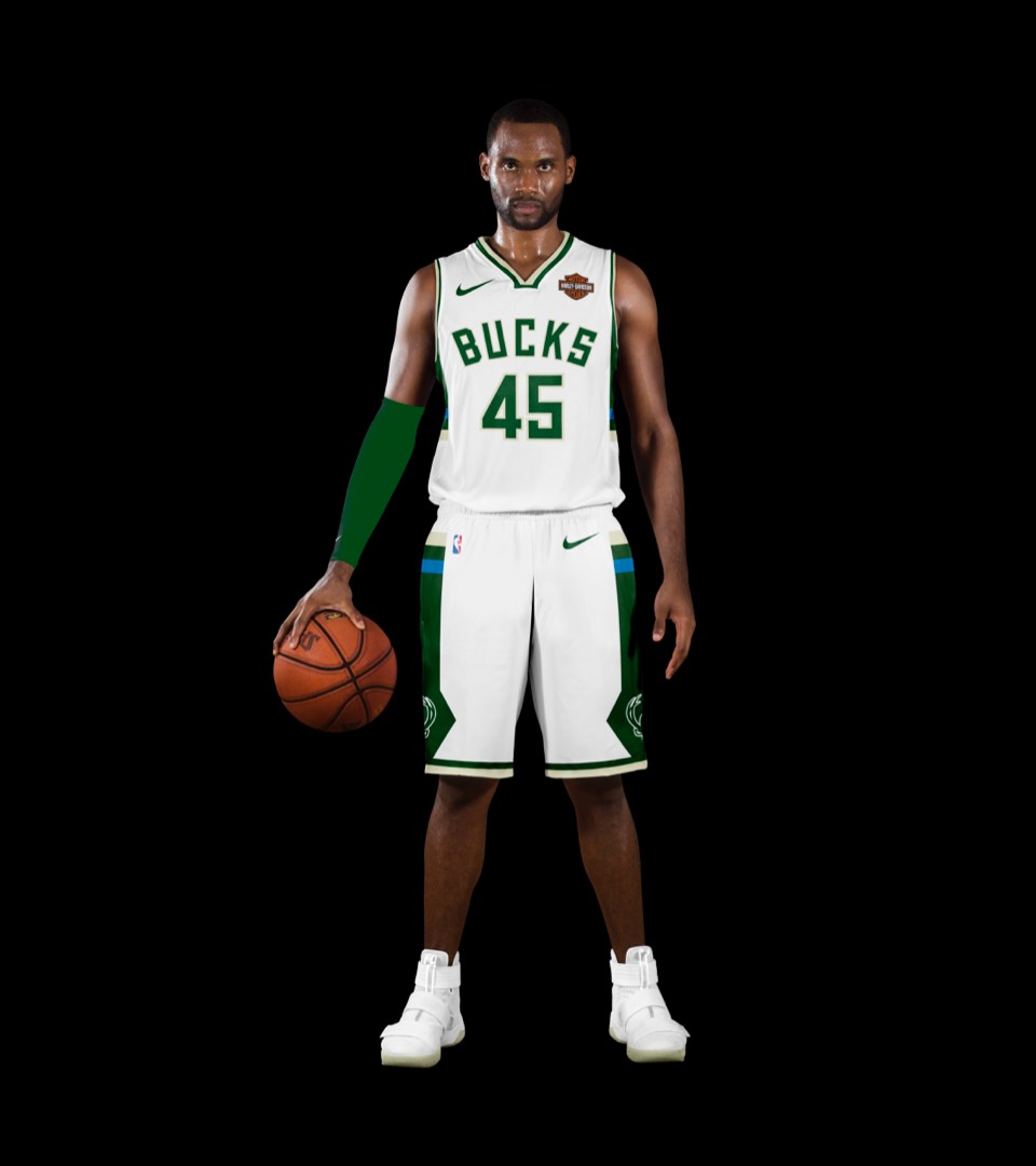
Barely discernible updates to the jersey, swapping the single-color trim for a 2-color treatment and an update to the side stripes and shorts.
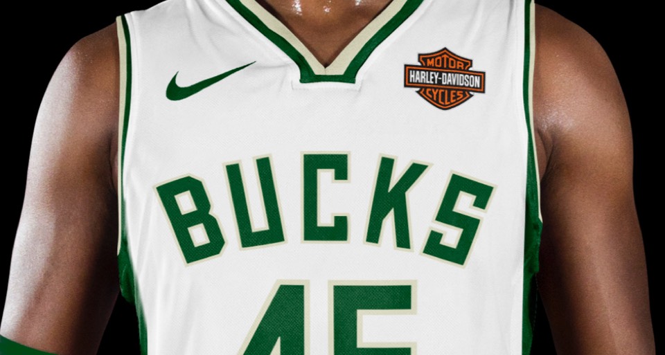
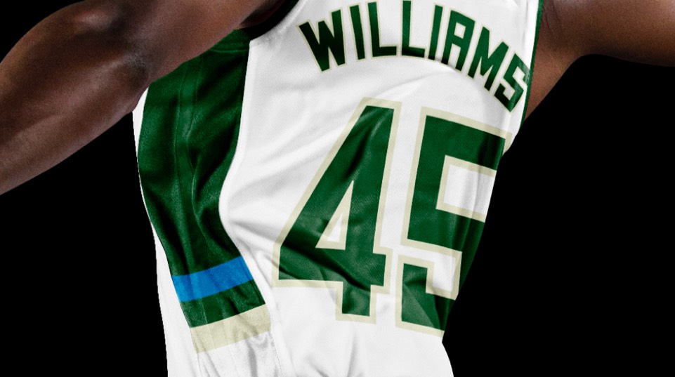
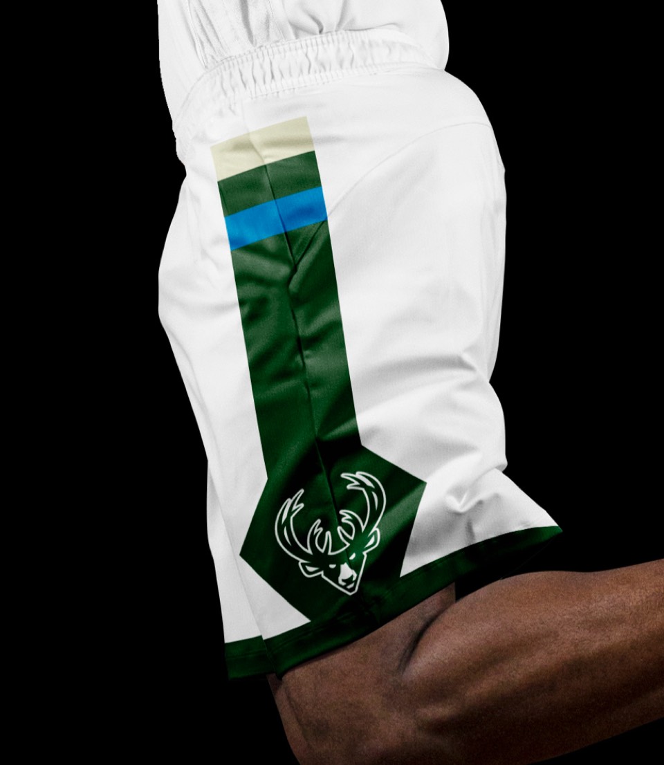
Barely discernible updates to the jersey, swapping the single-color trim for a 2-color treatment and an update to the side stripes and shorts.
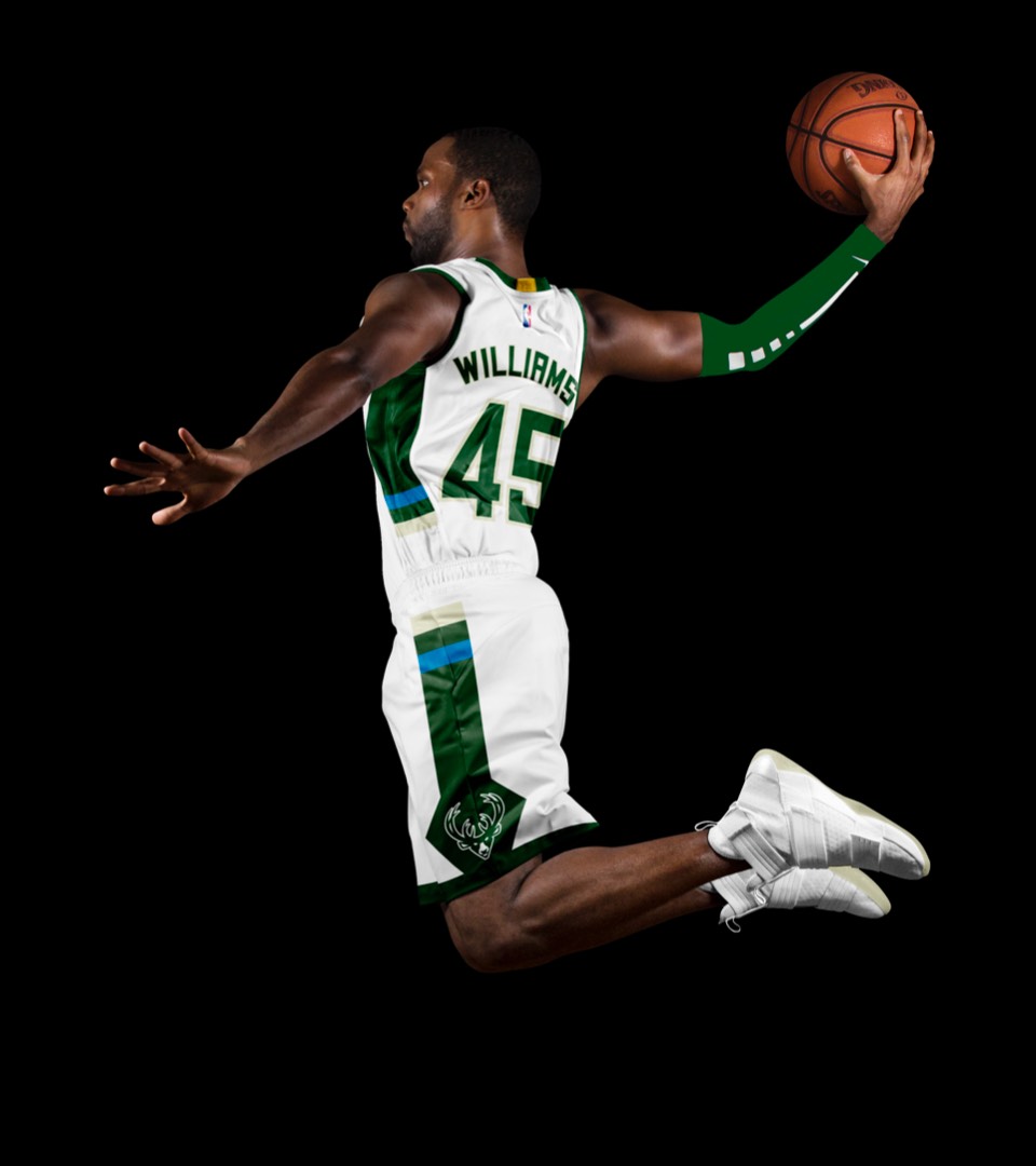
Kept the single-color trim here, all other updates match the Association uniform.
Kept the single-color trim here, all other updates match the Association uniform.
Cream city is a very cool take on the jersey, love the script rendition of their brand typeface. Only tweak we made was to add a nice big Wisconsin logo on the shorts.
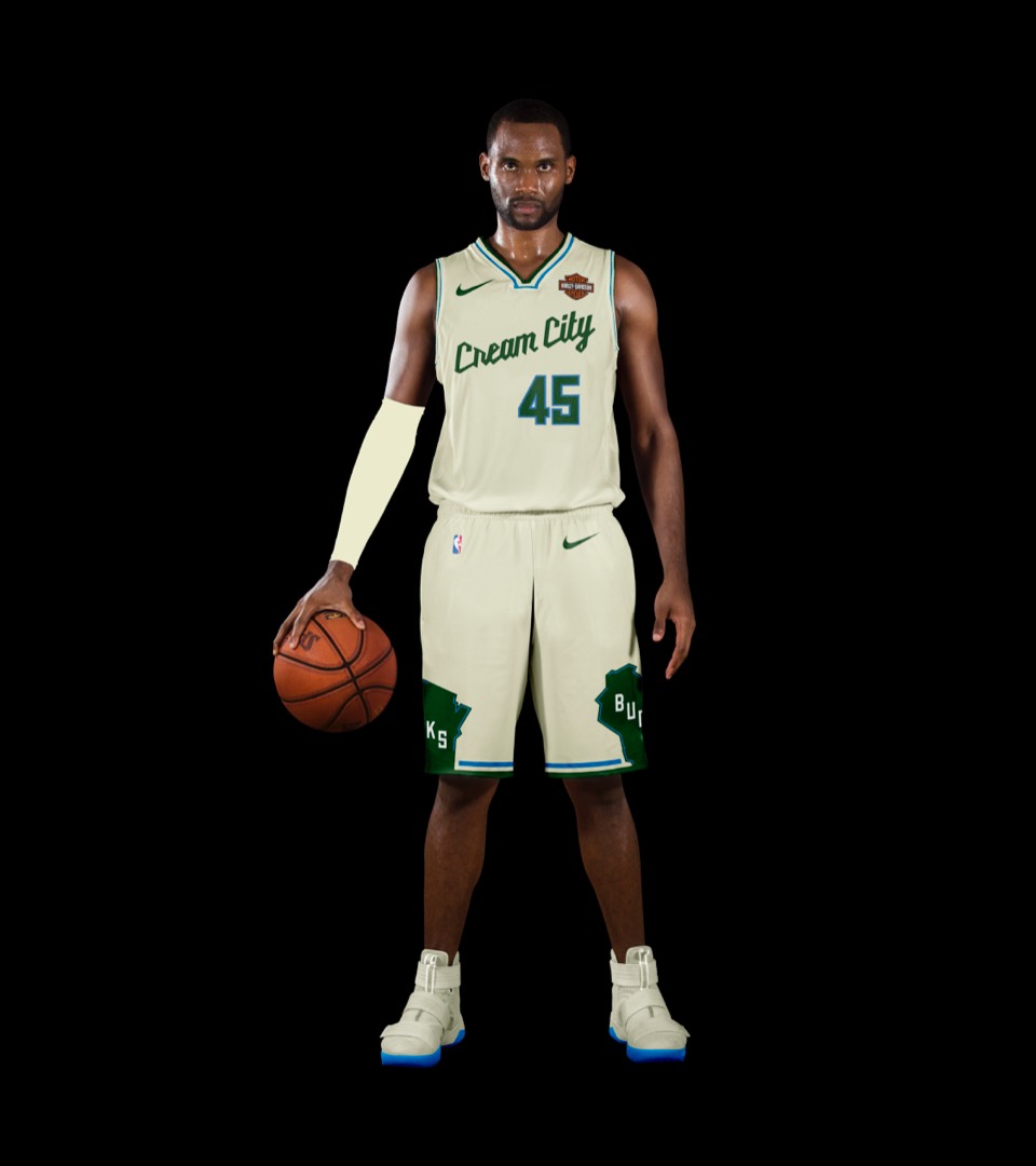
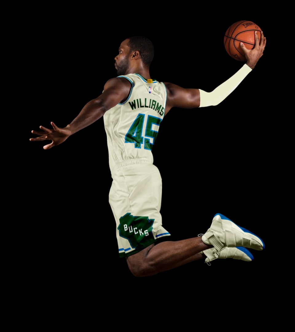
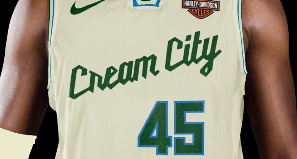
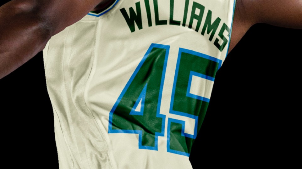
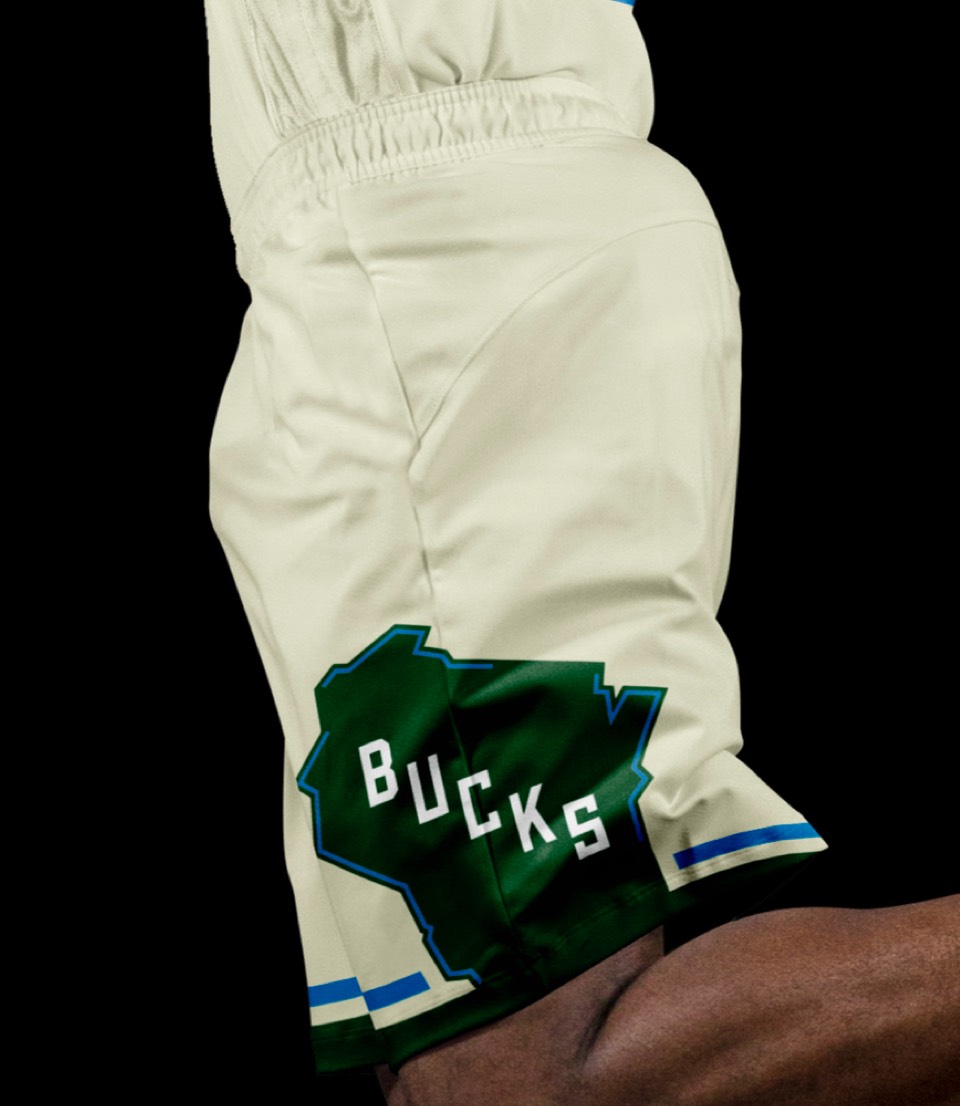
Cream city is a very cool take on the jersey, love the script rendition of their brand typeface. Only tweak we made was to add a nice big Wisconsin logo on the shorts.
The Robert Indiana MECCA floor is on our Mount Rushmore of NBA design pieces for sure. The Bucks have smartly capitalized on this in the past, but the execution was a little too asymmetrical and didn't fully capture the vibe for us. We took another run at it, making sure to include the MECCA lettering and looking at a more symmetrical front, that wraps around to a very experimental back number layout as if the edges of the court have converged on each other. We would kill to see this uniform get produced.
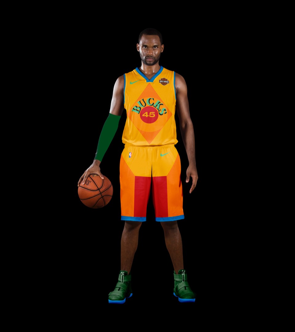
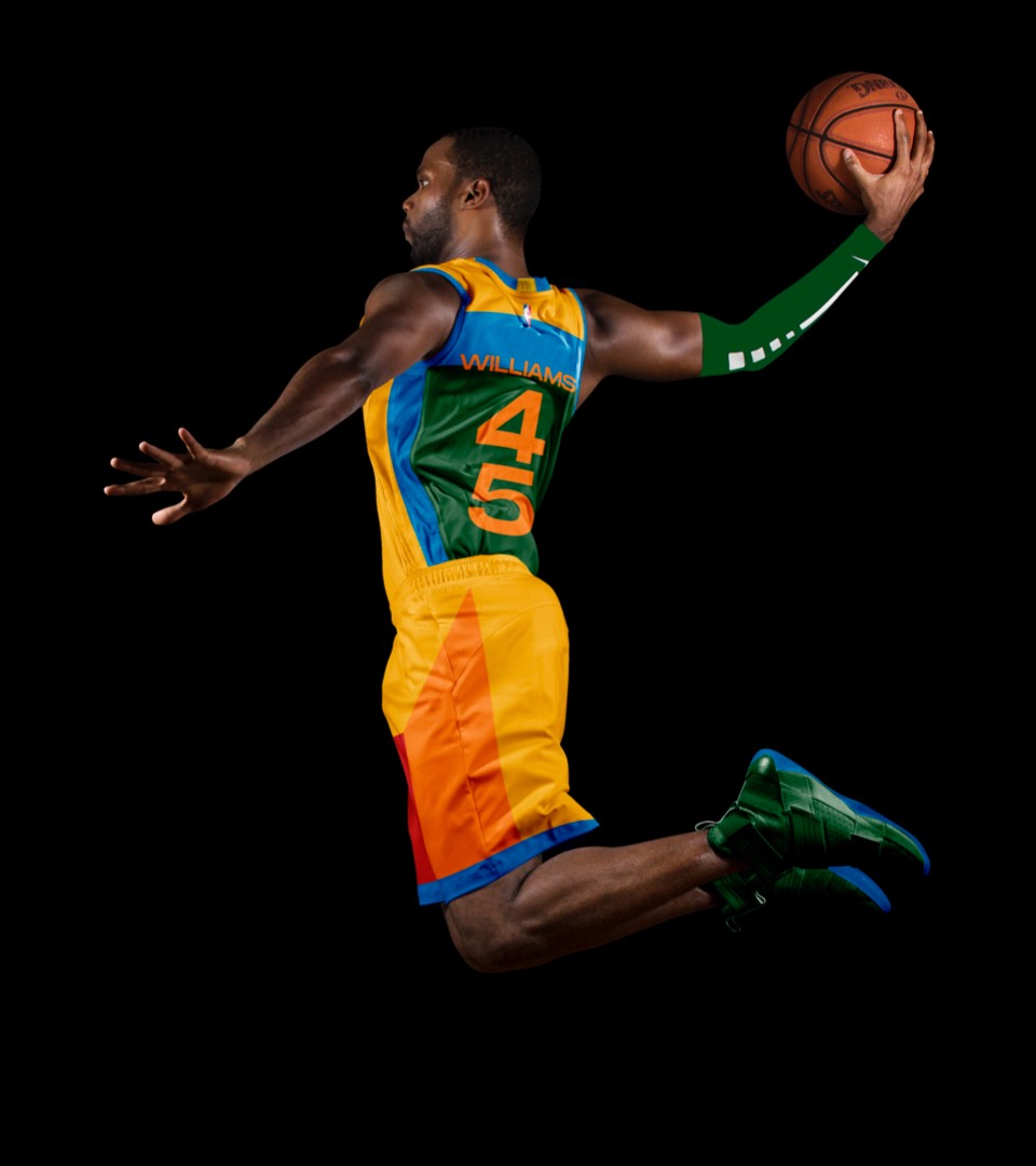
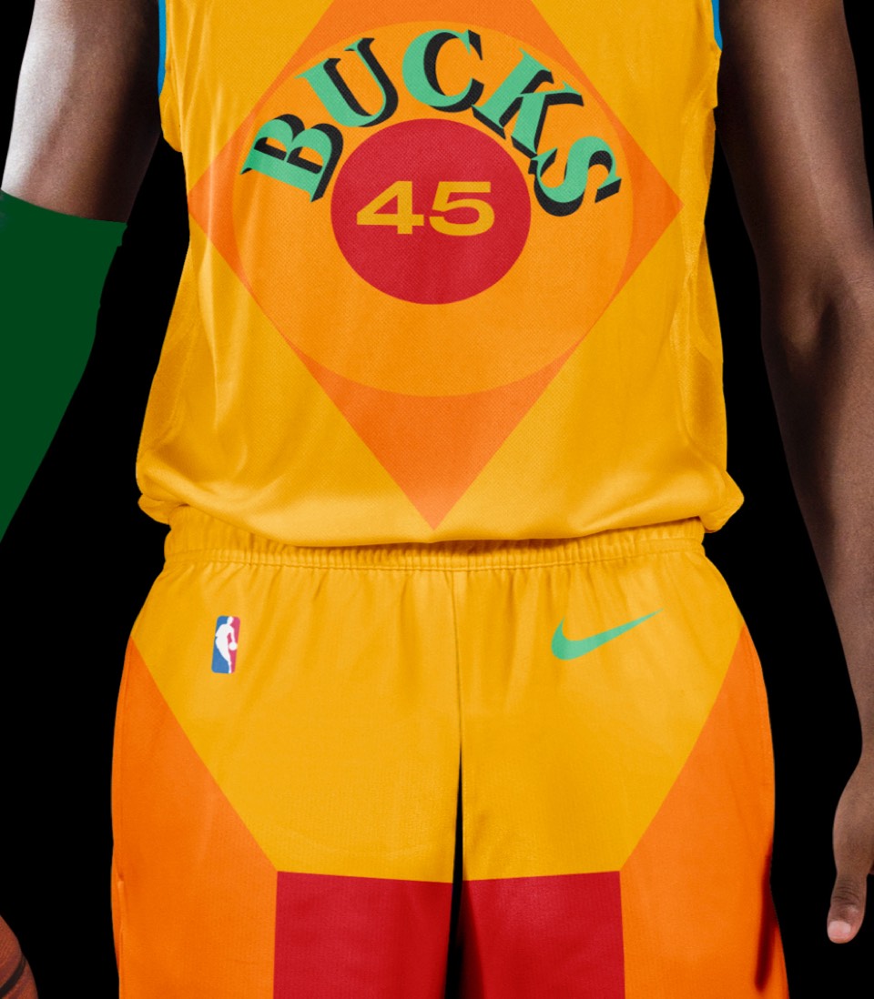
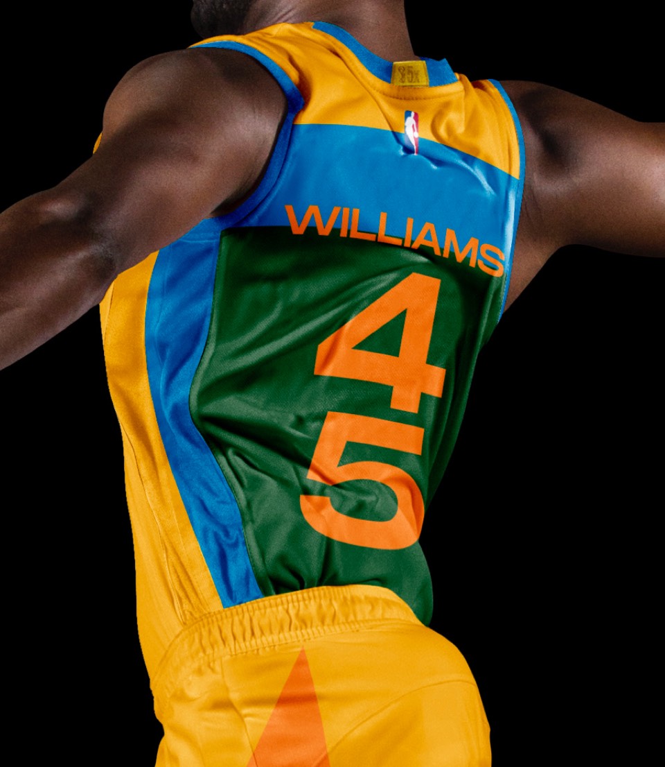
The Robert Indiana MECCA floor is on our Mount Rushmore of NBA design pieces for sure. The Bucks have smartly capitalized on this in the past, but the execution was a little too asymmetrical and didn't fully capture the vibe for us. We took another run at it, making sure to include the MECCA lettering and looking at a more symmetrical front, that wraps around to a very experimental back number layout as if the edges of the court have converged on each other. We would kill to see this uniform get produced.