
Captures the spirit of the wolf perfectly, the North Star is a great shout-out to the state motto, and other storytelling details abound around the northern lights and even some deep cuts about vikings(!). For all that, they've missed the forest for the trees, literally: we have a team called the Timberwolves without a single representation of a tree in their look and feel!

The blue on blue execution feels muddy and the northern lights green has never landed with their fans, so we evolved the color palette to something with more contrast and a more natural green. Most importantly, we added some trees to the logo! And the lettering looks pretty good on the current logo but by the time it makes it to the uniforms it feels way too modern and machine-made; we swapped in a more hand-made typeface that can help the logo and the uniforms feel more tied to the woods.
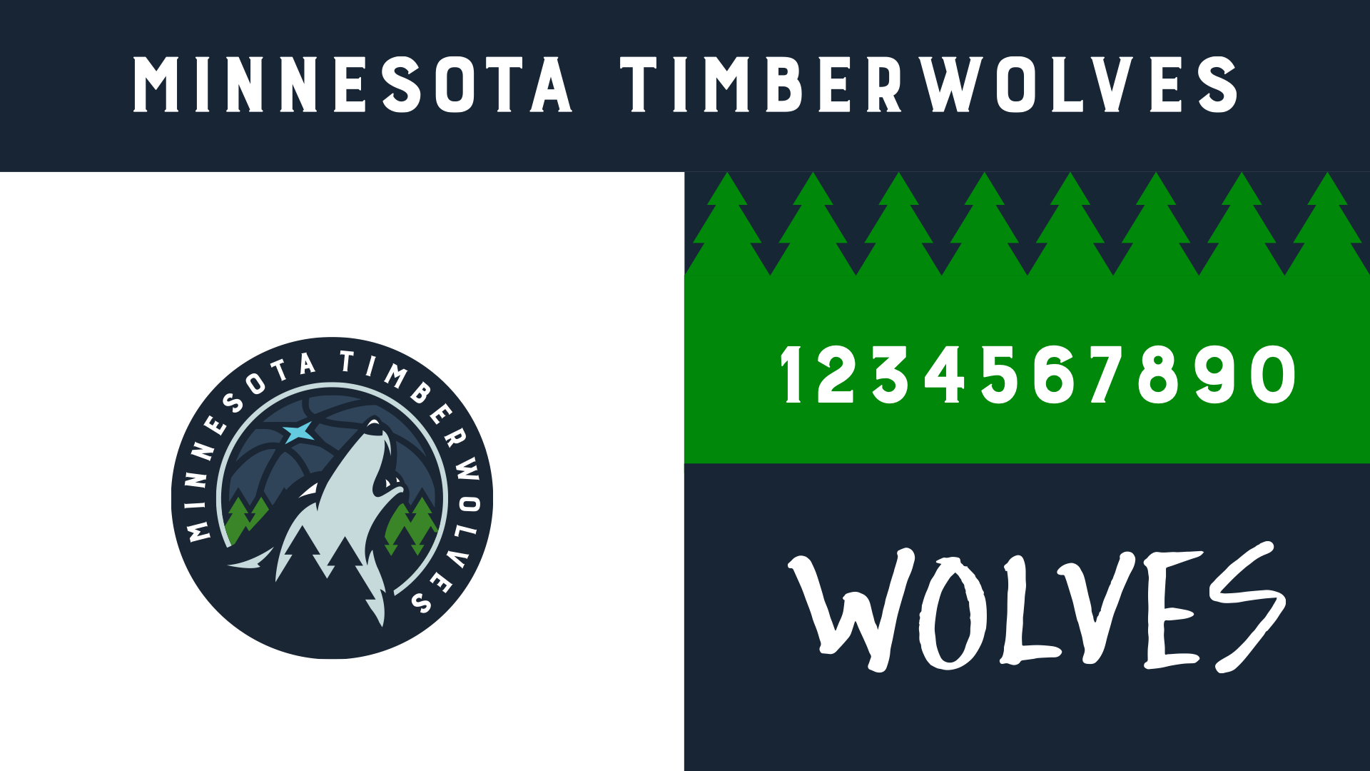
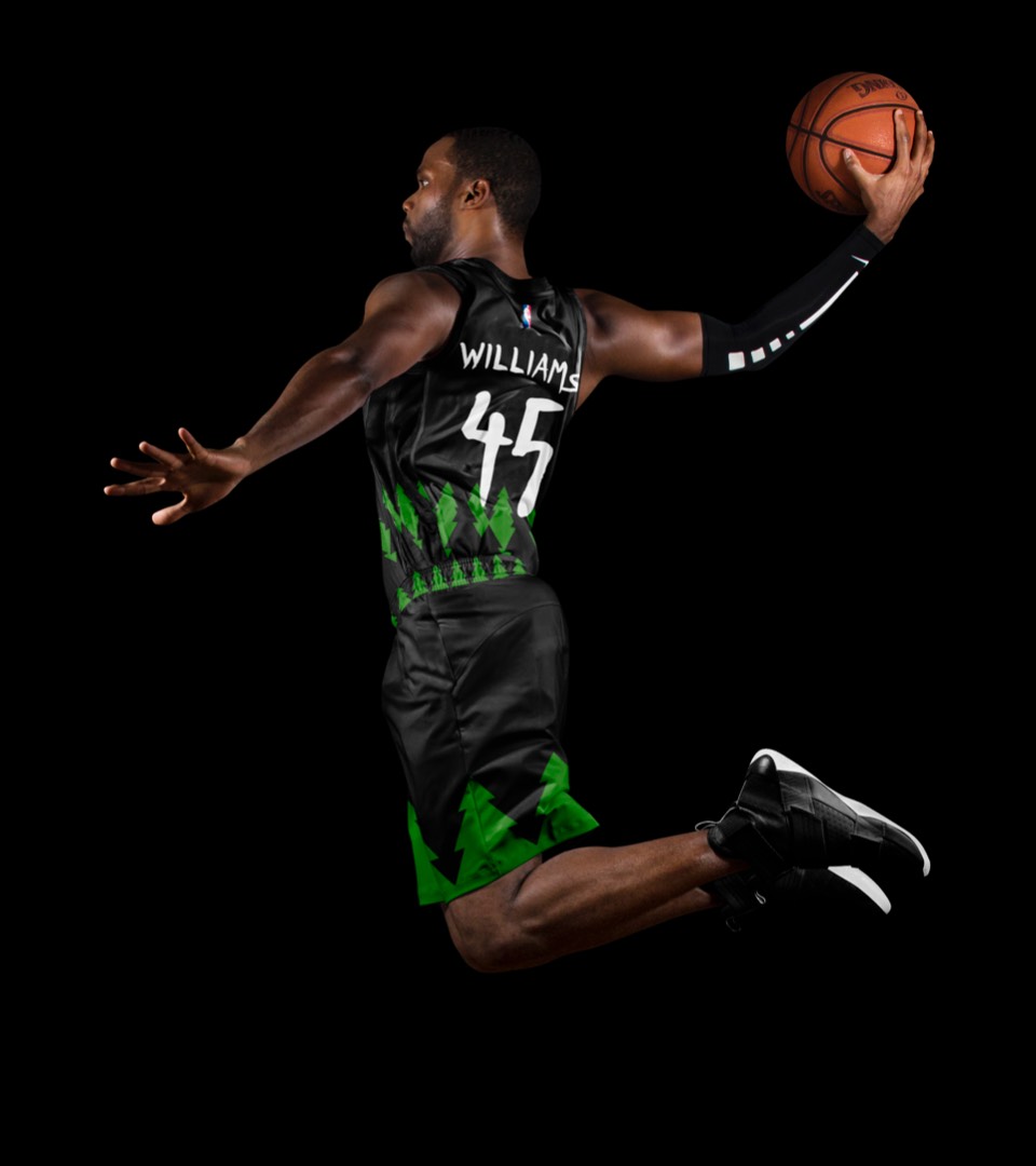
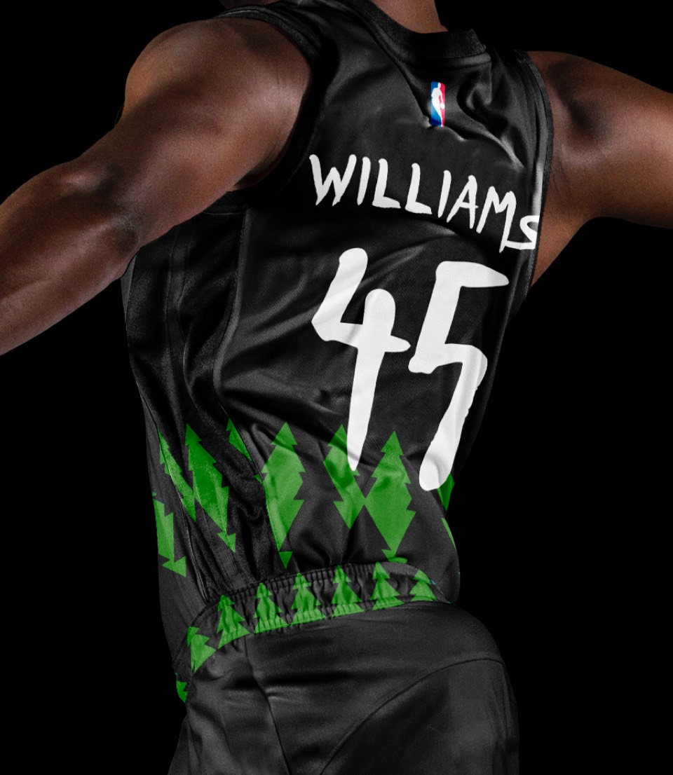
The tree motif continues here, bringing back the KG-era tree trimmings which are beloved by all. Extending the natural type to the numbers helps the graphics feel tighter, and we even included a "full moon" rendition of the "WOLVES" lettering (more on that when we get to the Statement uniform).
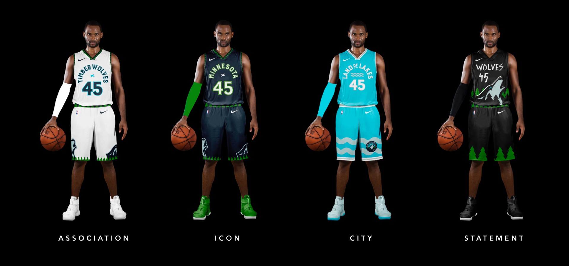
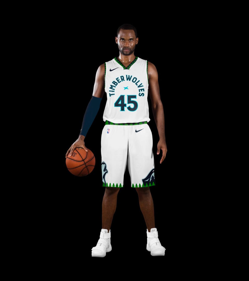
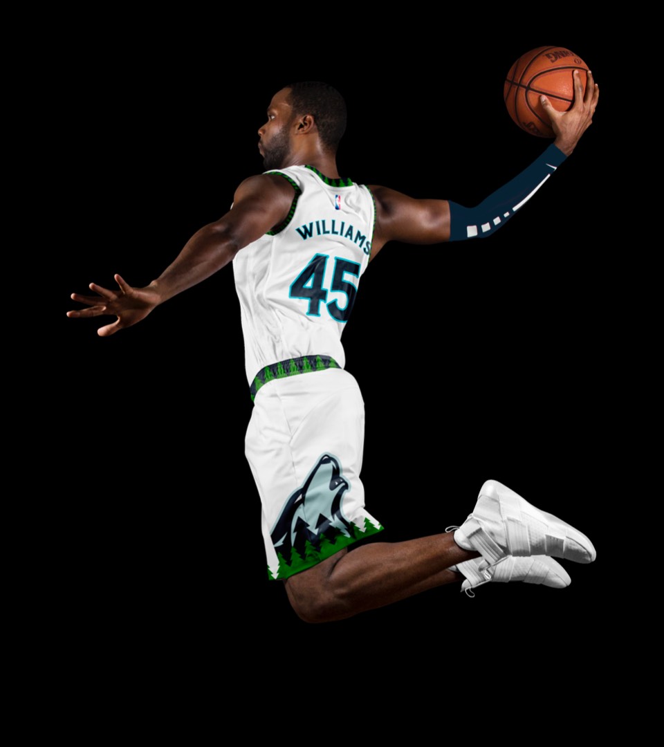
Pretty significant updates here. Back is the iconic and distinct Tree trim around the arm and neck holes, and we've given them a signature layout featuring lettering and numbers that revolve around the North Star, with a couple of wolves howling up at them from the sides of the shorts.
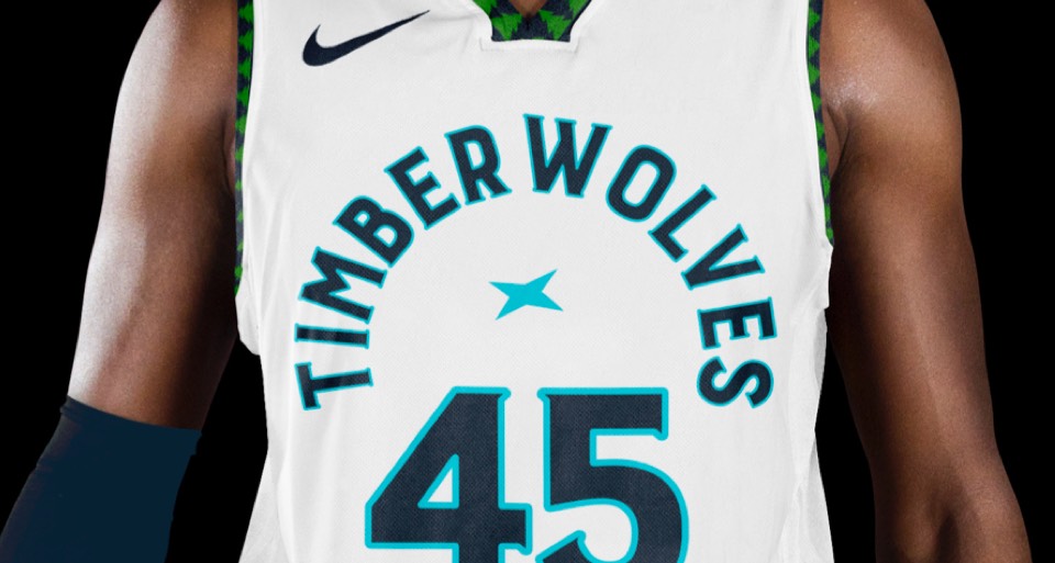
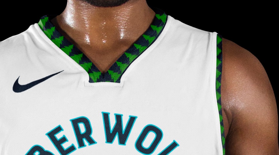
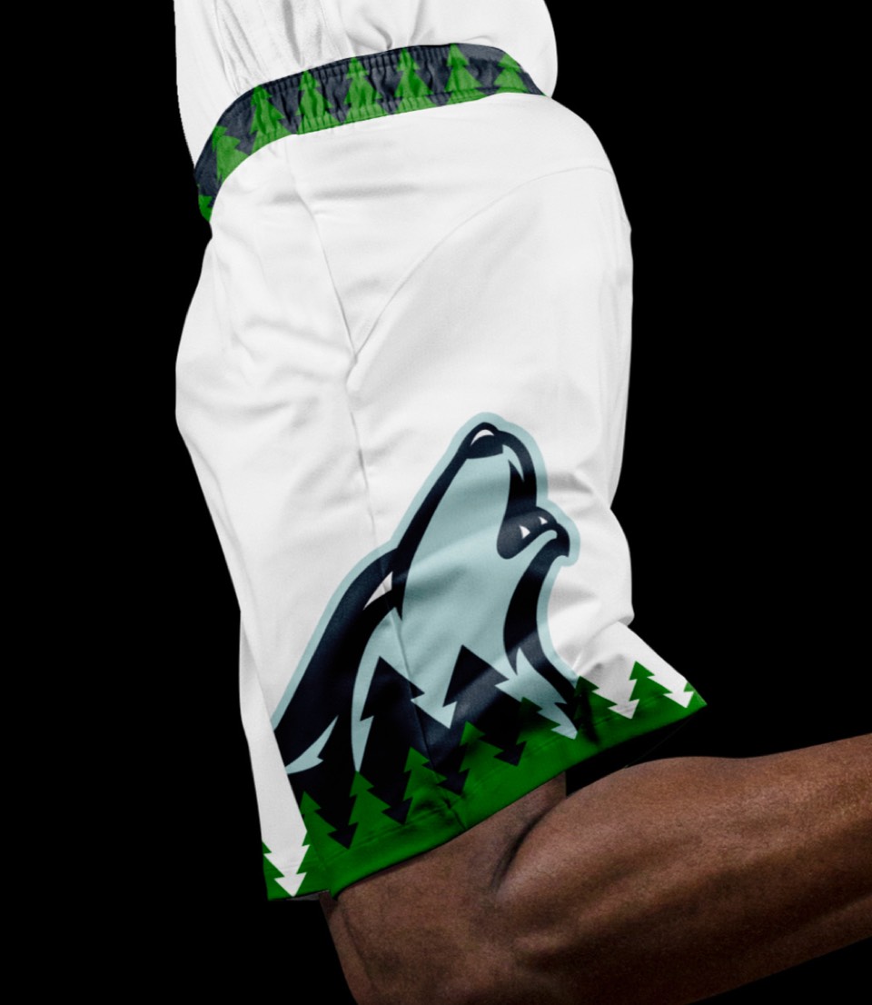
Pretty significant updates here. Back is the iconic and distinct Tree trim around the arm and neck holes, and we've given them a signature layout featuring lettering and numbers that revolve around the North Star, with a couple of wolves howling up at them from the sides of the shorts.
Same layout as the Association uniform but with a different colorway: navy background, white letters and swapping the blue stroke for green.
Same layout as the Association uniform but with a different colorway: navy background, white letters and swapping the blue stroke for green.
Land of 10,000 lakes, featuring the lake blue accent color. Still inspired by their new signature layout, but replacing the North Star in the center with a water icon, which gets repeated on the shorts behind a knee patch of the primary logo.
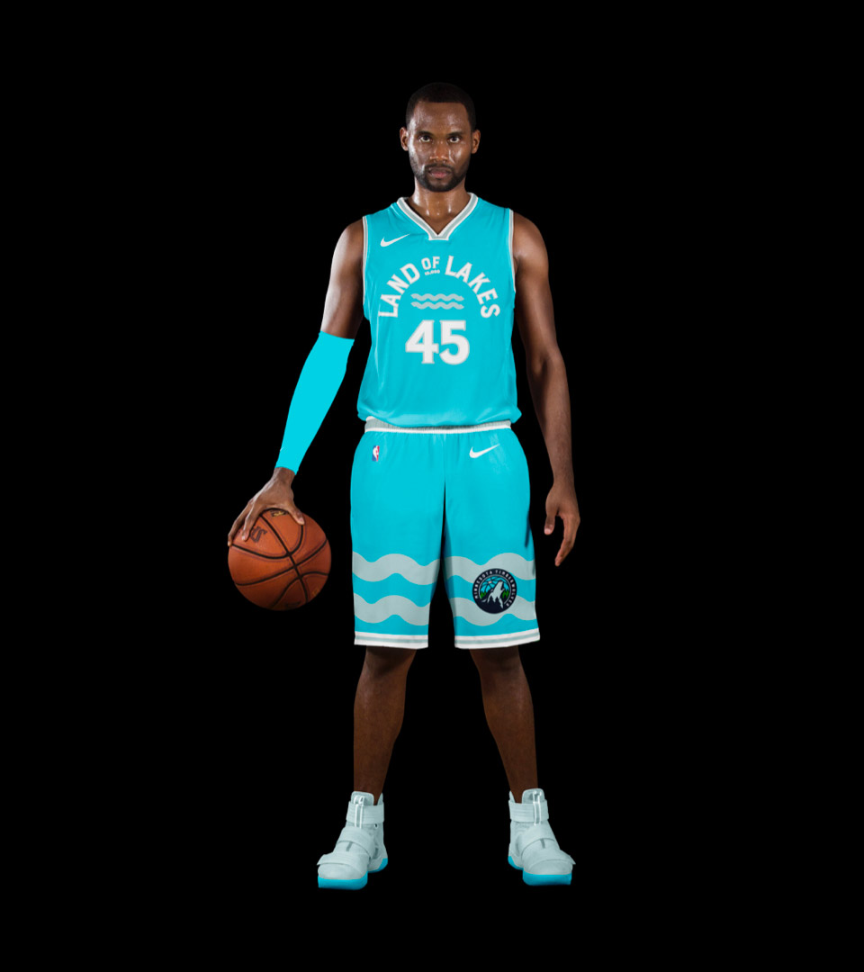
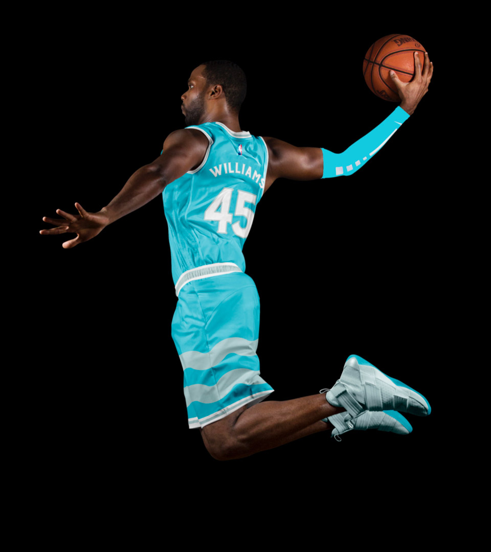
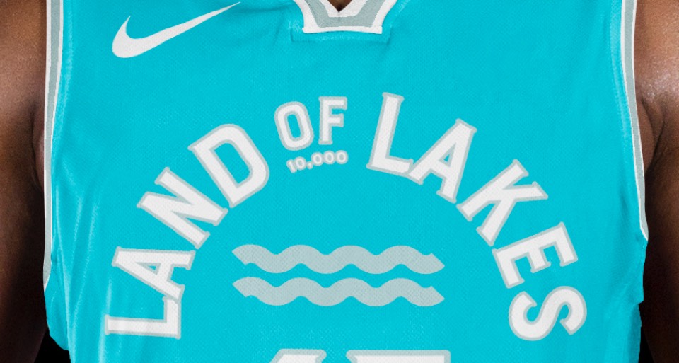
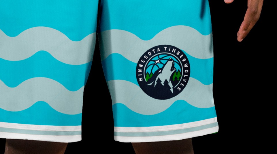
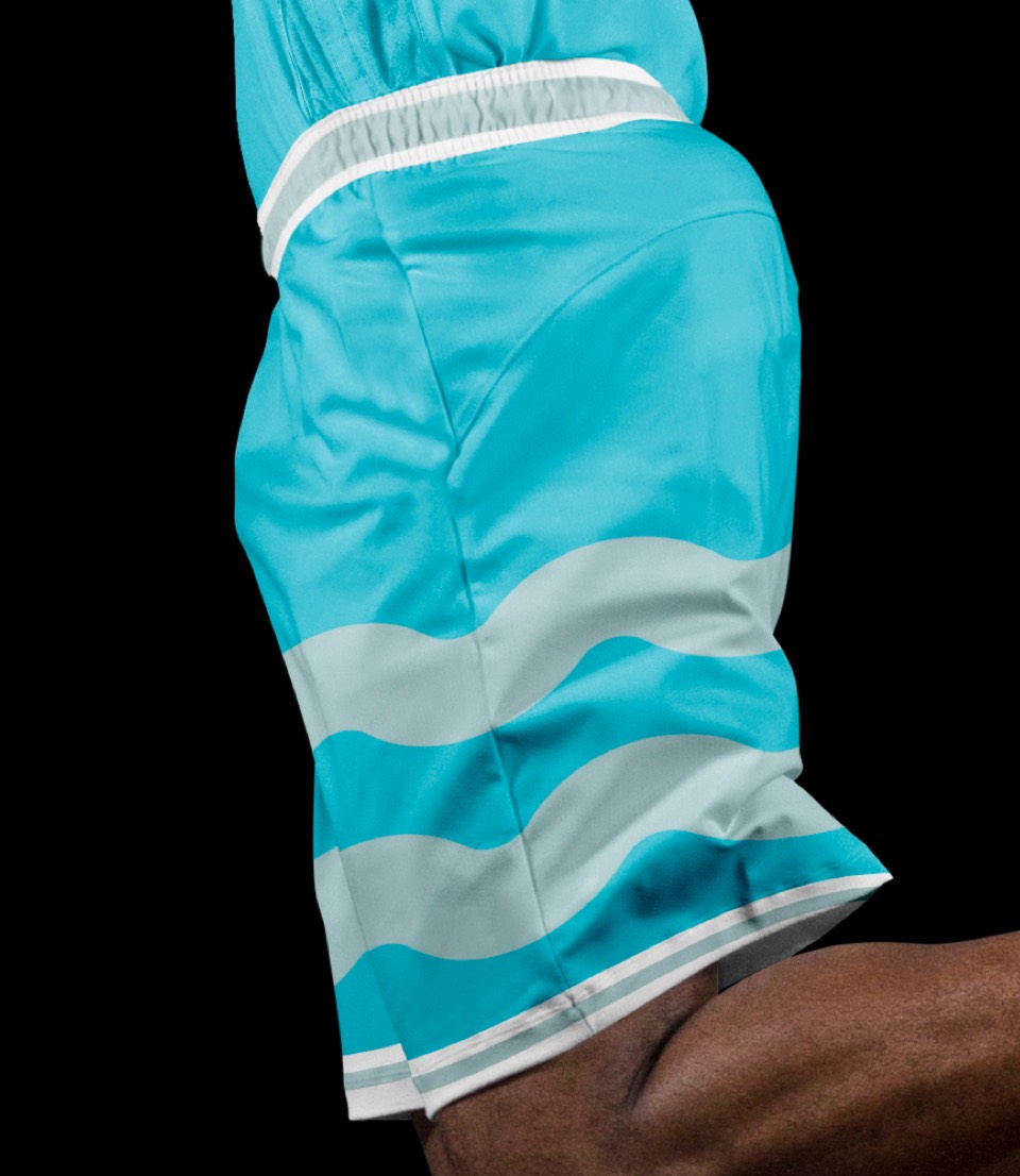
Land of 10,000 lakes, featuring the lake blue accent color. Still inspired by their new signature layout, but replacing the North Star in the center with a water icon, which gets repeated on the shorts behind a knee patch of the primary logo.
The "Full Moon" uniform, a nod to some of the more experimental 90's era kits featuring our Timberwolf as the main character spanning the width of the entire jersey, and rounding it out with hand-drawn (hand-clawed?) type and a large tree motif on the shorts.
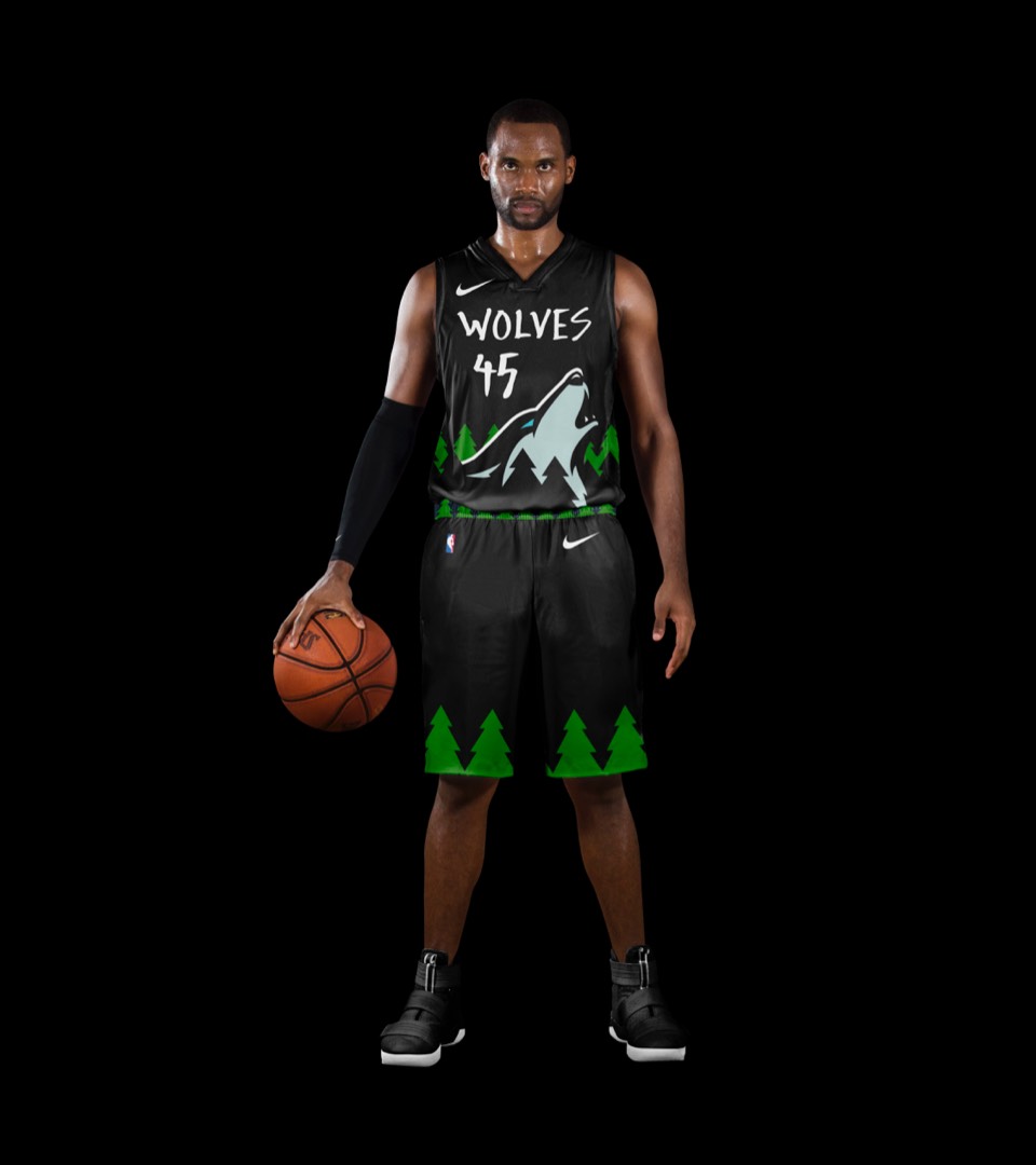
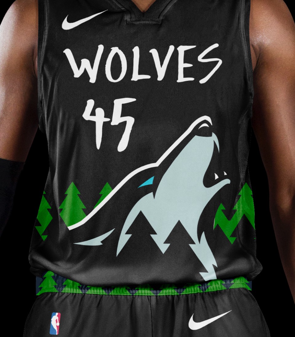
The "Full Moon" uniform, a nod to some of the more experimental 90's era kits featuring our Timberwolf as the main character spanning the width of the entire jersey, and rounding it out with hand-drawn (hand-clawed?) type and a large tree motif on the shorts.