

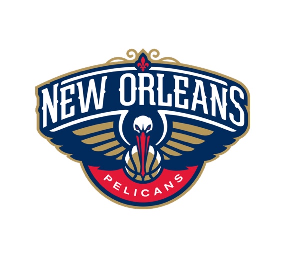
Love the pelican wings that morph into French Quarter architecture, but our gut is, a little too cartoon-y; maybe it's the overly angry expression? The gold feels a little drab and the type is nice but still suffers from a little bit of the "make it sporty" syndrome.


We went to a side angle of the pelican, capturing the pelican in motion and making it as aerodynamic as possible. It still has angry eyes but it's more of an icon than a caricature now. We brightened up the gold color and added a gold Fleur de Lis (replacing the bottom with a basketball because, NBA) as a direct reference to the NOLA flag. And updated the lettering to focus on the Pelicans name while incorporating more of the French-Quarter-inspired ornament.
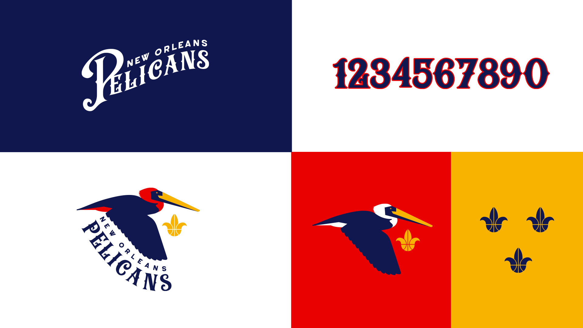
The stand-alone lettering is given a performative upward motion, the numbers are more expressive, and we have a couple pelican colorways (whenever possible its head and tail should be white). We also included a secondary mark, three Fleur de Lis basketballs arranged as they are in the city flag.
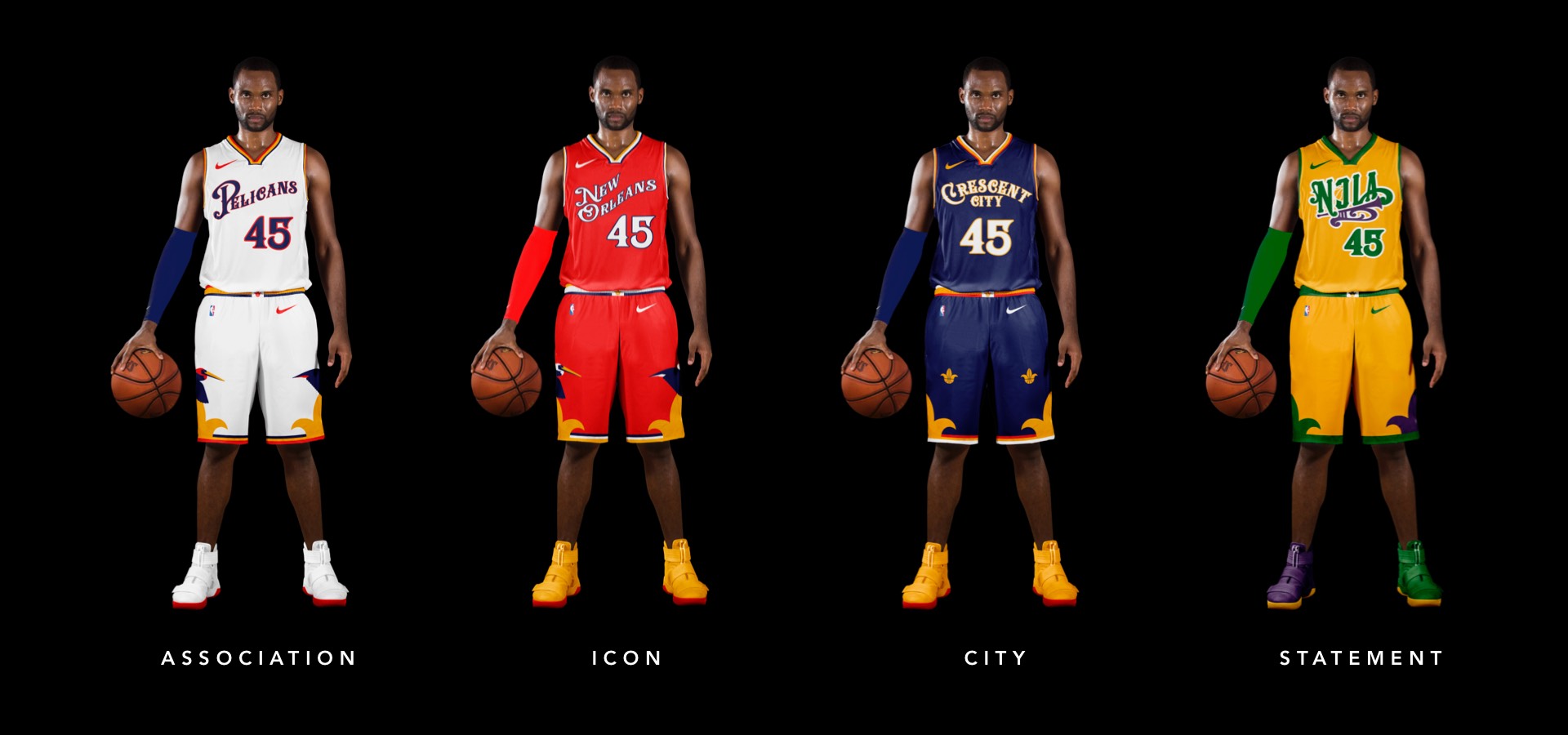
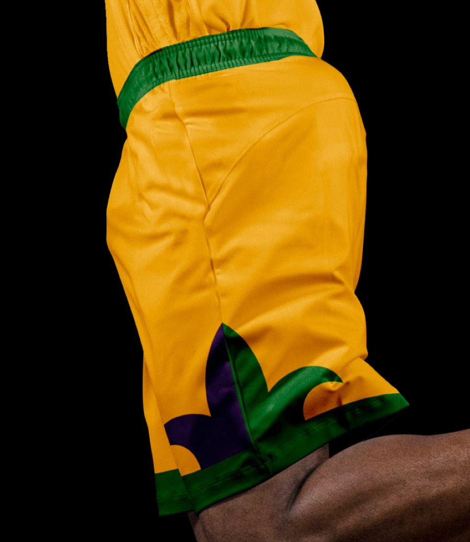
The jerseys get a big update with the evolved lettering, but the principles and the colors are still largely intact. The most significant change is the shorts, featuring a pelican flying over a Fleur de Lis.
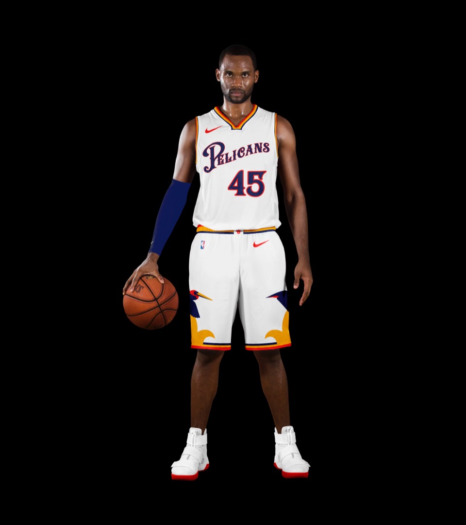
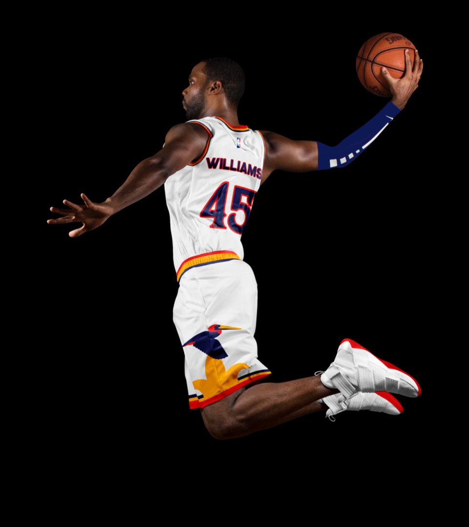
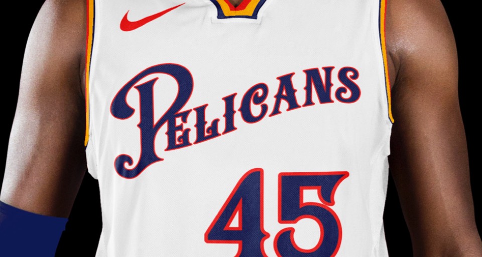
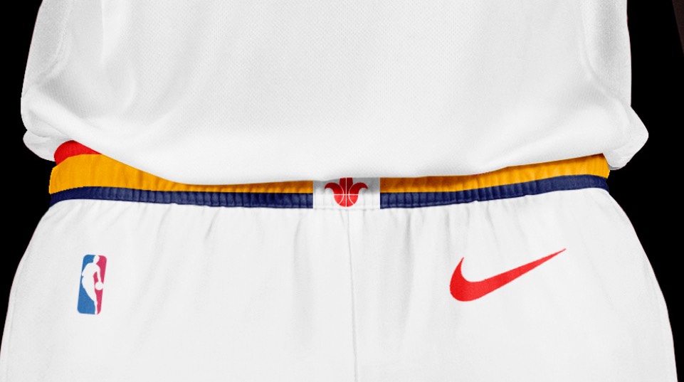
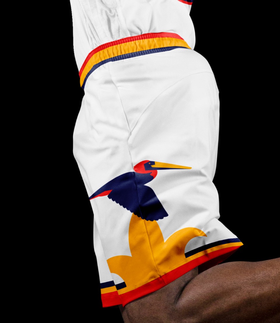
The jerseys get a big update with the evolved lettering, but the principles and the colors are still largely intact. The most significant change is the shorts, featuring a pelican flying over a Fleur de Lis.


The jerseys get a big update with the evolved lettering, but the principles and the colors are still largely intact. The most significant change is the shorts, featuring a pelican flying over a Fleur de Lis.
The jerseys get a big update with the evolved lettering, but the principles and the colors are still largely intact. The most significant change is the shorts, featuring a pelican flying over a Fleur de Lis.
It's surprising that we haven't seen a "Crescent City" uniform yet! Whelp, here it is. Set on a navy background with gold accents, the name is laid out in a crescent (duh) and the shorts feature three Fleur de Lis in a configuration that matches the city flag.
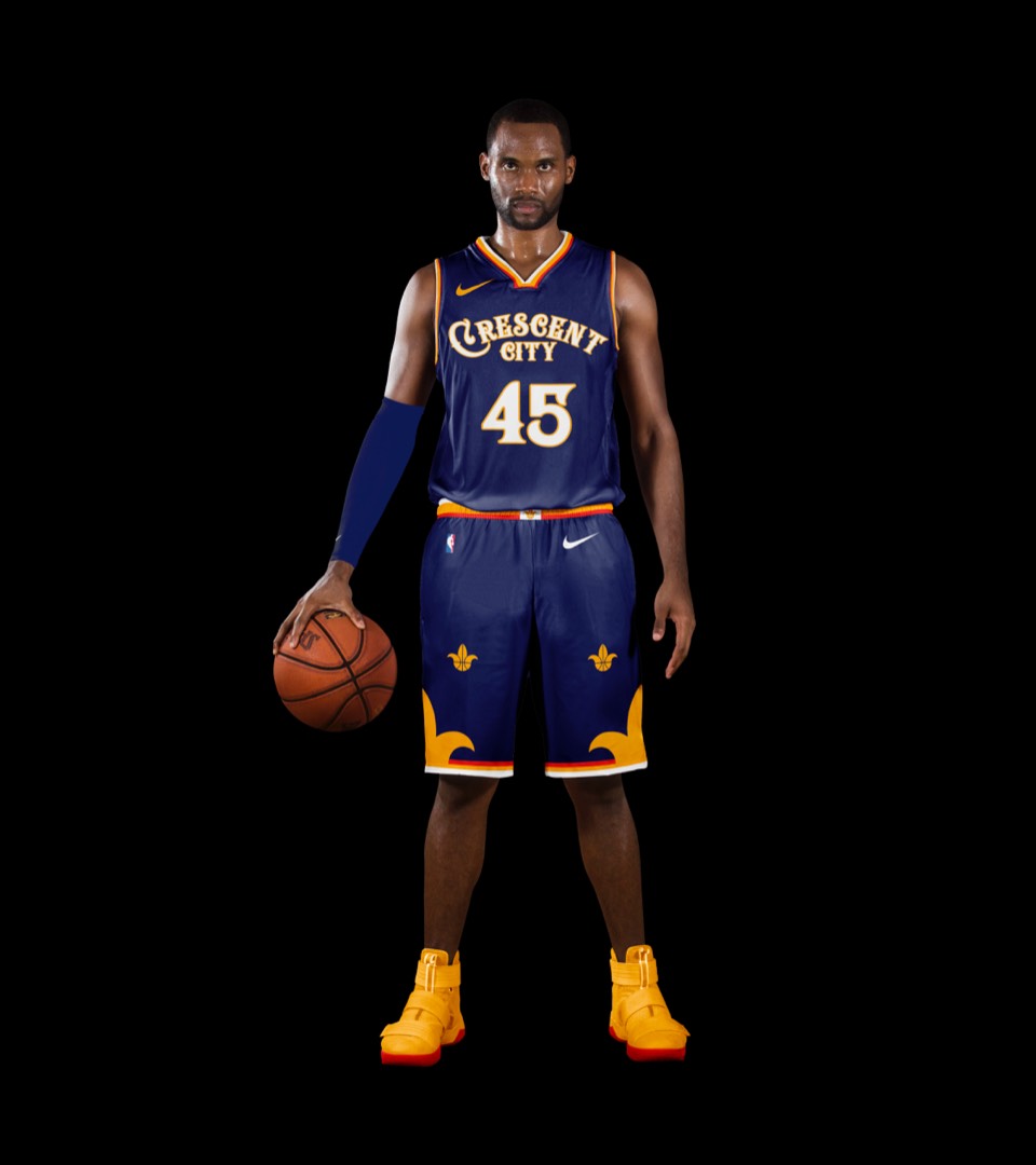
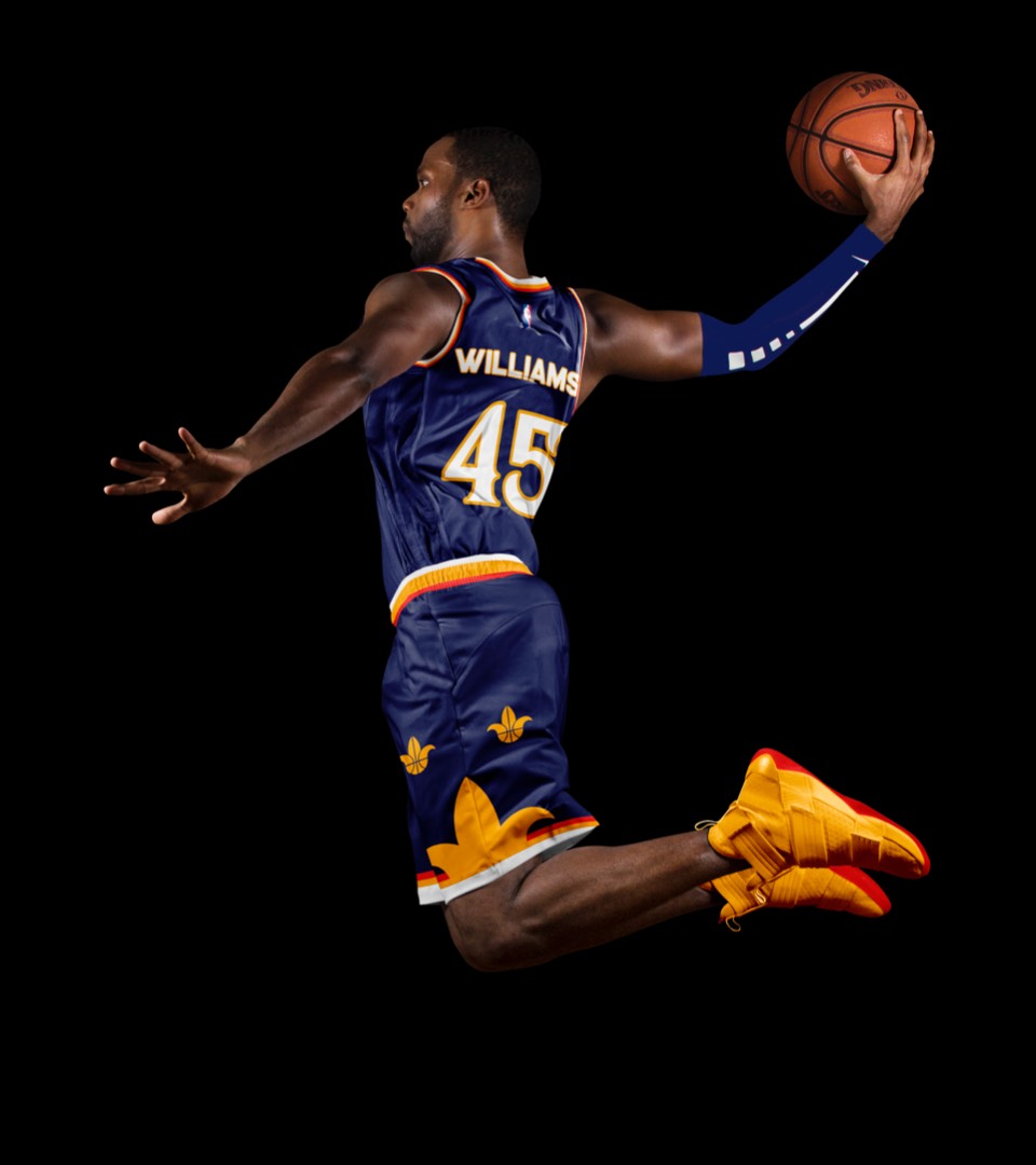
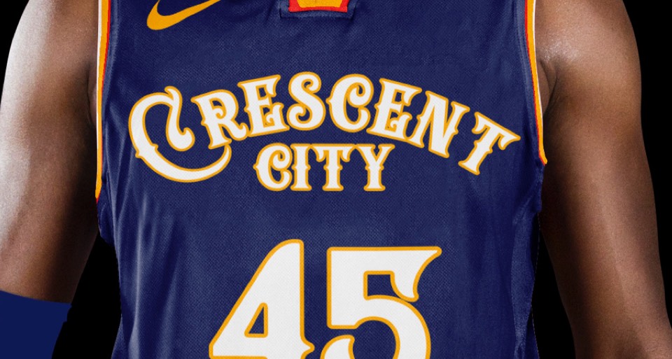
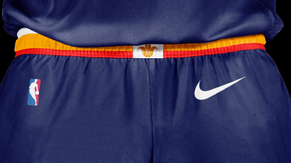
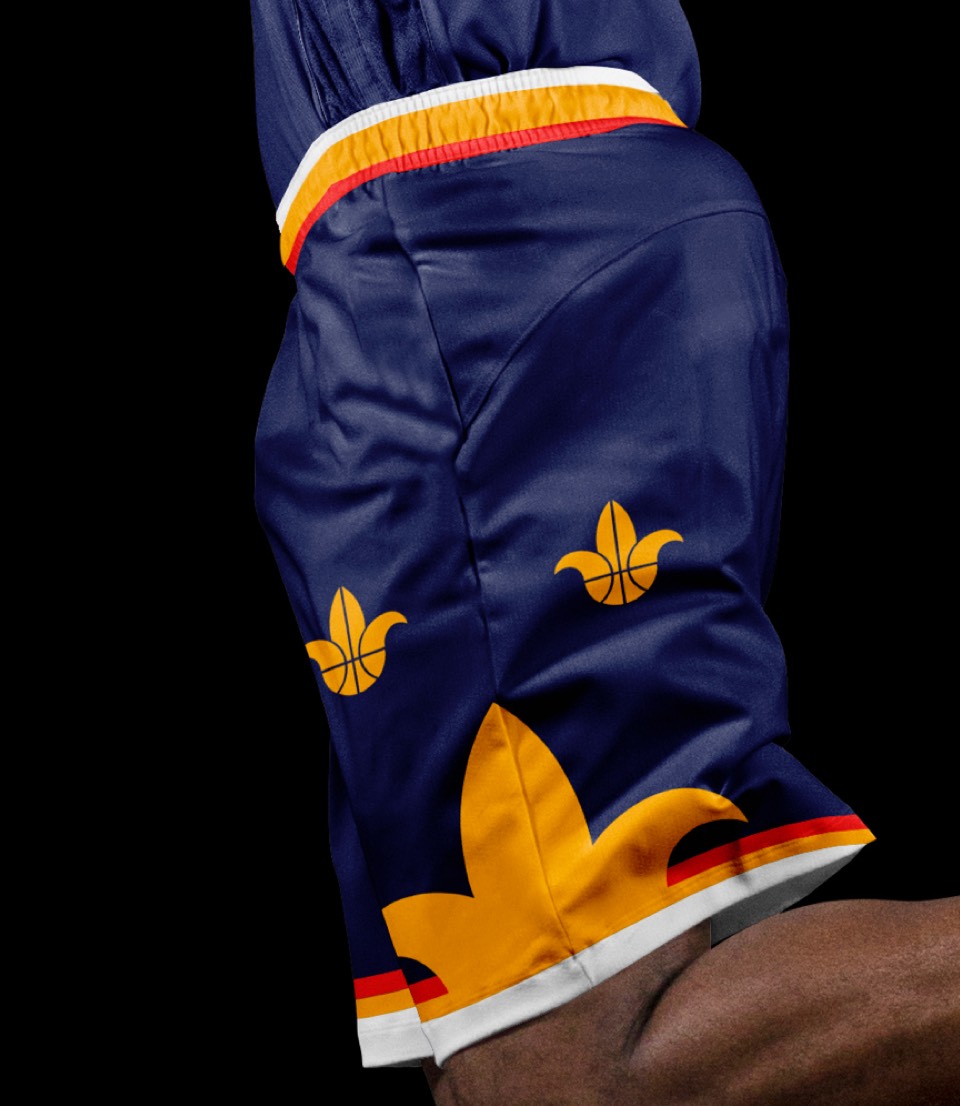
It's surprising that we haven't seen a "Crescent City" uniform yet! Whelp, here it is. Set on a navy background with gold accents, the name is laid out in a crescent (duh) and the shorts feature three Fleur de Lis in a configuration that matches the city flag.


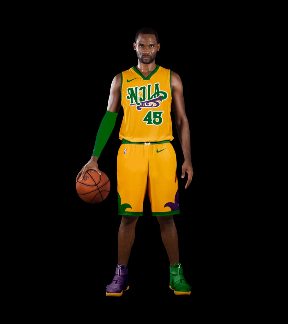
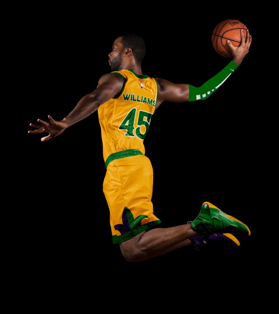
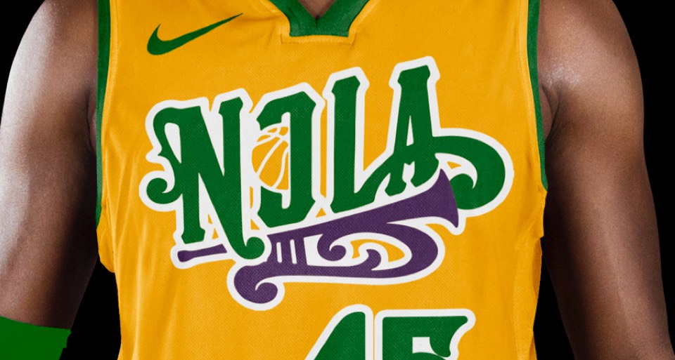
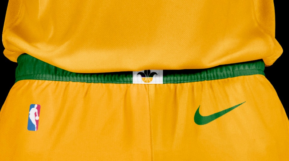
This is a bit of a throwback: one of the pre-pelicans secondary logos captured the spirit of New Orleans beautifully, and is the perfect centerpiece for a Mardi-gras colored NOLA uniform.


This is a bit of a throwback: one of the pre-pelicans secondary logos captured the spirit of New Orleans beautifully, and is the perfect centerpiece for a Mardi-gras colored NOLA uniform.
