
This is the rare case where the uniforms feel more untouchable and iconic than the actual logo. It doesn't really say anything about New York (unless you count the skyscraper-inspired letters) or what a Knickerbocker is.

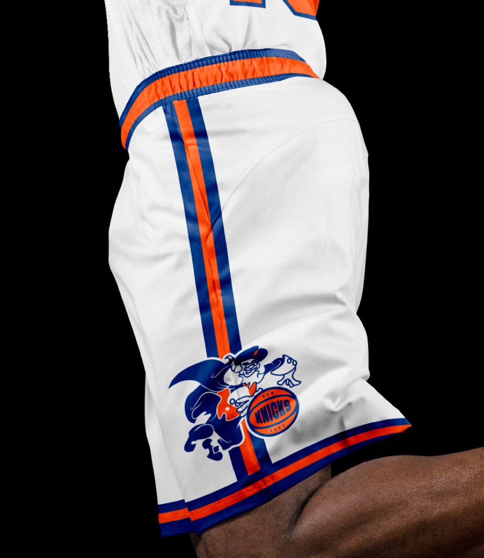
There are a number of interesting moments throughout the Knicks' logo history; we gravitated toward two: the first logo, a poorly drawn knickerbocker dribbling a basketball, and a secondary logo from the last re-design of the word mark inside a "side" view of a basketball. Silly as it may be, we thought it would be neat to put those together. We re-drew their original Knickerbocker and replaced his ball with a version of the old secondary logo. The only brand new update was some new custom lettering, still inspired by sky scrapers but less reliant on being dimensional.
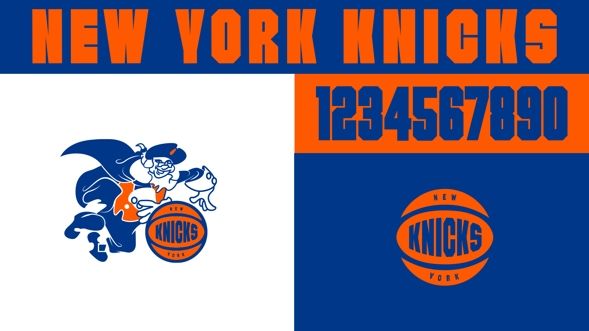
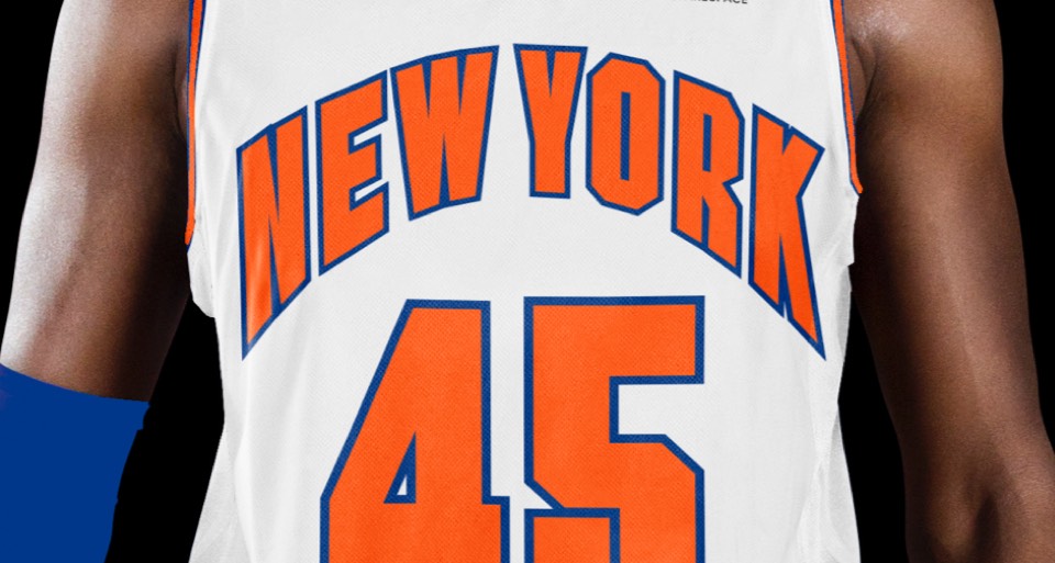
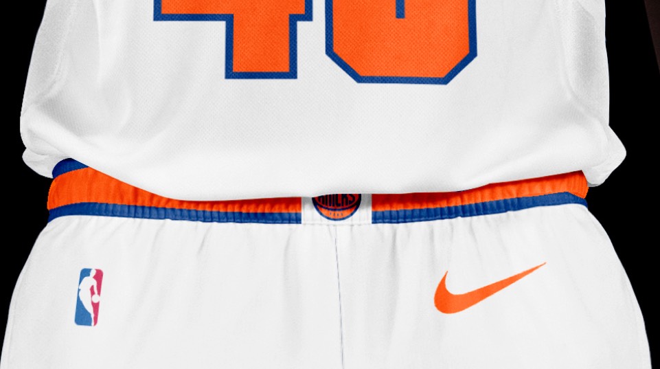
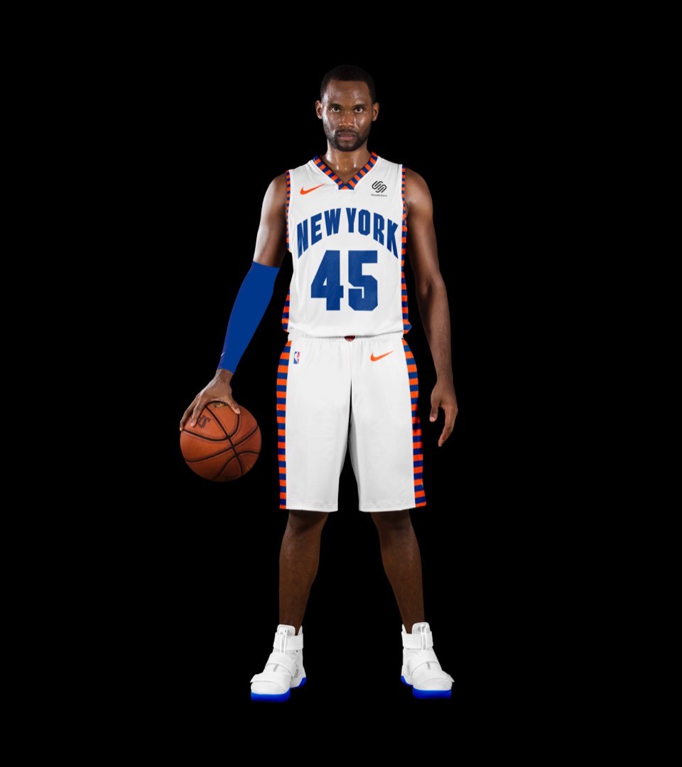
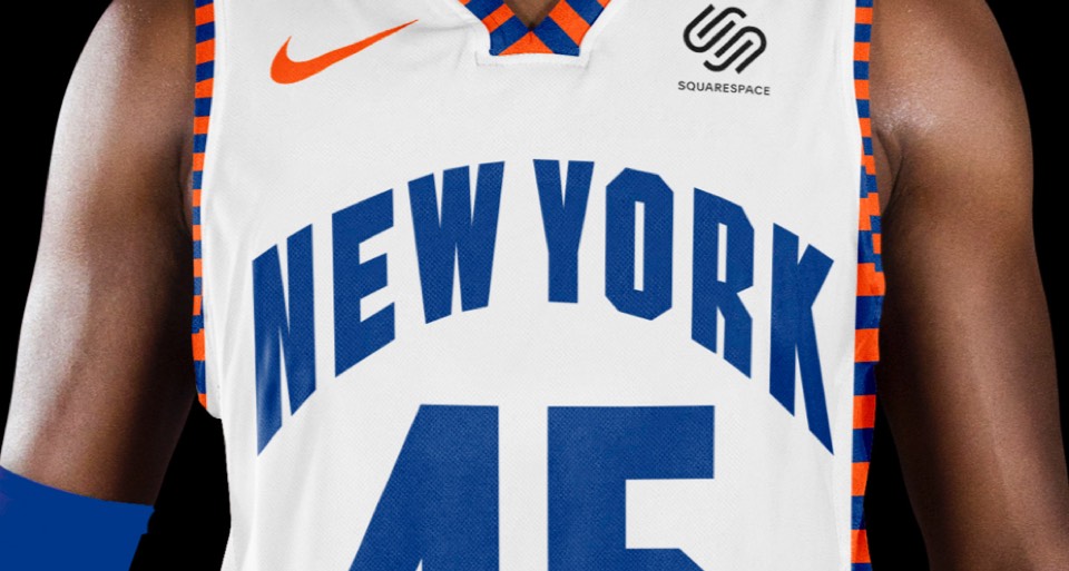
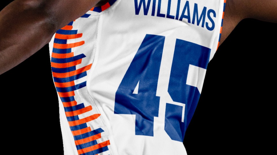
The premise of the new type is, make the letters as grid-like and boxy as possible with very tiny counter forms. Same with the numbers. We wanted everything to feel big and tight. The blue and orange are the official colors of New York, the most iconic thing about the Knicks, so no touching that; just get rid of the black. We did extract the basketball from our hooping Dutchman as a secondary mark.
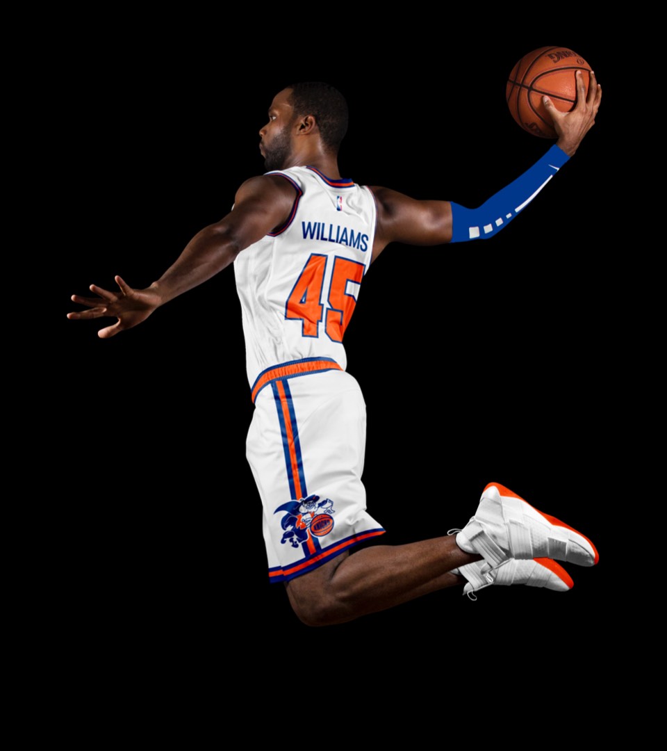
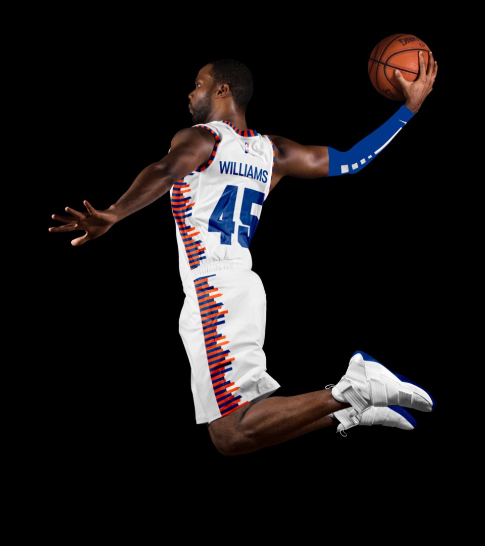
Looking through the history of the Knicks uniforms, the coolest ones were in the 60's, when the New York lettering ditched the slab serif and was so big it would bleed down and around the sides of the jersey. Today's lettering is way too small, it needs to feel larger than life. We created a distorted version of the NEW YORK letters, giving you the sense of buildings towering over you.
Looking through the history of the Knicks uniforms, the coolest ones were in the 60's, when the New York lettering ditched the slab serif and was so big it would bleed down and around the sides of the jersey. Today's lettering is way too small, it needs to feel larger than life. We created a distorted version of the NEW YORK letters, giving you the sense of buildings towering over you.
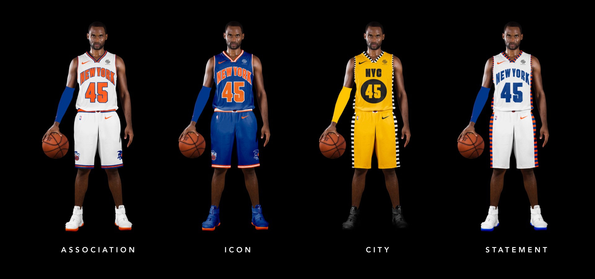
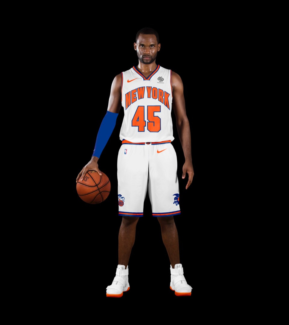
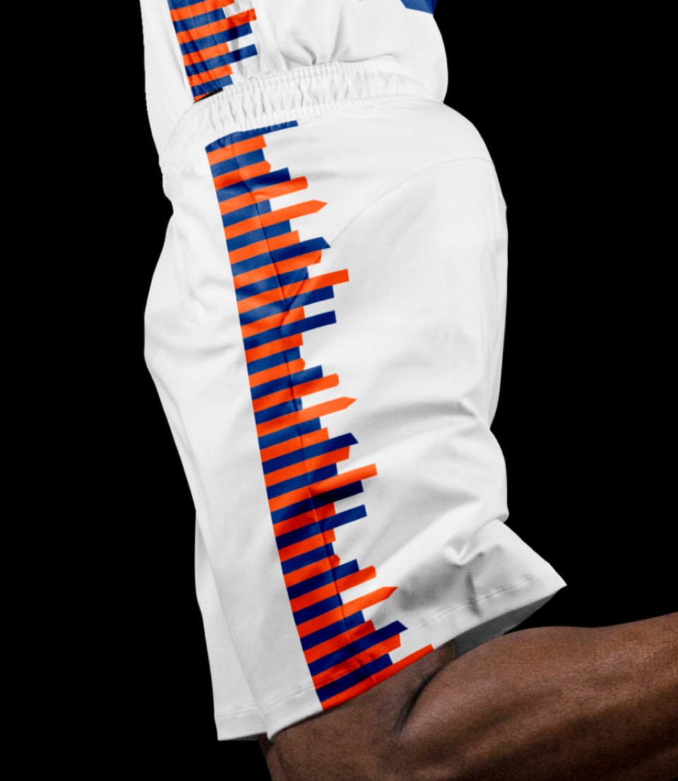
Icon and association uniforms keep the same color approach, but in addition to the aforementioned lettering, the shorts now feature the new Knickerbocker logo prominently on each leg, with a stripe that nods to the shorts they wore in their glory days.
Icon and association uniforms keep the same color approach, but in addition to the aforementioned lettering, the shorts now feature the new Knickerbocker logo prominently on each leg, with a stripe that nods to the shorts they wore in their glory days.
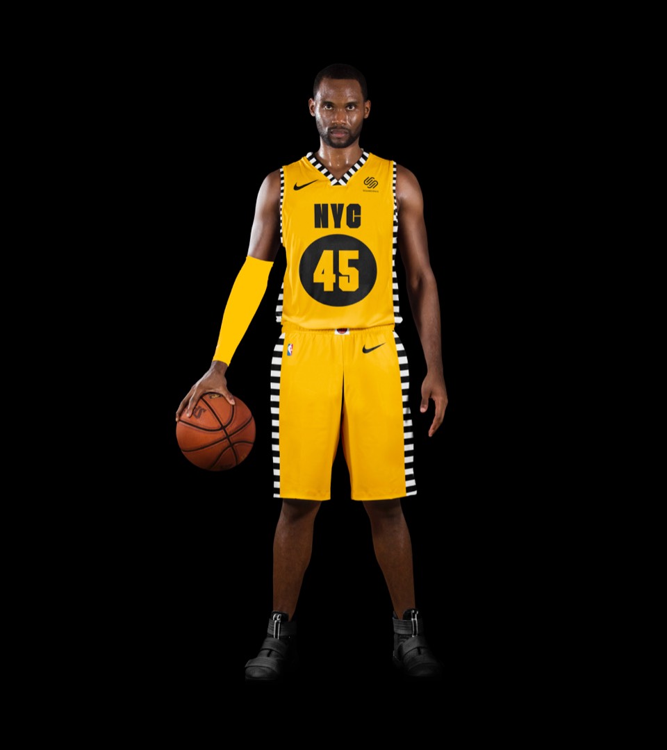
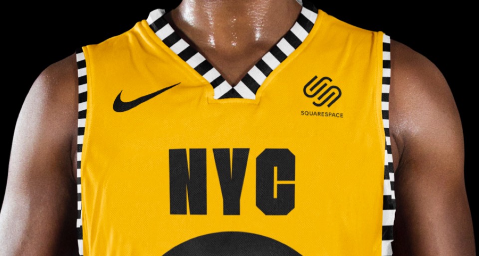
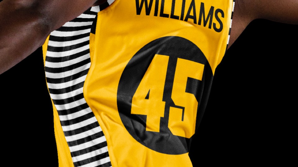
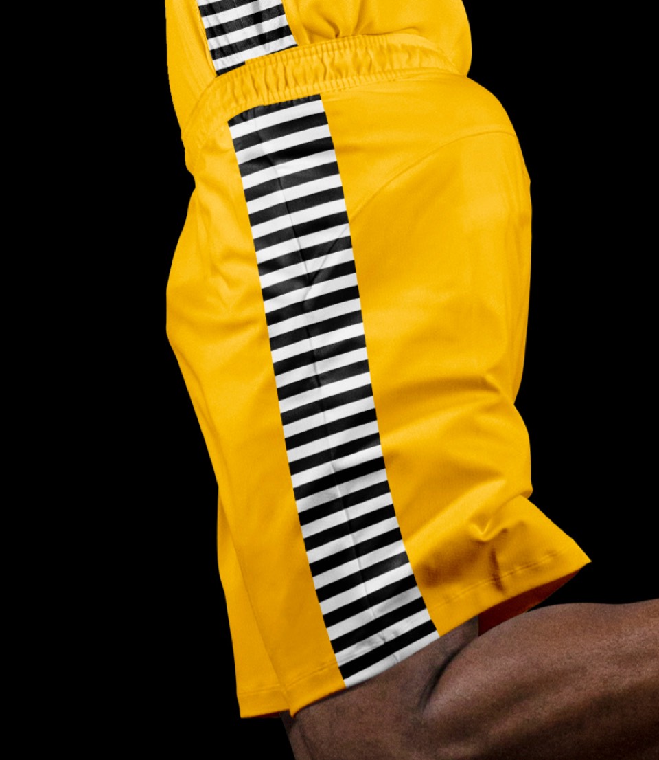
Too on-the-nose? We've seen subway concepts but not taxi uniforms; it's a build on their original checkerboard trim but with a yellow and black color treatment that feels fresh considering how ubiquitous the yellow taxis have always been in the city.

Too on-the-nose? We've seen subway concepts but not taxi uniforms; it's a build on their original checkerboard trim but with a yellow and black color treatment that feels fresh considering how ubiquitous the yellow taxis have always been in the city.
A new color way for a previous City jersey (with the NYC skyline built into the side stripes) that gets closer to the original 50's throwbacks.
A new color way for a previous City jersey (with the NYC skyline built into the side stripes) that gets closer to the original 50's throwbacks.