

... I guess it's a shield? Beyond that it's a whole lot of graphic fluff that feels kind of energetic but doesn't really say anything about OKC. It feels like a fake team that you would create as filler for a movie about a different basketball team.


Our new take revolves around a buffalo (like the thunder of a herd) and also with embedded lightning bolts in the type (go big or go huge)! We reset the hierarchy so it reads OKLAHOMA CITY THUNDER instead of THUNDER OKC, and pared the colors down to their navy and orange.
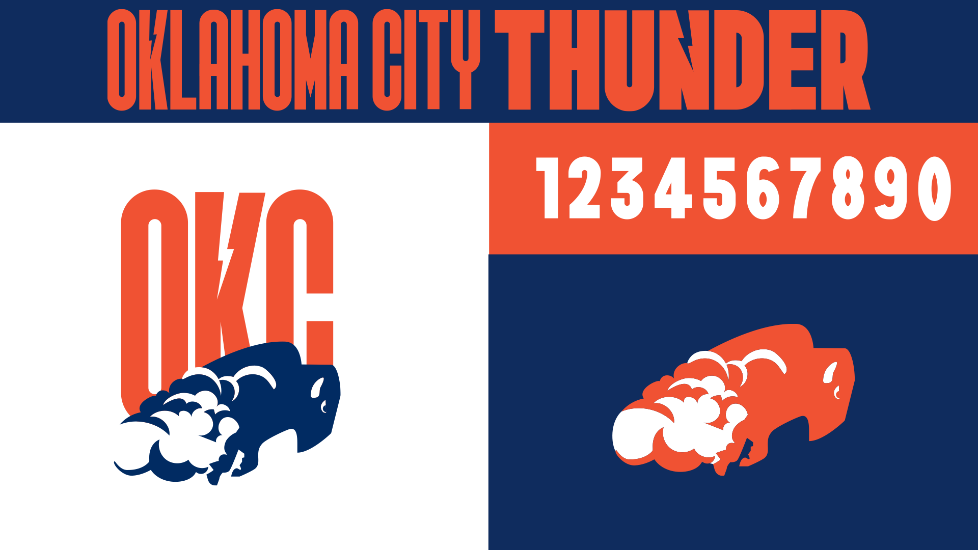
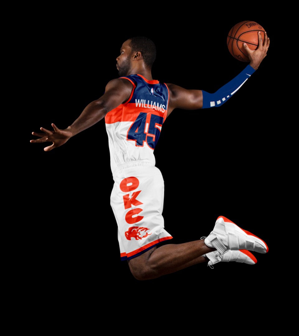
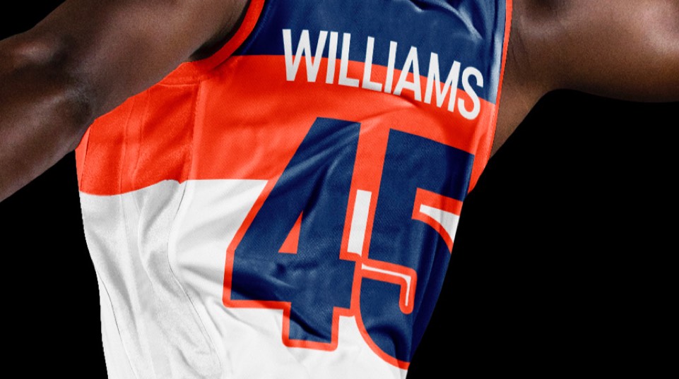
The lettering was the most fun part of this; we wanted it to be malleable to accommodate for the fact that everything from OKLAHOMA CITY (13 characters) to OKC (3 characters) would need to fill the same space on a jersey. The lettering can go from super condensed to super extended depending on context; and the K and N each have little lightning bolts embedded in them so they can say thunder on their own or with the buffalo. We extended the type to the numbers and created an alt colorway of the buffalo to function on dark backgrounds, as well as an "OKC" secondary logo (that we sorta prefer).
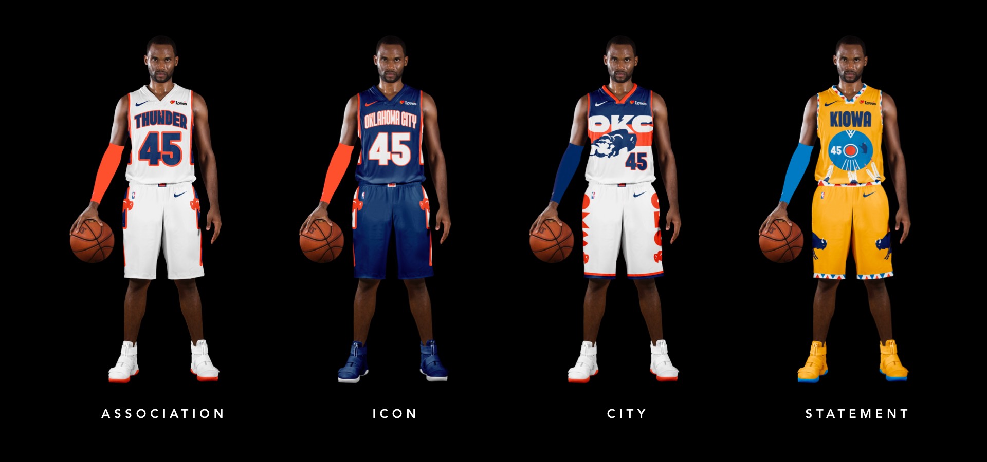
The issue with OKC's uniforms over the years is, they never figured out how to make their numbers and name feel BIG. Our new lettering solves that, and we also helped the vertical movement by simplifying all the little graphic moves and just having two big lightning bolts strike down the sides of the uniform (which also makes the shorts pretty awesome as a stand-alone).
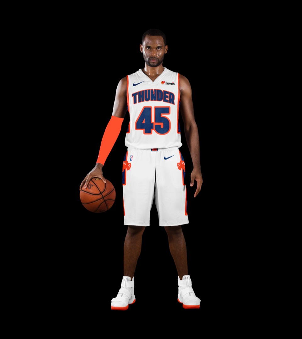
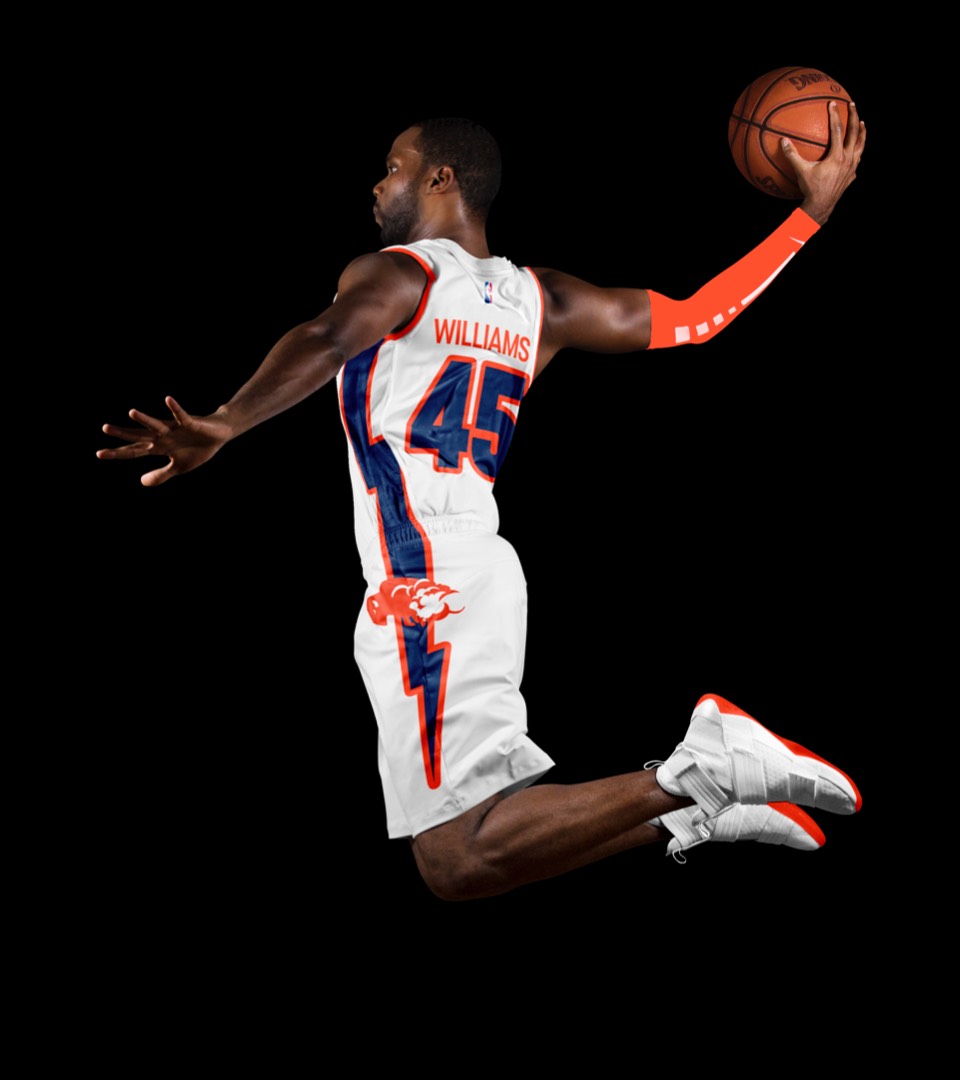
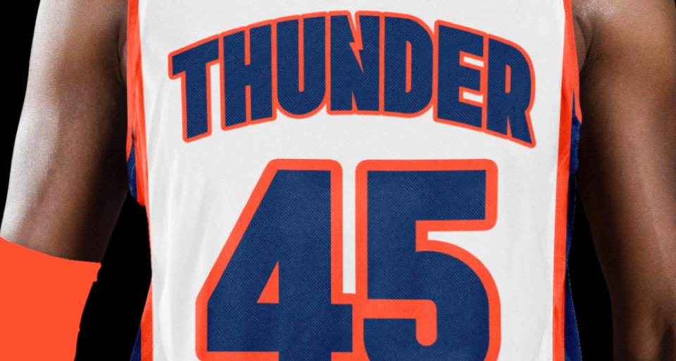
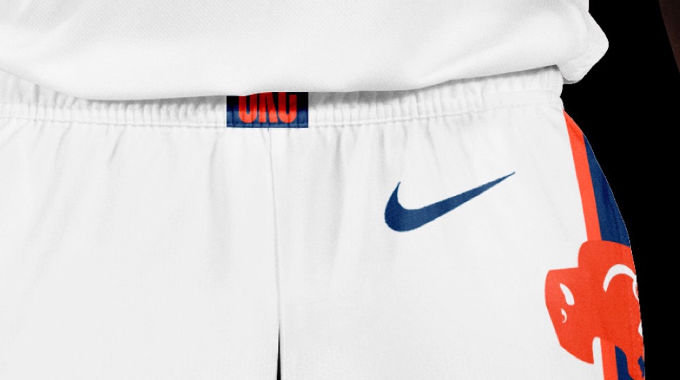
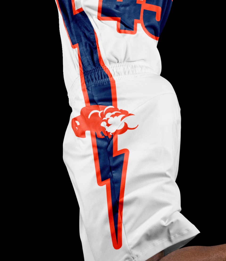
The issue with OKC's uniforms over the years is, they never figured out how to make their numbers and name feel BIG. Our new lettering solves that, and we also helped the vertical movement by simplifying all the little graphic moves and just having two big lightning bolts strike down the sides of the uniform (which also makes the shorts pretty awesome as a stand-alone).


Before, OKLAHOMA CITY had to be stacked on top of each other and it looked absolutely tiny. Our super-compressed letterforms allow for it to feel comfortably big even with all those letters.
Before, OKLAHOMA CITY had to be stacked on top of each other and it looked absolutely tiny. Our super-compressed letterforms allow for it to feel comfortably big even with all those letters.
Moving our buffalo front and center, the OKC version is meant to evoke the expansiveness of the Great Plains.
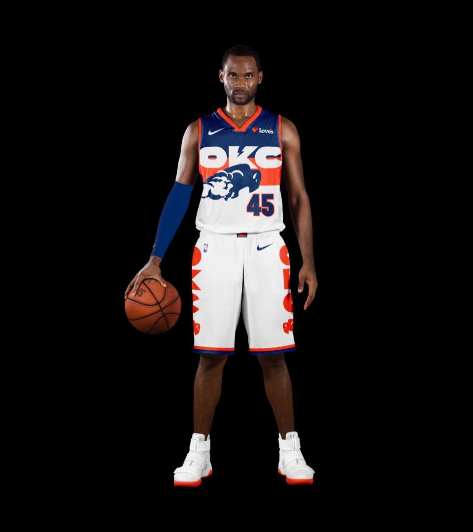
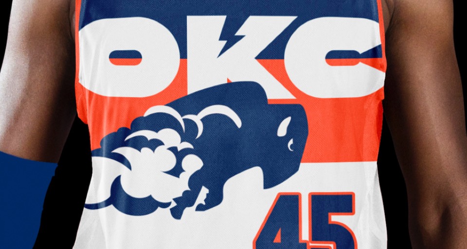
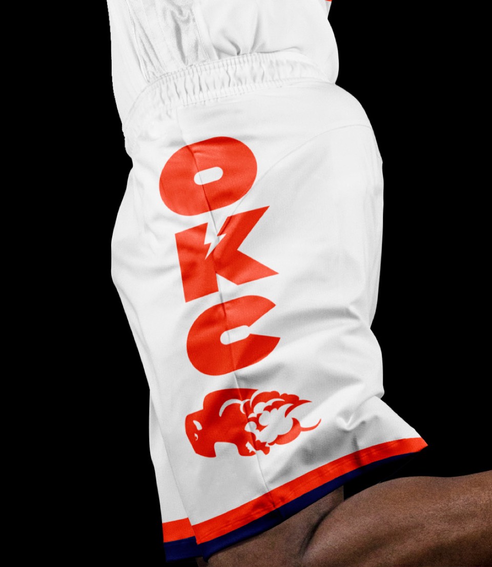
Moving our buffalo front and center, the OKC version is meant to evoke the expansiveness of the Great Plains.


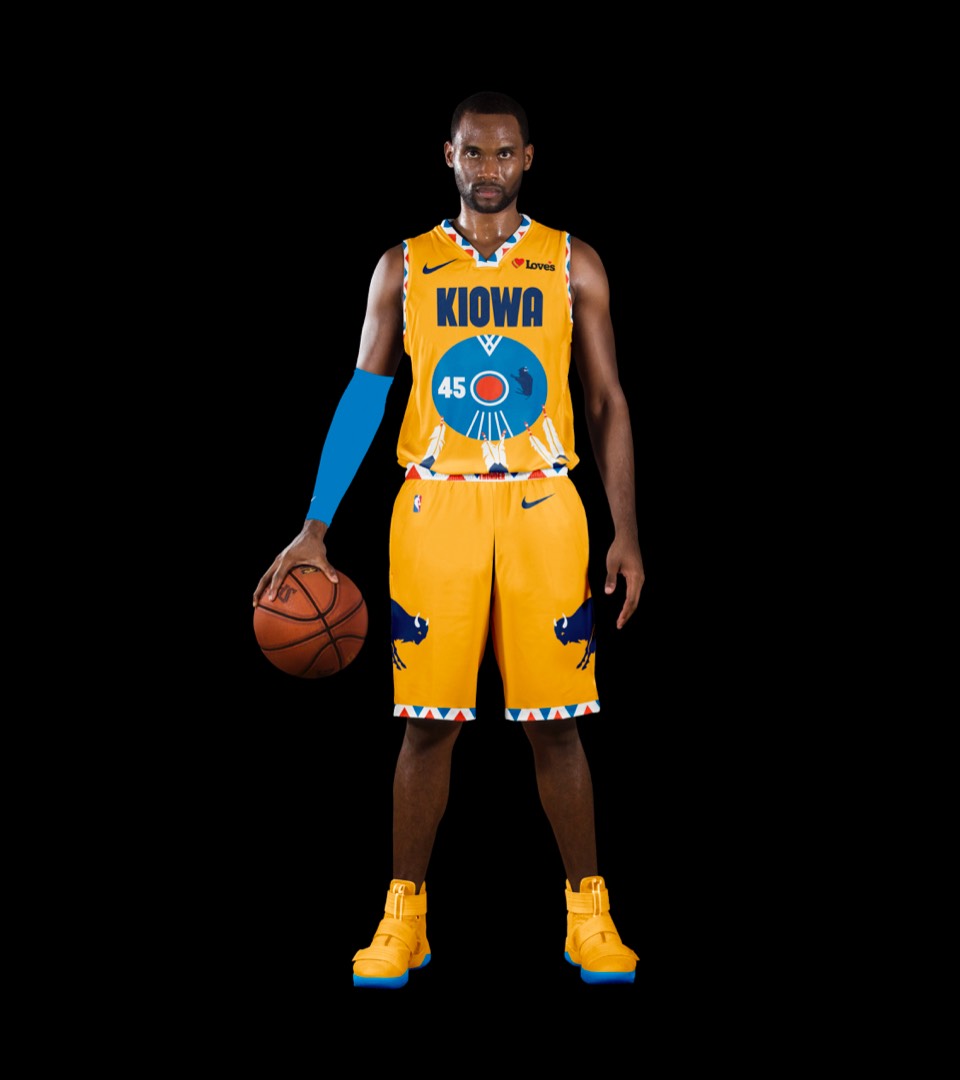
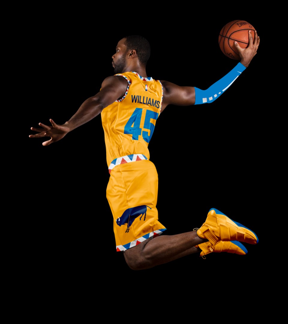
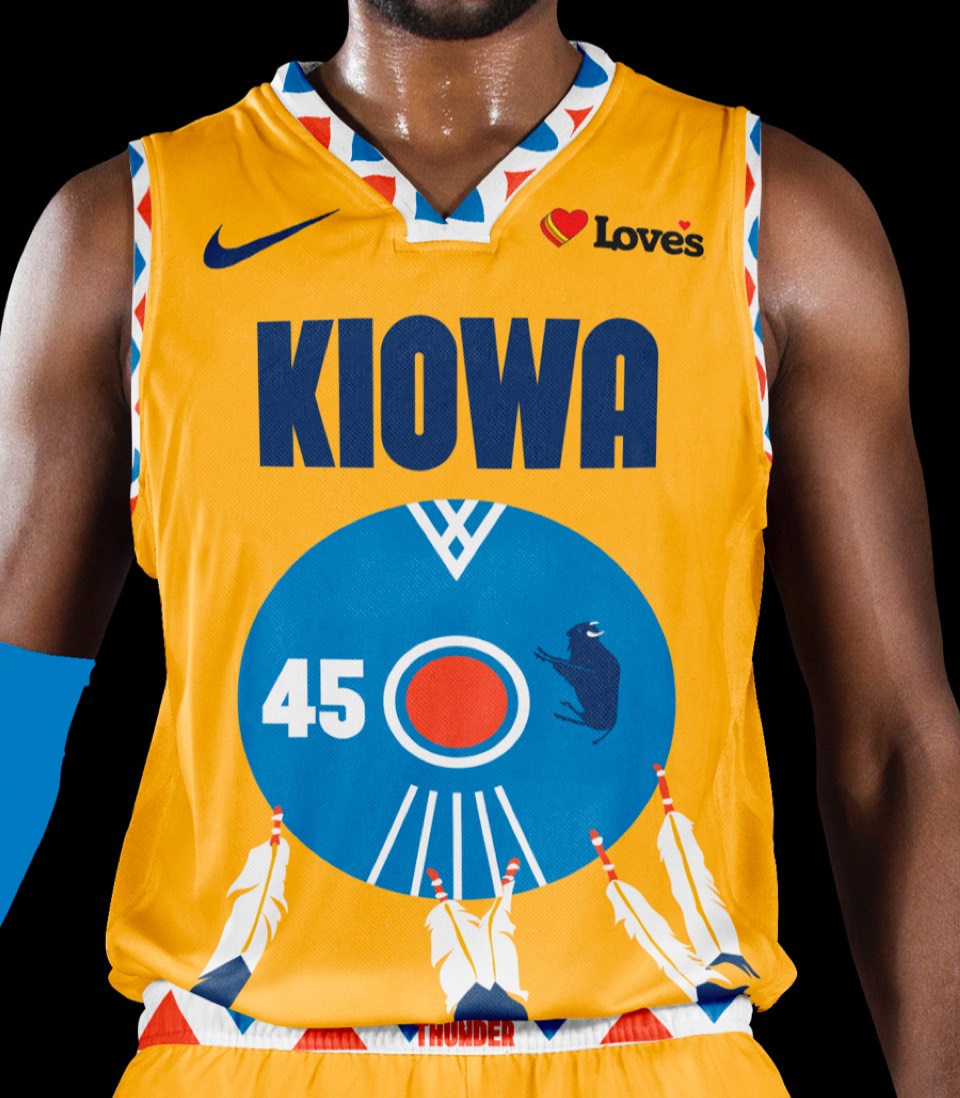
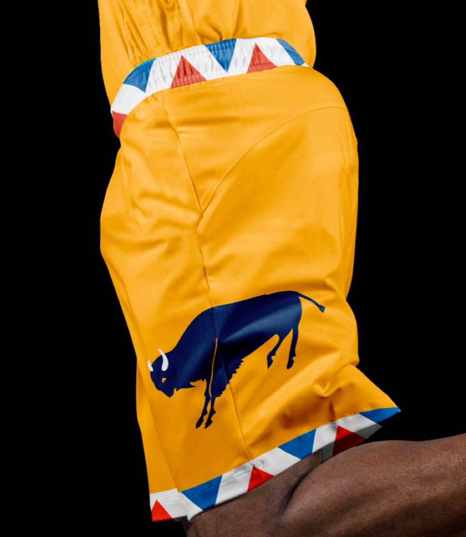
Oklahoma has five indigenous tribes, and a whopping 39 that call the state home. How great would it be if the Statement uniform was a collectible tribute to a different tribe every year, starting with the Kiowa, one of Oklahoma's five indigenous Native American tribes.


Oklahoma has five indigenous tribes, and a whopping 39 that call the state home. How great would it be if the Statement uniform was a collectible tribute to a different tribe every year, starting with the Kiowa, one of Oklahoma's five indigenous Native American tribes.
