

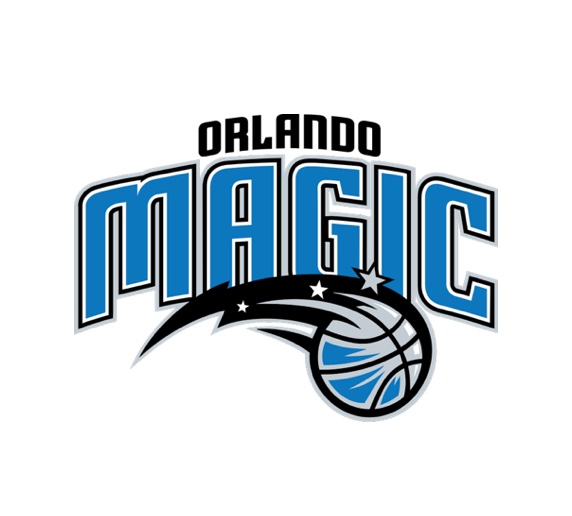
This is everything that's wrong about sports lettering—the asymmetrical letter structure, curves and points all at the same time, upper and lowercase letterforms, triple strokes... And the logo of the "comet" ball with a couple sparkles feels halfhearted and more like space than magic.


We drew lettering inspiration from turn-of-the-century magic show posters, to bring back the whimsy with a little bit of an edge. The lettering is more simple (no strokes) while the icon is more magical, with lots of silver stars (shout-out to the first Magic logo) emanating off a levitating basketball held by two magic hands.
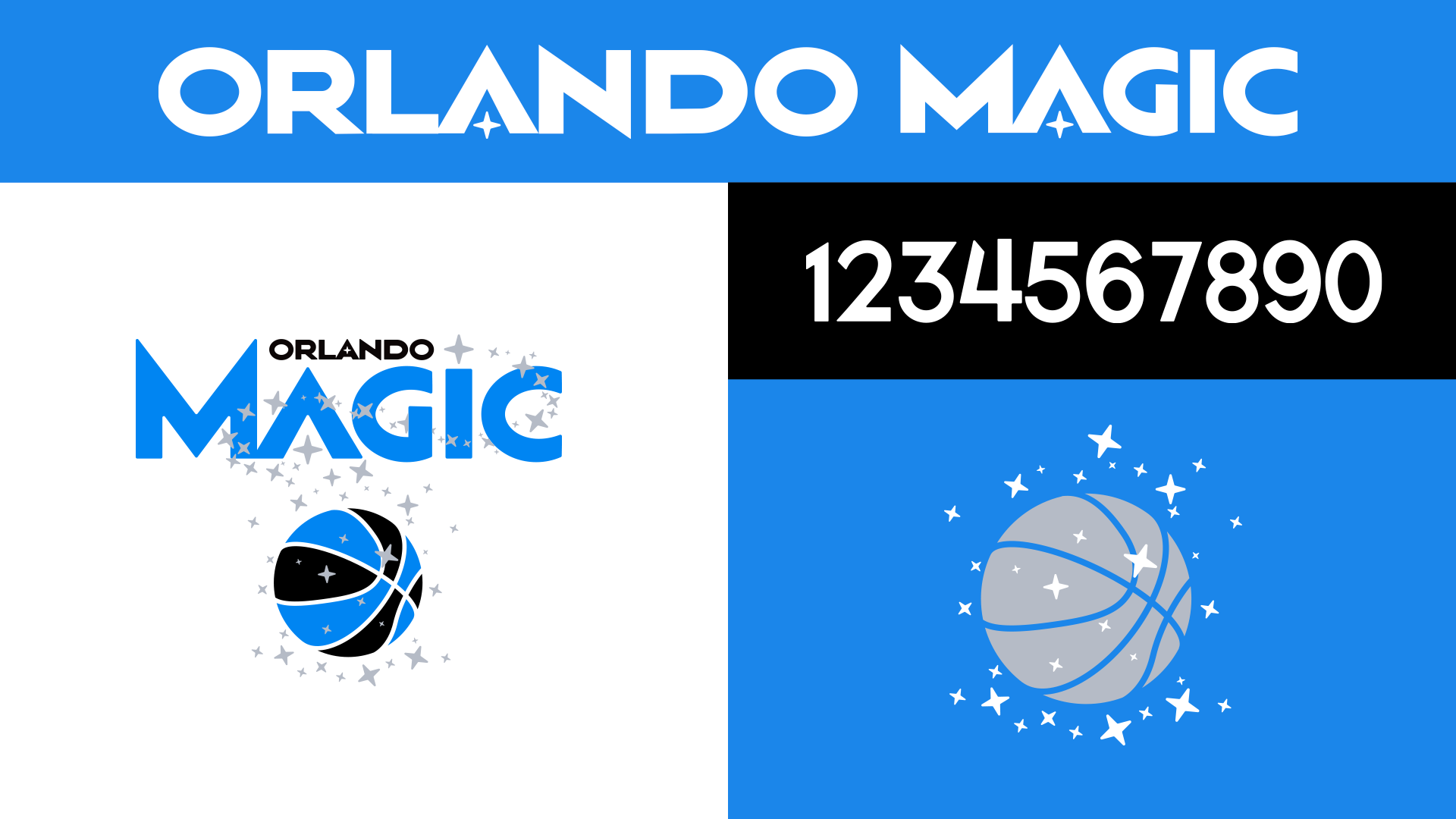
The new letter forms are more Magic-adjacent even before we add the sparkles in the A's; and the numbers in the same style feel like the grown-up (but not too stuffy) version the Shaq and Penny look.
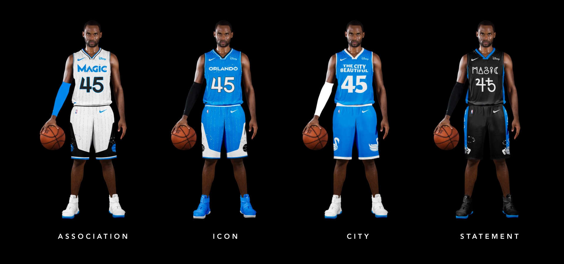
The type update and going back to the original color approach on the jerseys gets us most of the way there, but two elements really put it over the top: the giant stars on the side of both legs housing the secondary basketball logo, and the re-introduction of pinstripes. But not just ordinary pinstripes; MAGIC pinstripes.
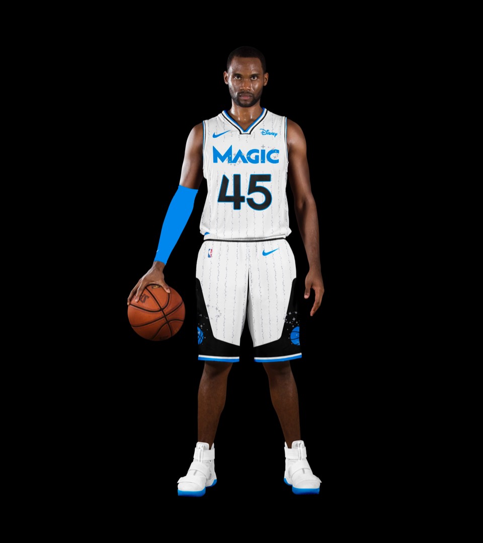
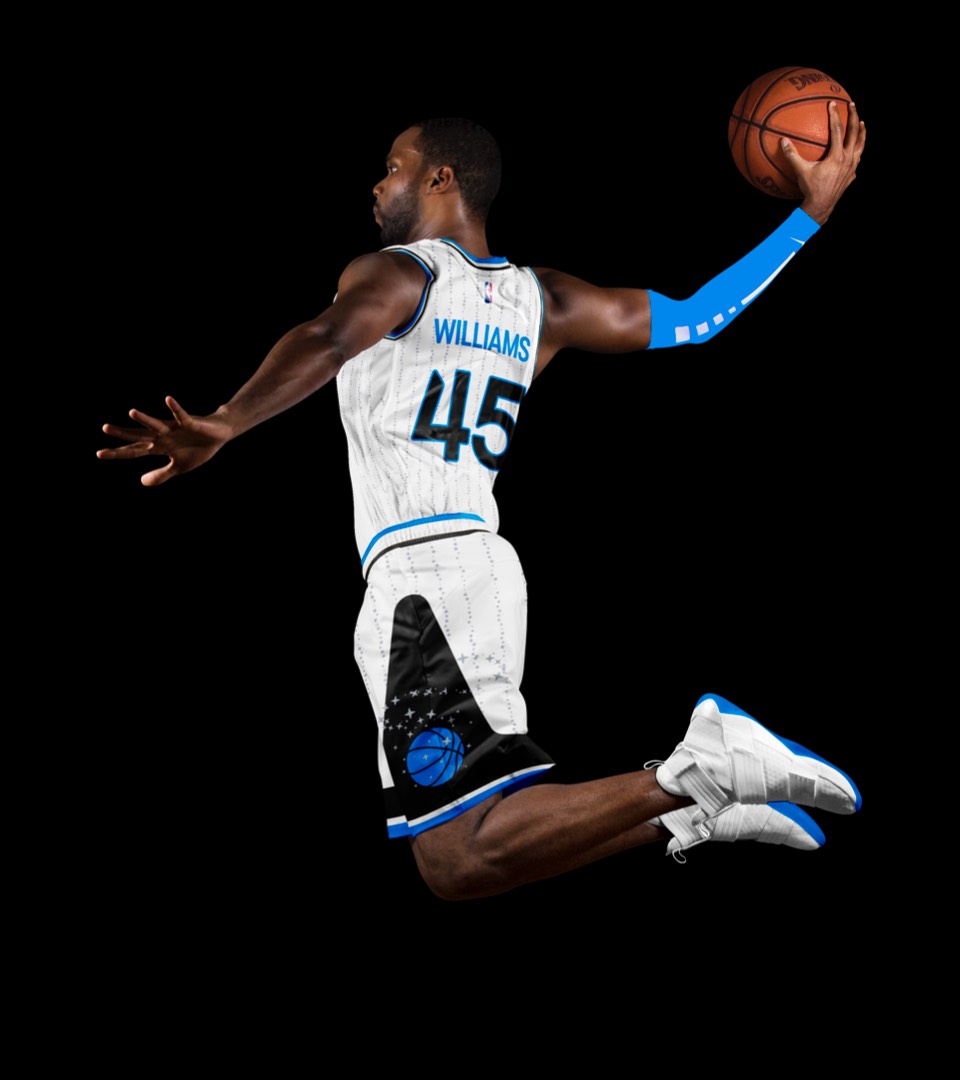
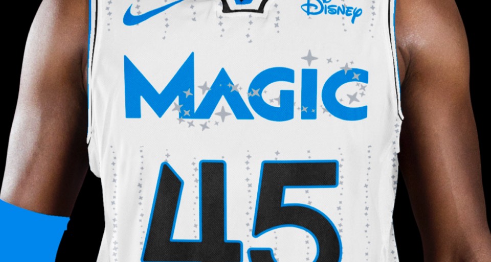
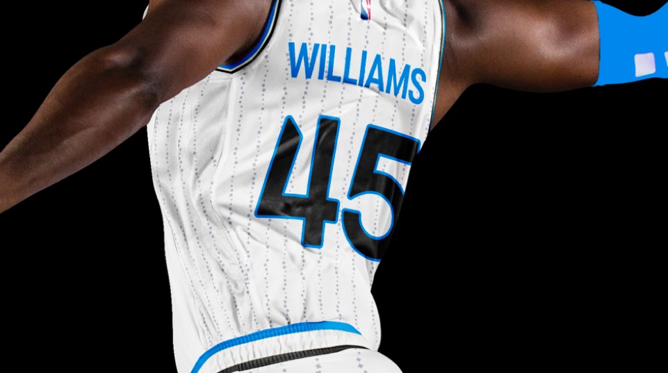
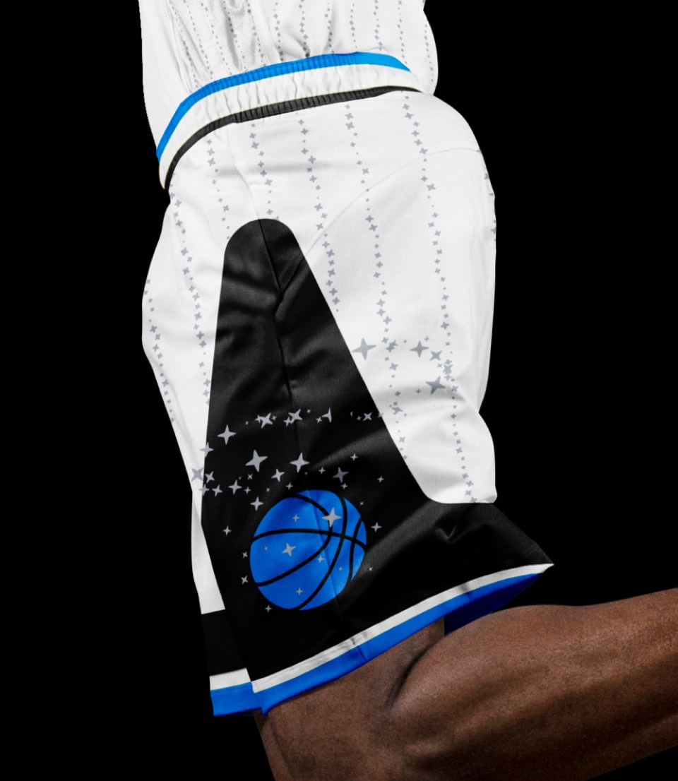
The type update and going back to the original color approach on the jerseys gets us most of the way there, but two elements really put it over the top: the giant stars on the side of both legs housing the secondary basketball logo, and the re-introduction of pinstripes. But not just ordinary pinstripes; MAGIC pinstripes.


All the same moves in the iconic blue colorway. And finally, we get a primary jersey that says ORLANDO to rally around.
All the same moves in the iconic blue colorway. And finally, we get a primary jersey that says ORLANDO to rally around.
Orlando means "The City Beautiful." We're bringing that sentiment into the city uniform, complete with the iconic Lake Eola swans on the shorts.
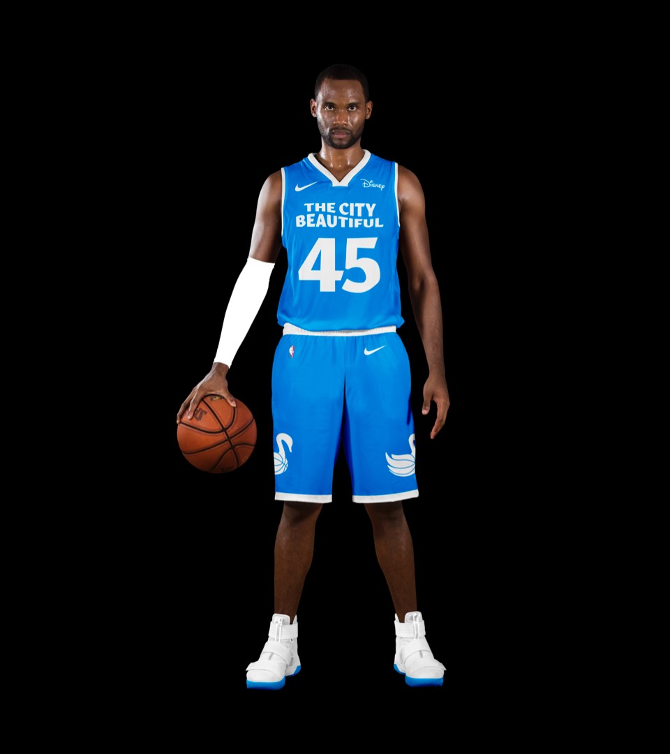
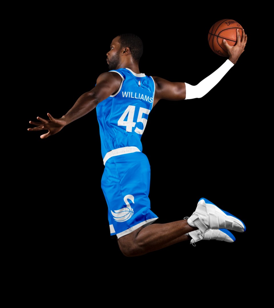
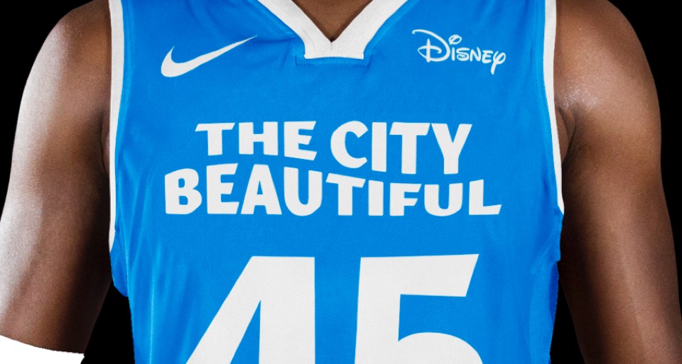
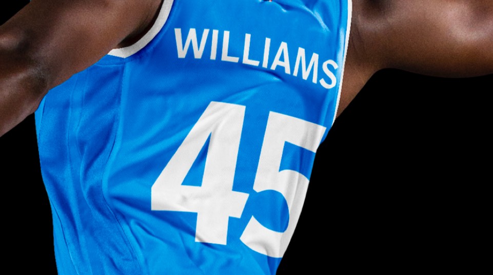
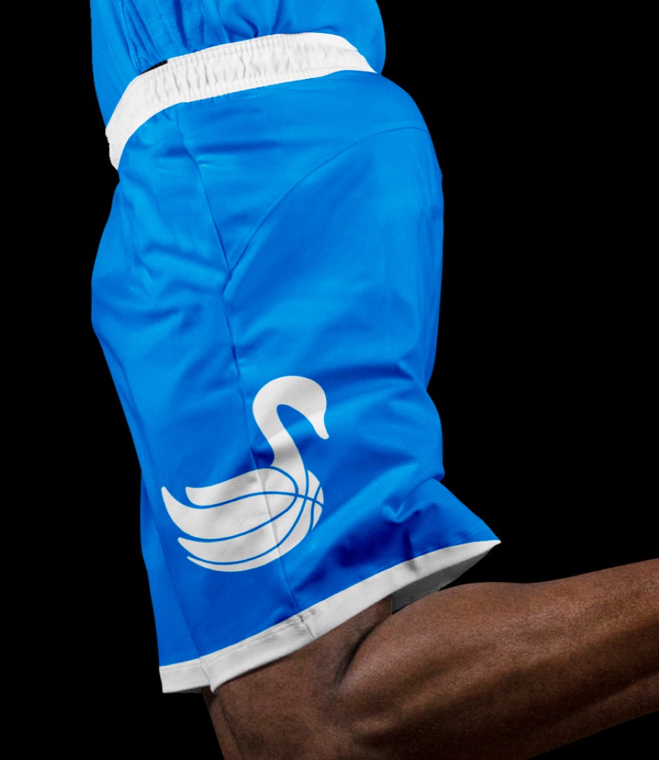
Orlando means "The City Beautiful." We're bringing that sentiment into the city uniform, complete with the iconic Lake Eola swans on the shorts.


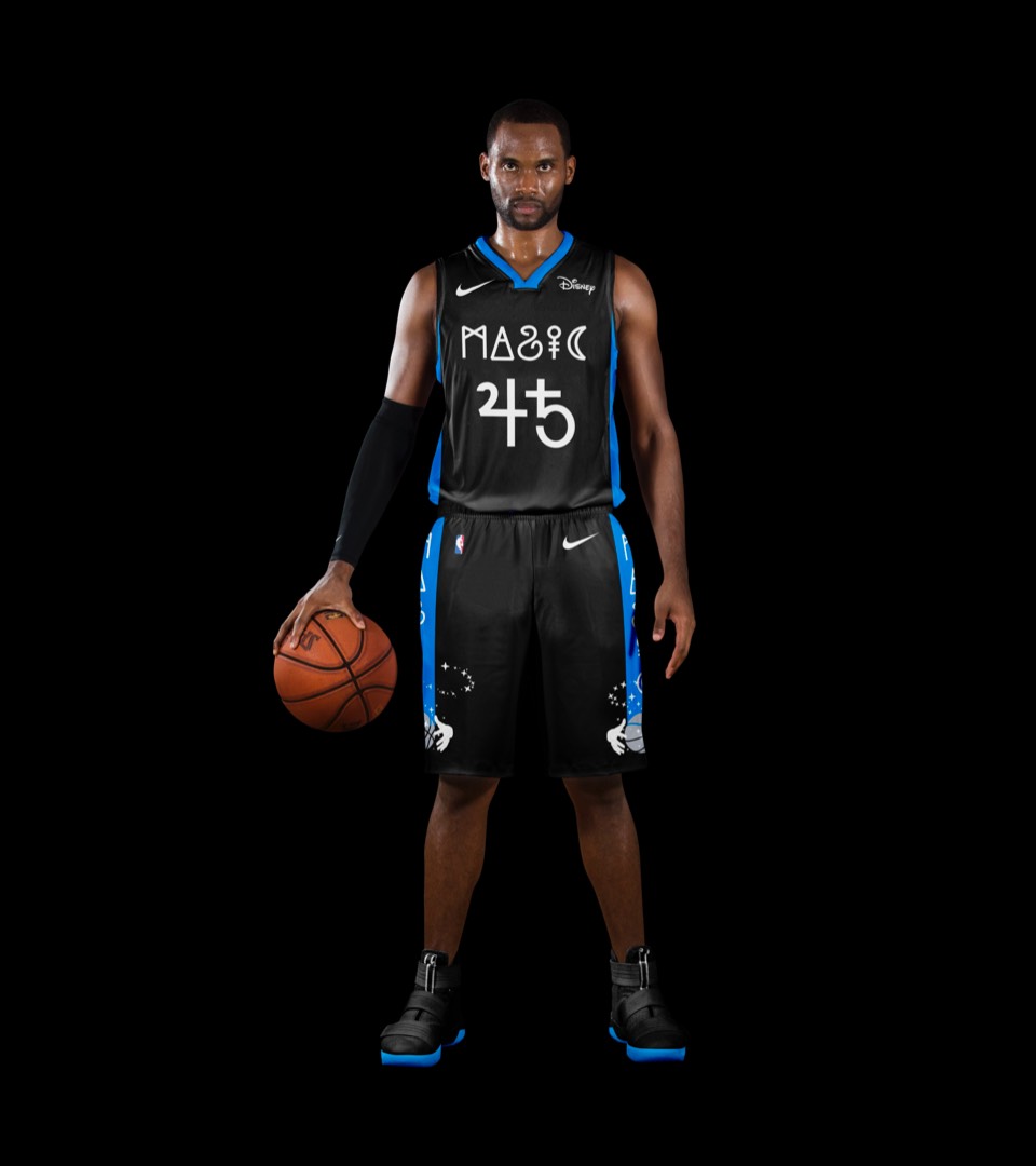
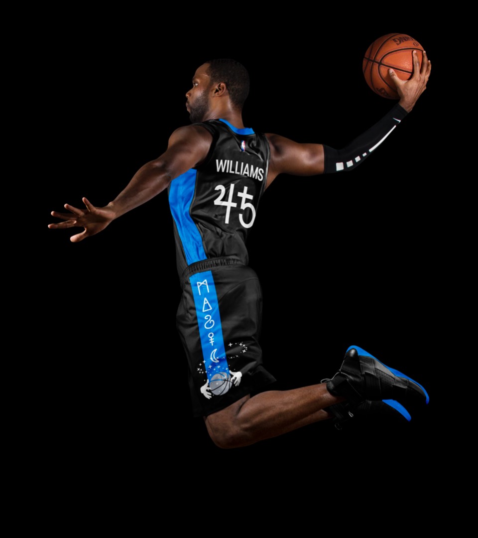
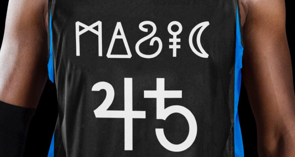
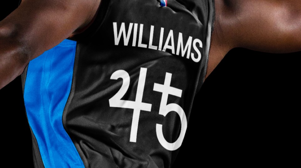
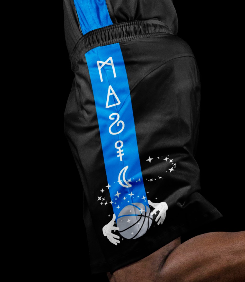
The "Black Magic" uniform features a custom (and cryptic) word mark and numbers with the magic ball logo unlocking another dimension (in the form of a side stripe) on the shorts.


The "Black Magic" uniform features a custom (and cryptic) word mark and numbers with the magic ball logo unlocking another dimension (in the form of a side stripe) on the shorts.
