
Their current logo wastes no space and is very satisfying to the eye. The logo itself is a modern take on their 60's era logo with subtle design tweaks. It's simple, appealing, timeless.

The only update was to match the more muted blue to a blue that matches the uniforms.
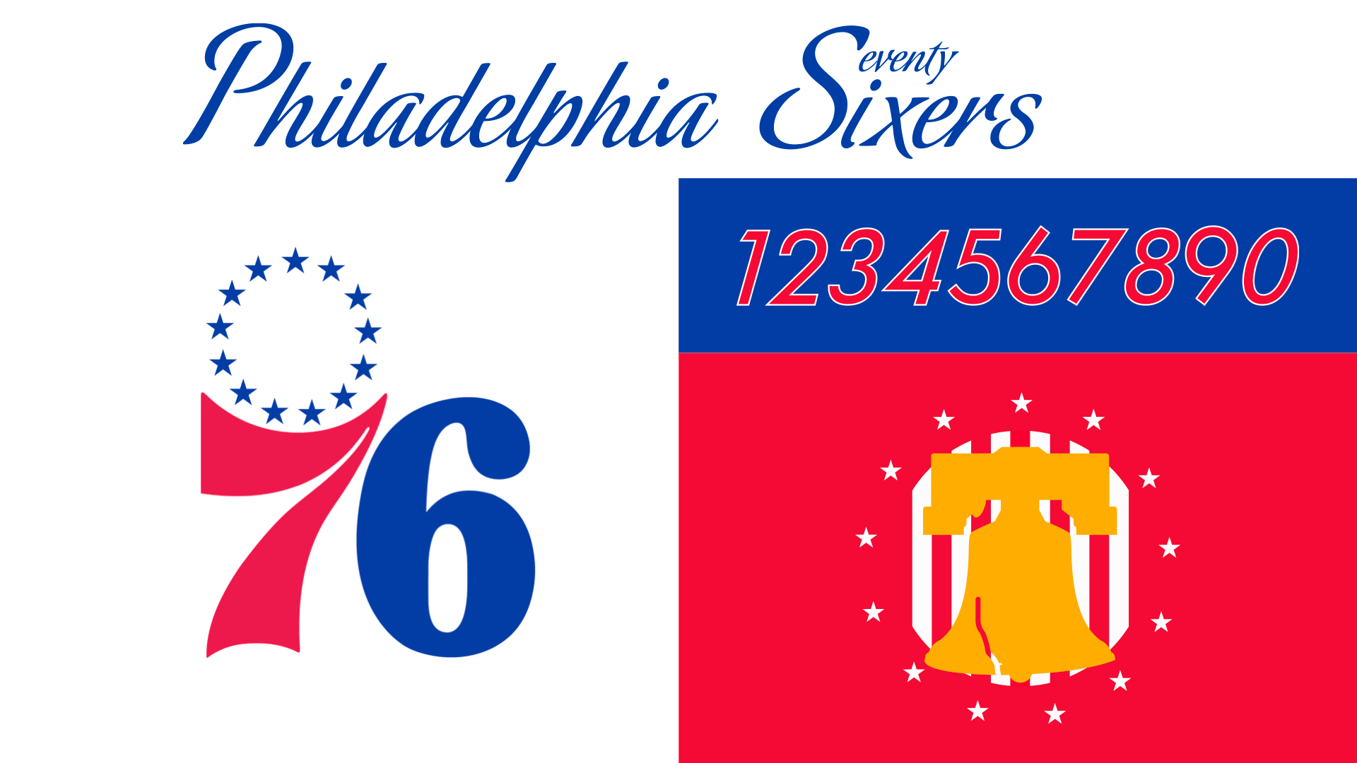
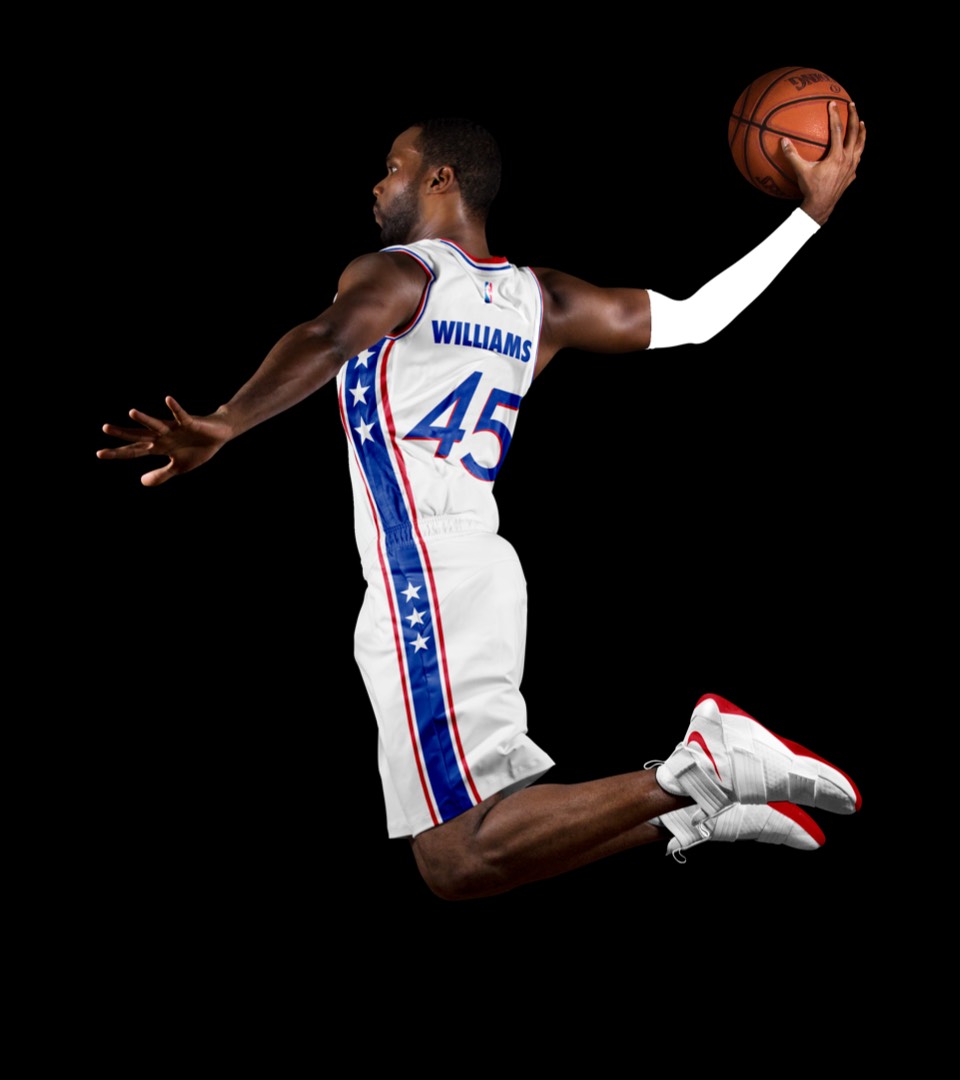
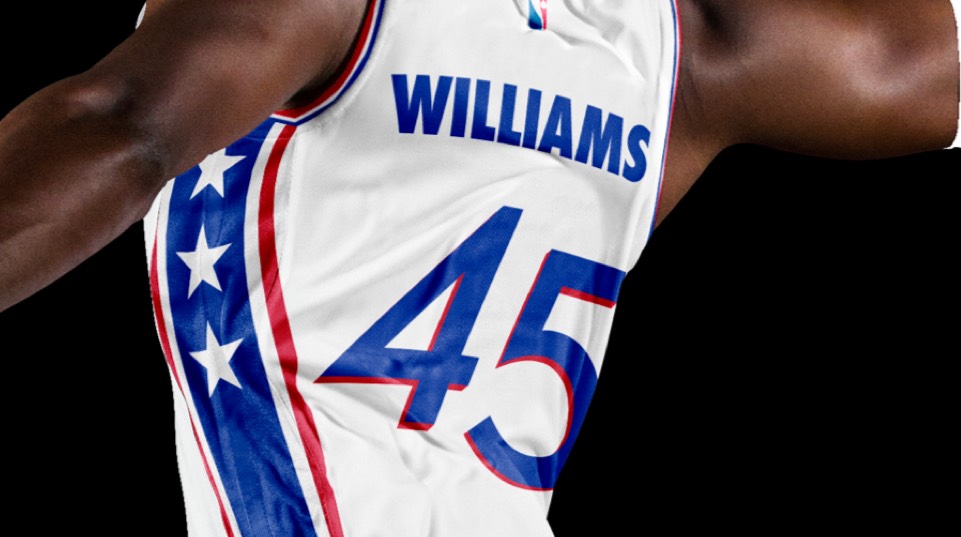
Bye block letters. The Sixers have been playing with a script font reminiscent of the declaration of independence for the past several years in their city and statement jerseys. Our goal was to bring that more to the forefront to create a more ownable look rather than the block letters in their current kits. The secondary liberty bell logo is inspired by their original Syracuse Nationals logo. We've paired this script type with a new number system that extends from their secondary "76" logo.
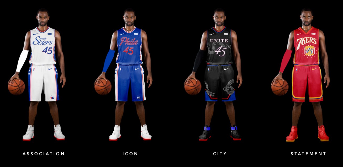
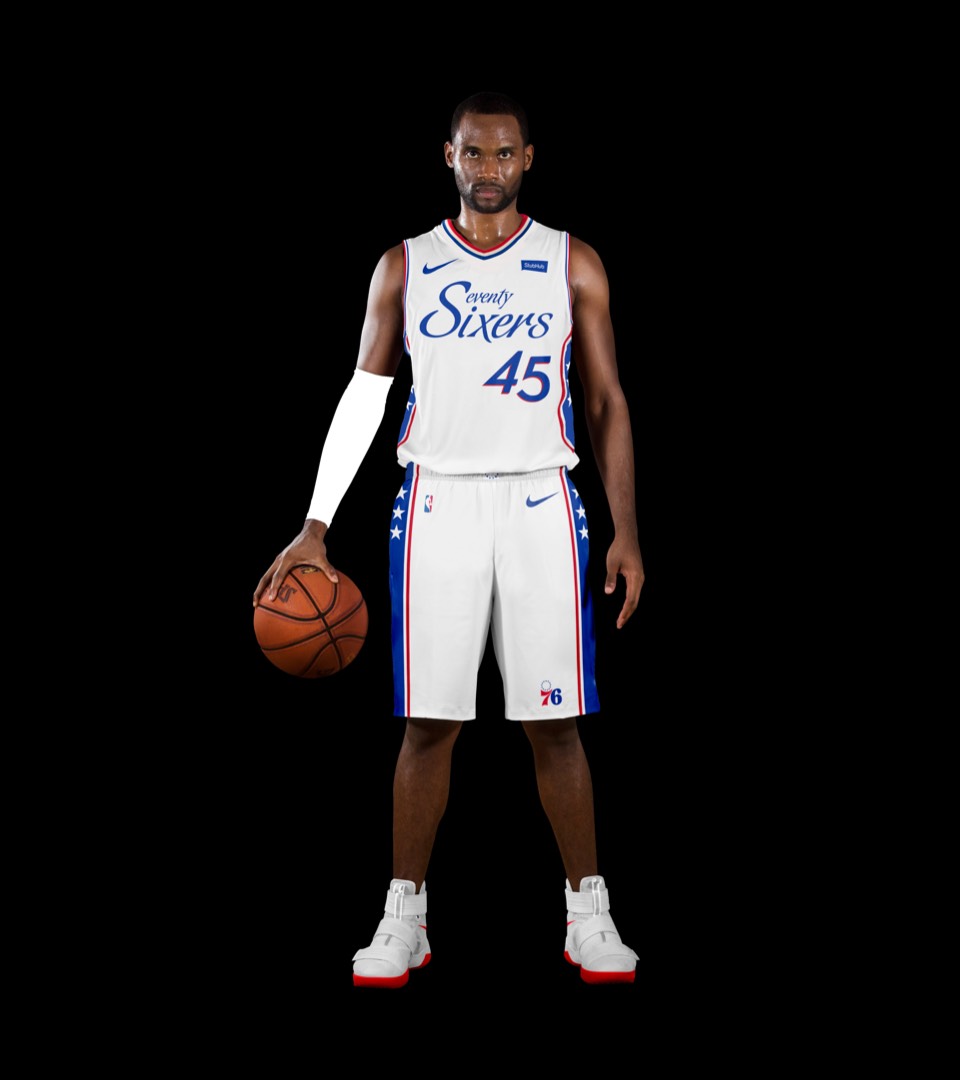
Main update here is the script Seventy Sixers. Seventy Sixers was spelled out across the uniform in the 70's and was reintroduced in 2019 Classic Edition uniforms. The goal was to match that look with the updated script font.
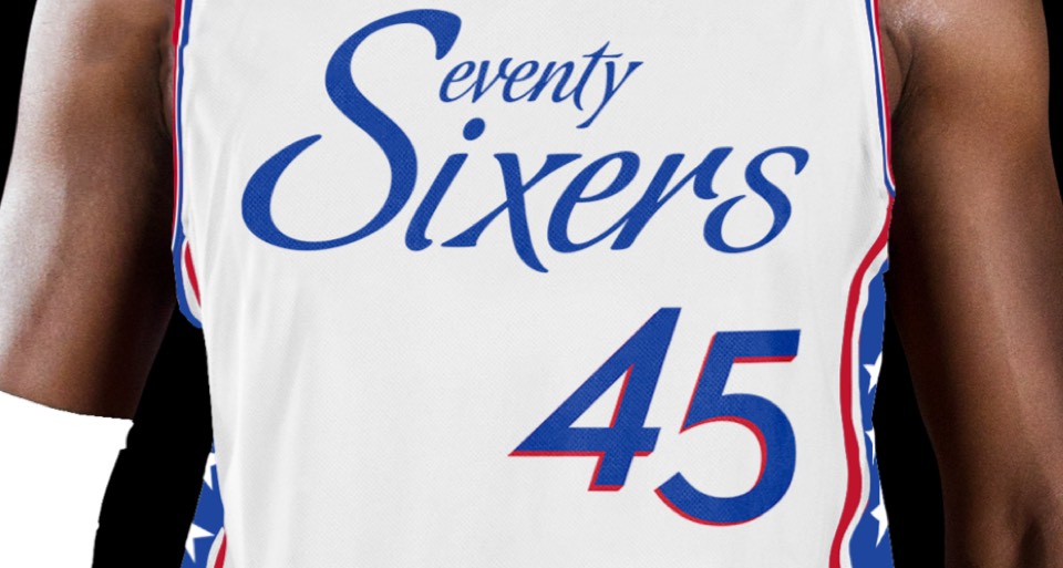
Main update here is the script Seventy Sixers. Seventy Sixers was spelled out across the uniform in the 70's and was reintroduced in 2019 Classic Edition uniforms. The goal was to match that look with the updated script font.
Main update here is in the updated lettering. We wanted a uniform that looks like a modernized Sixers look, but tied tightly to the classic Allen Iverson Slam Magazine cover.
Main update here is in the updated lettering. We wanted a uniform that looks like a modernized Sixers look, but tied tightly to the classic Allen Iverson Slam Magazine cover.
The fans have been clamoring to bring back the black uniforms for years. This look incorporates the Ben Franklin's illustrated "Join or Die" snake from the revolution and wraps it around the uniform. We chose the word "Unite" as the Sixers have been using that in pairing with the Snake graphic. Finally, the shorts are an abstracted look at Independence Hall.
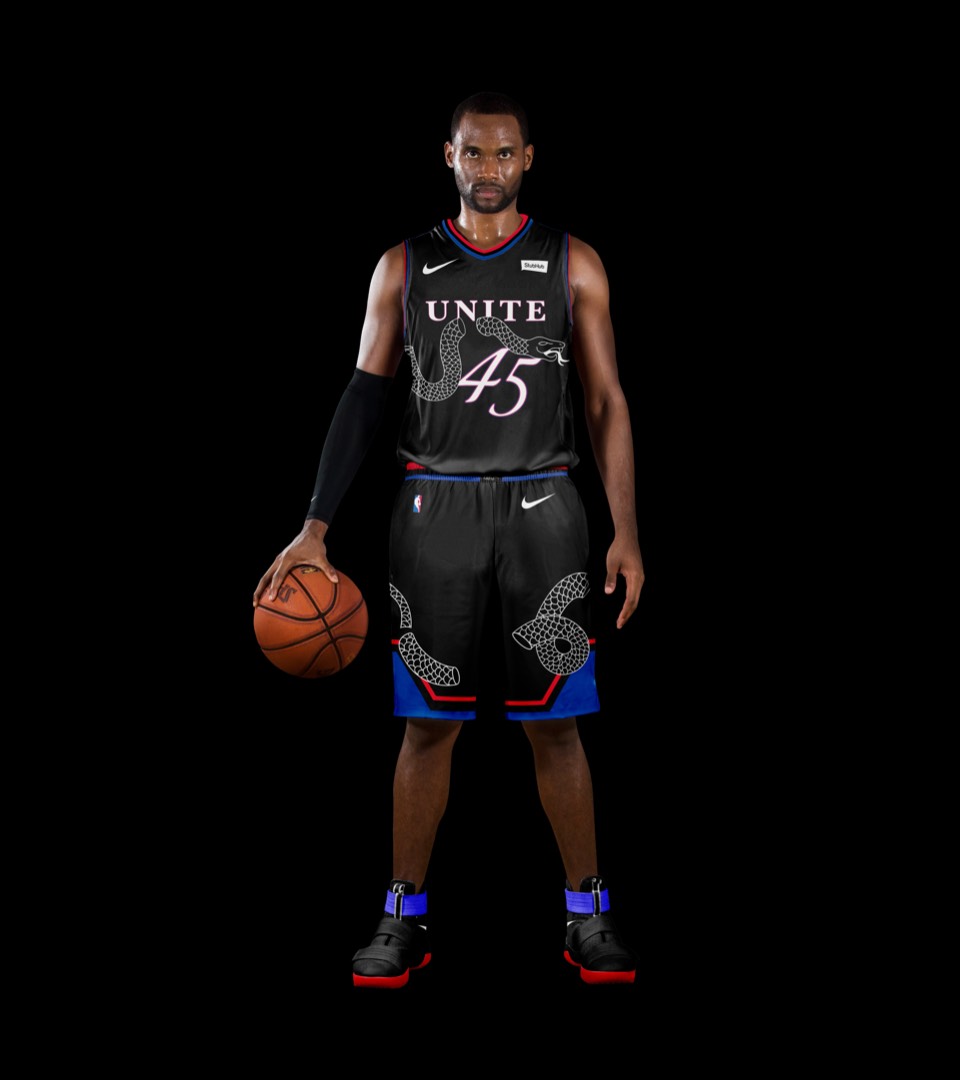
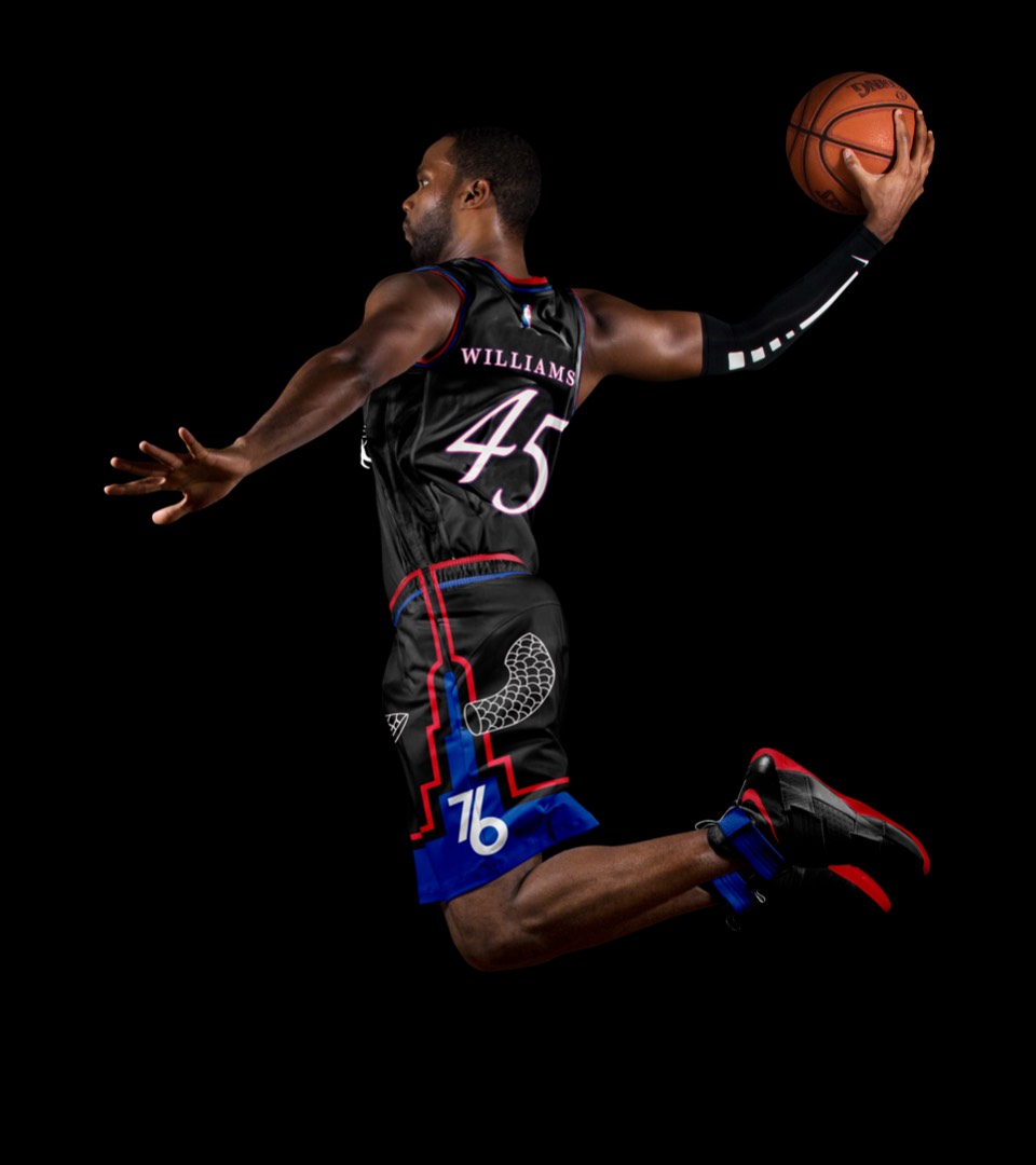
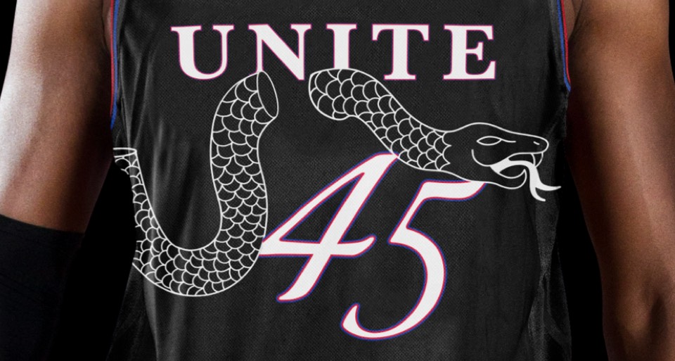
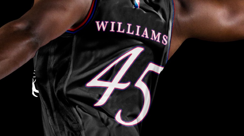
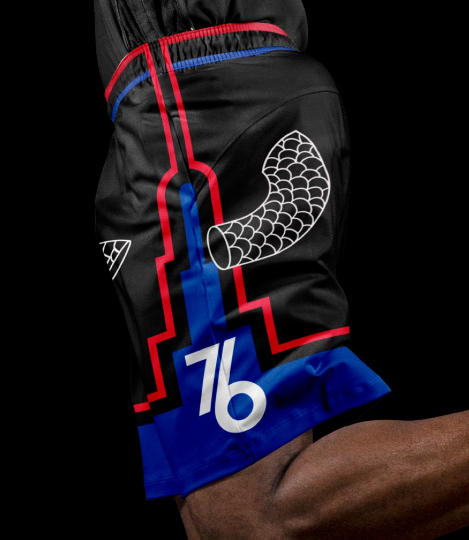
The fans have been clamoring to bring back the black uniforms for years. This look incorporates the Ben Franklin's illustrated "Join or Die" snake from the revolution and wraps it around the uniform. We chose the word "Unite" as the Sixers have been using that in pairing with the Snake graphic. Finally, the shorts are an abstracted look at Independence Hall.
In recent years the 2000's era look has grown to have a cult like following. These do not simply go rehash that era. Instead, we've repurposed the 76ers logo from that same era over a red uniform. The modernized Nationals logo comes into play here and sits nicely on the side of the shorts and under the number on the front of the jersey.
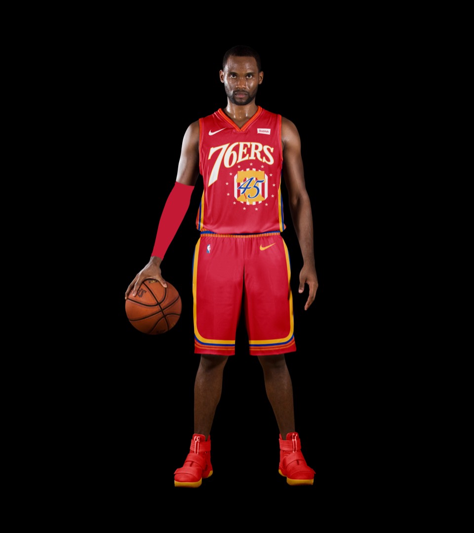
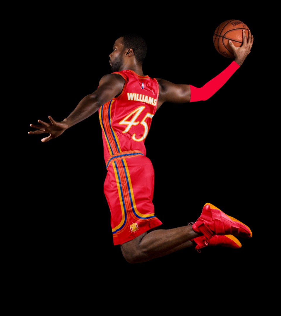
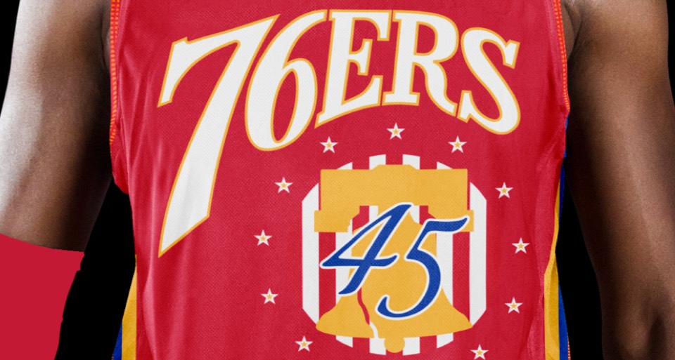
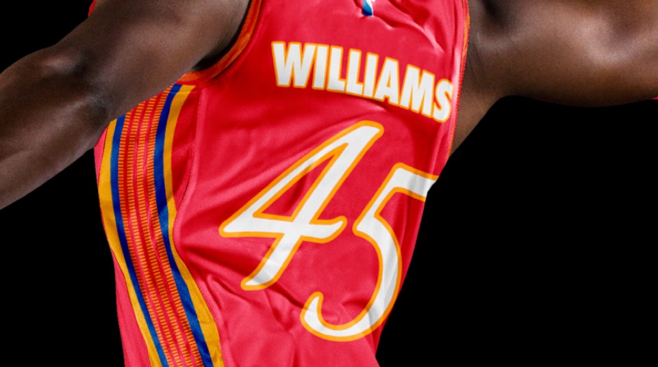
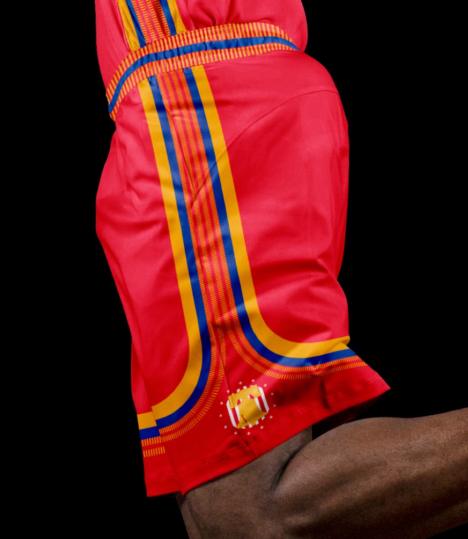
In recent years the 2000's era look has grown to have a cult like following. These do not simply go rehash that era. Instead, we’ve repurposed the 76ers logo from that same era over a red uniform. The modernized Nationals logo comes into play here and sits nicely on the side of the shorts and under the number on the front of the jersey.