


This is starting to go in the right direction; at least the fireball is back. And updating the tail to five spikes (we presume representing the five players on the floor) is clever. But then they bury it in black and ornamental design moves; to say nothing of the beveled, overly tech-y type. Let that thing breathe a little bit! And where did your purple go?!


Of course we returned to purple, and we brightened up the orange and yellow while we were at it. For the primary logo we're teasing everyone with a nod to the fireball, but one that reads more "sun" (don't worry, the fireball is coming). And we updated the type, building on that super-circular energy and making sure to preserve the nifty SUNS ambigram.

In this case we like the fireball as a secondary mark since it really doesn't say SUN but it does say PHOENIX SUNS. Beyond that we simplified the color palette (bye bye, black) and extended the type to the numbers.

Ah, the fun part. The fireball is BACK. This time with custom lettering to match! The two treatments of the sun/ball allow us to give more direction to the shorts as well; fireball on top, rising sun on each leg.



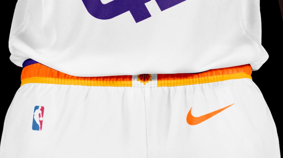
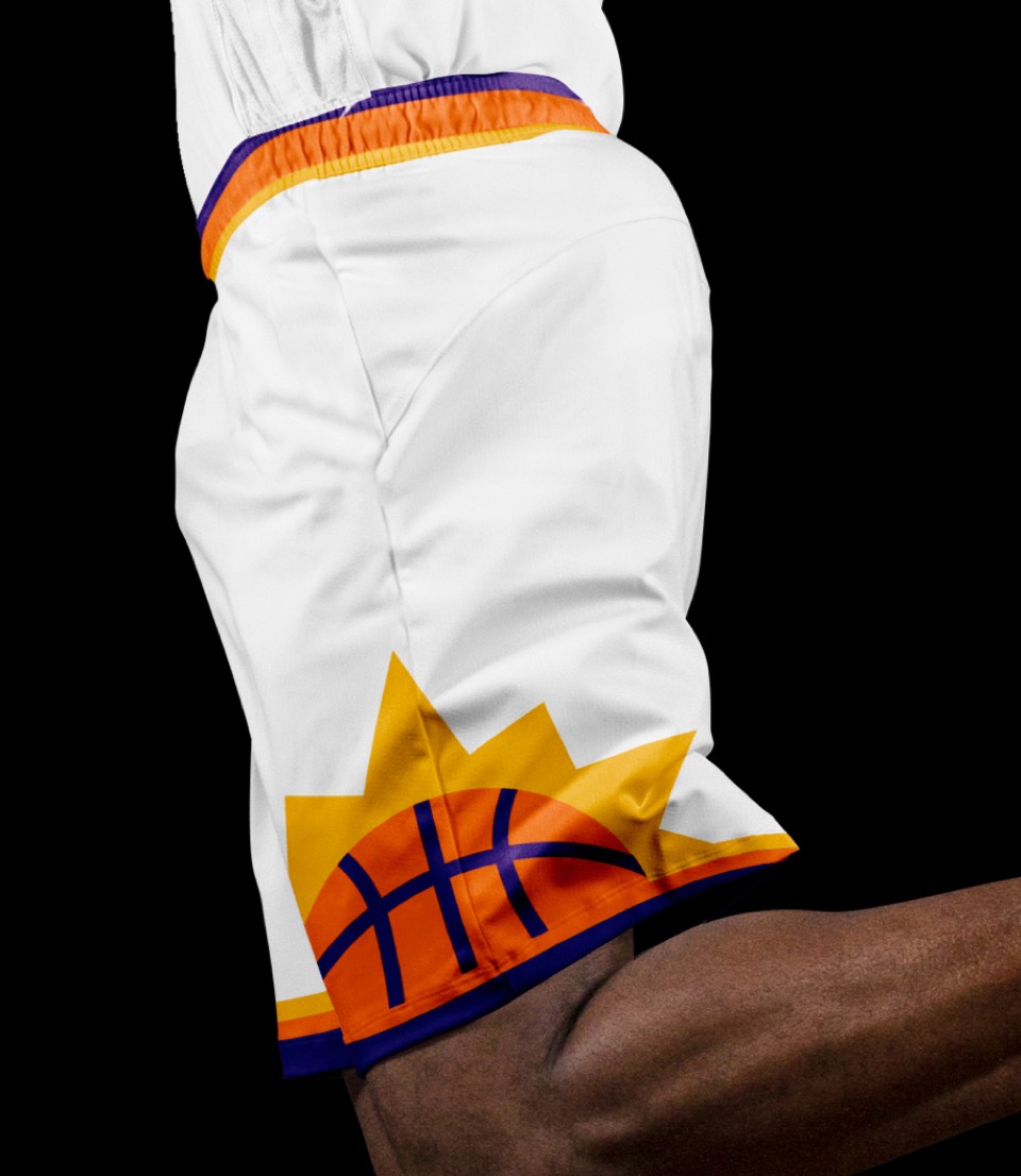
Ah, the fun part. The fireball is BACK. This time with custom lettering to match! The two treatments of the sun/ball allow us to give more direction to the shorts as well; fireball on top, rising sun on each leg.


We considered black here but the purple and orange is just too good.
We considered black here but the purple and orange is just too good.
We're inverting the placement of the logos, with the primary sun logo anchoring PHOENIX and housing the numbers. The shorts get a first-ever WRAPAROUND fireball treatment and the word SUNS down the right leg.



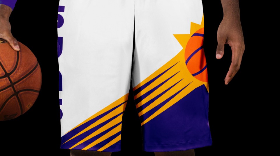
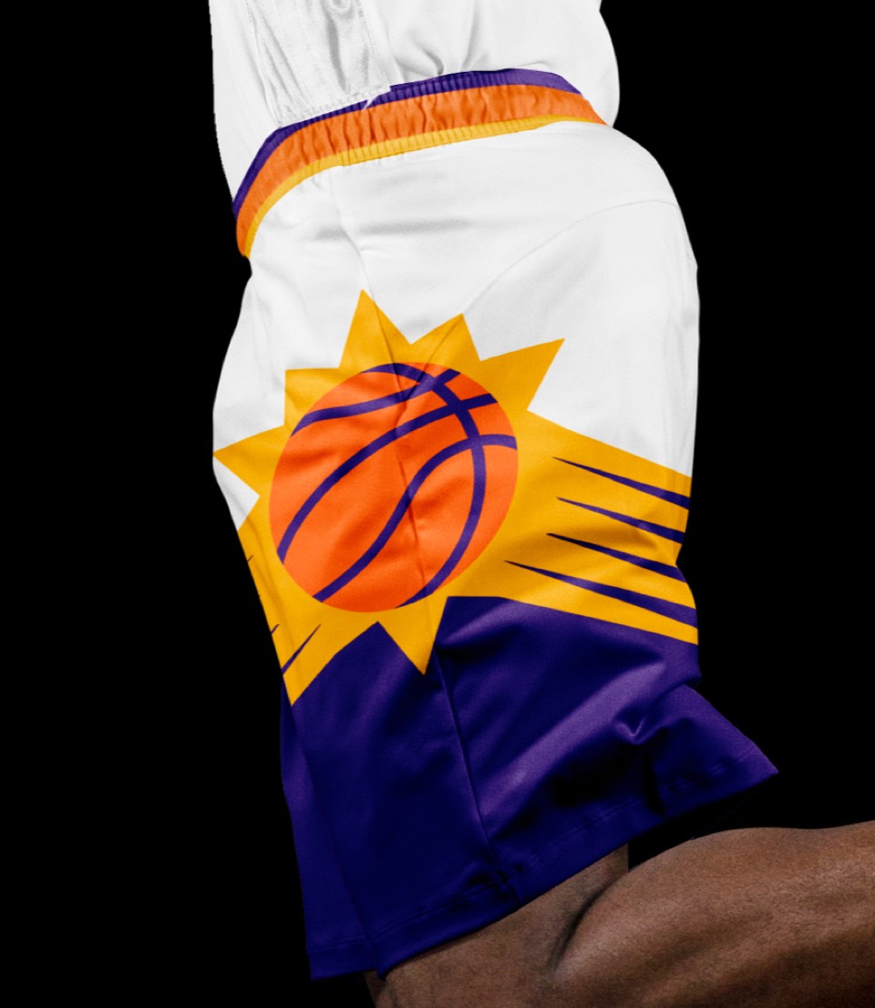
We're inverting the placement of the logos, with the primary sun logo anchoring PHOENIX and housing the numbers. The shorts get a first-ever WRAPAROUND fireball treatment and the word SUNS down the right leg.


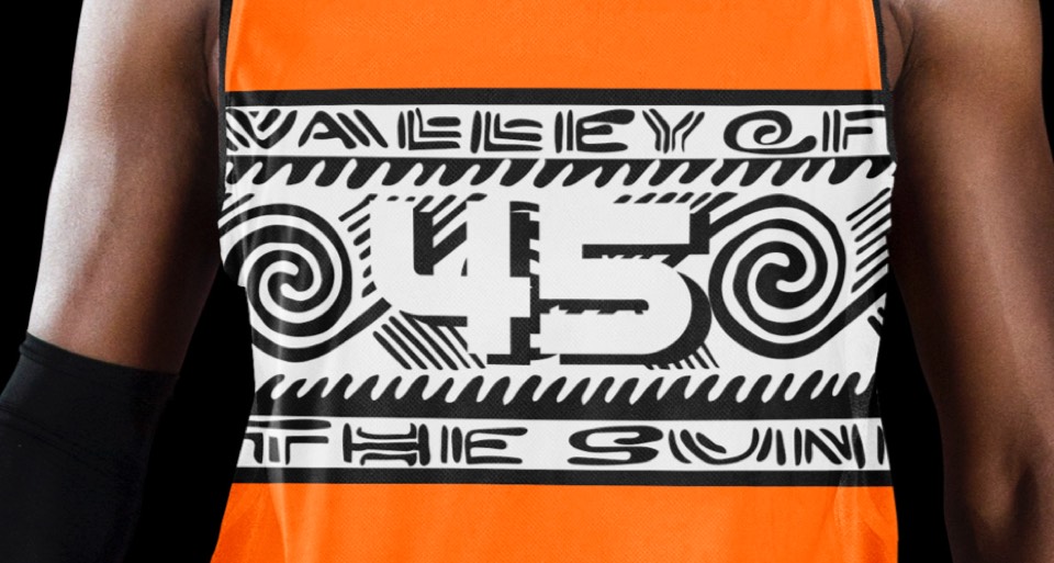
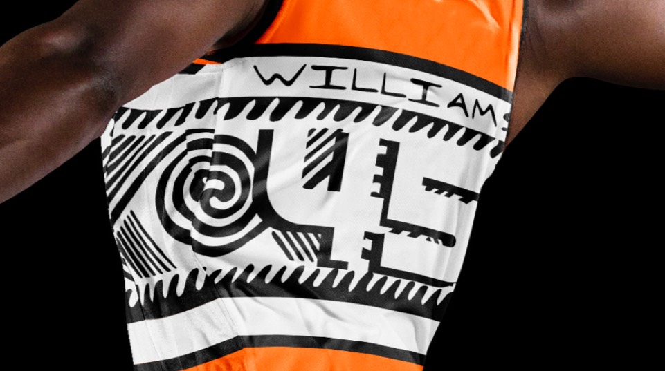
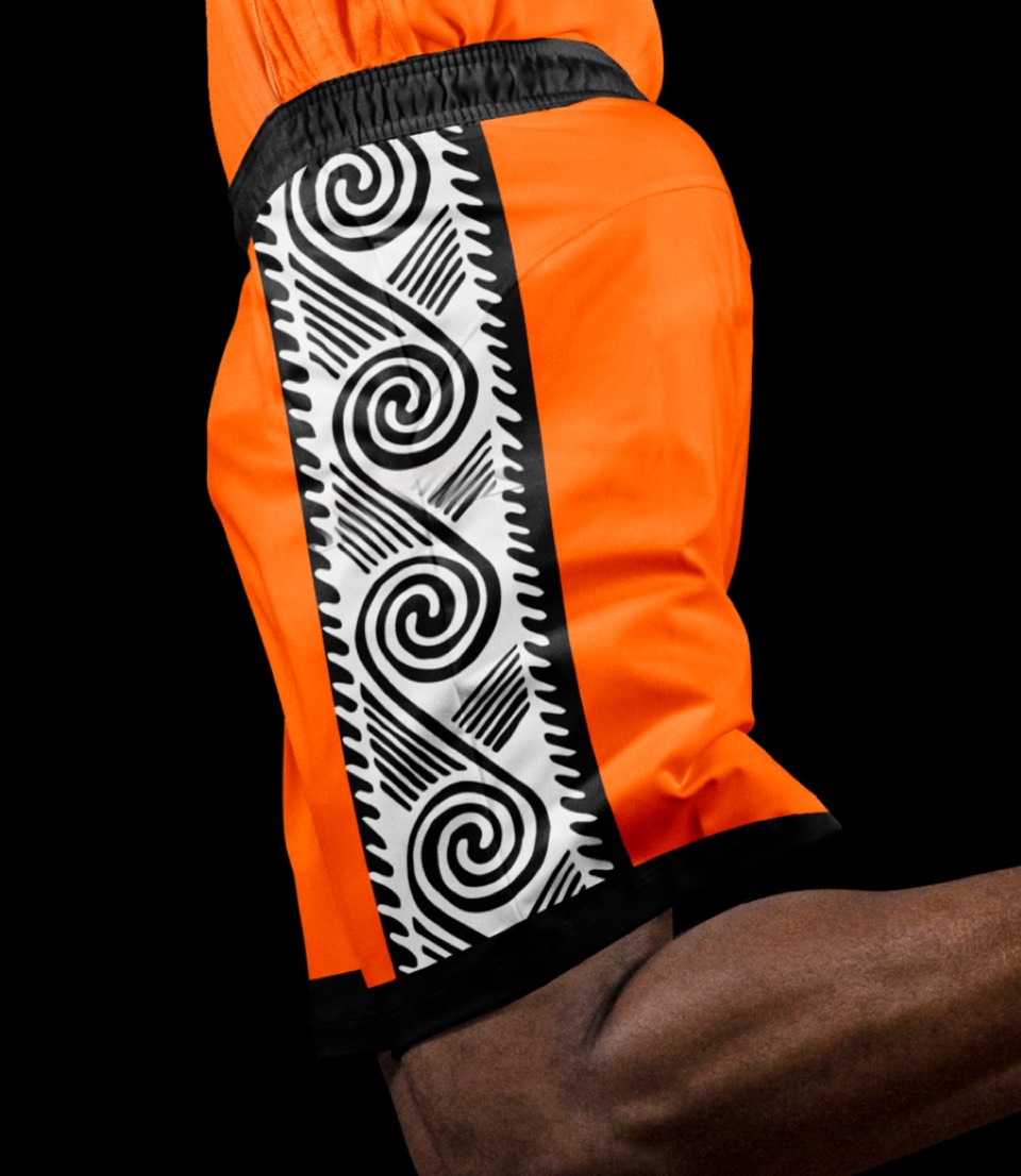
"Valley of the Sun" (look closely and you'll see it) housed in Hohokam-style art (the indigenous desert people of Arizona).


"Valley of the Sun" (look closely and you'll see it) housed in Hohokam-style art (the indigenous desert people of Arizona).
