
The issue with the logo is that it's pushing some fine-but-not-great lettering to the top of the hierarchy (two-too-many moves in PORTLAND); the mark is too small and the additional stroke makes it confusing as to whether there are five elements clashing (the negative space) or four (the positive space). (Or six? IDK)

We tried to force ourselves to include lockups for every single team with both a mark and the city/team name... but for the blazers, it felt right to make them the exception. JUST a mark. The Nike of the NBA. And while we were at it, we removed the stroke, adjusted the end-caps of the lines, and distilled the mark back down to it's essence—pure, five-on-five poetry in motion.
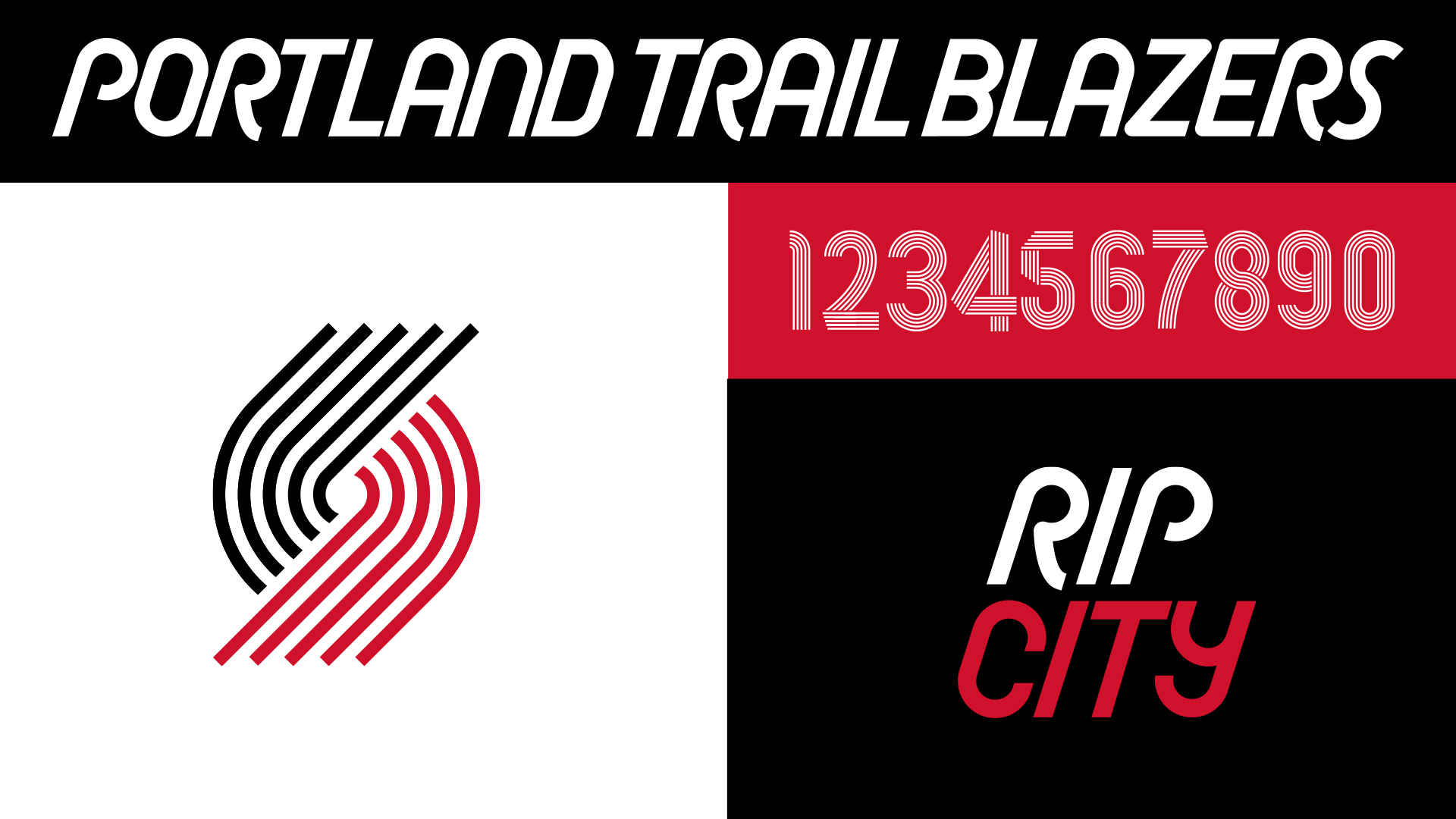
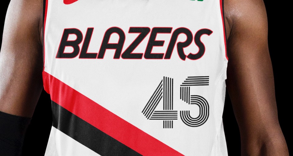
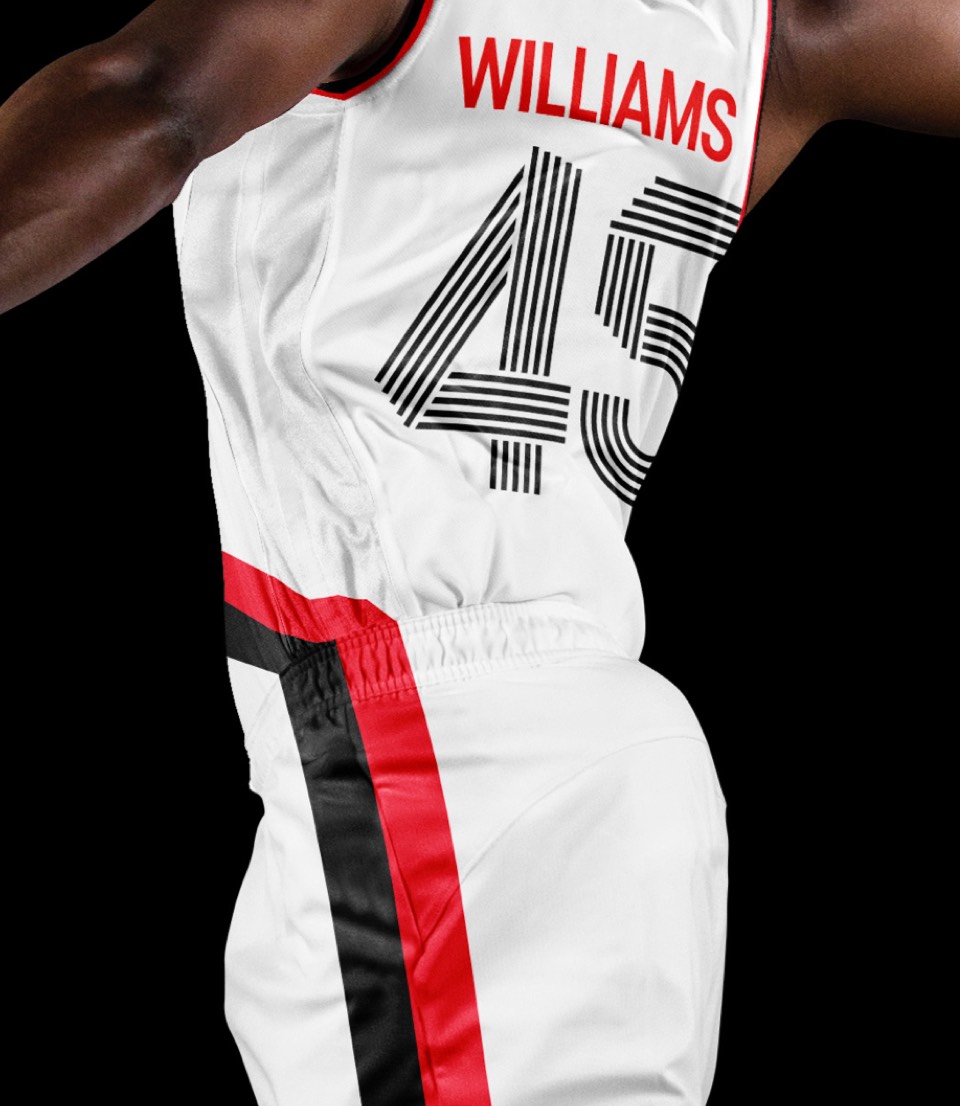
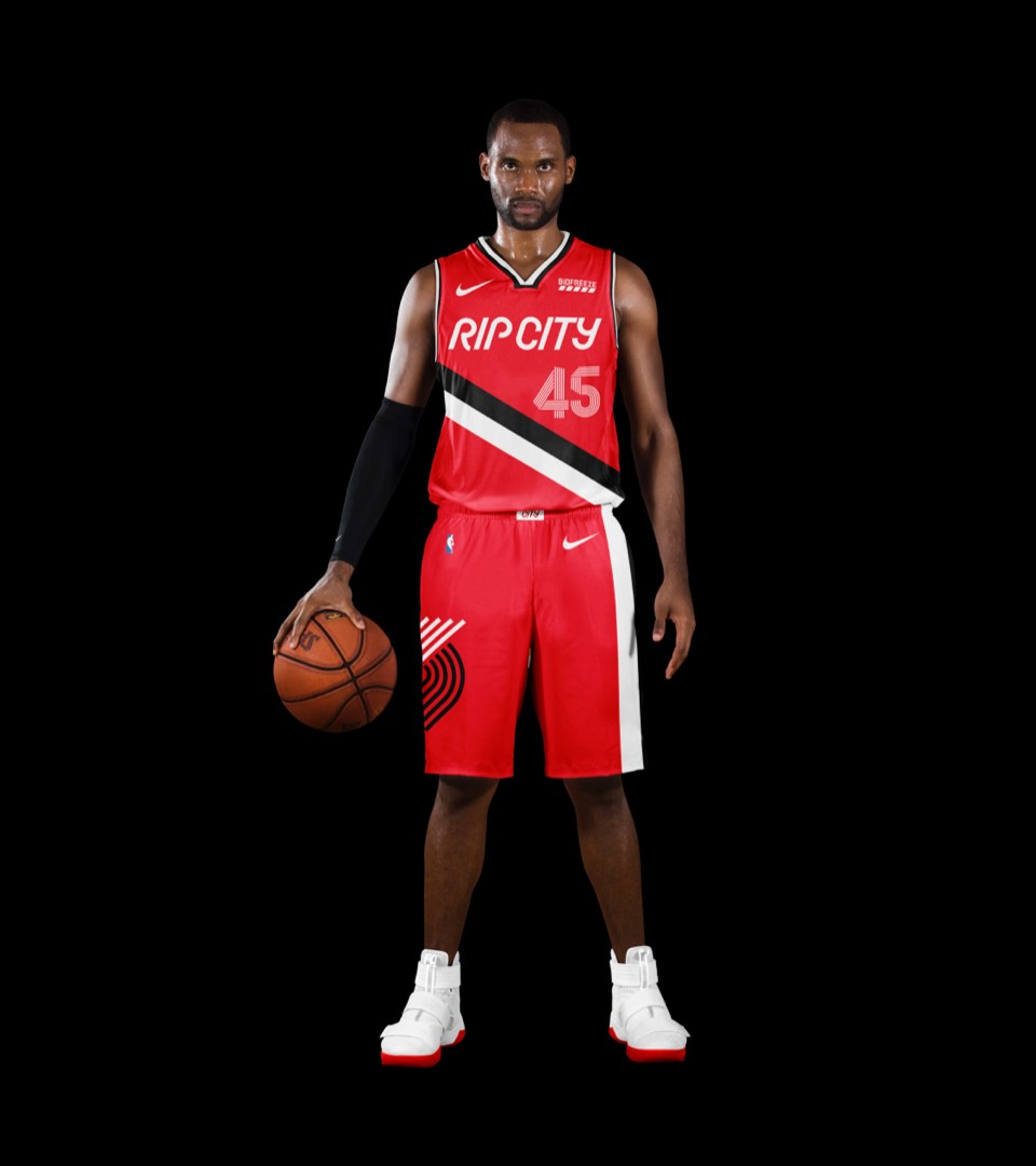
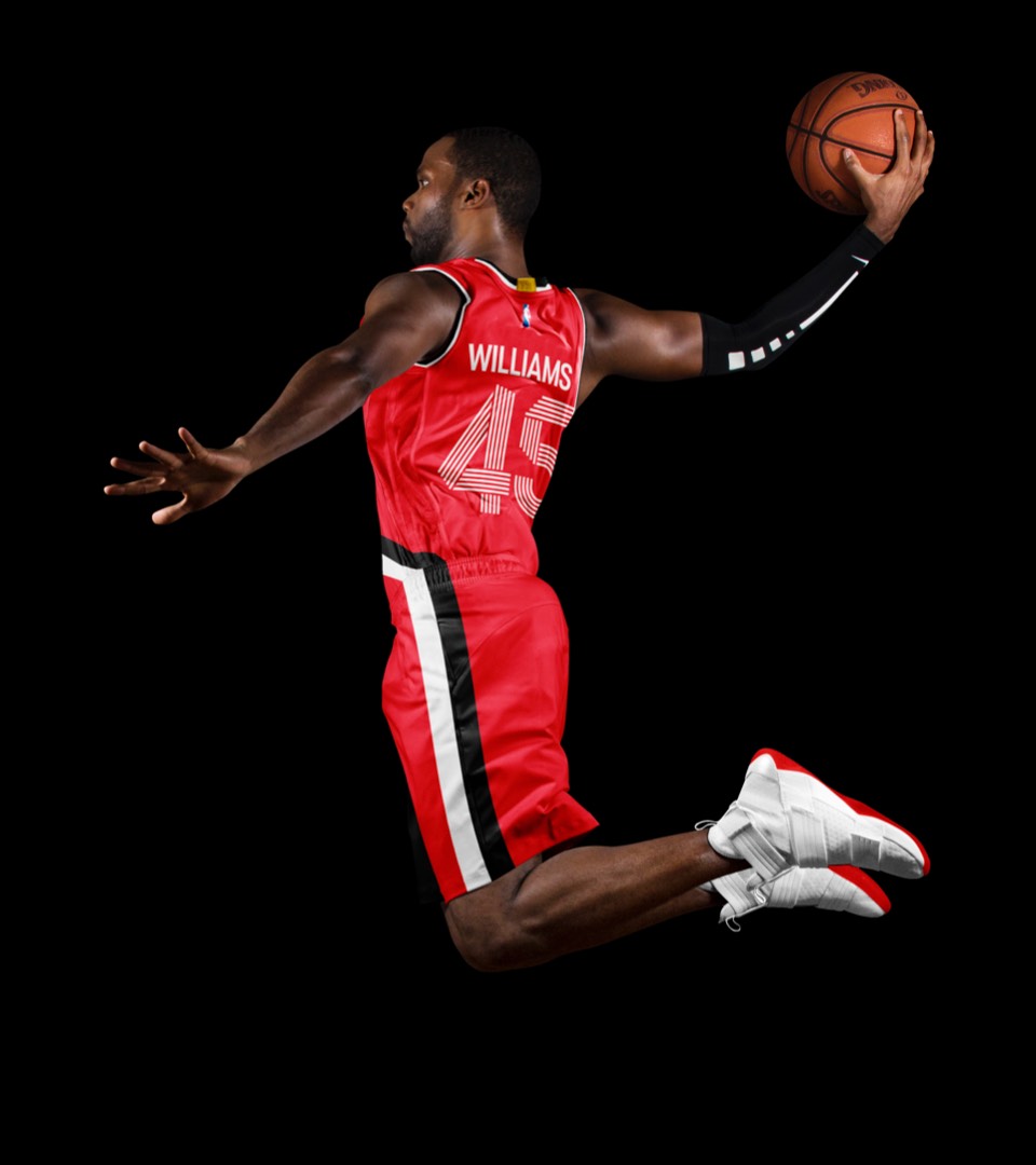
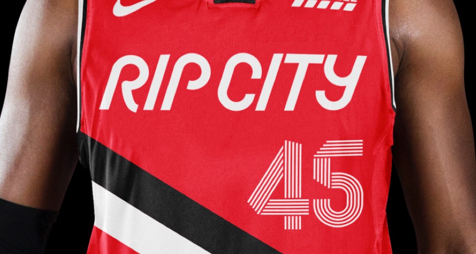
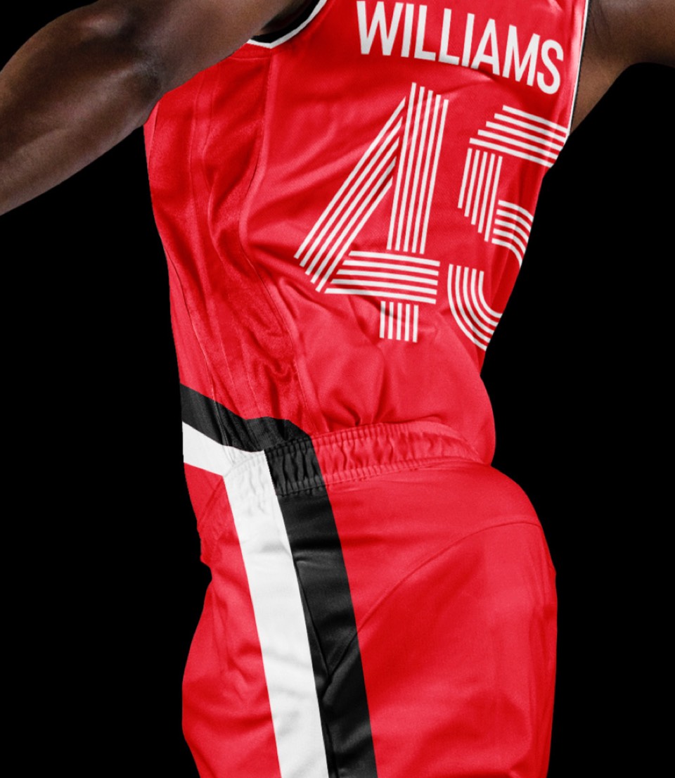
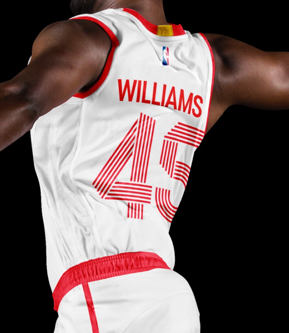
We built a lettering style that plays off the angle and movement of the logo, and numbers that are all built out of five lines moving in concert to match the concept. The secondary logo is a simple RIP CITY lockup.
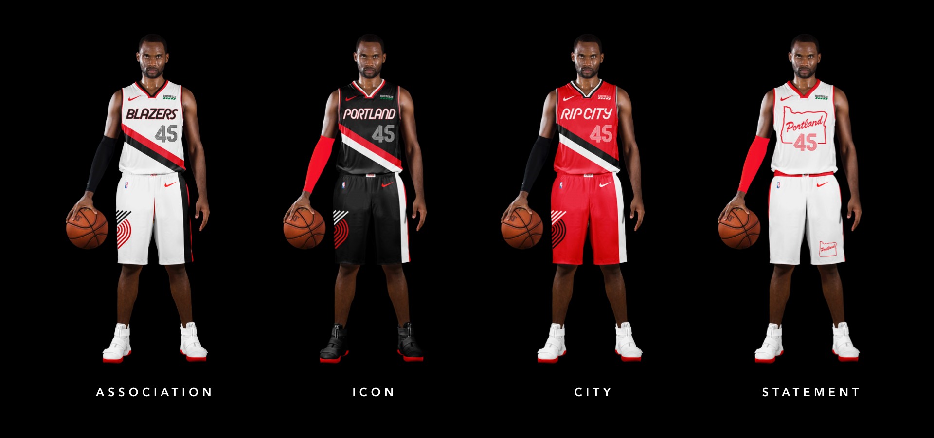
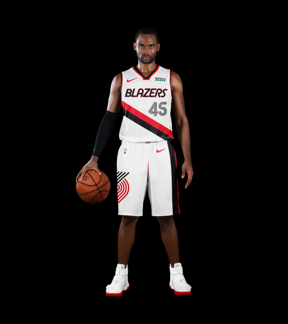
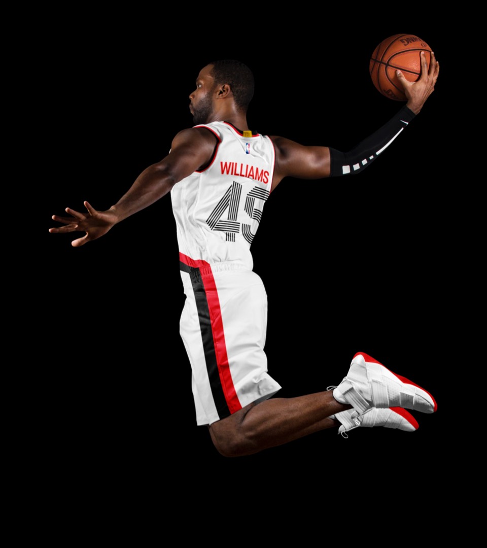
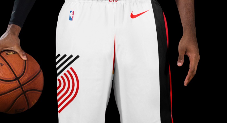
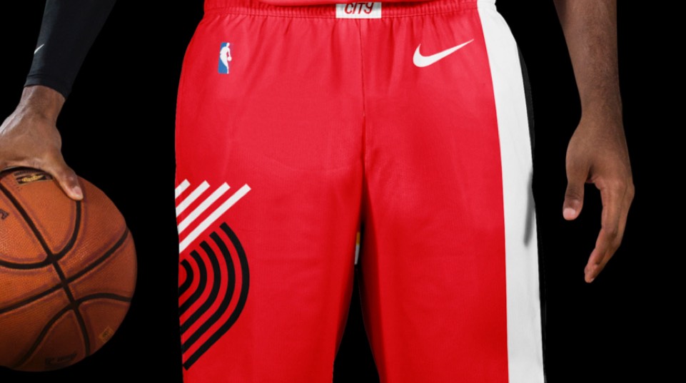
Keeping it as simple as possible here. The iconic double stripe that angles down across the jersey and down the left leg, plus the huge new logo on the right leg. Add our new letters and numbers, with the RIP CITY belt buckle, and we're done.
Keeping it as simple as possible here. The iconic double stripe that angles down across the jersey and down the left leg, plus the huge new logo on the right leg. Add our new letters and numbers, with the RIP CITY belt buckle, and we're done.
Same approach as the Association uniform, in black.
Same approach as the Association uniform, in black.
A red colorway with RIP CITY across the chest.
A red colorway with RIP CITY across the chest.
If you can believe it, we had finished this representation of the iconic PORTLAND sign before this years city jersey's came out! As with the Celtics, great minds think alike. Our take includes the Oregon silhouette and a simple piping line down the shorts.
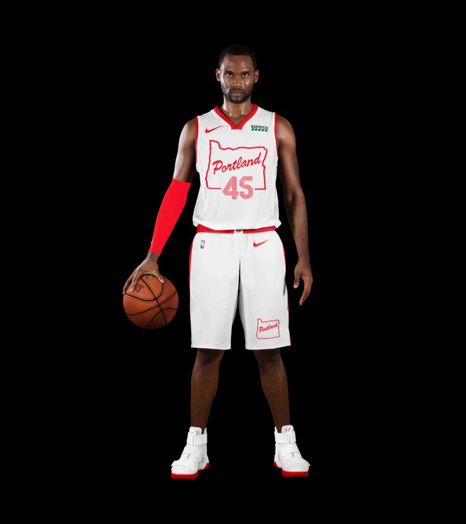
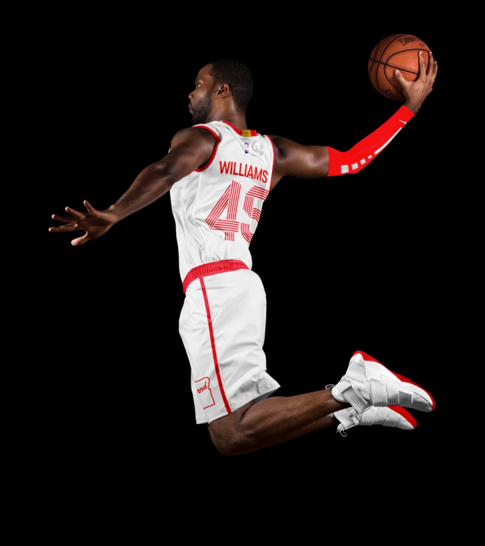
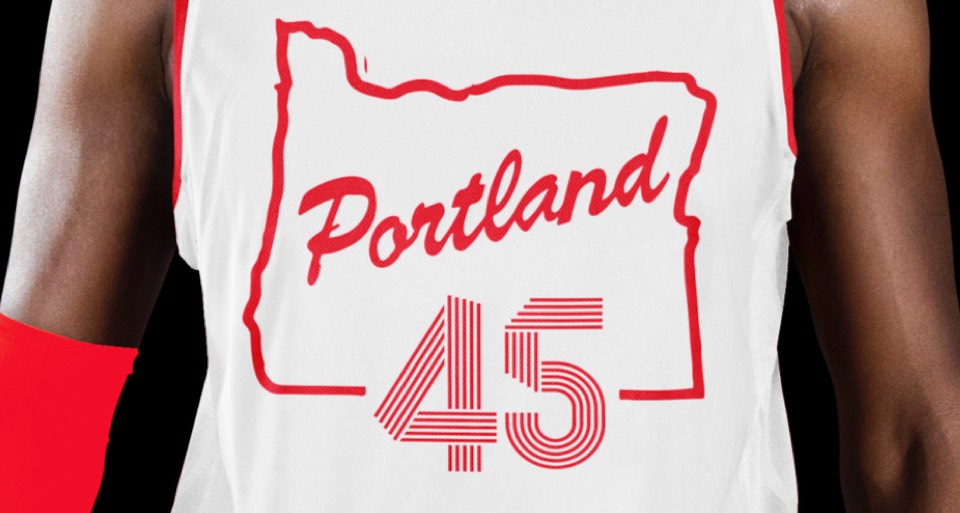
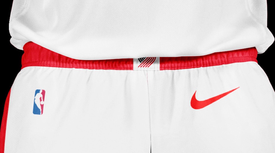
If you can believe it, we had finished this representation of the iconic PORTLAND sign before this years city jersey's came out! As with the Celtics, great minds think alike. Our take includes the Oregon silhouette and a simple piping line down the shorts.